Power Of Image
•Download as PPT, PDF•
2 likes•9,651 views

The document provides tips and guidelines for creating effective PowerPoint presentations with a focus on using visual elements like images and limiting text. It recommends following the 7X7 rule of using 7 bullet points with 7 words or less per slide. Images should be used to complement text and convey information visually. Charts and graphs should avoid being "chartjunk" and only include essential data. Presentations should avoid cognitive overload by keeping the style simple, concrete, unexpected and using stories and emotion to engage the audience.

Recommended
More Related Content
What's hot
What's hot (20)
Viewers also liked
Similar to Power Of Image
Similar to Power Of Image (20)
Recently uploaded
Recently uploaded (20)
Power Of Image
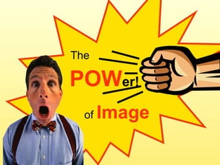
- 1. POW er! The of Image
- 2. Do you know your PowerPoint rules?
- 4. No more than six words. EVER. (Seth Godin)
- 6. Cognitive (over)load Numbers charts graphs and words Written words and text text text Words words words Spoken words and sounds and words
- 7. A slideument tries to put too much informa- tion on one slide or on a series of slides, thus tax- ing the cognitive limitations of the human brain, not to mention the capacity of human vision to de- cipher 12-point text from 20 feet or more and to make all the ne- cessary mental calcu- lations and associat- ions before moving on to the next slide. handouts rock! SLIDEUMENT
- 10. Sparky
- 11. Reduce and simplify text
- 13. S S T O R I E S E M O T I O N C R E D I B L E C O N C R E T E U N E X P E C T E D S I M P L E S E C C U S
- 14. Embed text in image
- 16. Libraries go green Reduce waste Conserve energy Design green Buy green
- 17. Text = image
- 18. Libraries Shine in Tough Economic Times A slowing economy drives more people to use the library
- 19. Libraries in tough economic times SHINE
- 20. Avoid chart-junk
- 22. Librarian v Search Engine Overall satisfaction with information provided Source: Perceptions of Libraries and Information Resources, OCLC, 2005 Librarian Search engine 48% 60%
- 23. Integrate image and text
- 25. Enter search term 4 steps to clip art Click image Scroll thumbnails 1 4 3 Image appears in slide Click Go 2
- 26. BUT i. AM. NOT. CREA- TIVE.
- 27. 1. Contrast 4. Repetition repetition repitition repitition repitition 2. Alignment Just balance the BIG 4 3. Proximity
- 28. Creativity! makes me feel so small 1
- 29. Anyone can think in pictures. Your brain already does. 2
- 30. 3 i. will. rewire. my. creative. circuits.
- 31. i. am. high. on. creative. thoughts. 4
- 33. Storyboard the low - tech way
- 34. Storyboard for this presentation
- 35. 3-step process 1 . brainstorm 2 . chunk 3 . Storyboard it
- 36. POW er! Feel the
Editor's Notes
- If your presentations are riddled with bullet points, you may be creating slides that compete with instead of complementing your delivery to an audience. Understanding the impact of the visual component of a presentation will help you convey your message more effectively and make your ideas stickier. Science is revealing more all the time about the fascinating workings of the brain. Recent studies have shown that infants recognize the visual pattern that makes up the human face. They can differentiate a realistic image of a face from an abstract or cartoon image, and they prefer the realistic one. They can differentiate their mother’s face from other faces. A new-born begins to make sense of the world through visual coding years before textual information enters in. Much of memory is stored as image in the brain. When presenting to an adult audience, take advantage of the visual potential of PowerPoint to reach their brains. Let your slides add the emotional, evocative “proof” to your words.
- Did you learn a set of rules when you were taught how to use PowerPoint? There are a lot of rules out there.
- Like this one! It’s simple enough to remember. Notice that this is the auto-generated format in PowerPoint---centered title in Arial 44-pt and bulleted text in Arial 32-pt for the body of the slide. It does fill the available space.
- What about this rule? Seth Godin’s recommendation is to “make slides that reinforce your words, not repeat them.” I already broke his rule by adding the attribution (= 8 words). I’m not here to make new rules. If you want to break out of the PowerPoint box, it’s best to think in principles instead of rules.
- This is the foremost principle underlying all others.
- Cognitive load is the limited capacity of the working memory to process information and integrate it with long term memory. To make the transfer to the long-term, the brain seeks to connect new information to prior knowledge; it looks for familiar patterns and images with which to associate the incoming data. The brain gets overloaded when there’s too much input in to the working memory coming in on too many channels. Different parts of the brain process information at different speeds, which is why narrating slides is hard on the brain: one area is trying to parse the audio channel while another area is working on the textual channel and neither is being very successful. Research: John Sweller "Cognitive Load Theory, learning difficulty, and instructional design". 1994
- Cognitive overload is epitomized by the Slideument- --a slide that is trying to be a document, that is, trying to capture too much information on a slide because there are just so many details you want the audience to know. PowerPoint slides are not the right vehicle for conveying a lot of dense or detailed information. If it’s important for your audience to have that level of supporting information, give them a handout (not a mere print-out of the slide deck). You can post the handout online ahead of time so the participants can absorb the detail and be mentally prepared to comprehend your key message. Or you can link to it after the event so they can reinforce what they heard. Some people, like David S. Rose, believe that your slides “should be completely incapable of standing by themselves.” I think a truly masterful visual slide deck can convey plenty of meaning. Look at “THIRST” on Slideshare for an impressive example. (http://www.slideshare.net/jbrenman/thirst )
- This standard slide format attempts to describe the puppy my husband brought home one day. There are 7 bullet points with a reasonable amount of detail to help you form an image in your mind. But is there an easier way?
- If you are using text to describe something, ask yourself what image would do it better? This image saves me the effort of trying to describe Sparky and it saves my audience’s brains the effort of trying to form a picture. With all that energy saved, I can spend more time telling cute and funny stories about this little pup.
- There’s way too much text on the world’s PowerPoint slides.
- Here’s the standard format applied to an introduction of the principles from Made To Stick, an excellent book by brothers Chip Heath and Dan Heath on why some ideas stick around and others fly off the radar quickly. There’s a mnemonic here to help you remember the six principles but it’s kind of buried in text.
- Why not augment the mnemonic with size and color and pare the text down to the six core principles? If you’re giving a presentation on Made To Stick, you’ll be elaborating on each of the principles; you don’t need to clutter up the slide with all the partially explanatory phrases in the previous example.
- This a typical introductory slide on the topic of efforts by libraries to go “green.” Standard title and bulleted list of what will be covered in the presentation, along with a typical bit of clip art on the side. At least the image is not totally gratuitous in that it does relate to the content of the slide. However, it all looks a bit sterile.
- If you turn the image into the background of the slide, it declares the theme. The brain sees green , sees tree , sees the recycling arrows , connects all that with the word libraries , and gets ready to absorb the new information in the context of all those familiar themes. The rest of the text has been reduced to 8 words. I would be inclined to get rid of the excess text altogether. You have the rest of the presentation to expand on the strategies and practices and to embed them with more memorable images.
- This principle is well-known to graphic designers. They understand that words are strong, standalone graphic elements. They pay very particular attention to choices of font style, color, size, and placement on the page.
- Once again, this title slide uses the default PowerPoint layout---centered title Arial 44-pt and centered subtitle Arial 32-pt. Ho-hum. Does this capture any excitement about the topic?
- Here, the word “shine” SHINES and makes the whole slide shine.
- This term coined by Edward Tufte refers to a nemesis of data visualization, one that infects many PowerPoint presentations.
- Just because the Excel program has the functionality to produce charts like this doesn’t mean you should ever go there. This is the epitome of chartjunk. The relationships of the data are rendered meaningless by lack of strong proximity, fuzzy positioning, tiny type---all made even worse by projecting it on a screen and narrating over it. Oh, it makes my brain hurt. How can you distill this down to a core message?
- Did you feel your brain relax just now? The mind can easily absorb this relationship. If you really need for your audience to see all that other data, give them a handout and give them time to study it.
- The brain pays more attention to images integrated with text because our senses are designed to work together. According to the “brain rules” site (http://www.brainrules.net/the-rules ), “the addition of just one other sense during learning doubles the mean number of creative solutions on problem-solving tests.” This principle is applicable to technical instructions and descriptions of mechanical processes.
- Here is a set of instructions for inserting clip art into a PowerPoint slide. Each step is a bullet point. The image tucked in the corner is presumably the one chosen via the process. Assuming the learner is not at a computer terminal following along step-by-step, she will have to memorize the text and the order of the tasks to be performed at a later time.
- When the steps are integrated with screen shots from the application, the brain has images to associate with the textual tasks. When the learner opens the application later, the Clip Art search box will look familiar; the jargon “scroll through the thumbnails” is made clear via illustration; the origin of the 3-balloon cluster is revealed. It all adds up to a much stickier lesson.
- Some of you may be feeling like this right about now. Yes, you get the power of image but you think you don’t have the “creativity” to make the power work for you. Creativity is much more than painting a masterpiece or taking National Geographic-quality photographs. Creativity is expressed in many ways not typically associated with visual art. Creativity is ….big picture thinking, outside the box thinking, finding solutions to problems, leading project teams effectively, coming up with new ideas for adult or youth programs, promoting the library to a variety of stakeholders, mentoring colleagues, etc.
- However, since we are focusing on the visual elements of a 2-dimmensional surface, I’ll give you the Big 4 guidelines for designing, identified as such by Garr Reynolds author of Presentation Zen---the book and the blog (http://www.presentationzen.com/ )
- #1 Contrast equals difference . Play with differences in size, value, hue (color), spatial position (near and far, top and bottom). Be bold with your contrast so that it broadcasts loud and strong to the back of the audience.
- #2 Alignment : pay attention to how elements are aligned within the frame of the slide. There is a classic approach to composition called the “rule of thirds,” which is the idea that compositions are more interesting to the eye and the brain when the focal interest is concentrated in one-third of the picture plane. Avoid the tendency to plop things right in the middle. Here the pink background, robot, and thought bubble are all in the right 1/3 of the slide. The thought bubble is the densest visual element and it occupies approximately 1/3 of the 1/3. Remember that words act like images too and be aware of the alignment of the text in a slide. Experiment with different text alignments. I’m very fond of right-aligned text. If there are multiple lines of text, align them intentionally with each other. To help you compose your slides, you can turn on gridlines through the View menu in PowerPoint.
- #3 Proximity : basically, the audience should not have to work too hard to figure out what goes together. Think about where the eye will go first and what path is likely to follow; then make the connections obvious. Here, the eye is likely to land on the robot (in part because it is now a familiar object), then float up to the thought bubble, then catch the arrow over and down to the circuit board.
- #4 Repetition and consistency: give the brain some recurring elements as a grounding for all the other new information it is receiving. Repetition may apply to a single slide but it is more effective to think of its application to the entire slide deck. If you think of your slide deck as like a song, then the repeating elements are like the chorus. For consistency, work within self-imposed limitations for fonts (sticking to one is just fine), colors, layouts and thematic images.
- In fact, it’s a good practice to view your slide deck in slidesorter mode. Step back from it and blur your eyes so that you’re just seeing colors and patterns. Does it have balance and rhythm? Is the repetition apparent?
- When starting a new slide presentation, it is common practice to open PowerPoint, start with the title slide since it’s what pops up first, and then maybe create an outline, which will naturally evolve into bulleted text. I recommend trying a new approach, away from the computer--- just you, a pencil, and a piece of paper.
- This is the storyboard I sketched for this presentation. It is messy; it is not at all complete; it has lots of notes about re-ordering and inserting stuff. The key is that it helps me identify my CORE IDEA and then develop images that will help convey that idea. By starting with image notes, I’m less likely to end up with bullet-riddled slides with an afterthought bit of clip art in the corner.
- Try it! Brainstorm your presentation ideas until you have identified your CORE message. You can use little post-it notes for this part. Adhering to the core message, group your ideas into logical clusters or chunks. Distill ideas into images and rough sketches. You don’t have to commit to any specific images ----this is just an exercise to get you thinking in pictures instead of in bullet points. Nobody is going to critique your drawing skills. Arrange (and rearrange) on a letter or legal sheet of paper. Think in terms of repeating images, colors, patterns, etc. Use the post-it notes or transfer & draw on the paper.