Download as PDF, PPTX


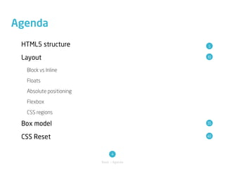
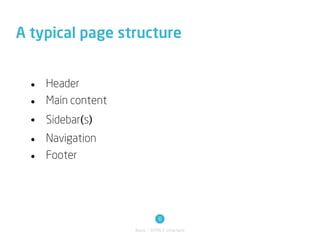
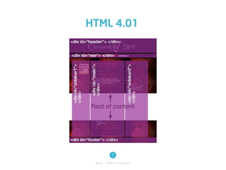
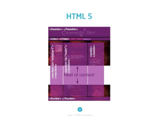

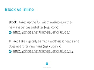
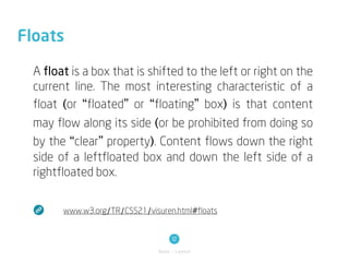
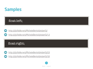
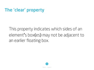

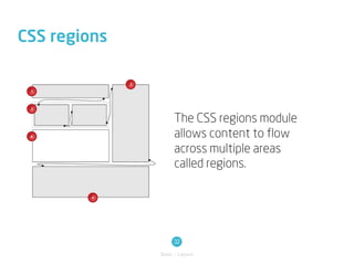
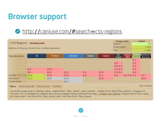

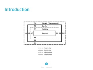


The document outlines techniques in digital animation, focusing on HTML5 structure, layout management, and CSS properties including flexbox and the box model. It covers elements such as floats, absolute positioning, and the purpose of CSS reset stylesheets to standardize browser rendering. Additionally, it includes resources for practical examples and cross-browser support for various CSS features.