1. AlbumCover Poster
10cc – DECEPTIVEBENDS
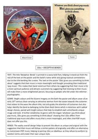
TEXT: The title ‘Deceptive Bends’ is printed in a wavy bold font, helping it stand out from the
rest of the text on the poster and the band’s name while also giving nautical connotations
due to the title bending like a wave. The text on the poster ‘10cc gives you something to think
about’ suggests that their music is more meaningful and thought provoking than traditional
‘pop music’. This makes their band stand out from others by suggesting that their music is for
a more spiritual audience and attracts customers by suggesting that listening to their music
will make them a more enlightened person, focusing on people who fall under the reformer
psychographic.
GENRE: Bright colours and the bizarre imagery on the both the poster and album cover of an
early 20th
century diver carrying an attractive woman from the ocean towards the customer
that relates to the wave like album title, not only grabs the attention of customers but also
helps identify the band as belonging to the Glam Rock Genre which is notorious with radical
design choices, paired with bright colours that help to establish each artist/bands unique
image and style. It further establishes its genre with the slogan ‘whatever you think about
pop music, 10cc gives you something to think about’ showing that 10cc differs from
traditional pop music and offers music that is more meaningful, and infers that POP music
does not offer you this.
IMAGE: The wacky overall design helps to present the album as unique and original with the
suggestion that their music will follow a similar pattern of originality and offers an alternative
to mainstream POP music, helping to portray 10cc as rebellious as they refuse to conform to
societal norms and create their own unique style.
2. DAVID BOWIE - HEROES
TEXT: The same bold font coloured white against a black background used on both the posters
and album cover helps it stand out to grab the audience’s attention. The slogan ‘There’s old
wave , there’s new wave and there’s David bowie’ suggests that his music is timeless and that
buying his records is a sound investment as it will never go out of fashion, keeping them
valuable. It also suggests that his music is superior to others as it will never go out of fashion,
attracting customers who want to listen to music that is being described as timeless.
GENRE: Contrasting black and white colours paired with the gelled hair and leather jacket that
associates David Bowie with popular fashion icons from the 1950s such as James Dean or Jonny
Cash give David Bowie a rebellious and cool image that is commonly associated with the rock
genre. There’s also no explanation or description of the artist suggesting that he’s already well
known, expecting the audience to know the genre of the artist, which presents David Bowie as
important.
IMAGE: The advert represents David Bowie and his music as unique and cool, suggesting that
audiences who listen to his music will inherit or share the same originality and swathe style.
The slogan ‘tomorrow belongs to those who can hear it coming’ infers that people like David
Bowie and those who listen to his music are more fashionable and trendy than others,
appealing to the aspirer and reformer psychographs. It also differs from the artists previous
images/styles such as the brightly coloured Ziggy Stardust, which is a deep contrast from the
more moody black and white Bowie presented in the poster and album cover. This may be a
result of him changing his image/style which he changes his to match current fashion, allowing
to remain in popularity for a longer period of time.
AlbumCover Posters