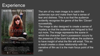
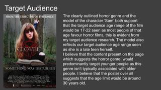
This is my final poster, which acts as a promotional device
to advertise my groups film trailer; ‘Cloven’. I am happy with
the end result of my horror film poster as I believe that it
uses, develops and challenges the forms and conventions
of real media products successfully. My poster includes a
variety of conventional features such as; a film title, an
image which relates to the narrative of the film, a release
date, a tag-line and credits such as a billing block. These
conventional aspects are vital to my film poster as they
allow the page to appear a lot more professional therefore
allowing my film poster to be conventionally effective. I also
believe that my film poster is successful as it keeps to the
conventional colour scheme of red, black and white. These
colours are important to keep to whilst creating a media
product as they work well together, as they highlight and
contrast each other allowing vital information to stand out
easily on the page. These colours are all visually eye
catching which allows all media products to be attractive
and conventionally stylistic.
Main Image The main image on my horror film poster, which is of the character Sam, in my opinion
is conventionally successful as it uses and develops the forms and conventions of real
media products proficiently. I believe that this image is conventional as it carries out a
variety of features which are essential when creating a horror film poster, such as;
relating to the genre of the film and revealing a sense of narrative to the audience
which is shown through the key-art of the image. These features allow the poster to
entice the audience to watch the film, which is the main purpose of the poster as it acts
as a promotional device.
This image evidently relates to the horror genre as it shows the character Sam whilst
channelling her possession. This is clearly identifiable from the mise-en-scene of the
image and the characters makeup. The lighting of the image creates a sinister feel as
the sky appears dark and shadowed suggesting that the character isn’t pure. This is a
conventional aspect to a horror film poster image, as there is normally a character
present on the page who is represented as being inhumane, disturbing or victimised. In
this case the character ‘Sam’ is all of these things as she is physically and mentally
disturbed, seen as her soul is being taken over by this evil entity. But in addition to this
she is also victimised, not only is she targeted by this evil entity but she as a result of
her possession is her own enemy. I decided to capture the character in a crouched
pose to make her seem almost animalistic, symbolising that her touch with humanity is
starting to slip away. This helps to represent the genre further.
The blood splatters underneath the characters hand also suggests the horror genre,
emphasising the despair most characters feel throughout the film plot. The blood also
symbolises the violence which is present within the film, this entices the target audience
to watch the film showing that it is a successful promotional device as it achieves what
it sets out to do.
Over all as a result, these key features allow the poster to reveal a sense of narrative,
which is that the character is possessed and the cause of her possession is due to the
prop of the book that she herself is holding. The prop of the book is used to initially
relate to the film plot but it is also used to create a code of enigma.
Credits
The billing block present on my horror film poster is a conventional feature as real existing film posters always include credits. This is when a poster
publicly mentions a list of individuals who contributed towards the production of the film being released. The film conventionally states the roles in which
they carried out such as being an actor starring in the film, being a producer/director or being a member of the crew. The billing block is conventionally
positioned at the bottom of the page and takes up around 30% of the space present on the whole page. It also typically keeps to a small, compact font
size so that it has enough space to list various members of the production team. Specific credits within my billing block such as the actors; Ethan Blake,
Ellie Reed, Nadine Powell, Josh Baugh and Joe Pugh are purposely included in order to act as a unique selling point, this a conventional feature to any
billing block as they entice the audience to watch the film, as they’re the actors who star in the film ‘Cloven’. Other credits such as the directors; Luke
Gumery and Josh Baugh feature within the billing block as it is a conventional aspect to include. This allows the audience to identify the directors famous
work that they have achieved before hand, therefore allowing them to pre-judge the success of the film and to decide whether they believe it will be worth
watching.
Over all I believe that my billing block is very conventional, as it includes all these vital features needed in order to achieve a successful media product. I
also decided to add the statement “from the director of evil inside” which is positioned at the top of my horror film poster, as I found out from my research
that this is a conventional aspect to include on a film poster. It is considered a conventional aspect as it states a famous film which the director has
worked on, crediting him for his previous accomplishments. This therefore gives the audience evidence that the film ‘Cloven’ will be a success. It is
positioned at the top of the page, to make the poster look more appealing as it takes up dead space.
Tag-line
The tag-line “something was disturbed” is a conventional feature present on my film poster, as it relates to the
narrative of our groups film plot by representing the idea that the character Sam has been corrupted by an evil entity,
which is the main cause of the disturbance. The tag-line also links in with the main image present on my horror film
poster as the character is portrayed as being possessed and psychologically tormented. This is easily identified by
the negativity of the mise-en-scene and the characters makeup, which makes her look bruised, unhealthy and evil,
which connects to the idea that she is experiencing disturbing changes, physically and mentally. This is also a
conventional aspect to include, as I found out from my research that most film posters typically correlate the image of
their film poster to the tag-line.
The tag-line is also conventionally designed to create a code of enigma, so that the film poster accomplishes what it
set out to achieve as a promotional device and entices the audience to watch the film. In this case I believe that my
tag-line is very conventional as it creates mystery of the unknown, the audience are intrigued to find out who or what
was disturbed? I also decided to use this statement as my tag-line, seen as most film posters conventionally include
one of the intertitles present within their film trailer as their tag-line so that the poster shows a clear link between them
due to promotional reasons.
Film Title
The title for our film is very conventional as it relates to the
narrative of our film plot. The title ‘Cloven’ has multiple
connotations as the word Cloven means a split or division into
two, this therefore represents the sudden change of the character
Sam who’s personality almost splits into two after her possession
has taken place. It also represents the idea of her soul splitting
into two separate entities; one which is evil and one which is
pure, that was present inside the old Sam.
The word ‘Cloven’ is also closely associated with a Cloven hoof,
this is a hoof which is split into two toes. Examples of mammals
that possess this type of hoof are cattle, deer, goats, and sheep.
In folklore and popular culture, a cloven hoof has long been
associated with the Devil. Over all I believe that our film title is
very conventional as it is closely linked to the narrative of our film,
as it represents the character Sam as being the Devil. I also
believe that it is a conventional feature as it creates a brand
image for the film, this is based upon its Celtic style of font which
also correlates to its narrative.
Other features
I decided to add a website ‘www.clovenmovie.com’ which is situated below the billing block, to show
that the film being promoted is multi-platform. This is a conventional aspect as many posters include
the website address of the film in order to act as another promotional feature. I also added the website
to further the audiences interaction with the film which a conventional aim for any successful media
product.
I added other features to the poster such as company logos as this is a common feature present on
most real film posters. I did this in order to make my horror film poster appear more realistic and
therefore professional.
Experience
The aim of my main image is to catch the
audiences eye and make them feel a sense of
fear and distress. This is so that the audience
evidently recognise the genre of the film ‘Cloven’
successfully.
The image is also designed to create a sense of
mystery so that the audience are intrigued to find
out more. The image represents the scene in
which the character Sam’s possession occurs by
the presence of the book this allows the audience
to have insight of what the film will entail. This as
a result creates a close relationship with the
narrative of film as it is the main focus point of the
plot.
Target Audience
The clearly outlined horror genre and the
model of the character ‘Sam’ both support
that the target audience age range of the film
would be 17-22 seen as most people of that
age favour horror films, this is evident from
my target audience research. The model also
reflects our target audience age range seen
as she is a late teen herself.
I believe that the content present on the page
which suggests the horror genre, would
predominantly target younger people as this
genre isn’t typically associated with older
people. I believe that the poster over all
suggests that the age limit would be around
30 years old.
Conclusion
• Over all I believe that my horror film poster is conventionally
successful as it follows the conventional features of many real
existing media products. I identified the typical layout of a horror film
poster by carrying out research into real media posters, this helped
me to design and to develop a conventional product as a result.
Initially I wanted to include as many of the codes and conventions of
film posters as I possibly could on my own product, this would
therefore ensure that my over all product would appear successfully
professional.
• In order to achieve this I decided to take specific conventional
features from existing posters that I was inspired by and apply them
to my own personal product.
Posters I was inspired by…
I was inspired by the image of this poster,
as I liked the idea that it shows the main
character within the location in which the
film plot was set. I tried to achieve this
exact same representation by placing the
character ‘Sam’ in the location in which she
became possessed, this is why I included
the prop of the book to add to the narrative
of the location. I was also influenced by the
fact that the sky is darkened or shadowed
as it creates a sinister feel and allows the
audience to identify the genre of the film
immediately. The sky also creates pathetic
fallacy as it represents the mood of the
character, seen as he is possessed.
I was inspired by the content and text
featured within this film poster, as I
believe that it successfully targets it’s
audience through the use of credits. The
line “from the producer of Paranormal
Activity and Insidious” allows the
audience to identify that the producer
has made previous accomplishments,
this therefore gives the audience
evidence that the film will be a success. I
decided to feature this on my film poster,
as I believed that it would make my
media product appear conventional and
therefore effective.

Evaluation q1 poster

  • 1.
    This is myfinal poster, which acts as a promotional device to advertise my groups film trailer; ‘Cloven’. I am happy with the end result of my horror film poster as I believe that it uses, develops and challenges the forms and conventions of real media products successfully. My poster includes a variety of conventional features such as; a film title, an image which relates to the narrative of the film, a release date, a tag-line and credits such as a billing block. These conventional aspects are vital to my film poster as they allow the page to appear a lot more professional therefore allowing my film poster to be conventionally effective. I also believe that my film poster is successful as it keeps to the conventional colour scheme of red, black and white. These colours are important to keep to whilst creating a media product as they work well together, as they highlight and contrast each other allowing vital information to stand out easily on the page. These colours are all visually eye catching which allows all media products to be attractive and conventionally stylistic.
  • 2.
    Main Image Themain image on my horror film poster, which is of the character Sam, in my opinion is conventionally successful as it uses and develops the forms and conventions of real media products proficiently. I believe that this image is conventional as it carries out a variety of features which are essential when creating a horror film poster, such as; relating to the genre of the film and revealing a sense of narrative to the audience which is shown through the key-art of the image. These features allow the poster to entice the audience to watch the film, which is the main purpose of the poster as it acts as a promotional device. This image evidently relates to the horror genre as it shows the character Sam whilst channelling her possession. This is clearly identifiable from the mise-en-scene of the image and the characters makeup. The lighting of the image creates a sinister feel as the sky appears dark and shadowed suggesting that the character isn’t pure. This is a conventional aspect to a horror film poster image, as there is normally a character present on the page who is represented as being inhumane, disturbing or victimised. In this case the character ‘Sam’ is all of these things as she is physically and mentally disturbed, seen as her soul is being taken over by this evil entity. But in addition to this she is also victimised, not only is she targeted by this evil entity but she as a result of her possession is her own enemy. I decided to capture the character in a crouched pose to make her seem almost animalistic, symbolising that her touch with humanity is starting to slip away. This helps to represent the genre further. The blood splatters underneath the characters hand also suggests the horror genre, emphasising the despair most characters feel throughout the film plot. The blood also symbolises the violence which is present within the film, this entices the target audience to watch the film showing that it is a successful promotional device as it achieves what it sets out to do. Over all as a result, these key features allow the poster to reveal a sense of narrative, which is that the character is possessed and the cause of her possession is due to the prop of the book that she herself is holding. The prop of the book is used to initially relate to the film plot but it is also used to create a code of enigma.
  • 3.
    Credits The billing blockpresent on my horror film poster is a conventional feature as real existing film posters always include credits. This is when a poster publicly mentions a list of individuals who contributed towards the production of the film being released. The film conventionally states the roles in which they carried out such as being an actor starring in the film, being a producer/director or being a member of the crew. The billing block is conventionally positioned at the bottom of the page and takes up around 30% of the space present on the whole page. It also typically keeps to a small, compact font size so that it has enough space to list various members of the production team. Specific credits within my billing block such as the actors; Ethan Blake, Ellie Reed, Nadine Powell, Josh Baugh and Joe Pugh are purposely included in order to act as a unique selling point, this a conventional feature to any billing block as they entice the audience to watch the film, as they’re the actors who star in the film ‘Cloven’. Other credits such as the directors; Luke Gumery and Josh Baugh feature within the billing block as it is a conventional aspect to include. This allows the audience to identify the directors famous work that they have achieved before hand, therefore allowing them to pre-judge the success of the film and to decide whether they believe it will be worth watching. Over all I believe that my billing block is very conventional, as it includes all these vital features needed in order to achieve a successful media product. I also decided to add the statement “from the director of evil inside” which is positioned at the top of my horror film poster, as I found out from my research that this is a conventional aspect to include on a film poster. It is considered a conventional aspect as it states a famous film which the director has worked on, crediting him for his previous accomplishments. This therefore gives the audience evidence that the film ‘Cloven’ will be a success. It is positioned at the top of the page, to make the poster look more appealing as it takes up dead space.
  • 4.
    Tag-line The tag-line “somethingwas disturbed” is a conventional feature present on my film poster, as it relates to the narrative of our groups film plot by representing the idea that the character Sam has been corrupted by an evil entity, which is the main cause of the disturbance. The tag-line also links in with the main image present on my horror film poster as the character is portrayed as being possessed and psychologically tormented. This is easily identified by the negativity of the mise-en-scene and the characters makeup, which makes her look bruised, unhealthy and evil, which connects to the idea that she is experiencing disturbing changes, physically and mentally. This is also a conventional aspect to include, as I found out from my research that most film posters typically correlate the image of their film poster to the tag-line. The tag-line is also conventionally designed to create a code of enigma, so that the film poster accomplishes what it set out to achieve as a promotional device and entices the audience to watch the film. In this case I believe that my tag-line is very conventional as it creates mystery of the unknown, the audience are intrigued to find out who or what was disturbed? I also decided to use this statement as my tag-line, seen as most film posters conventionally include one of the intertitles present within their film trailer as their tag-line so that the poster shows a clear link between them due to promotional reasons.
  • 5.
    Film Title The titlefor our film is very conventional as it relates to the narrative of our film plot. The title ‘Cloven’ has multiple connotations as the word Cloven means a split or division into two, this therefore represents the sudden change of the character Sam who’s personality almost splits into two after her possession has taken place. It also represents the idea of her soul splitting into two separate entities; one which is evil and one which is pure, that was present inside the old Sam. The word ‘Cloven’ is also closely associated with a Cloven hoof, this is a hoof which is split into two toes. Examples of mammals that possess this type of hoof are cattle, deer, goats, and sheep. In folklore and popular culture, a cloven hoof has long been associated with the Devil. Over all I believe that our film title is very conventional as it is closely linked to the narrative of our film, as it represents the character Sam as being the Devil. I also believe that it is a conventional feature as it creates a brand image for the film, this is based upon its Celtic style of font which also correlates to its narrative.
  • 6.
    Other features I decidedto add a website ‘www.clovenmovie.com’ which is situated below the billing block, to show that the film being promoted is multi-platform. This is a conventional aspect as many posters include the website address of the film in order to act as another promotional feature. I also added the website to further the audiences interaction with the film which a conventional aim for any successful media product. I added other features to the poster such as company logos as this is a common feature present on most real film posters. I did this in order to make my horror film poster appear more realistic and therefore professional.
  • 7.
    Experience The aim ofmy main image is to catch the audiences eye and make them feel a sense of fear and distress. This is so that the audience evidently recognise the genre of the film ‘Cloven’ successfully. The image is also designed to create a sense of mystery so that the audience are intrigued to find out more. The image represents the scene in which the character Sam’s possession occurs by the presence of the book this allows the audience to have insight of what the film will entail. This as a result creates a close relationship with the narrative of film as it is the main focus point of the plot.
  • 8.
    Target Audience The clearlyoutlined horror genre and the model of the character ‘Sam’ both support that the target audience age range of the film would be 17-22 seen as most people of that age favour horror films, this is evident from my target audience research. The model also reflects our target audience age range seen as she is a late teen herself. I believe that the content present on the page which suggests the horror genre, would predominantly target younger people as this genre isn’t typically associated with older people. I believe that the poster over all suggests that the age limit would be around 30 years old.
  • 9.
    Conclusion • Over allI believe that my horror film poster is conventionally successful as it follows the conventional features of many real existing media products. I identified the typical layout of a horror film poster by carrying out research into real media posters, this helped me to design and to develop a conventional product as a result. Initially I wanted to include as many of the codes and conventions of film posters as I possibly could on my own product, this would therefore ensure that my over all product would appear successfully professional. • In order to achieve this I decided to take specific conventional features from existing posters that I was inspired by and apply them to my own personal product.
  • 10.
    Posters I wasinspired by…
  • 11.
    I was inspiredby the image of this poster, as I liked the idea that it shows the main character within the location in which the film plot was set. I tried to achieve this exact same representation by placing the character ‘Sam’ in the location in which she became possessed, this is why I included the prop of the book to add to the narrative of the location. I was also influenced by the fact that the sky is darkened or shadowed as it creates a sinister feel and allows the audience to identify the genre of the film immediately. The sky also creates pathetic fallacy as it represents the mood of the character, seen as he is possessed.
  • 12.
    I was inspiredby the content and text featured within this film poster, as I believe that it successfully targets it’s audience through the use of credits. The line “from the producer of Paranormal Activity and Insidious” allows the audience to identify that the producer has made previous accomplishments, this therefore gives the audience evidence that the film will be a success. I decided to feature this on my film poster, as I believed that it would make my media product appear conventional and therefore effective.