Download to read offline
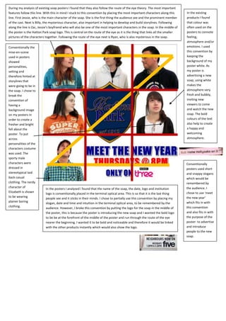

1) The document analyzes existing soap opera posters and identifies conventions around placement of key elements along an implied line of sight or "route of the eye". 2) It describes how the poster for a new soap opera sticks to conventions by placing main characters along this line, with the soap logo in the center to link the characters. 3) The poster breaks from conventions of including background images and uses color and character costumes to convey personalities and a fresh, welcoming atmosphere for the new soap.


![Music magazine front covers [repaired]](https://cdn.slidesharecdn.com/ss_thumbnails/musicmagazinefrontcoversrepaired-130227093653-phpapp01-thumbnail.jpg?width=640&height=640&fit=bounds)


