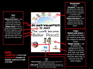
The document describes the process of designing a poster. Key elements include using different fonts, images, and selecting colors to make the poster simple, organized and attention grabbing for various audiences. Elements were arranged and backgrounds removed using selection and movement tools. The goal was to create balance and interest without being messy or complicated.
Axa Assurance Maroc - Insurer Innovation Award 2024
Skills and graphic design
1. Background:
I used…
• Gradient: I leave the
top alone and make the
bottom light so I can put
the text under it because
Text: it will look more
I used… interesting and cool.
•Select and move: I use •Select and move: I use
Select and move for Select and move for
organize and make the organize and make the
text fit with the poster. background fit with the
•Magic wand: I use to poster.
delete the background of
the text (images) so it will
Image:
not look odd, and when
we put it in the poster •Select and move: I
with the other text, it will use select and move
not cover the other text. for organize and make
the images fit with the
poster.
•Magic wand: I use
to delete the
background of the
images so it will not
S kills look odd, and when
•Audience: everyone we put it in the poster
•Purpose: I make it with the other text, it
Logo: will not cover the
simple and not really I used…
other images.
colorful •Select and move: I use Select and move for organize and
make the logo fit with the poster.
•Magic wand: I use to delete the background of the logo so it
will not look odd, and when we put it in the poster with the other
text, it will not cover the other images.
2. Balance: Simple:
There are 9 layers: • The background (image at the
•1 focal point which is top) look simple and not really
the background, I choose kid or adult it just normal (?).
it because it look peace •The white background look
and fit with everyone organize and neat and when
•4 group texts with there are image, we not really
different style to erase the background of that
•Images (so the poster image
not look boring •Good balance make it look
•Logo interest and neat and NOT mess
and complicate
•The white background help the
text, images and the logo not
look so colorful.
Fantastic fonts:
•1001freefonts is the websites Colors correct:
I use to find font (s). •Cause I was chose
•4 different fonts style the color of the
•I use different font style to background is white so
make the poster look more it fit with all text and
interest and to make it look image.
cool, like the first font, the •White are go with any
word look like it connect to the color!!
background like it was just 1! Get attention:
• Images, different fonts, simple it what I used to
get attention to people
• I use lots of images so it not look boring
•Use different fonts to get interest
•Simple and not colorful so it can fit with both kid
and adult
G raphic Des ign