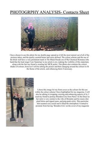
PHOTOGRPHY ANALYSIS- Contacts Sheet
I have chosen to use this photo for my double page spread as it felt the most natural out of all of the
pictures taken, and the quality seemed better and more defined. The colour scheme and the use of
the brick wall have a very prominent mark in The Black Parade era of My Chemical Romance (the
band that the lead singer I am 'featuring' in my article is in), making the visibility of this important,
along with the fact my friend is wearing her MCR jacket. This photo also contains the correct
shades of colours, however I will be editing the picture and then changing around the colours to fit
the theme of the article, and enhancing them if necessary.
I chose this image for my front cover as the colours for this are
within the colour scheme I have highlighted for my magazine. I will
also be editing it (cropping, resizing and enhancing aspects of it). I
used my friend to portray Brendon Urie from Panic! At the Disco as
her style is very similar to the vibe of Brendon and his music (her
plaid shirts and ripped jeans, and pop-punk style). This particular
shot seemed very casual and it fitted the atmosphere I wanted to
promote from having ‘Brendon Urie’ on the cover of my magazine
These are all of the shots that I have taken in order for my magazine. They all have different aspects
which would either be beneficial or not beneficial in the final production; whether that be because it
was blurry, the shot was at the wrong angle, or generally the actors weren’t ready for the photo

Photography Analysis

  • 1.
    PHOTOGRPHY ANALYSIS- ContactsSheet I have chosen to use this photo for my double page spread as it felt the most natural out of all of the pictures taken, and the quality seemed better and more defined. The colour scheme and the use of the brick wall have a very prominent mark in The Black Parade era of My Chemical Romance (the band that the lead singer I am 'featuring' in my article is in), making the visibility of this important, along with the fact my friend is wearing her MCR jacket. This photo also contains the correct shades of colours, however I will be editing the picture and then changing around the colours to fit the theme of the article, and enhancing them if necessary. I chose this image for my front cover as the colours for this are within the colour scheme I have highlighted for my magazine. I will also be editing it (cropping, resizing and enhancing aspects of it). I used my friend to portray Brendon Urie from Panic! At the Disco as her style is very similar to the vibe of Brendon and his music (her plaid shirts and ripped jeans, and pop-punk style). This particular shot seemed very casual and it fitted the atmosphere I wanted to promote from having ‘Brendon Urie’ on the cover of my magazine
  • 2.
    These are allof the shots that I have taken in order for my magazine. They all have different aspects which would either be beneficial or not beneficial in the final production; whether that be because it was blurry, the shot was at the wrong angle, or generally the actors weren’t ready for the photo