Painting intermediate Student Work Spring 2016
•Download as PPTX, PDF•
0 likes•293 views

Glenn Hirsch, Instructor www.glennhirsch.com

Recommended
More Related Content
What's hot
What's hot (20)
Similar to Painting intermediate Student Work Spring 2016
Similar to Painting intermediate Student Work Spring 2016 (13)
More from glennhirsch
More from glennhirsch (20)
Recently uploaded
Recently uploaded (20)
Painting intermediate Student Work Spring 2016
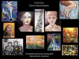
- 1. Final Crit Paint Intermediate UC Berkeley Extension Spring 2016 Glenn Hirsch, Instructor
- 2. Abigail Drapkin Double Exposures Movement, memory, and transparency Multiple exposures condense moments into a single ghostly image. In each painting, gestures in oil on wood leave slick traces of movement, translucent limbs capturing the ephemeral, selective nature of memory. Muted and subdued with hints of saturation, the colors recall stained glass with overlapping figures forming geometric shapes. The surreal comes into play when transparent bodies fade into the background and a girl appears to have four arms and two heads. I draw from Alex Kanevsky and Robert Birmelin. My lonesome figures speak to Edward Hopper, revealing the beauty in the ordinary.
- 17. Angela Hunkler This artist thinks and dreams in colors; she was raised on a farm in North Dakota and so often portrays the colors (such as purple iris, red feathers on my mythological birds and blues of the sky near dawn) of the seasons, birds and the life and death cycles course through her work. She adores Kathe Kollowitz, Paul Klee, Corita Kent and Leonard Baskin as constant expressionistic models; often for the intense spiritual underpinnings of their sometimes unpopular renderings of human nature. Color is starting to come back to her paintings more vigorously with a pastel-like underpainting of some color. This artist tends to paint with whatever tools her imagination and meditation brings to her; birds of life and death and just taking some botanical plants from her fertile mind of her gardening expertise. Mixed media is often her forte; this term she mostly concentrated on oils with a gift from a friend. It has opened up for the moment much in the line of going from light to dark and dark to light; both are worthy venues for me (black is such a pregnant creative color). She loves series as with oils one needs to wait anyway and this allows the creative process to lie fallow and then proceed on with the mood of the moment with scattering of the seeds for the planting of various vegetation or simply non- representational art.
- 24. Colin Dunne I am drawn to the isolation and the danger of driving and the uglier pieces of our infrastructure. The huge concrete structures that dominate our landscapes. I try and create clear and succinct images that tell a story and communicate the tension of urban life and the danger we routinely and absentmindedly place ourselves in each day. I work primarily in water colour and acrylic and occasionally make mixed media pieces. I am drawn to greys and blacks and the colours at the cooler end of the spectrum. I am inspired by the starkness of the paintings of Franz Kline and the kineticism of the installations of Chris Burden. My latest series concerns automobiles and highways, with an emphasis on overpasses and how weather affects these massive concrete structures that dominate our landscapes and sever ground level connections within the city. These ugly structures. Weather-stained and rusty. Crumbling and hastily patched. Breathtaking in their size and in their massive weight. They are monuments to our own ingenuity and, most importantly, monuments to the automobile. They are the ultimate sign that the modern city was built to be driven over rather than lived in. Yet they are also monuments to our hubris. Concrete does not age gracefully and weather chews inexorably away at it. Day by day, eroding it. Growing up around the Great Lakes, I learned that it only takes a little bit of snow and some wind to turn these structures of convenience into death traps. I want the viewer to feel the snow and the wind. To be reminded of that all too familiar moment: that moment on the highway when the best, most reasonable part of you whispers “you shouldn’t be doing this.”
- 32. Jennifer Hearing The Owls One came into the world in the caul on the full moon eclipse. One emerged slowly, silently, in her own sweet time. And one entered quickly, desperately clinging to all he knew. My three little owls, magical. From the start, each so unique, individual. My inspirations - so creative, such teachers, so wise with youth, inter-connected to the universe, wild + free. Like the vibrance + individuality of children, these owls represent this unique, mystical presence and innate wisdom, often masked by a wild + carefree nature. Each picture is interconnected, the whole, not one without the other. Van Gogh’s brush and the monochromatic color reminiscent of Rothko channel their essence.
- 40. Vermeer study and response
- 42. Jessica Orme I love the challenge of painting portraits. The human face is endlessly interesting and nuanced. Working from photographs, I notice more detail each time I look at them. What at first looks like an unvaried field of one color and value becomes full of many subtle variations? It is fun to play with color and experiment with transparent layers upon layers. The representational faces are painted without concern for matching colors to reality. Acrylic paints completely cover the canvas. Smooth surfaces show visible brushwork. Many glazes over a blue and white underpainting. Skin is a colorful combination of red, blue, yellow, blue, purple, and white. Art has always been a part of my life. Both of my parents have always created art. Like my dad, I love to paint portraits. Like my mom, I am not overly concerned with reality. I am in awe of the technique of the old masters such as Van Eyck and Rembrandt, the passion of Van Gogh, and the somber beauty of Mark Demsteader's portraits.
- 44. Study of Thomas Eakins and response
- 48. Lawrence Lagin Sacrifice by Fire Holocaust is a word of Greek origin meaning “sacrifice by fire.” I painted this series after seeing photographs in the Holocaust Memorial Museum in Washington, D.C., where I was particularly struck by the children who I felt were calling to me to tell their story. The work is done with limited palette to convey sorrow, and with sketchy lines and brash strokes to convey the energy and strong emotion of the subject - much in the style of my favorite artists, Lautrec and Van Gogh. I know that this is very sad and I found it difficult to do. I hope that I showed the respect that these beautiful souls deserve.
- 54. Study of Renoir and response
- 56. Liz Berg Stone Walls and Life Circles My work can best be characterized as using bold colors coupled with line and shape brought together to form pleasing compositions. It is usually non-objective in its abstract formation. I work intuitively and spontaneously most of the time, although I usually have a clear idea of where I want the piece to go. I particularly enjoy incorporating multiple levels of depth to my work, bringing one in closer and closer to see more detail. Each piece is open to one's individual discovery and interpretation. Light purples, deep purples, various shades of browns and neutrals, a smattering of green and orange, toned and subdued – except for the orange. Weather eroded sandstone hills. Amethyst covered in grime fill the square in a style like Paul Klee, innocent and free August, Celebration Set, Creation Day, Geese in the Streamers, July, June, Life circles 5, 6, 7, 8 - Purple Sun and a sea star. Stone walls, individual hand carved stones carefully placed to create something more substantial that the individual stones. Violets, oranges, scarlet, mauve, recollections of verges, colors seen in nature but more subdued and quiet, speaking of strength and integrity, holding walls, holding bridges, making fences. Interlocking shapes, lines moving easily amongst them, colors free to associate with each other.
- 61. Lyndsay Erickson Dance on Wood This series finds its heart with a palette knife on panel. The wood grain shows through crimson, scarlet, pink, vermillion, alizarin, thalo green and iridescent yellow. These paintings have a restless “wind” that blows through each picture in a dance both wild and still. The movement of Degas' dancers and horses, the complex composition of Diebenkorn, the energy and color of Matisse. The work is improvised and remains unadjusted after it’s finished. I paint quickly and this velocity helps avoid critical voices in a grand release from my career in finance. Art reminds us of how important it is to take action and to be bathed in color, even if only for a moment.
- 64. detail
- 65. detail
- 74. Renee Kelly Indications. Thoughts. Feelings. Buried in. The Mind. Fate. Hidden. Unseen. Moments lead up to. A Time. Life is changed forever. But...what was life like before fate really took hold? What if that fate had never existed? In The Prequel to Fate’s True Colors, I explore these questions by looking at a time before fate made its full mark, before life was uncontrollably altered, leaving nothing but snapshots of a previous era. What could things have been like if it weren’t for fate? Opposite of how I usually work this series was created from found photos and titles based on what those photos seemed to represent. The paintings use a combination of bright and subdued color, and are from a pulled back third person observational position, a point of view in which the viewer is there but not there. Inspired in part by the work of Frida Kahlo, Rene Magritte, and Gottfried Helnwein, these paintings are for those out there who have experienced the unrelenting hand of fate, especially those who have lived with the sad and devastating fate of one that perhaps affected the fate of all. You are not alone.
- 77. Study of Gottfried Helnwein and response
- 82. Sandra Schultz
- 83. Study of František Kupka
- 85. detail
- 87. Yi Lin Pei