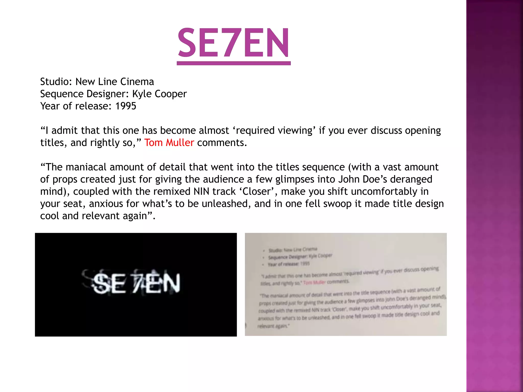
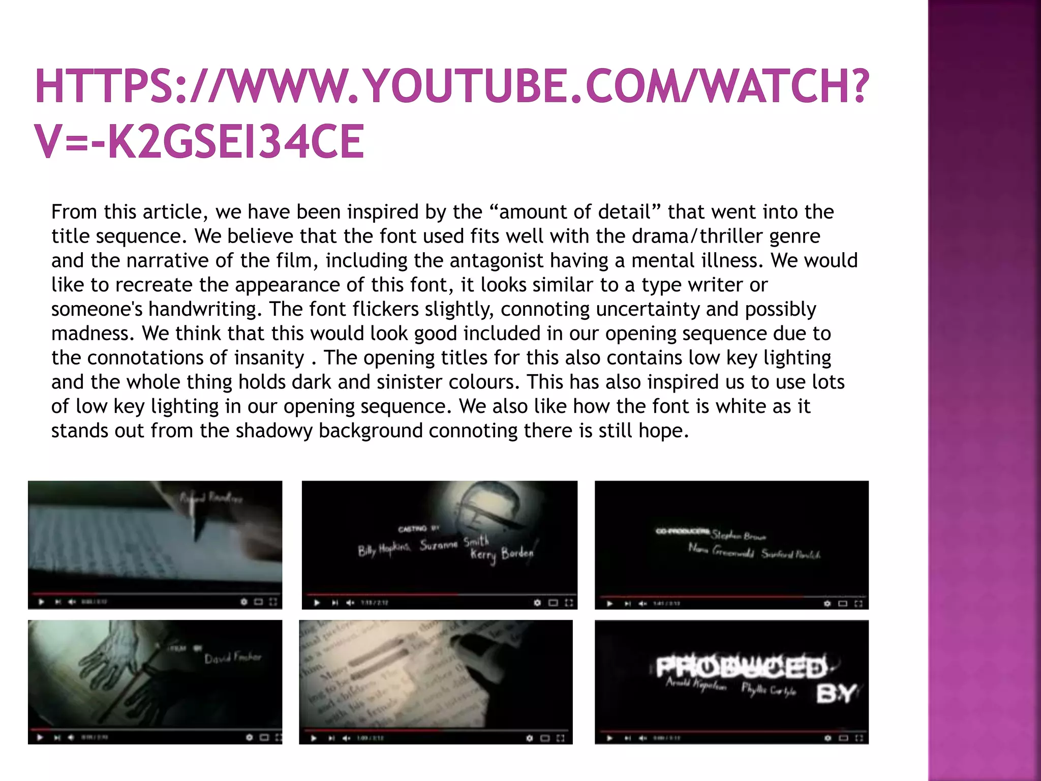
Studio: New Line Cinema
Sequence Designer: Kyle Cooper
Year of release: 1995
“I admit that this one has become almost ‘required viewing’ if you ever discuss opening
titles, and rightly so,” Tom Muller comments.
“The maniacal amount of detail that went into the titles sequence (with a vast amount
of props created just for giving the audience a few glimpses into John Doe’s deranged
mind), coupled with the remixed NIN track ‘Closer’, make you shift uncomfortably in
your seat, anxious for what’s to be unleashed, and in one fell swoop it made title design
cool and relevant again”.
From this article, we have been inspired by the “amount of detail” that went into the
title sequence. We believe that the font used fits well with the drama/thriller genre
and the narrative of the film, including the antagonist having a mental illness. We would
like to recreate the appearance of this font, it looks similar to a type writer or
someone's handwriting. The font flickers slightly, connoting uncertainty and possibly
madness. We think that this would look good included in our opening sequence due to
the connotations of insanity . The opening titles for this also contains low key lighting
and the whole thing holds dark and sinister colours. This has also inspired us to use lots
of low key lighting in our opening sequence. We also like how the font is white as it
stands out from the shadowy background connoting there is still hope.

Opening sequence research

  • 2.
    Studio: New LineCinema Sequence Designer: Kyle Cooper Year of release: 1995 “I admit that this one has become almost ‘required viewing’ if you ever discuss opening titles, and rightly so,” Tom Muller comments. “The maniacal amount of detail that went into the titles sequence (with a vast amount of props created just for giving the audience a few glimpses into John Doe’s deranged mind), coupled with the remixed NIN track ‘Closer’, make you shift uncomfortably in your seat, anxious for what’s to be unleashed, and in one fell swoop it made title design cool and relevant again”.
  • 3.
    From this article,we have been inspired by the “amount of detail” that went into the title sequence. We believe that the font used fits well with the drama/thriller genre and the narrative of the film, including the antagonist having a mental illness. We would like to recreate the appearance of this font, it looks similar to a type writer or someone's handwriting. The font flickers slightly, connoting uncertainty and possibly madness. We think that this would look good included in our opening sequence due to the connotations of insanity . The opening titles for this also contains low key lighting and the whole thing holds dark and sinister colours. This has also inspired us to use lots of low key lighting in our opening sequence. We also like how the font is white as it stands out from the shadowy background connoting there is still hope.