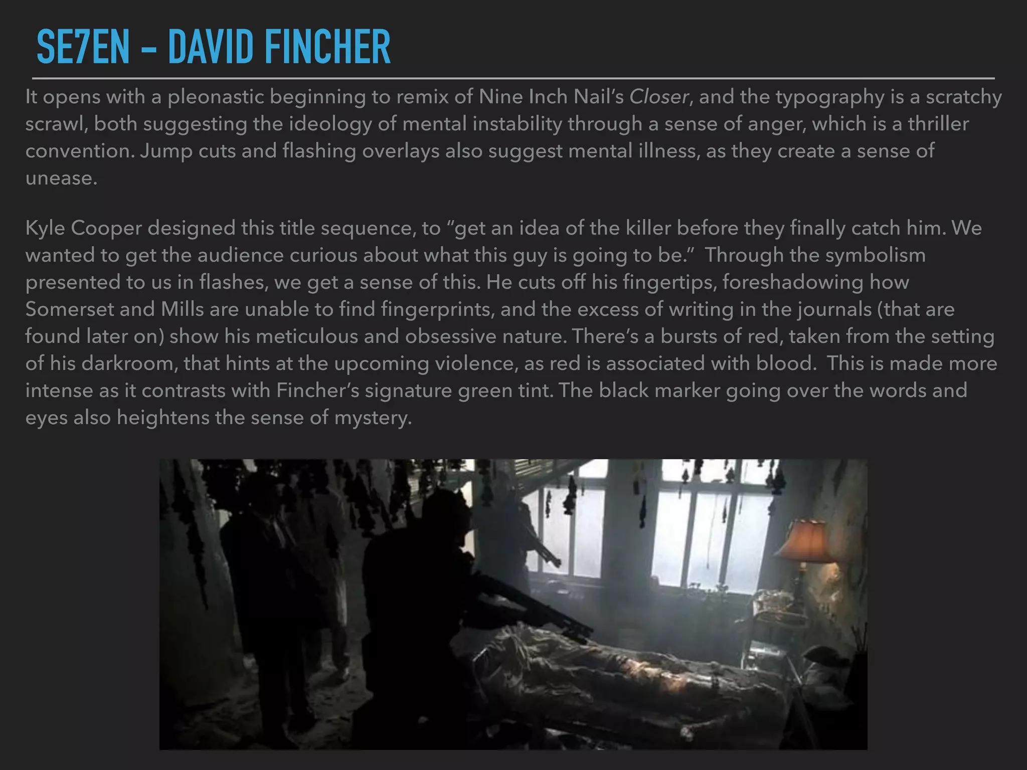
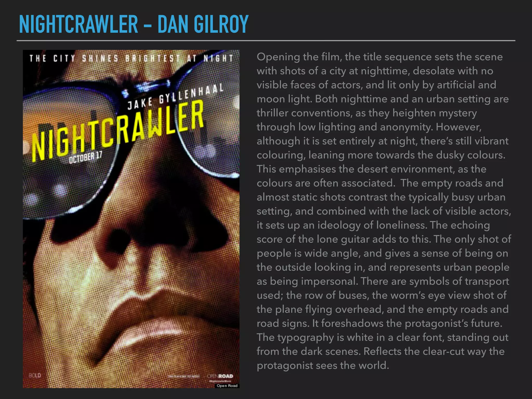
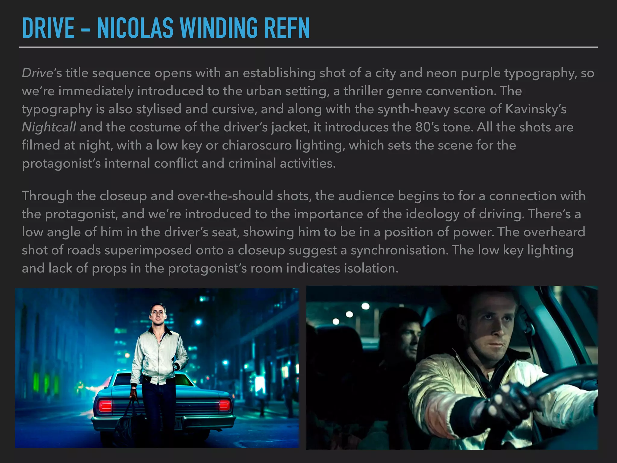
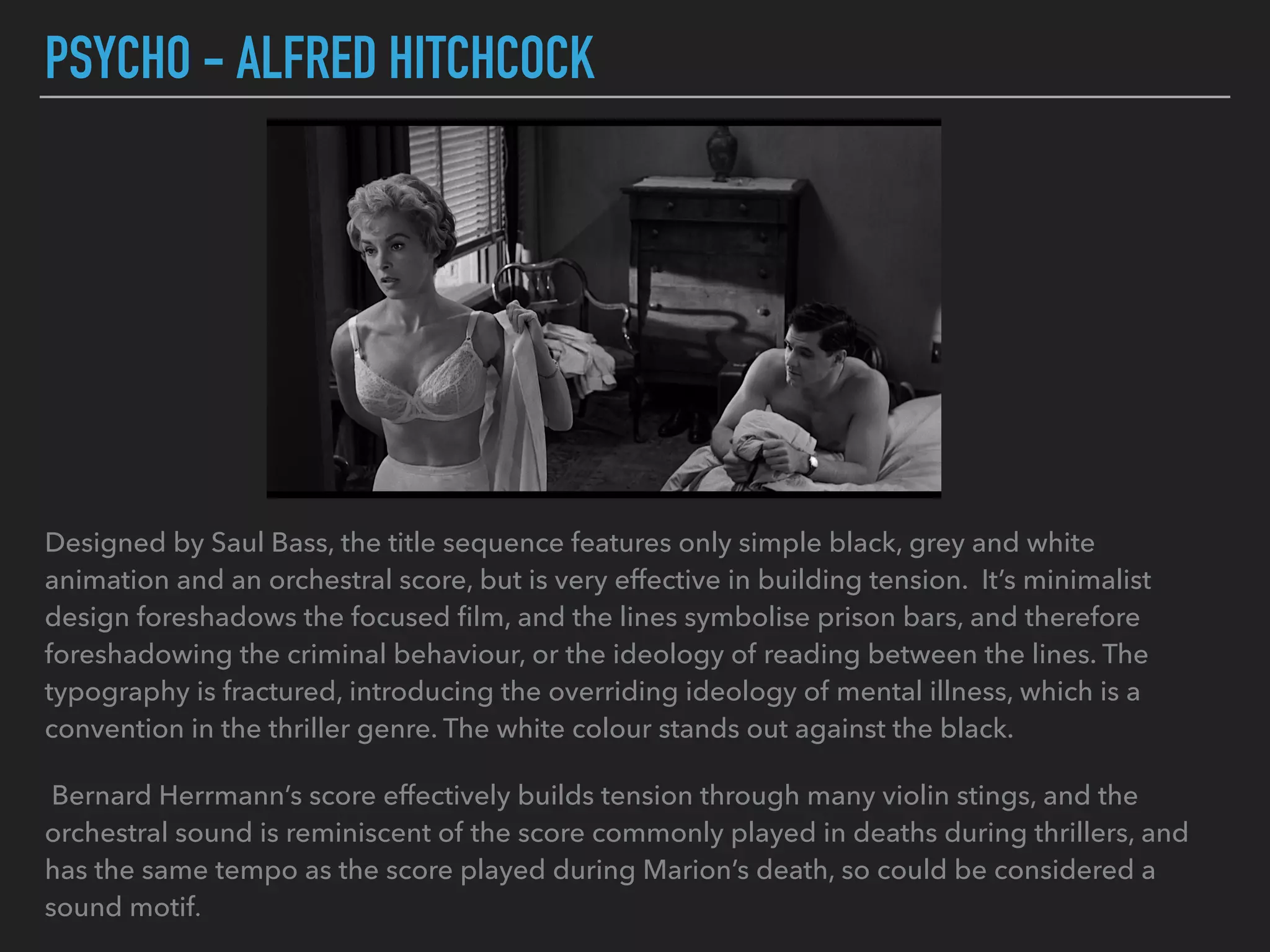
TITLE SEQUENCE ANAYLSIS
SE7EN - DAVID FINCHER
It opens with a pleonastic beginning to remix of Nine Inch Nail’s Closer, and the typography is a scratchy
scrawl, both suggesting the ideology of mental instability through a sense of anger, which is a thriller
convention. Jump cuts and flashing overlays also suggest mental illness, as they create a sense of
unease.
Kyle Cooper designed this title sequence, to “get an idea of the killer before they finally catch him. We
wanted to get the audience curious about what this guy is going to be.” Through the symbolism
presented to us in flashes, we get a sense of this. He cuts off his fingertips, foreshadowing how
Somerset and Mills are unable to find fingerprints, and the excess of writing in the journals (that are
found later on) show his meticulous and obsessive nature. There’s a bursts of red, taken from the setting
of his darkroom, that hints at the upcoming violence, as red is associated with blood. This is made more
intense as it contrasts with Fincher’s signature green tint. The black marker going over the words and
eyes also heightens the sense of mystery.
NIGHTCRAWLER - DAN GILROY
Opening the film, the title sequence sets the scene
with shots of a city at nighttime, desolate with no
visible faces of actors, and lit only by artificial and
moon light. Both nighttime and an urban setting are
thriller conventions, as they heighten mystery
through low lighting and anonymity. However,
although it is set entirely at night, there’s still vibrant
colouring, leaning more towards the dusky colours.
This emphasises the desert environment, as the
colours are often associated. The empty roads and
almost static shots contrast the typically busy urban
setting, and combined with the lack of visible actors,
it sets up an ideology of loneliness. The echoing
score of the lone guitar adds to this. The only shot of
people is wide angle, and gives a sense of being on
the outside looking in, and represents urban people
as being impersonal. There are symbols of transport
used; the row of buses, the worm’s eye view shot of
the plane flying overhead, and the empty roads and
road signs. It foreshadows the protagonist’s future.
The typography is white in a clear font, standing out
from the dark scenes. Reflects the clear-cut way the
protagonist sees the world.
DRIVE - NICOLAS WINDING REFN
Drive’s title sequence opens with an establishing shot of a city and neon purple typography, so
we’re immediately introduced to the urban setting, a thriller genre convention. The
typography is also stylised and cursive, and along with the synth-heavy score of Kavinsky’s
Nightcall and the costume of the driver’s jacket, it introduces the 80’s tone. All the shots are
filmed at night, with a low key or chiaroscuro lighting, which sets the scene for the
protagonist’s internal conflict and criminal activities.
Through the closeup and over-the-should shots, the audience begins to for a connection with
the protagonist, and we’re introduced to the importance of the ideology of driving. There’s a
low angle of him in the driver’s seat, showing him to be in a position of power. The overheard
shot of roads superimposed onto a closeup suggest a synchronisation. The low key lighting
and lack of props in the protagonist’s room indicates isolation.
PSYCHO - ALFRED HITCHCOCK
Designed by Saul Bass, the title sequence features only simple black, grey and white
animation and an orchestral score, but is very effective in building tension. It’s minimalist
design foreshadows the focused film, and the lines symbolise prison bars, and therefore
foreshadowing the criminal behaviour, or the ideology of reading between the lines. The
typography is fractured, introducing the overriding ideology of mental illness, which is a
convention in the thriller genre. The white colour stands out against the black.
Bernard Herrmann’s score effectively builds tension through many violin stings, and the
orchestral sound is reminiscent of the score commonly played in deaths during thrillers, and
has the same tempo as the score played during Marion’s death, so could be considered a
sound motif.

Title Sequence Analysis

  • 1.
  • 2.
    SE7EN - DAVIDFINCHER It opens with a pleonastic beginning to remix of Nine Inch Nail’s Closer, and the typography is a scratchy scrawl, both suggesting the ideology of mental instability through a sense of anger, which is a thriller convention. Jump cuts and flashing overlays also suggest mental illness, as they create a sense of unease. Kyle Cooper designed this title sequence, to “get an idea of the killer before they finally catch him. We wanted to get the audience curious about what this guy is going to be.” Through the symbolism presented to us in flashes, we get a sense of this. He cuts off his fingertips, foreshadowing how Somerset and Mills are unable to find fingerprints, and the excess of writing in the journals (that are found later on) show his meticulous and obsessive nature. There’s a bursts of red, taken from the setting of his darkroom, that hints at the upcoming violence, as red is associated with blood. This is made more intense as it contrasts with Fincher’s signature green tint. The black marker going over the words and eyes also heightens the sense of mystery.
  • 3.
    NIGHTCRAWLER - DANGILROY Opening the film, the title sequence sets the scene with shots of a city at nighttime, desolate with no visible faces of actors, and lit only by artificial and moon light. Both nighttime and an urban setting are thriller conventions, as they heighten mystery through low lighting and anonymity. However, although it is set entirely at night, there’s still vibrant colouring, leaning more towards the dusky colours. This emphasises the desert environment, as the colours are often associated. The empty roads and almost static shots contrast the typically busy urban setting, and combined with the lack of visible actors, it sets up an ideology of loneliness. The echoing score of the lone guitar adds to this. The only shot of people is wide angle, and gives a sense of being on the outside looking in, and represents urban people as being impersonal. There are symbols of transport used; the row of buses, the worm’s eye view shot of the plane flying overhead, and the empty roads and road signs. It foreshadows the protagonist’s future. The typography is white in a clear font, standing out from the dark scenes. Reflects the clear-cut way the protagonist sees the world.
  • 4.
    DRIVE - NICOLASWINDING REFN Drive’s title sequence opens with an establishing shot of a city and neon purple typography, so we’re immediately introduced to the urban setting, a thriller genre convention. The typography is also stylised and cursive, and along with the synth-heavy score of Kavinsky’s Nightcall and the costume of the driver’s jacket, it introduces the 80’s tone. All the shots are filmed at night, with a low key or chiaroscuro lighting, which sets the scene for the protagonist’s internal conflict and criminal activities. Through the closeup and over-the-should shots, the audience begins to for a connection with the protagonist, and we’re introduced to the importance of the ideology of driving. There’s a low angle of him in the driver’s seat, showing him to be in a position of power. The overheard shot of roads superimposed onto a closeup suggest a synchronisation. The low key lighting and lack of props in the protagonist’s room indicates isolation.
  • 5.
    PSYCHO - ALFREDHITCHCOCK Designed by Saul Bass, the title sequence features only simple black, grey and white animation and an orchestral score, but is very effective in building tension. It’s minimalist design foreshadows the focused film, and the lines symbolise prison bars, and therefore foreshadowing the criminal behaviour, or the ideology of reading between the lines. The typography is fractured, introducing the overriding ideology of mental illness, which is a convention in the thriller genre. The white colour stands out against the black. Bernard Herrmann’s score effectively builds tension through many violin stings, and the orchestral sound is reminiscent of the score commonly played in deaths during thrillers, and has the same tempo as the score played during Marion’s death, so could be considered a sound motif.