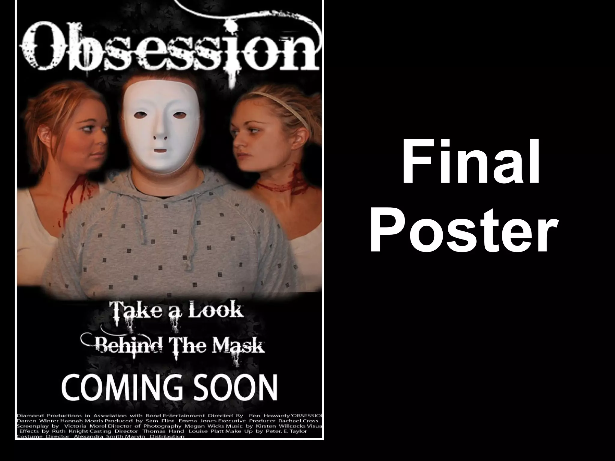
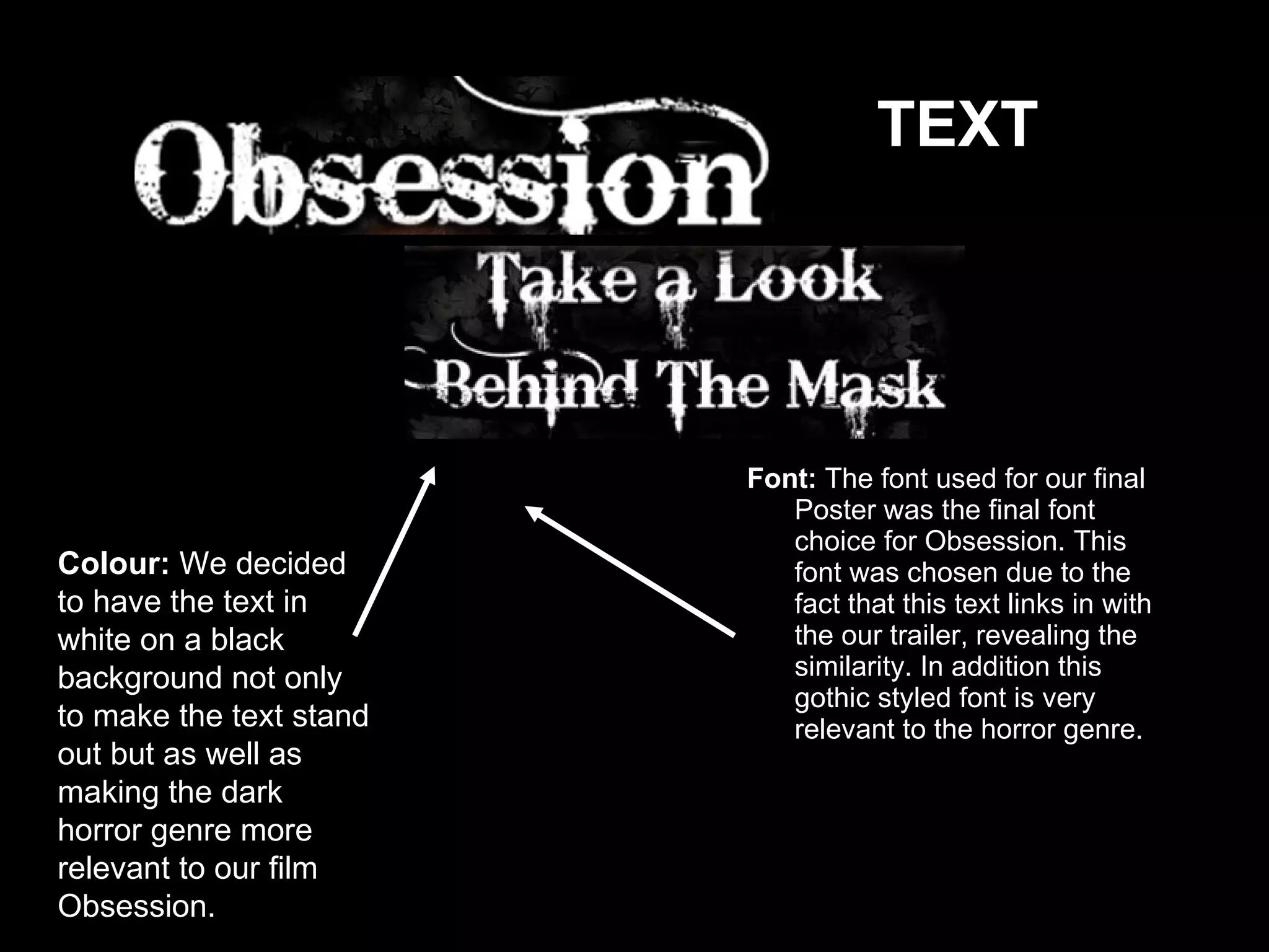
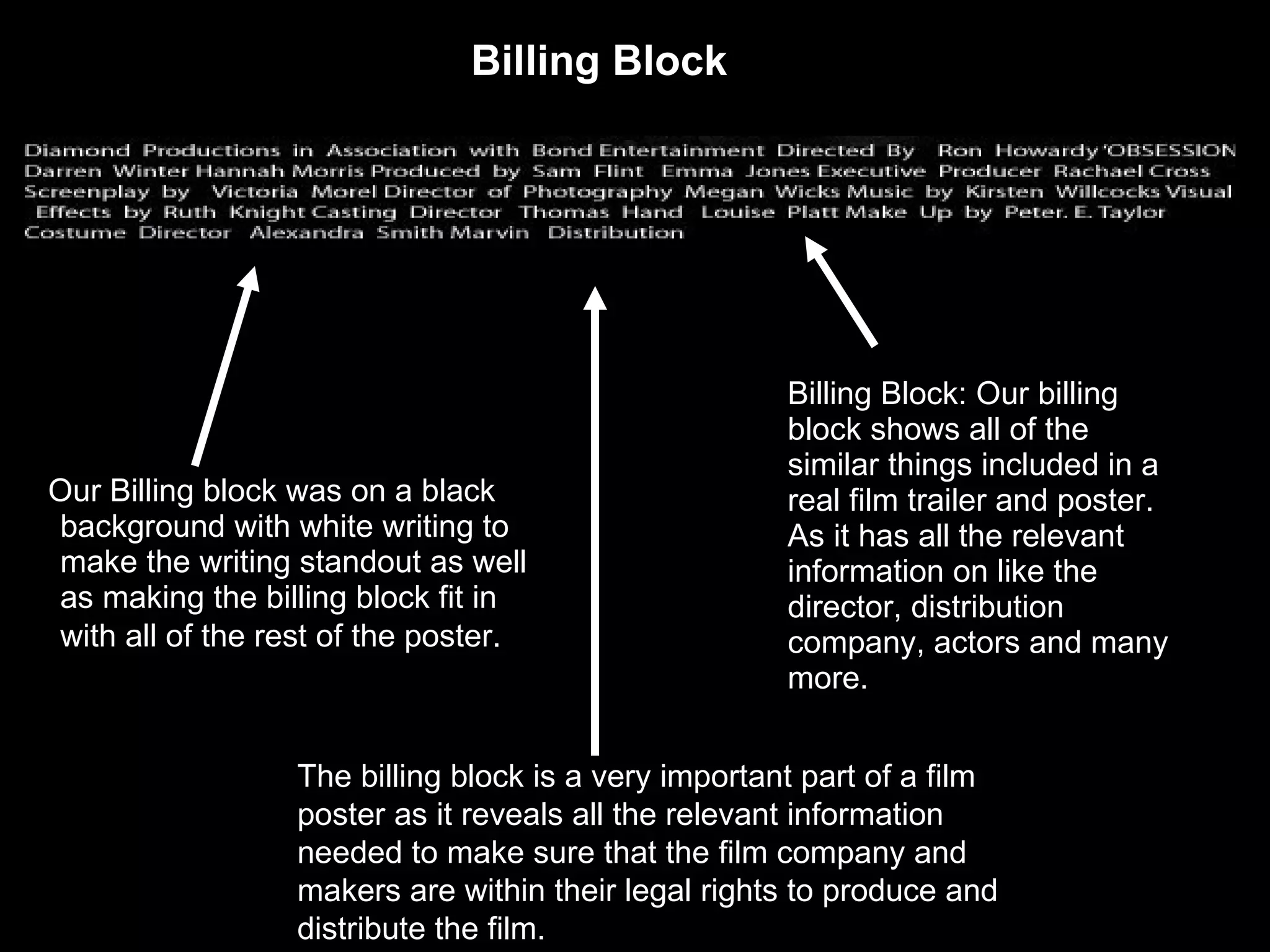
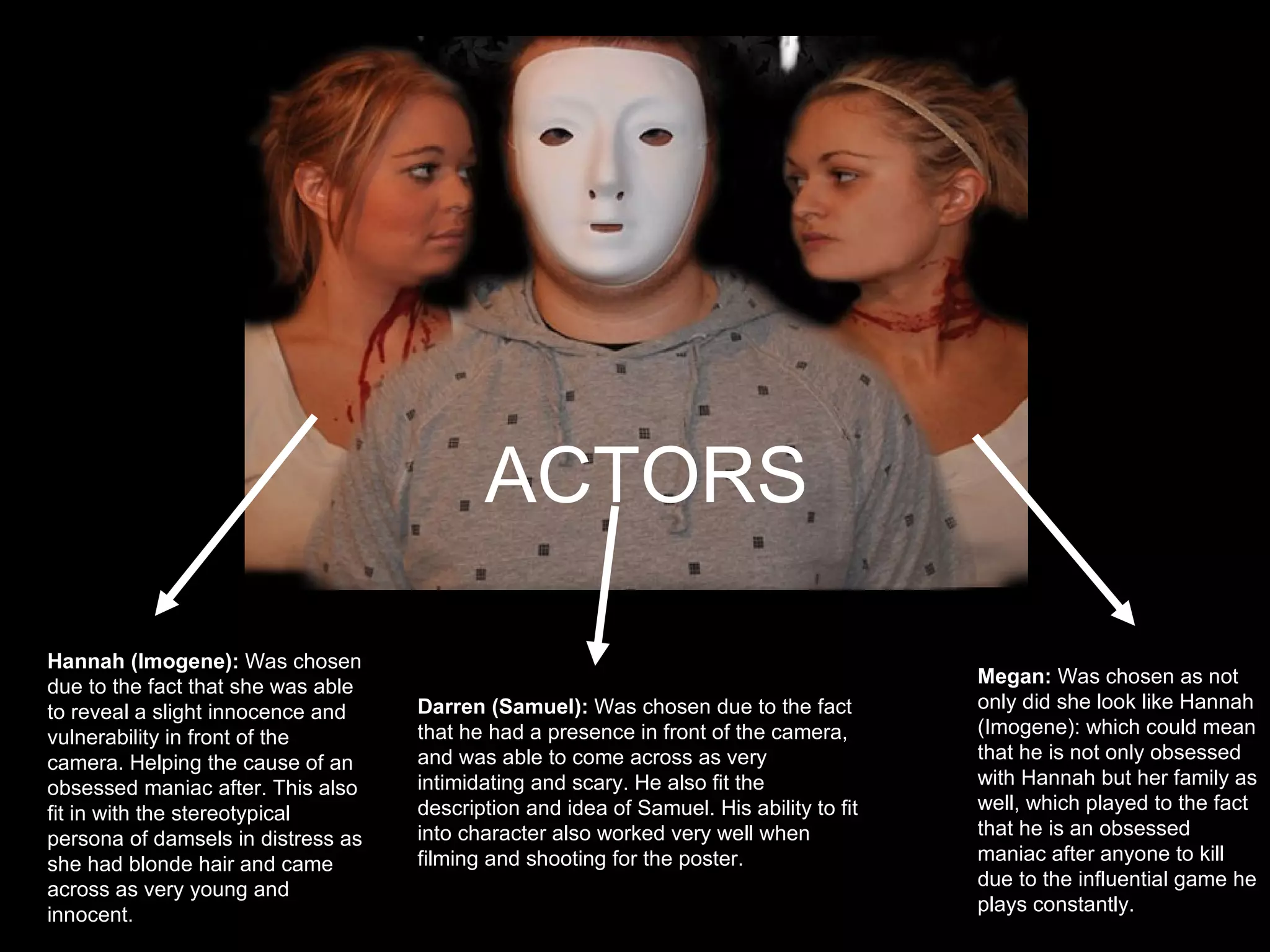
Final Poster
Font:  The font used for our final Poster was the final font choice for Obsession. This font was chosen due to the fact that this text links in with the our trailer, revealing the similarity. In addition this gothic styled font is very relevant to the horror genre.  Colour:  We decided to have the text in white on a black background not only to make the text stand out but as well as making the dark horror genre more relevant to our film Obsession.  TEXT
Billing Block: Our billing block shows all of the similar things included in a real film trailer and poster. As it has all the relevant information on like the director, distribution company, actors and many more. Our Billing block was on a black background with white writing   to make the writing standout as well as making the billing block fit in with all of the rest of the poster.   The billing block is a very important part of a film poster as it reveals all the relevant information needed to make sure that the film company and makers are within their legal rights to produce and distribute the film.  Billing Block
ACTORS Actors  Darren (Samuel):  Was chosen due to the fact that he had a presence in front of the camera, and was able to come across as very intimidating and scary. He also fit the description and idea of Samuel. His ability to fit into character also worked very well when filming and shooting for the poster.   Hannah (Imogene):  Was chosen due to the fact that she was able to reveal a slight innocence and vulnerability in front of the camera. Helping the cause of an obsessed maniac after. This also fit in with the stereotypical persona of damsels in distress as she had blonde hair and came across as very young and innocent.  Megan:  Was chosen as not only did she look like Hannah (Imogene): which could mean that he is not only obsessed with Hannah but her family as well, which played to the fact that he is an obsessed maniac after anyone to kill due to the influential game he plays constantly.

Presentation2

  • 1.
  • 2.
    Font: Thefont used for our final Poster was the final font choice for Obsession. This font was chosen due to the fact that this text links in with the our trailer, revealing the similarity. In addition this gothic styled font is very relevant to the horror genre. Colour: We decided to have the text in white on a black background not only to make the text stand out but as well as making the dark horror genre more relevant to our film Obsession. TEXT
  • 3.
    Billing Block: Ourbilling block shows all of the similar things included in a real film trailer and poster. As it has all the relevant information on like the director, distribution company, actors and many more. Our Billing block was on a black background with white writing to make the writing standout as well as making the billing block fit in with all of the rest of the poster. The billing block is a very important part of a film poster as it reveals all the relevant information needed to make sure that the film company and makers are within their legal rights to produce and distribute the film. Billing Block
  • 4.
    ACTORS Actors Darren (Samuel): Was chosen due to the fact that he had a presence in front of the camera, and was able to come across as very intimidating and scary. He also fit the description and idea of Samuel. His ability to fit into character also worked very well when filming and shooting for the poster. Hannah (Imogene): Was chosen due to the fact that she was able to reveal a slight innocence and vulnerability in front of the camera. Helping the cause of an obsessed maniac after. This also fit in with the stereotypical persona of damsels in distress as she had blonde hair and came across as very young and innocent. Megan: Was chosen as not only did she look like Hannah (Imogene): which could mean that he is not only obsessed with Hannah but her family as well, which played to the fact that he is an obsessed maniac after anyone to kill due to the influential game he plays constantly.