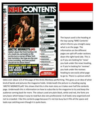
The layout used is the heading at
                                                               the top saying ‘NME Contents’
                                                               which informs you straight away
                                                               what is on the page. The
                                                               information on the different
                                                               pages are split off under sections
                                                               down the right hand side. This is
                                                               so if you are looking for ‘news’
                                                               you look under the news heading,
                                                               or if you’re looking for ‘reviews’
                                                               you look under the reviews
                                                               heading to see easily what page
                                                               to go to. There is a picture which
takes over about 1/3 of the page of the Arctic Monkeys performing. This gives us an idea of what
kind of bands and pictures the magazine holds. Underneath the picture is a heading saying
‘ARCTIC MONKEYS p45’ this shows that this is the main story as it takes over half the contents
page. Underneath this is information on how to subscribe to the magazine to try and keep the
audience coming back for more. The colours used are plain black, white and red, the fonts are
very basic which keeps it easy to read but also very professional. It all looks very organised and
not to crowded. I like this contents page because it’s not too busy but it fills all the space and
looks eye catching even though it is quite basic.

NME Contents Page Analysis

  • 1.
    The layout usedis the heading at the top saying ‘NME Contents’ which informs you straight away what is on the page. The information on the different pages are split off under sections down the right hand side. This is so if you are looking for ‘news’ you look under the news heading, or if you’re looking for ‘reviews’ you look under the reviews heading to see easily what page to go to. There is a picture which takes over about 1/3 of the page of the Arctic Monkeys performing. This gives us an idea of what kind of bands and pictures the magazine holds. Underneath the picture is a heading saying ‘ARCTIC MONKEYS p45’ this shows that this is the main story as it takes over half the contents page. Underneath this is information on how to subscribe to the magazine to try and keep the audience coming back for more. The colours used are plain black, white and red, the fonts are very basic which keeps it easy to read but also very professional. It all looks very organised and not to crowded. I like this contents page because it’s not too busy but it fills all the space and looks eye catching even though it is quite basic.