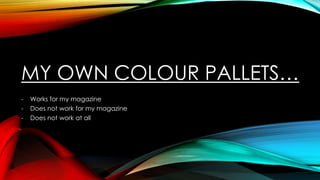
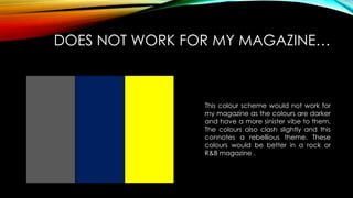
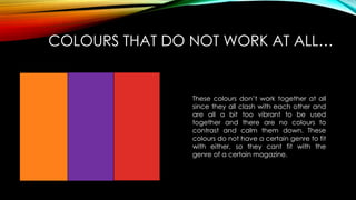
MY OWN COLOUR PALLETS…
-

Works for my magazine
Does not work for my magazine
Does not work at all
WORKS FOR MY MAGAZINE…
This colour pallet works for my
magazine because my magazine is a
pop magazine and it needs to be fun
and by using these colours I can
create a fun magazine since the
connotations of these colours are fun,
light-hearted and popular as they are
used often.
DOES NOT WORK FOR MY MAGAZINE…

This colour scheme would not work for
my magazine as the colours are darker
and have a more sinister vibe to them.
The colours also clash slightly and this
connotes a rebellious theme. These
colours would be better in a rock or
R&B magazine .
COLOURS THAT DO NOT WORK AT ALL…

These colours don’t work together at all
since they all clash with each other and
are all a bit too vibrant to be used
together and there are no colours to
contrast and calm them down. These
colours do not have a certain genre to fit
with either, so they cant fit with the
genre of a certain magazine.

My own colour pallets

  • 1.
    MY OWN COLOURPALLETS… - Works for my magazine Does not work for my magazine Does not work at all
  • 2.
    WORKS FOR MYMAGAZINE… This colour pallet works for my magazine because my magazine is a pop magazine and it needs to be fun and by using these colours I can create a fun magazine since the connotations of these colours are fun, light-hearted and popular as they are used often.
  • 3.
    DOES NOT WORKFOR MY MAGAZINE… This colour scheme would not work for my magazine as the colours are darker and have a more sinister vibe to them. The colours also clash slightly and this connotes a rebellious theme. These colours would be better in a rock or R&B magazine .
  • 4.
    COLOURS THAT DONOT WORK AT ALL… These colours don’t work together at all since they all clash with each other and are all a bit too vibrant to be used together and there are no colours to contrast and calm them down. These colours do not have a certain genre to fit with either, so they cant fit with the genre of a certain magazine.