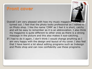
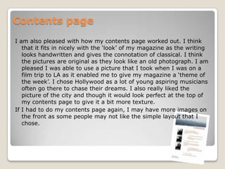
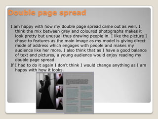
The document provides a final evaluation of a music magazine created by the author. They are pleased with how the front cover turned out, feeling the edited photo looks professional and the abbreviated name "CMM" is catchy and memorable. They are also happy with the contents page, thinking the handwritten text and original photos fit the magazine's style. Additionally, they are satisfied with their double page spread, feeling the mix of gray and color photos along with a model making direct eye contact engages readers. The author states they would not change anything on the front cover, contents page, or double page spread if doing it again.
2. Front cover Overall I am very pleased with how my music magazine front cover turned out. I feel that the photo looks professional as I edited it on Photo shop. I like the name ‘CMM’ as I feel it is short, catchy and will be easy to remember as it is an abbreviation. I also think my magazine is quite different to other ones as there is a strong message in the picture and this also makes it eye-catching. If I had to do it again, I don't think I would change anything as I am very happy with the design and layout of my cover. I also feel that I have learnt a lot about editing programs such as Indesign and Photo shop and can now confidently use these programs.
3. Contents page I am also pleased with how my contents page worked out. I think that it fits in nicely with the ‘look’ of my magazine as the writing looks handwritten and gives the connotation of classical. I think the pictures are original as they look like an old photograph. I am pleased I was able to use a picture that I took when I was on a film trip to LA as it enabled me to give my magazine a ‘theme of the week’. I chose Hollywood as a lot of young aspiring musicians often go there to chase their dreams. I also really liked the picture of the city and though it would look perfect at the top of my contents page to give it a bit more texture. If I had to do my contents page again, I may have more images on the front as some people may not like the simple layout that I chose.
4. Double page spread I am happy with how my double page spread came out as well. I think the mix between grey and coloured photographs makes it look pretty but unusual thus drawing people in. I like the picture I chose to features as the main image as my model is giving direct mode of address which engages with people and makes my audience like her more. I also think that as I have a good balance of text and pictures, a young audience would enjoy reading my double page spread. If I had to do it again I don't think I would change anything as I am happy with how it looks.