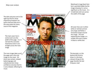
1. Masthead in large black font
Mojo cover analysis
but is partially hidden by the
image showing it is not as
significant as the music. It is
in bold text and runs across
the width of the page
The date and price and in the
right top third to show
importance however are
quite small but they are in
the same place for every
issue of the magazine All cover lines are in either
white or red text and are
very large and follow a
horseshoe shape around
the image. The text
The main cover line is explaining the image is in
central and runs the smaller font and is either
width of the page. It is in in black or white text
red text this connotes
importance and it runs
straight across the main
image
The main image takes up all The barcode is in the
the page and is the only bottom left third to
image on the cover. His show it is the least
direct eye contact, relaxed relevant thing on the
body language and page therefor the last
unbuttoned shirt show thing you read
confidence and also that he
is very relaxed; reflecting his
music
2. MJO Contents Page Analysis
The masthead is in the
same text and on the cover
and in the same place,
central, however it is
smaller and in white font
The whole page is in black and
so that it shows up on the
white except the pull quote and
grey background
page numbers to show
importance and to catch the eye
The issue date is also
in the same place but
is separated from the
other text by a yellow
dotted line
There is only image on the
page, like the cover, and it is
There is a red line with the an artist who looks
cover story page number and intoxicated and this is also
a small amount of information shown by the drink in his
regarding it. By giving it its hand this represents the
own section on the contents ‘rock and roll’ lifestyle which
page it connotes importance also reflects the music. It is
the first thing you notice on
the page
3. Mojo double page spread analysis
The title of the article
is across the top of
the page with the
word ‘50’ being in
yellow text and the
rest in white to show
importance
The whole of one
page is taken up
by an image it is
in black and
white and gives
up the
The quote is in the appearance of
largest text and is being taken at a
just above the gig, a live
article with ‘be show, opposed to
there now’ in being taken in a
yellow. This is a photo shoot
imperative and
makes it feel more
personal as if they
are speaking directly
to you
There is a small ammount of text The drop caps
giving background information in letter ‘w’ is The article is in small white text to
larger text before the article itself much larger contrast the black background. It
again some of the words are in than the other is not broken up into columns it is
yellow to show importance text and is also only broken up into 4 paragraphs
in bold