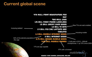
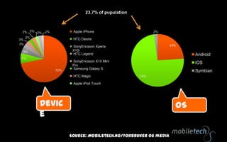
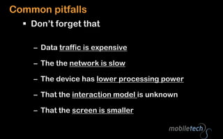
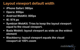
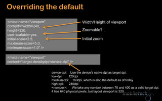
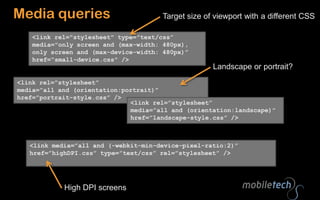
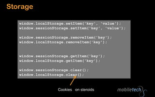
Jon Arne SæteråsProduct Director, MobiletechTwitter: @jonarnesEmail: jas@mobiletech.mobi
Baby steps…Mobile webMobile internet usage will be bigger than most people thinkMobileFirst!Some statistics
Some differences
Context
View port
Pixels
Some Quick-Wins
Media Queries
JavaScript
CacheCurrent global scene470 mill print newspapers per day920 mill cars1.15 bill fixed phone landlines1.5 bill credit card users1.6 bill tv sets1.4 bill PCs (inc laptops and tablets)1.3 bill mobile internet users2 bill internet users3.75 bill unique mobile users4.25 bill mobile phonesNew TVs are web enabledIncluding tablets!Including mobile54% of the planets population. Any age1.3 bill sold in 2010. ~300mill smartphones -> up 75% since 200917% are app capable97% with a browserSource: TomiAhonen, comScore, Nielsen
Page view growth:2009-2010: 109%2010-2011: 150%Unique users
23,7% of pupulationDeviceOSSource: Mobiletech.no/Forbrukerog media
23,7% of pupulationBrowserConnectionSource: Mobiletech.no/Forbrukerog media
BedtimeDesktop preferredBreakfast / commuting
iPad ready??http://www.apple.com/ipad/ready-for-ipad/
Common pitfalls Don’t forget thatData traffic is expensive The the network is slowThe device has lower processing powerThat the interaction model is unknownThat the screen is smaller
Context HardwareOSPhysical capabilitiestech perspectiveBrowserWRTAppSocial networksLocal user profileCRMSuperlocalHome/abroadTelco networkWiFiBandwidth
Logic is movingMore front-end!Get started!Feature detection, not device detection
View portThe visual part of the web sitehttp://www.flickr.com/photos/dm-set/3579287485/
On a desktopviewport =size of <html/> =size of the browser window
Visual ViewportLayout Viewport
Layout viewport default widthiPhone Safari: 980pxOpera: 850pxAndriodWebKit: 800pxIE: 974 pxSymbian WebKit: Tries to keep the layout viewport equal to the visual viewport.BadaWebkit: layout viewport as wide as the widest elementBlackberry: layout viewport equals the visual viewport at 100% zoom
Best user experience when visual view port width = layout view port width = device-width
1px != 1pxiPhone 4 has 640 physical pixels, but layout viewport is 320“High DPI” screens“CSS pixels”Zoom levelNot the same as physical pixels on the deviceDecides how many physical pixels a CSS pixel coversRead More: http://www.quirksmode.org/mobile/viewports.htmlhttp://www.flickr.com/photos/korosirego/
?Good to know that:Viewport has impact on presentation
Different “kinds” of pixels
Users ZoomBaby steps:How to make use of this?http://www.flickr.com/photos/andrewrennie/
Overriding the default<meta name="viewport" content="width=240, height=320, user-scalable=yes,initial-scale=2.5, maximum-scale=5.0,minimum-scale=1.0" />Width/Height of viewportZoomable?Initial zoom<meta name="viewport” content="target-densitydpi=device-dpi" />device-dpi:    Use the device's native dpi as target dpi.low-dpi:       120dpimedium-dpi:    160dpi, which is also the default as of todayhigh-dpi:      240dpi<number>:      We take any number between 70 and 400 as a valid target dpi.4 has 640 physical pixels, but layout viewport is 320
iPhone4 High DPI trick640px wide<imgsrc=“image.png” width=“320” alt=“highdpi” />Pysical image size = visual viewport width * pixel ratio
Media Queries<stylemedia="handheld”  type=“” />Small screensFor big screens
Media queriesTarget size of viewport with a different CSS<link rel="stylesheet" type="text/css” media="only screen and (max-width: 480px),only screen and (max-device-width: 480px)”href=“small-device.css" />Landscape or portrait?<link rel=”stylesheet” media=”all and (orientation:portrait)” href=”portrait-style.css” /><link rel=”stylesheet” media=”all and (orientation:landscape)” href=”landscape-style.css” /><link media=”all and (-webkit-min-device-pixel-ratio:2)” href=”highDPI.css” type=”text/css” rel=”stylesheet” />High DPI screens
Detect iPadif(navigator.platform== "iPad”){//put iPadcss into the dom}@media only screen and (min-device-width: 768px) and (max-device-width: 1024px) {	/* “iPad” style*/}
Javascript

Mobile for web developers

Editor's Notes

  • #12 Betyrmer front end!
  • #18 @media only screen and (-webkit-min-device-pixel-ratio: 2) { // CSS goes here }if (navigator.connection.type==navigator.connection.WIFI) {}