Milli Jain , Commercial Design Interior Design
•
0 likes•75 views

Student Dezyne E'cole College , www.dezyneecole.com

Recommended
More Related Content
Similar to Milli Jain , Commercial Design Interior Design
Similar to Milli Jain , Commercial Design Interior Design (20)
More from dezyneecole
More from dezyneecole (20)
Recently uploaded
Recently uploaded (20)
Milli Jain , Commercial Design Interior Design
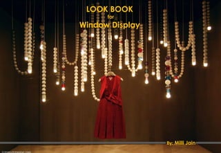
- 1. LOOK BOOK for Window Display By: Milli Jain
- 2. LOOK BOOK A Critical Study Was Undertaken By Me Of Various Window Displays. My Study Is Based On The Principles And Elements Of Design Used In A Window Display, Which You Will Find In Further Pages. Take A Look.
- 3. LOOK BOOK • Under all these displays merchandise is being displayed as a piece of art and is given highest importance. • In first image, use of tyre attracts the mind and will force the human eye to see in the center of the circle. • In second image there is repetition of circles as well as of bags, which tends to be more attractive. • The use of glass jars in third image is increasing the importance of shoes. Picture Courtesy - Pinterest
- 4. LOOK BOOK • Circle is A shape that forces an human eye to focus in its centre and then see around its circumference. • In this image the merchandise is being placed intelligently in the centre of the circle, being a circle it is catching the attention of the potential customer. • The emphasis is on merchandise. • The eye moves from merchandise to the circumference of the circle. Picture Courtesy - Pinterest
- 5. LOOK BOOK • The way the handbags are been kept on the pearls, delicacy as well as the preciousness of the bags can be easily seen. • The whole display is being united using pearls. • The use of white pearls on red background is making the display more beautiful and eye catching. • Eye movement is from pearls to handbag. Picture Courtesy - Pinterest
- 6. LOOK BOOK • After Getting An Eye On The Letter ”D” The Eye Searches For Other Letters Which Leads To The Letter “R” And Then The Merchandise On The Display Is Seen. • The Use Of Perspective View Is Attractive. • The Innovative Use Of Brand Name. • This Show Window Is Of Dior. • Under This The Flow Is Because Of The Word Dior. Picture Courtesy - Pinterest
- 7. LOOK BOOK • The use of pineapple shaped stand in proximity is attractive. • The gap between any two objects catches the attention of the viewer. • The gap between the stand is eye catching because human eye tends to look what's within space. Therefore, there is an intelligent placement of merchandise (within the space). • Whole display is harmonised using venetian pink and black colour. • Emphasis is on stand. • Eye moves from pineapple to merchandise till mannequin. Picture Courtesy - Pinterest
- 8. LOOK BOOK • Emphasis is on huge white bag (prop). • The eye moves from prop to each bag on the display. • The composition is united using same set of handbags with same shape and texture but varies in colour. • The shadow of the white bag on the rear wall is pleasing to eye, therefore specifying smart use of lights. Picture Courtesy - Pinterest
- 9. LOOK BOOK • The repetition of doors within doors is emphasising the display. • The flow is from the miniature to the doors till female mannequin. • The illusion is created by making the display appear like a mirrored image is attractive • The flow is from left side of the display to the right. • The illusion or the mirror image created attracts the eye of the customer. • In this the human eye will tend to figure out complete posture of the mannequin. Picture Courtesy - Pinterest
- 10. LOOK BOOK • The innovative use of colour bands in the exterior of the store is very attractive and is tempting. • The flow is from colour bands to merchandise. • The concept taken in second image attractive. Picture Courtesy - Pinterest
- 11. LOOK BOOK • This is not a window display but is an intelligent way to funnel the window shoppers inside the store. • The bands in white are creating eye movement from exterior of the store to the interior of the store. Picture Courtesy - Pinterest
- 12. LOOK BOOK • Emphasis is purely on the merchandise. • Merchandise is well lighted up, showcasing the good lighting design. • Silhouettes of cameramen is increasing the importance of the merchandise. • Flow is from the merchandise to the silhouettes. Picture Courtesy - Pinterest
- 13. LOOK BOOK • The Differences In Texture Is What Is Necessary In Making The Display Attractive. • This Is Being Followed In This Display. Matte Finished Cubical Structure Is Emphasising The Heels i.e. The Merchandise • The hands are showcasing actual gesture of human hand which is making this display more attractive and eye catching. • The display is united by the use of white colours. • Because of white base the emphasis is on the merchandise. Picture Courtesy - Pinterest
- 14. Thank You Milli Jain, 2nd Year Commercial Design Diploma, NSQF Level-6 (NSDC) Dezyne E’cole College, www.dezyneecole.com