Visual Merchandising Project Report Showcases Retail Display Design Skills
•
0 likes•183 views

Student Dezyne E'cole College , www.dezyneecole.com

Recommended
Recommended
More Related Content
What's hot
What's hot (20)
Similar to Visual Merchandising Project Report Showcases Retail Display Design Skills
Similar to Visual Merchandising Project Report Showcases Retail Display Design Skills (20)
More from dezyneecole
More from dezyneecole (20)
Recently uploaded
Recently uploaded (20)
Visual Merchandising Project Report Showcases Retail Display Design Skills
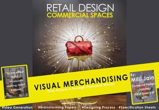
- 2. Dezyne E’cole College 106/10, Civil Lines, Ajmer Tel-01452624679 www.dezyneecole.com 2017- 2018 Project Report On: Visual Merchandising At Dezyne E’cole College, Ajmer Submitted To Dezyne E’cole College Towards The Partial Fulfillment Of 2nd Year Commercial Design Diploma NSQF Level 6 (NSDC) By: Milli Jain
- 3. Synopsis As A Commercial Interior Design Student This Project On Retail Spaces Showcases My Expertise Learnt During My Study Of Retail Spaces, Confirming To NSQF Level 6 Of NSDC, At Dezyne E'cole College. The Window Displays Are An Attractive Sales Feature. How They Need To Be Devised? How The Principles Of Design Are Followed In Any Window Displays Are All Discussed In My Portfolio Pages Showcased Here. More Focussing Has Been On The Customer Behaviour For Designing Effective Store Layout. My Project Focuses On The Product Displays Of Fashion Accessories Like Handbags, Female Designer Bags And Fashion Formal Informal Shoes. Mainly Under The Fashion Retail Sector. I Request You To Please Go Through The Pages Of My Portfolio Pages.
- 4. I, Milli Jain, Student Of Dezyne E'cole College, Am Extremely Grateful ToEach And Every Individual Who Has Contributed In Successful Completion Of My Project. I Would Like To Express My Special Thanks Of Gratitude Towards Dezyne E’cole College And Its Mentors For Their Guidance And Constant Supervision As Well As For Providing Me The Necessary Information And Support Regarding The Completion Of Project. I Also Want To Thank My Parents And My Friends Who Helped Me A Lot In Finalizing This Project Within A Limited Time Frame. Thank You. Due Regards Milli Jain Acknowledgement
- 5. Grade Sheet This Project Report Of Ms. Milli Jain, A Student Second Year, Commercial Design Diploma, NSQF Level 6 Of NSDC, Has Been Checked And Is Graded As Thank You Principal (Seal & Sign)
- 6. ABOUT ME CONTACT www.dezyneecole.com dezyneecole@gmail.com 9829024839 0145-2629679 www.linkedin.com/in/milli- jain-b809a8105 INTERESTS ▪ Idea Generation ▪ Good Knowledge Of Colours ▪ Drafting (Metric Projections) ▪ Stylising ▪ Model Making LEARNING OUTCOMES ▪ Project Handling. ▪ Residential Space Planning. ▪ Designing And Planning Commercial Spaces. ▪ Lighting Design. ▪ Furniture Design. ▪ 3D Rendering. ▪ Explained About Primary Elements Of Design And Universal Design In Identity Exhibition (2016). ▪ Showcased My Residential Project In Identity Exhibition (2017). ▪ Prototype Development. ▪ Handled A Residential Project. ▪ Handled Live Site Project In Restaurant Design. ▪ Worked On Retail Space Planning And Visual Merchandising. ACTIVITIES DIGITAL SKILLS EDUCATION B. Com. Bachelor Of Commerce, Govt. College, Ajmer (2014-2017) 2014 1 Year Residential Design Diploma, NSQF Level 5 Of NSDC, Dezyne Ecole College (2016-2017) Diploma 2016 1 Year Commercial Design Diploma, NSQF Level 6 Of NSDC, Dezyne Ecole College (2017-2018) Diploma 2017 Bachelor Of Science In Interior Design, Dezyne Ecole College (2016-2019) B. Sc. 2016 School 1999 Did My Schooling From St. Stephens Sr. Sec. School Ajmer (1999-2014) Design is all about observation and idea generation. It can be simple as well as complex, it should be personal. Everywhere I turn I see colours, textures and patterns. I always had attraction towards beautiful architecture of the world, designed spaces of commercial and residential areas where a variety of textures, colours and styles were used. I honed my skills later in this field and made my career. Today I want to excel in this field and develop not only beautiful but functional spaces to help make dreams of people into reality.
- 9. “Visual Merchandising is everything the customer sees, both exterior and interior, that creates a positive image of a business and results in attention, interest, desire and action on the part of the customer.”
- 10. Eighty Percent Of Our Impressions Are Created By Sight; That Is Why One Picture Is Enough Thousand Words. A Successful Retailing Business Requires That A Distinct And Consistent Image Be Created In The Customers Mind That Permeates All Products And Service Offerings. Visual Merchandising Can Help Create That Positive Customer Image That Leads To Successful Sales. Visual Merchandising Can Be Defined As Everything The Customer Sees, Both Interior And Exterior, That Creates A Positive Image Of A Business And Results In Attention, Interest, Desire And Action On Part Of The Customer. The Basic Object Of Visual Merchandise Is A Desire To Attract Customers To A Place Of Business In Order To Sell The Merchandise. Introduction To: Visual Merchandising Importance Of Visual Merchandising In Retail Space: • It Is Communicates The Stores Image And Also Reinforces The Stores Advertising Efforts. • Encourages Impulse Buying By The Customer. • Helps In Creating The Stores Overall Atmosphere. • It Communicates Story To The Prospective Customer What The Store Is All About. • It Helps Maximises The Aesthetics Of The Merchandise Which Intent To Maximise The Sales. • It Creates Awareness And Also Increases The Brand Loyalty.
- 11. To attract customers. To increase sales. Encourages Impulse Buying Creates Stores Atmosphere Increases Brand Loyalty Maximises Aesthetics Of Merchandise Reinforces The Stores Advertising Efforts Communicates Story To The Customer Why Visual Merchandising? WhyVisualMerchandising?
- 12. 1. Visual Merchandising Starts With The Store Design To Reflect The Products In The Store And Window Display. The Purpose Is To Create A Warm, Friendly, And Approachable Atmosphere For Customers. 2. To Predict Future Merchandising Trends Is Important. 3. Majority Of Customers Respond To The Lighting More Positively. Visual Merchandisers Should Select Appropriate Lighting System That Creates Satisfaction Of Psychological Needs Of Customers. 4. Sophisticated Visual Merchandising Requires Convenient Lighting Combined With Display Themes. 5. Most People Give Buying Or Shopping Decision By Looking At The Shop’s Ambience And Visual Display. 6. Store Window Displays Is The Most Important Tool To Draw People Into The Store, Because They Are A Great Way To Highlight Certain Types Of Merchandise. 7. Graphics And Signage Are Cost-effective And Efficient Tools For Delivering A Message Or Inform The Customer About The Products Available In The Store. The Findings Of This Study Can Be Summarized As:
- 14. Introduction To: Exterior Presentations Creating And Maintaining A Stores Visual Merchandising Plan, However, Is Not A Simple Task. It Is Necessary To Continually Determine What The Customer Sees. This Evaluation From The Customers Perspective Should Start On The Exterior And Work Completely Through The Interior Space. The Quality Of A Store Front Is A Major Determent For A Customer, Particularly A New Customer And Should Not Be Underestimated. Good Exterior Visual Merchandising Attracts Attention, Creates Interest And Invites The Customer Into Its Business. The Exterior Presentation Can Offer A Conservative, Progressive, Lavish Or Discount Image To The Customer. Exterior Presentation Exterior Signs Marquees Walks And Entries Landscaping Awnings Banners Window Display 1 2 3 4 5 6 7
- 15. A sign is a silent salesperson, and part of a shopper’s first impression of a store. In less than 10 seconds the sign must attract attention, tell who the business is and what it has to sell. An effective sign will communicate what type of business is being conducted. 1. EXTERIOR SIGNS: • A sign should simple, brief, well-designed, well-lettered and easy-to- read. • The size of letter depends on the width of the front road of the store. (8”- 12”) Remember These Guidelines While Designing The Exterior Sign For The Store 1. 2.
- 16. Remember These Guidelines While Designing The Exterior Sign For The Store • When preparing sign consider size, shape, material, lettering, height, placement and structure. 3. • A stark design and limited materials may suggest discount prices. • Elegant and expensive sign materials may suggest luxury goods and services.
- 17. How Do Customers Locate Business? Premises signs Off-Premises signs • The Off-premise Sign Provide Information And Direction Especially For Travellers And New Residents. • A Premise Sign Is The Sign On The Exterior Of The Store Or Outlet.
- 18. • Colour And Appeal Can Be Added To A Store’s Exterior With The Use Of Awnings . They Provide The Customer With Protection From Weather And Makes Viewing The Window Display More Pleasant As It Reduces Heat, Cuts Down On Glare And Reflection, And Prevents Fading Of The Merchandise From Exposure To The Sun. • Many Businesses Are Updating Their Storefronts With New Back-lit Awning Systems . • Sign And Awning Companies Can Assist You In Selecting And Installing The Right Style, Colour And Design Of Awning That Would Be Appropriate For Your Building . 2. AWNINGS: Reduces Heat Cuts Down On Glare Prevents Fading Of Merchandise Protection From Weather Makes Viewing The Window Display More Pleasant
- 19. • Banners Are Used Increasingly As An Inexpensive But Colourful, Eye-catching Means Of Promotion. • A New And Interesting Appearance Can Be Offered By Changing The Banners Frequently. Consumers Will Think Exciting Changes Are Taking Place, And Be Drawn Into The Store . • Banners Can Be Hung From Flagpoles, Projected From The Building Or Hung Flat Against The Exterior. 3. BANNERS: However, Do Not Overuse Banners Because Shoppers Will Stop Noticing Them. • Provide information to shoppers about different offers • Gives information about upcoming events. • Provides direction of a space. • For developing temporary structures
- 20. • This special type of sign is used to display the name of a store. • An effective marquee must stand out from the other businesses to attract attention. • A marquee on some older buildings is a permanent canopy projecting over an entrance that provides protection from the elements. • It can be. • The top of the permanent canopy (marquee) provides an opportunity to showcase seasonal displays or special promotional banners. 4. MARQUEES: • Used to announce a change in seasons, a special event or any promotion. • These can be seen as the canopy like structure used on the top of the mall to indicate the specific store it is promoting • The letter “M” of Mc Donald's is the most common example of marquee.
- 21. 5. WALKS AND ENTRIES: When Adding An Entryway, Be Sure It Is Designed To Blend Or Be Consistent With The Architecture Of The Building . An attractive, well designed entrance is inviting to the customer. • Entrance To Any Store Should Be Perfectly Planned As 75 Percent Of First Time Customers Remember A Store’s Entrance, Which Provides The First And Last View Of The Store’s Interior. • Entrances Can Be Of Various Types: V Shaped Entrance Flush Entrance Corner Entrance Recessed Entrance
- 22. • Landscaping Should Lead The Customer’s Eye To The Focal Point Using Colour And Texture To Provide Contrast And Harmony. • The Essence Of Good Landscaping Is Simplicity; Simple Landscape Designs That Are Easy To Maintain . • Planters Placed Below And In Front Of A Display Window Actually Strengthen The Display By Adding Greater Depth To The Setting. • Planters, Flower Boxes And Plants Used In Front Of A Store Add To The General Appearance, Regardless Of What Type Of Merchandise Is Being Sold. 6. LANDSCAPING:
- 23. • Window Displays Should Be In Harmony With The Entire Surroundings; A Whole Is Being Created Rather Than A Fragment . • When Planning A Window Display Consider The Building Facade, Street, People And Their Perceptions, Colour Harmony, Lighting And Viewing Angle. 7. WINDOW DISPLAY: Types Of Window Displays Open Window Display Closed Window Display Semi-closed Window Display Open window display gives full view of the store interior to the passer-by. Which helps to generate more sales due to impulse buying from the part of the customer. the only drawback is that the concept taken for designing the display looses importance. Closed window display allows a designer to create theatrical setting using fantasy and drama. A display designed according to concept gathers attention of the passer-by and insist him to visit the store. Semi closed window display is the best type of window display gives full view of the store interior to the passer-by and also allows the designer to use concept on background as well as on foreground that gathers attention of the passer-by and insist him to visit the store.
- 24. Suggested WINDOW TREATMENTS That Have Proven Successful Include: A Single Object Against Seamless Paper Merchandise Displayed As It Would Be Utilized In A Realistic Setting. Theatrical Setting Using Fantasy And Drama.
- 25. Animation, Such As In Holiday Windows, That Draws Crowds Of Shoppers . A Straight Merchandise Glamorized With Props . The Use Of Sculpture, Paintings Or Art Objects For A Touch Of Class . Suggested WINDOW TREATMENTS That Have Proven Successful Include:
- 27. Balance Involves The Equilibrium And Weight Of Elements Between Two Sides Of A Display. Balance Is Based On A Theory Of Equals. If Colours Are Too Bright, They Will Overwhelm Pastels. A Large Expanse Of Empty Space Will Call Attention To A Single Object Placed Within It. If An Object Is Centred, The Empty Space Loses Importance Because Its Shape Is Predictable And Therefore Has Less Recognition As Its Own Element. A pleasing distribution of weight using merchandise of similar value will provide importance to both sides. A large expanse of empty space will call attention to a single object placed within it. If an object is centred, the empty space loses importance because its shape is predictable and therefore has less recognition as its own element. BALANCE
- 28. Emphasis Is The Point Of Initial Eye Contact. From This Spot All Other Eye Movements Flow. Emphasis Is Therefore The Formulation Of A Focal Point, With All Else In The Display Subordinate. There Should Be Emphasis In All Displays. This Can Be By Virtue Of The Focal Point’s Size, Colour Or Position. The Merchandise Is The Focal Point In A Majority Of Displays. Eye movement is from left to right and represents a change in texture. The focal point is the big eye. The eye movement is from the eye to the space below. The focal point is in the upper left and eye movement is to the lower right. EMPHASIS
- 29. Eye movement is from left to right. Another example of size difference and eye movement from large to small and left to right. EMPHASIS
- 30. Proportion Is The Ratio Of The Parts To The Whole Display. It Is A Comparative Relationship Of Distances, Sizes, Amounts, Degrees Or Parts. Each Item May Look Normal When Isolated, But If It Is Inconsistent In Area Or Dimension With Neighbouring Items, It Seems Out Of Proportion. Each Piece Of Merchandise Must Be Considered In Relationship To All The Other Merchandise The mannequins in this display are all in proportion to each other. If not in proportion, then people have trouble looking at it. The differences in there lengths are in proportion. Proportion is also important when repetition is used in a display. PROPORTION
- 31. Rhythm or flow involves the measurement of organized movement; a self-contained movement from object to object, background to foreground, and/or side to side. The rhythm in a display should lead the viewer’s eye from the dominant object to the subordinated object(s) or from the primary presentation of the grouping down to the arrangement of accessories or alternate parts of the display. Flow is accomplished by repetition of items (chairs) which can be placed in a variety of positions in a display. Flow is created by a progression of sizes. For example, small to large or large to small. Flow is created by a continuous line movement created by the placement of the items in the display. RHYTHM
- 32. Flow is created by radiation from the centre or dominant object to subordinate objects in the display. RHYTHM
- 33. Harmony is a coordinating umbrella principle that can cover and incorporate every other principle. Harmony is agreement in feeling and consistency in mood i.e., the feeling that all parts of a display relate to each other and to the whole display. Without harmony, the observer is uncomfortable and will not be enticed to purchase merchandise. Functional harmony deals with how something works physically, which means it must be realistic and must work. Structural harmony is correctly fitting together all the pieces; merchandise should not be out of place in the display Decorative harmony includes the parts of a display that are included only for decorative purposes. HARMONY
- 34. Colour Rules That Can Improve Display
- 35. Colour In A Display Can Catch The Eye And Make People Pause And Look. The Colour Combinations Of The Ceiling, Walls, Floor Covering And The Overall Decor Can Affect The Atmosphere Of A Store. Changing The Colour Scheme Can Change People’s Attitudes And Perceptions Of A Store, And Can Increase (Or Decrease) Business.
- 36. 1. Match The Colour Scheme To The Merchandise On Display. Use Soft Tints Rather Than Saturated Hues. Use A Neutral Colour, Or One Of The Main Colours Of The Merchandise For The Floor, Walls And Background. Light Tints Are Pleasing To The Eye.
- 37. 2. Consider Intensity, Value And Contrast When Developing Colour Schemes. Be Careful When Using Strong Contrast And Loud Colours. Do Not Paint Large Areas In Strong Colours. The More Intense The Colour, The Softer The Second Colour Should Be. Do Not Combine Two Or More Strong Colours Without Changing The Value Or Intensity. The More Intense The Colour, The Smaller The Area It Should Cover.
- 38. 3. Associate The Value Of The Merchandise Displayed To The Selection Of Colours In The Display. Do Not Mix High- priced And Low- priced Merchandise In A Display. Items Should Be Grouped By Price And Design. Use A More Refined Colour Scheme With The More Exclusive Merchandise. Colour Schemes Seen In Current Fashion Are Acceptable. Lower-priced Merchandise Is Generally Displayed In A Colour Scheme Of Vivid Hue.
- 39. 4. Dark Shades Appear To Bring The Background To The Fore, Shortening The Perceived Window Cool Colours Are Blue And Green. These Colours Are Calming, Soothing And Balanced. They Create The Illusion Of Enlarging The Window. Warm Colours Are Yellow, Orange, Red And Their Combinations With Black And White. All These Hues Please The Eye, Enhance The Appearance Of The Merchandise, And Optically Push It To The Front Of The Display. Space. Colours Are Labelled As Either Warm Or Cool.
- 40. Influence Of Background Colour On Merchandise
- 41. Dark Grey Background Beige Background White Background Black Background Brighter Yellow Enhanced In Richness Lightly Duller Warmer
- 42. Dark Grey Background Beige Background White Background Black Background Brighter but loses saturation Far more brilliant Darker, purer Bright but less intense Red
- 43. Dark Grey Background Beige Background White Background Black Background Brighter More Luminous Richer And Darker A Little More Luminous Blue
- 44. Dark Grey Background Beige Background White Background Black Background Increases Brilliancy Paler, Sharpened Deepens In Value Lighter And Yellowish Green
- 46. Black Background White Background Beige Background Dark Grey Background Not Seen Very Well Looses Strength And Brilliancy Darker Brighter Purple
- 47. Case Study
- 48. You Are Supposed To Design A Window Display And A Façade Of An Store. The Design Must Be Theme Based And All The Material Specifications And Dimensions Must Be Showcased By Detailed Drawings Of The Design. All These Details Need To Be Shown By The Student Through ▪ Elevations And Placement Of Objects. ▪ Rendered Views
- 50. My site is located in Vaishali nagar, Ajmer Map of Ajmer Adidas Store Reebok Store Chevrolet Showroom My Site Location: Gaurav Path Road, Nera Reebok Store, Vaishali Nagar, Ajmer CLIMATOLOGY OF AJMER: Ajmer is a beautiful and peaceful city situated between Aravalli’s. being a city of Rajasthan, it has hot and arid climate. Ajmer experiences medium to heavy rainfall between July to September. The average temperature ranges between 25º- 35º C. LIFESTYLE OF PEOPLE OF AJMER: Ajmer is a city in which mostly mediocre and high mediocre class people live. People of Ajmer mainly depends on tourism for their livelihood. The city has some of the best artisans, sculptors and architects. The neighbouring town kishangarh, house some of the finest marble works and miniature paintings. With so many beautiful works of art, Ajmer is a paradise for art lovers. ABOUT LOCATION OF SITE: My site is located in one of the cities highly rated areas. It has a shopping mall, café’s, hotels and many brand stores like mochi, reebok, blackberry and jockey. Wealthier group of citizens live in this area of the city. The area is low dense with people living in their multi storey houses. BUYING BEHAVIOUR OF PEOPLE: In Ajmer there are two categories of buyers, one who purchases what is required and the other who purchases whatever attracts him.
- 51. Design Process • Look Book • Brainstorming Papers • Designing Boards • Concept Board • Mood Board • Material Board • Detail Drawings • Final Design • Rendered View
- 52. LOOK BOOK On Window Display Look Book
- 53. LOOK BOOK • Circle Is A Shape That Forces An Human Eye To Focus In Its Center And Then See Around Its Circumference. • In this image the merchandise is being placed intelligently in the center of the circle, being a circle it Is catching the attention of the potential customer. • The emphasis is on merchandise. • The eye moves from merchandise to the circumference of the circle.
- 54. LOOK BOOK • The way the handbags are been kept on the pearls, delicacy as well as the preciousness of the bags can be easily seen. • The whole display is being united using pearls. • The use of white pearls on red background is making the display more beautiful and eye catching. • Eye movement is from pearls to handbag.
- 55. LOOK BOOK • Under all these displays merchandise is being displayed as a piece of art and is given highest importance. • In first image, use of tyre attracts the mind and will force the human eye to see in the center of the circle. • In second image there is repetition of circles as well as of bags, which tends to be more attractive. • The use of glass jars in third image is increasing the importance of shoes.
- 56. LOOK BOOK • After Getting An Eye On The Letter ”D” The Eye Searches For Other Letters Which Leads To The Letter “R” And Then The Merchandise On The Display Is Seen. • The Use Of Perspective View Is Attractive. • The Innovative Use Of Brand Name. • This Show Window Is Of Dior. • Under This The Flow Is Because Of The Word Dior.
- 57. LOOK BOOK • The use of pineapple shaped stand in proximity is attractive. • The gap between any two objects catches the attention of the viewer. • The gap between the stand is eye catching because human eye tends to look what's within space. Therefore, there is an intelligent placement of merchandise (within the space). • Whole display is harmonised using venetian pink and black colour. • Emphasis is on stand. • Eye moves from pineapple to merchandise till mannequin.
- 58. LOOK BOOK • Emphasis is on huge white bag (prop). • The eye moves from prop to each bag on the display. • The composition is united using same set of handbags with same shape and texture but varies in colour. • The shadow of the white bag on the rear wall is pleasing to eye, therefore specifying smart use of lights.
- 59. LOOK BOOK • The repetition of doors within doors is emphasising the display. • The flow is from the miniature to the doors till female mannequin. • The illusion is created by making the display appear like a mirrored image is attractive • The flow is from left side of the display to the right. • The illusion or the mirror image created attracts the eye of the customer. • In this the human eye will tend to figure out complete posture of the mannequin.
- 60. LOOK BOOK • The innovative use of colour bands in the exterior of the store is very attractive and is tempting. • The flow is from colour bands to merchandise. • The concept taken in second image attractive.
- 61. LOOK BOOK • This is not a window display but is an intelligent way to funnel the window shoppers inside the store. • The bands in white are creating eye movement from exterior of the store to the interior of the store.
- 62. LOOK BOOK • Emphasis is purely on the merchandise. • Merchandise is well lighted up, showcasing the good lighting design. • Silhouettes of cameramen is increasing the importance of the merchandise. • Flow is from the merchandise to the silhouettes.
- 63. LOOK BOOK • The Differences In Texture Is What Is Necessary In Making The Display Attractive. • This Is Being Followed In This Display. Matte Finished Cubical Structure Is Emphasising The Heels i.e. The Merchandise • The hands are showcasing actual gesture of human hand which is making this display more attractive and eye catching. • The display is united by the use of white colours. • Because of white base the emphasis is on the merchandise.
- 67. Window Display Ideas Idea no.1 Idea no.2 Idea no.3 Idea no.4
- 68. Idea no.1 Façade Ideas Idea no.2 Idea no.3
- 69. Final Design Of Show Window. It Is Based On The Concept “LET’S PLAY” The Window Recreates The Claw Game Evoking The Inner Child In The Passer By.
- 70. Final Design Of Store Facade. I Have Designed This Keeping In Mind The Word Pinnacle Which Means The “Highest Peak” Or “The Most Successful Point”. This Is The Reason Why The Shape Of The Entrance Is Taken To Be That Of Mountain.
- 71. Designing Boards • Concept board • Mood board • Material board
- 72. Conceptual Design Defines The Direction Of A Space, Irrespective Of Its Intended Use. It Helps To Identify Design And Serves As Funnel Through Which Ideas Can Be Channelled In Order To Meet Spatial Requirements. My Design Of Window Display Is Based On The Concept “LET’S PLAY” The Window Recreates The Claw Game Evoking The Inner Child In The Passer By. The Mood Taken Is “Sunshine Play” That Involves All The Bright And Tempting Colours As Required By Concept Taken. Concept Board, Mood Board And Material Board Can Be Seen In Further Pages. Have A Look.
- 74. 45, 75, 59, 38 66, 47, 100, 4 13, 100, 41, 1 19, 100, 100, 11 0, 100, 100, 0 81, 100, 3, 1 6, 0, 97, 0 43, 2, 0, 0 Colours with their CMYK values.
- 75. Claw Machine Material: Metal Multi Coloured Balls Material: Soft Foam Radius: 3” Adhesive Vinyl Sheet Transparent Prize Bucket Material: Plastic Radius: 8” Sunrise Wallpaper Size: 13’ X 9’ Low-e Glass China Glass Networks Thickness: 15mm Wooden Plank Size: 6” X1 ½” Clear Varnish Matt Finish Black Paint Matt Finish Track Lights
- 76. Detail Drawing
- 77. Window display Rendered view of window display This Layout Deals With The Right Side Of The Store’s Exterior Featuring Window Display. When Planning A Window Display Consider The Building Facade, Street, People And Their Perceptions, Colour Harmony, Lighting And Viewing Angle. Suggested Window Treatments That Have Proven Successful Include: ▪ A Single Object Against Seamless Paper. ▪ A Theatrical Setting Using Fantasy And Drama. ▪ Animation, Such As In Holiday Windows, That Draws Crowds Of Shoppers . ▪ The Use Of Sculpture, Paintings Or Art Objects For A Touch Of Class . Cut Section Of the side On Which Branding Is Done. Wooden Planks 7” X 2” Warm white LED strip used as indirect light to highlight the brand name. Brand Name Jutting Out 2” Brand Logo On Window Display Made Using Transparent Vinyl Sheet The Claw Machine Moving Up And Down Attracts The Customer And Creates The Interest To See What The Claw Is Carrying And By This The Merchandise Will Be Highlighted With The Overall Look Created In The Window Display. Brand Name Details: • Wooden alphabets painted black with indirect lighting through warm white LED strip. • Dimensions- 9’ X 8½” X 2” • Font- Agency FB Merchandise On Display Is Showcased As If They Are The Prizes That Can Be Won From The Game. Alternate wooden planks on glass wall will provide full interior view. PINNAKLE The Planks On The Front Wall Of The Store Will Continue On The Side Elevation Of The Store Which Will Draw The Customer Attention On The Window Display.
- 78. Diagonal Wooden Planks Rotated At 45° Angle with dimensions 7” X 2” Provides Upward Eye Movement. The Shape Of The Door Is Of Truncated Irregular Pentagon Is Taken To Give It A Shape Of The “Mountain Peak” Which Is The Meaning Of The Word “Pinnacle” The Planks On The Front Wall Of The Store Will Continue On The Side Elevation Of The Store Which Will Draw The Customer Attention On The Window Display. This Layout Deals With The Store’s Exterior/ Façade (Front View). Eighty Percent Of Our Impressions Are Created By Sight; That Is Why One Picture Is Enough Thousand Words. A Successful Retailing Business Requires That A Distinct And Consistent Image Be Created In The Customers Mind That Permeates All Products And Service Offerings. Visual Merchandising Can Help Create That Positive Customer Image That Leads To Successful Sales. Store Front Rendered View Of Store Exterior With Window Display Cut section of wall Wooden Battens 7” X 2” Warm LED Light Strip Behind The Brand logo is Highlighting it. Logo jutting out 2” Brand Name Details: • Wooden alphabets painted black with indirect lighting through warm white LED strip. • Dimensions- 5’ X 8½” X 2” • Font- Agency FB • Logo jutting out 2”
- 79. Rendered View
- 80. Window Display
- 83. Bibliography o Visual merchandising- guidelines for practical usage o Time savers standards o Magazines: 1. better interiors 2. inside outside o Wikipedia o Pinterest
- 84. Thank You Milli Jain, 2nd Year Commercial Design Diploma, NSQF Level-6 (NSDC) Dezyne E’cole College, www.dezyneecole.com