Downloaded 1,042 times

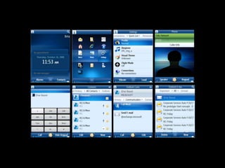


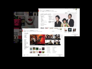
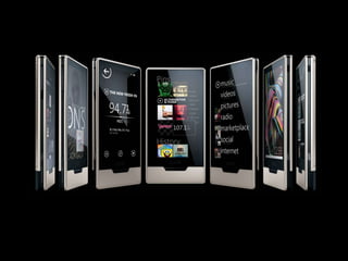

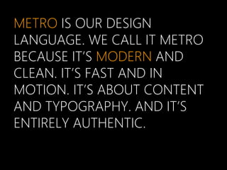

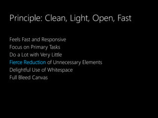
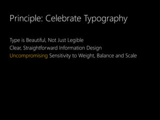
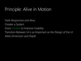
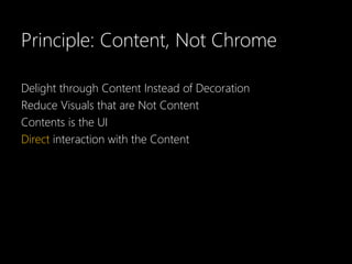
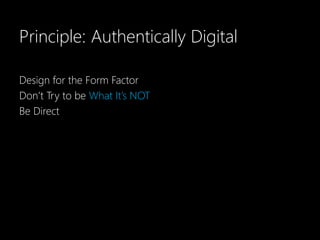
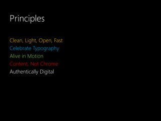

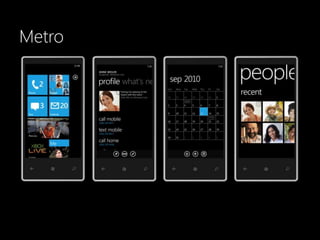
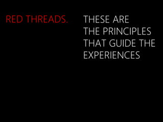
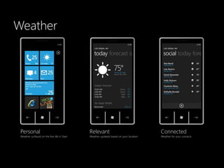
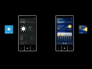
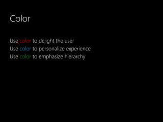
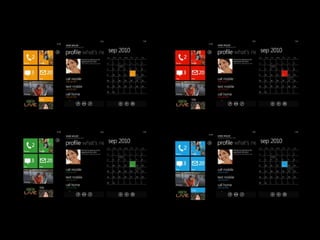
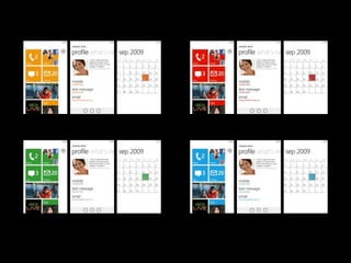
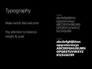
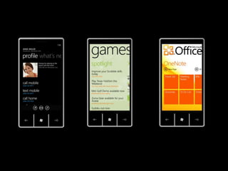
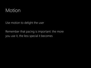
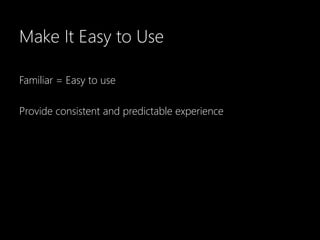
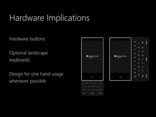
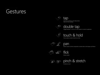
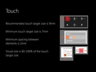
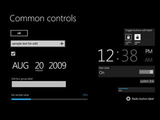

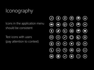


The document discusses design principles for Metro, a clean, minimalist design language for Windows phones. The key principles are that Metro design should be clean and light, focus on primary tasks with minimal unnecessary elements, celebrate typography, feel responsive and in motion, prioritize content over visual chrome, and be authentically digital by designing for the device form factor. Examples are provided of how these principles can be applied to elements like color, typography, motion, gestures, common controls, and iconography. The document provides guidance to help balance Metro principles with an original design style.


