Download to read offline
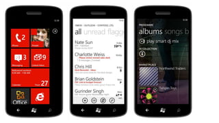
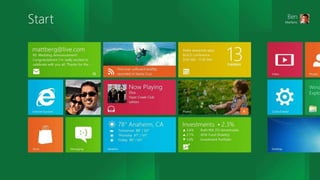
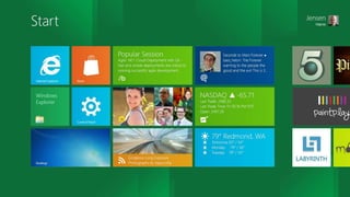

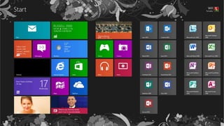
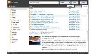
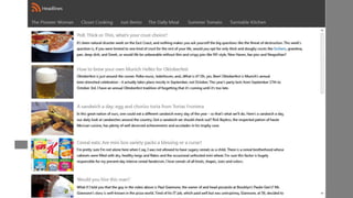


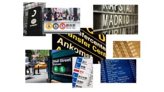
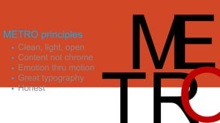
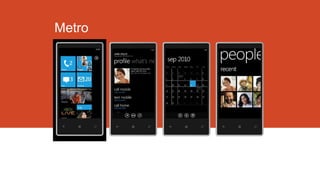
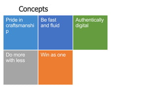

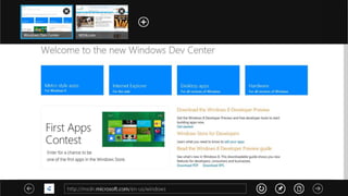

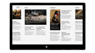

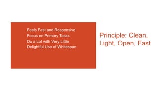

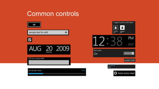
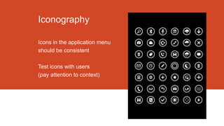
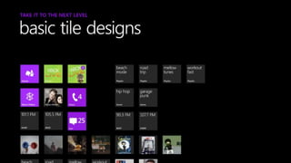


The document discusses the Windows Design Language called Metro and its principles for user interface design. It focuses on clean, minimalist interfaces that prioritize content over visual decoration with a emphasis on typography, responsiveness to motion, and authentic digital experiences. Key principles are outlined like using color to delight users and emphasize hierarchy while ensuring usability across devices with touch targets and controls that are optimized for touchscreens.