Download to read offline
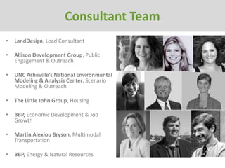
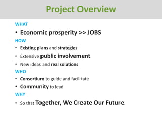
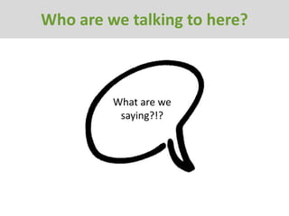

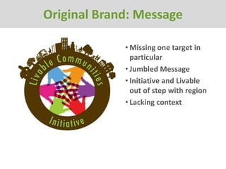
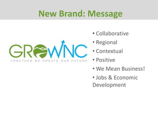
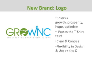
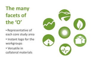
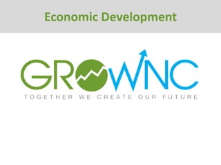
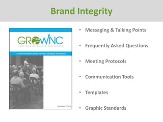

This document summarizes a workshop on crafting messages and building resources for a rural sustainable development initiative. It outlines the consultant team and project overview, focusing on jobs and economic growth through existing plans, public involvement, and new ideas. It discusses ensuring the initiative's branding targets the right audience and conveys the right message clearly. The presentation evaluates the original branding's logo and message and proposes a new collaborative, regional, and positive message centered on jobs and economic development. It introduces a new versatile logo using the letter "O" to represent different facets of development. It emphasizes the importance of brand integrity, management, and readiness to adapt the branding approach.


