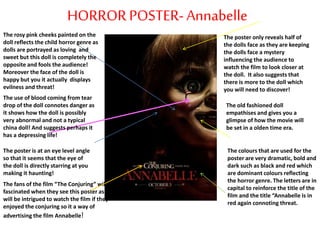
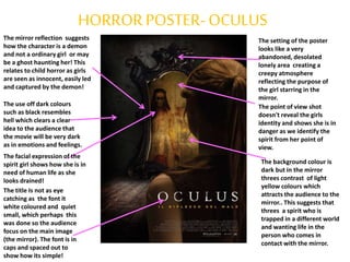
The document analyzes and compares two horror movie posters - Annabelle and Oculus. Both posters use dark colors like black and red to set a scary, ominous tone and imply danger. They also leave some aspects of the films' plots mysterious to intrigue viewers. Common horror poster conventions discussed include using scary facial images and low-key lighting to create an unsettling atmosphere that draws in audiences. Analyzing these posters provided lessons on effective horror poster design, such as emphasizing striking imagery over text and hinting at a film's hidden story without revealing too much.