1. Mario Pinto
⦁ in what ways does your media product use, develop or challenge
forms and conventions of real media products?
⦁ Research
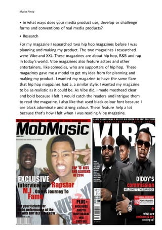
For my magazine I researched two hip hop magazines before I was
planning and making my product. The two magazines I researched
were Vibe and XXL. These magazines are about hip hop, R&B and rap
in today's world. Vibe magazines also feature actors and other
entertainers, like comedies, who are supporters of hip hop. These
magazines gave me a model to get my idea from for planning and
making my product. I wanted my magazine to have the same flare
that hip hop magazines had a, a similar style. I wanted my magazine
to be as realistic as it could be. As Vibe did, I made masthead clear
and bold because I felt it would catch the readers and intrigue them
to read the magazine. I also like that used black colour font because I
see black adominate and strong colour. These feature help a lot
because that's how I felt when I was reading Vibe magazine.
2. Mario Pinto
Contents page
I researched vibe magazine and how they displayed their contents
page; I took at inspiration and tried to make a similar design. I broke
up features into to section and kept the pictures to one side for the
reader to see two different sides, ones with photos and the others
with features. I used the same numbering however I didn’t put any
text on my pictures. My contents page was better with only the
picture and the number. We can see in the vibe contents page how
the pictures are displayed in vertical rows, this is for the reader to
see and they read down the contents page so I made and similar
design as this. I change the way I displayed my photos because I felt
my main feature should have the biggest picture because it’s the
most important.
4. Mario Pinto
For my double page spreadIlookedata differentdesign,XXLmagazine.There magazineare about
hiphop andR&B . Onthe double page we have soldierboyand50 Cent, well know rappers. They
are givingof that 'hard' look. I decided touse a similarpose toshow that mycharacter is sortof a
'Badman' whichmakesmydouble page spreadinterestingtoread.
I likedthe colourscheme of the double page spreadbecause itwasagreywhite andit had bold
writingwhichstoodouta lot inthe background.My colourscheme wasa lightbrownbackground
whichI believe fittedwell withmypicture andmywritingbecause ithelpedmypicture toreally
reveal itslef.Iputmyphotoonthe leftthem same as the double page as XXL photo,I like thatthey
do thisbecause theyhave the phot o onone side andtextonthe other.Thisgooddivisionbetween
the double page spread.
On mydouble page spreadIput in the MobMusic mastheadnexttomypage numberbecause IfeltI
gave off more of that professional lookthismakesmymagazine lookbetterand professional.
Readerswouldlike itbecause of itsdesign.