- The document discusses the design choices and conventions used in creating a mock music magazine called "Renegade".
- The title "Renegade" was chosen to represent hip-hop artists and was inspired by a song of the same name.
- Design elements were taken from magazines like Complex, XXL, and Vibe including simple covers, prominent images, and compact information layouts.
- Fonts, placement of images, and double-page spreads were modeled after conventions from these influential music magazines.
1. In whatwaysdoesyour mediaproductuse,developorchallenge formsandconventionsof real
mediaproducts?(I.e.of musicmagazines)
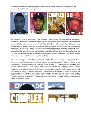
My magazines title is ‘Renegade’. The title that I have chosen for my magazine is the word
'Renegade'.The decisionof thistitlewasmyfirstinitial ideawhichafterattempting to think of more
choicesall fell short in comparison, such as 'RUN' and 'III'. These titles simply did not have the bold
impact I wanted and also they did not sound as good when said. The definition that struck me for
Renegade –An outlawora rebel. Thisdefinitionsuitsthe personalityof manyHip-Hopartists. AlsoI
simplythinkthe word 'Renegade' is sound amazing and therefore a good title. Ironically, there is a
track by well-known Hip-Hop Artists Jay-Z and Eminem entitled 'Renegade' also which applied
further emphasis and influence on my choice of title.
Whenresearchingvariouship-hopmagazines, Ifoundthatthere wasnomagazine in particular that I
wanted to implement a majority. Instead, I looked over various parts of magazines I liked, wrote
them specifics down and saved the cover for future reference. I took the ideas and mixed them
together. For my cover I took aspects from two issues of XXL and a Complex issue. Complex
Magazine remainedonof my maininfluenceswhenmakingthe magazine and my cover was heavily
inspiredbythe simplicityof theircoverpages. Above the mastheadIhave includedthe name of the
magazine founder, which in Renegade’s case would be me. This feature is only really used by
Complex magazine;howeverIfelt thatitwasa feature thatwouldlookgoodforRenegade magazine
to add an aesthetic touch.
2. In whatwaysdoesyour mediaproductuse,developorchallenge formsandconventionsof real
mediaproducts?(I.e.of musicmagazines)
Anotherconvention of my cover that was inspired by Complex magazine was my choice to include
no other features. This choice was made for a number of reasons. Firstly, I wanted to support my
initial pitchof havingasimplisticstyle.Additionally,havingno other features surrounding the cover
artist emphasised the attention on Joel Roberts. Professionalism was another reason for not
including any other features. When attempting to add them on my cover, it looked very crowded
and cluttered and therefore I decide against it, continuing with my initial vision.
3. In whatwaysdoesyour mediaproductuse,developorchallenge formsandconventionsof real
mediaproducts?(I.e.of musicmagazines)
Furtherinspirationsthatwere developed into my design include ones from two separate issues of
XXL magazine. One of the first magazines that I saw when I began research on the magazine was a
XXL issue featuring Hip-Hop star Kendrick Lamar. The shot involves a close up of the rapper with a
neutral face. This was one that I thought could work well with the type of magazine I wanted to
create,therefore Iusedthisshotasmy inspiration. The secondXXL coverthat I used for inspiration
was one featuringFuture.AfterfinishingmydraftI wentlookingformore ideasfromreal magazines
that I could develop for mine. When I found the Future cover liked the idea of having a coloured
filterovermyimage.Therefore I coloured it a shade of blue. This colour was used to represent the
personalityof myartist. Additionally,onall pagesof my magazine I added noise to my images. This
createdan effectthatison several othercoversas well aship-hopalbumcovers andthe use of noise
is generally associated with the genre.
I used a number of fonts for my magazine including ‘REVOLUTION’ which I downloaded from
dafont.com to use for my Masthead. This font was chosen for the fact that it was bold and clear to
attract reader’sattention.Thiswasneededespeciallydue tothe fact that a portion of the masthead
was hiddenbymyartist’simage – whichwasdone as a way to representamagazine with popularity
and influence. This font was also chosen to have the same powerful impact as many other
magazines have.
For the coverline I decidedonusingadifferentfont(AgencyFB) which wasusedforall othertext on
my cover page. This font was used after deciding to have a similar style to Complex in where the
cover line is small and out of the way of the image. I liked the idea of this a decided to implement
this for my own magazine.
4. In whatwaysdoesyour mediaproductuse,developorchallenge formsandconventionsof real
mediaproducts?(I.e.of musicmagazines)
For my contents,ItookinspirationfromVIBEmagazine’slayoutwhichinvolve a single column filled
with features of the issue. When creating my contents, I wanted my main image to fade in its
lighting from dark to light to provide a more appealing and professional look like the image of
EminemforVIBE’scontentsdid. AlsoIlikedthe ideaof showingthe magazine’sidentity on the page
in a more presentable way like Vibe had, therefore a Provided the magazine name, issue, twitter
account and website information on the top left. This provides readers with a large amount of
information all in a small, compact and appealing way.
When researching for my magazine it was clear that I wanted a simplistic design and after viewing
many different double page spreads I was focused on producing a double page spread that
resembled a similar layout to magazines like these:
5. In whatwaysdoesyour mediaproductuse,developorchallenge formsandconventionsof real
mediaproducts?(I.e.of musicmagazines)
My final design took a large amount of inspiration from Q magazine’s layout (Jay-Z article). I
especiallylikedthe large ‘J’thatissetbehindthe textasI feltthatit gave the page more personality
as well asmake it lookfarmore aestheticallypleasing.Additionally,mydouble page spread includes
the use of a large close up image of my artist on the left side of the page. When researching most
magazineswiththisdesignfeltmore attractive andprofessionalthanothersIsaw. A single drop cap
was usedat the start of my article.Thisistypicallydone inmanymagazinesincludingthe WizKhalifa
Vibe double page spread.