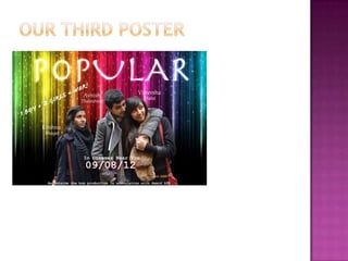
   Our media product uses teen conventions such as stereotypical characters where the protagonist is a ‘popular’ girl at
    school. Conventionally in teen films, the protagonist is the outcast and is faced with a dilemma related to teen issues in
    which they have to overcome. We have stuck to the same storyline, however basing it from a different protagonist’s point
    of view. Thus instead of the story being from the outcasts point of view, we portrayed the story from the “antagonists”
    point of view. Therefore to achieve this in our opening sequence, we represented stereotypical characters. As stereotypes
    aid audience ease into what they expect of the character with regards to the situation. Our opening sequence follows
    conventions of a teen film being based around the setting of school. This is reflected through the use of a year book as a
    mise-en-scene, as it conveys that the protagonist is still at school. Similarly as an audience we infer that the plot is based on
    relationships and friendships from the use of images in the year book.
   We were inspired by Napoleon Dynamite, by not revealing the protagonist which creates suspense towards the audience.
    In the opening sequence for the Napoleon Dynamite we established that the character was either in a school or
    college, with props such as the library books, and the ID card being used in the Opening Credits. So we decided to
    incorporate this into our final idea and use props such as stationary.
   The soundtrack is used to represent characters in Clueless, as when we are first introduced to Deon’s boyfriend, there is
    hip-hop music in the back ground, and this reflects the characters “bad boy image”. The use of a voice over in Clueless
    builds Cher’s character, as her monologue helps the audience to understand her character, seeing things from her point of
    view. Thus fits in with the teen genre as the narrative generally revolves around “teen issues” for example when she is
    talking to her friend Deon about relationships, the use of a sound bridge is used to show the audience what Cher is actually
    thinking, reflecting on her opinion.


                                                                                            BURN
                                                                                            BOOK
By using a year book this
shows that it the based
around school life which is
conventional.


The concept of not revealing the
protagonists. However from the
mise–en –scene inferring the
type of character she is.


                        The messages written on the page and
                        the frequent pictures Melissa is in
                        reflects her popularity
                      Clear theme of
                      relationships is
                      shown using teen
                      language
   Be distributed only in Britain as it relates to more teenage girls in the UK rather than internationally, schools
    are seen from different perspectives
   Best means of distributing our product – internet first, TV, Cinema – minimise the risk of piracy and gives
    variety for the audience.
   Paramount would most probably distribute
   Film 4 ideal media institution as channel 4 owns it and it is a British
   It is due to our opening sequence that fits its values of “make trouble”, furthermore channel 4’s main target
    audience is the same as our ideal target audience.
   As a part of our research, we created our ideal audience. In the format of a facebook profile
    page, as it related to our target audeince, being interactive on social networks. More over,
    this profile page reveals information about our person, their interests and likes. This helped
    us base our opening sequence on what our ideal person would want to see and expect.
   http://www.slideshare.net/MissCTurner/audience-profile-facebook-1


   Our ideal audience is directed towards teenagers aged 16/17 who is interested in romcoms
    and have a social status. Be able to interact with others and not be a shy person. Likes social
    networking ie; facebook and be a people’s person with a sense of humour, as this is what our
    protagonist reveals about her personality. However, some secondary audience it might appeal
    to is, adults in their early 20’s as it may make them reminisce over their high school
    memories.
Audience Feedback;
   The stationary signifies that the character is still in education therefore would appeal to the target
    audience, as they are still in education and can relate.
   From our feedback of our first rough cut, we were told that a way to improve it was to include a
    close up shot at the beginning to make the storyline clearer. Also to change the soundtrack. We still
    need to add our voice over which should bring the whole storyline together.
   From our audience feedback of our second rough cut, we added a voice over which was effective as
    from our final cut, our feedback was that the voice over aided the storyline, making it clearer and
    engages the audience.
Initially this was our first idea. We had the pictures of the protagonist
in order of appearance, in with Melissa (Vaneesha) is first as she is the
main protagonist. The photography was supposed to symbolise the
storyline, Nikil (Avnish) has his arm around Melissa, which represents
that they have some form of relationship, where as Serena (Krishna) is
positioned further away, signifying that she is unwanted, however she
is looking up towards Nikil, in which as an audience we infer that she
has feelings for him. We created this poster a form of audience
feedback. To see whether the poster would appeal to our target
audience. The you of colour in our background was to reflect the life of
the target audience. More over using a variety of colours doesn’t make
our film gender specific.
However it was pointed out that the distinct colour difference looked
primary, thus we wanted to make it look more teen and change things
accordingly.
From our audience feedback, it was
                                                             brought to our attention that our
                                                             opening sequence was similar to that of
                                                             Mean girls, and was suggested that we
                                                             should maybe use a similar approach
                                                             regarding the conventions used on its
                                                             movie poster.


The colour theme of purple reflects it’s target audience
as it is girly. The positioning of the characters are also
similar to how our poster is, as it indicates that the
protagonist is different to the other girls in the
background. Also the catch phrase “watch your back”
reveals the context of the story, that it will be about
gossip and betrayal, thus following the teen
conventions. Therefore we have incorporated all of this
into our poster.
• I found that using the camera was pretty easy except you have to have steady hands so
that we have the right focus however using a tripod was easier. Staying within the 180
degree angle while using a camera is important so that your work doesn’t go out of focus.

• We used iMovie to edit, iMovie is an editing software to edit movies on the Mac. It was
hard to use at first because we hadn’t used it before but after a while we got the hang of it
and gained new skills.

• Production work helped improve and build my skills by using new technology. From the
beginning and developed new skills throughout the production work.

• Wordpress, helped us to organise and present our work successfully and professionally
into a blog so it is easier to follow and explain what we did at each stage

• Youtube was really helpful as mostly everyone uses it so this allowed us to share our
work. I think that we used it effectively for audience feedback and uploading our videos!

• Facebook was definatly a good medium in order for us to improve our work as people
were able to share and were able to freely give back feedback whenever they like
The stationary shows
                                    that the protagonist is
                                    still at school. Related to
                                    audience

                                    The use of pink nail
                                    varnish and Jewellery
                                    signifies the protagonists
                                    feminism and portrays a
                                    typical “girly girl”


The scripted Font can be
interpreted as being quite girly,
and reflects its target audience.


  The use of Phones an Ipods to
  represent the new age of
  technology and how it is
  associated with the younger
  generation and modern
  audience.
It was harder to make a story board for our final piece than our preliminary task, as we were still unsure
how we would be able to effectively convey our storyline through a yearbook as it would have minimum
camera shots.
We have learnt from the preliminary task how to improve the quality of our footage and put it together
to make it look continuous in which we failed to show in our preliminary task.
ETHNICITY


      Representation of ethnicity is negatively represented in Teen films
      as there is usually an absence, or stereotypically portrayed.
      However, we have used an Asian person as the main protagonist
      which is not how the media represents typical Asians.


Typical teenage stereotypes presenting characters with glasses and
braces stereotypically place them as nerds, emos with long hair.
Strengths                   Weaknesses
Use of technology well      Time management
Appealed to target          Limited camera angles
audience
Interesting storyline       Transition between editing
Clear narrative             Unclear voice over
Introduces character well   Soundtrack wasn’t to best
                            standard
Follows teen conventions

media evaluation

  • 2.
    Our media product uses teen conventions such as stereotypical characters where the protagonist is a ‘popular’ girl at school. Conventionally in teen films, the protagonist is the outcast and is faced with a dilemma related to teen issues in which they have to overcome. We have stuck to the same storyline, however basing it from a different protagonist’s point of view. Thus instead of the story being from the outcasts point of view, we portrayed the story from the “antagonists” point of view. Therefore to achieve this in our opening sequence, we represented stereotypical characters. As stereotypes aid audience ease into what they expect of the character with regards to the situation. Our opening sequence follows conventions of a teen film being based around the setting of school. This is reflected through the use of a year book as a mise-en-scene, as it conveys that the protagonist is still at school. Similarly as an audience we infer that the plot is based on relationships and friendships from the use of images in the year book.  We were inspired by Napoleon Dynamite, by not revealing the protagonist which creates suspense towards the audience. In the opening sequence for the Napoleon Dynamite we established that the character was either in a school or college, with props such as the library books, and the ID card being used in the Opening Credits. So we decided to incorporate this into our final idea and use props such as stationary.  The soundtrack is used to represent characters in Clueless, as when we are first introduced to Deon’s boyfriend, there is hip-hop music in the back ground, and this reflects the characters “bad boy image”. The use of a voice over in Clueless builds Cher’s character, as her monologue helps the audience to understand her character, seeing things from her point of view. Thus fits in with the teen genre as the narrative generally revolves around “teen issues” for example when she is talking to her friend Deon about relationships, the use of a sound bridge is used to show the audience what Cher is actually thinking, reflecting on her opinion. BURN BOOK
  • 4.
    By using ayear book this shows that it the based around school life which is conventional. The concept of not revealing the protagonists. However from the mise–en –scene inferring the type of character she is. The messages written on the page and the frequent pictures Melissa is in reflects her popularity Clear theme of relationships is shown using teen language
  • 5.
    Be distributed only in Britain as it relates to more teenage girls in the UK rather than internationally, schools are seen from different perspectives  Best means of distributing our product – internet first, TV, Cinema – minimise the risk of piracy and gives variety for the audience.  Paramount would most probably distribute  Film 4 ideal media institution as channel 4 owns it and it is a British  It is due to our opening sequence that fits its values of “make trouble”, furthermore channel 4’s main target audience is the same as our ideal target audience.
  • 6.
    As a part of our research, we created our ideal audience. In the format of a facebook profile page, as it related to our target audeince, being interactive on social networks. More over, this profile page reveals information about our person, their interests and likes. This helped us base our opening sequence on what our ideal person would want to see and expect.  http://www.slideshare.net/MissCTurner/audience-profile-facebook-1  Our ideal audience is directed towards teenagers aged 16/17 who is interested in romcoms and have a social status. Be able to interact with others and not be a shy person. Likes social networking ie; facebook and be a people’s person with a sense of humour, as this is what our protagonist reveals about her personality. However, some secondary audience it might appeal to is, adults in their early 20’s as it may make them reminisce over their high school memories.
  • 7.
    Audience Feedback;  The stationary signifies that the character is still in education therefore would appeal to the target audience, as they are still in education and can relate.  From our feedback of our first rough cut, we were told that a way to improve it was to include a close up shot at the beginning to make the storyline clearer. Also to change the soundtrack. We still need to add our voice over which should bring the whole storyline together.  From our audience feedback of our second rough cut, we added a voice over which was effective as from our final cut, our feedback was that the voice over aided the storyline, making it clearer and engages the audience.
  • 8.
    Initially this wasour first idea. We had the pictures of the protagonist in order of appearance, in with Melissa (Vaneesha) is first as she is the main protagonist. The photography was supposed to symbolise the storyline, Nikil (Avnish) has his arm around Melissa, which represents that they have some form of relationship, where as Serena (Krishna) is positioned further away, signifying that she is unwanted, however she is looking up towards Nikil, in which as an audience we infer that she has feelings for him. We created this poster a form of audience feedback. To see whether the poster would appeal to our target audience. The you of colour in our background was to reflect the life of the target audience. More over using a variety of colours doesn’t make our film gender specific. However it was pointed out that the distinct colour difference looked primary, thus we wanted to make it look more teen and change things accordingly.
  • 9.
    From our audiencefeedback, it was brought to our attention that our opening sequence was similar to that of Mean girls, and was suggested that we should maybe use a similar approach regarding the conventions used on its movie poster. The colour theme of purple reflects it’s target audience as it is girly. The positioning of the characters are also similar to how our poster is, as it indicates that the protagonist is different to the other girls in the background. Also the catch phrase “watch your back” reveals the context of the story, that it will be about gossip and betrayal, thus following the teen conventions. Therefore we have incorporated all of this into our poster.
  • 11.
    • I foundthat using the camera was pretty easy except you have to have steady hands so that we have the right focus however using a tripod was easier. Staying within the 180 degree angle while using a camera is important so that your work doesn’t go out of focus. • We used iMovie to edit, iMovie is an editing software to edit movies on the Mac. It was hard to use at first because we hadn’t used it before but after a while we got the hang of it and gained new skills. • Production work helped improve and build my skills by using new technology. From the beginning and developed new skills throughout the production work. • Wordpress, helped us to organise and present our work successfully and professionally into a blog so it is easier to follow and explain what we did at each stage • Youtube was really helpful as mostly everyone uses it so this allowed us to share our work. I think that we used it effectively for audience feedback and uploading our videos! • Facebook was definatly a good medium in order for us to improve our work as people were able to share and were able to freely give back feedback whenever they like
  • 12.
    The stationary shows that the protagonist is still at school. Related to audience The use of pink nail varnish and Jewellery signifies the protagonists feminism and portrays a typical “girly girl” The scripted Font can be interpreted as being quite girly, and reflects its target audience. The use of Phones an Ipods to represent the new age of technology and how it is associated with the younger generation and modern audience.
  • 13.
    It was harderto make a story board for our final piece than our preliminary task, as we were still unsure how we would be able to effectively convey our storyline through a yearbook as it would have minimum camera shots. We have learnt from the preliminary task how to improve the quality of our footage and put it together to make it look continuous in which we failed to show in our preliminary task.
  • 14.
    ETHNICITY Representation of ethnicity is negatively represented in Teen films as there is usually an absence, or stereotypically portrayed. However, we have used an Asian person as the main protagonist which is not how the media represents typical Asians. Typical teenage stereotypes presenting characters with glasses and braces stereotypically place them as nerds, emos with long hair.
  • 15.
    Strengths Weaknesses Use of technology well Time management Appealed to target Limited camera angles audience Interesting storyline Transition between editing Clear narrative Unclear voice over Introduces character well Soundtrack wasn’t to best standard Follows teen conventions