What have you learned from your
audience feedback?
Evaluation
Trailer
• After shooting a variety of shots to start with, as a group, we decided to show our peers our
scenes so that they could give us feedback on what we did well and how we could
potentially improve what we had put together so far. Our media class consists of 10 women
(all aged between 16 and 17), which is our primary target audience. Positive feedback
included a great establishing shot, which set the scene and also set the genre of our film
due to the speed (action) and low-key lighting to increase suspense and mystery (thriller).
Trailer
• In addition to this, it is also worth noting that they felt our range of shots helped convey
further uncertainty. The over the shoulder shots of the two girls looking in the mirror
illustrated the girls as normal and outgoing young girls who were obviously getting ready
for a might out. However, this perception of the girls did not last for long. Once the girls had
finished putting on their dark lipsticks, one of the girls’ moves away from the mirror, turning
the mirror and her face to darkness, which causes the girl to no longer be in sight. This
suggests that the girl isn’t as innocent as what those my have first perceived. Yet again, the
low-key lighting causes shadows and generates further suspicion and uncertainty.
Trailer
• Furthermore, the last few scenes that we had created at this point included the scenes that
were taken using a GoPro. Essentially, this is where the action begins, since speed and
anticipation arises.
• Nonetheless, our peers suggested that we needed more footage to establish the narrative
of our trailer. Even though our scenes were effective, the narrative has to be understood
from the moment the trailer actually begins. For example, one member of our class
suggested that the scenes featuring the girls placing make up on in the mirror could also
feature voice-overs to reveal what both girls are thinking. That way, the storyline is brought
to life immediately.
• We then went on to film a number of new scenes to convey our narrative in greater depth.
For that reason, we decided to film a scene where our antagonist is holding the gun.
Ultimately, this scene establishes our genre as action since an action genre showcases
weapons and fight scenes etc.
Trailer
As stated on the previous slide, my
primary audience felt that the narrative
was not clear enough. For that reason, we
decided to retake a number of shots in
order to make our storyline
understandable. As shown in the images
on the right, we have filmed new scenes
displaying the girls being friendly towards
one another, in which Chloe talks about
her new boyfriend (Ricky) to Sarah and
Jessica. We also filmed scenes of Chloe
and Sarah dancing in a club using an
Iphone. This represents our target
audience (16-24 year olds) perfectly, as
young girls would use their phones to film
themselves on a night out. We also shot
new scenes of Chloe and Ricky showing
their loving relationship in a clear light.
Furthermore, we also shot a new scene of
Jessica and Sarah discussing the situation
and how it is getting out of hand. Jessica
suggests that we need to contact Michael.
As a result of this, our storyline becomes
clear.
Magazine
Magaizne
Magazine
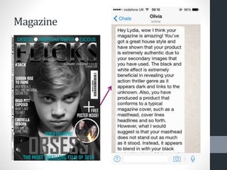
• As shown on the previous slide, I used Whatsap (App) to send a picture of my poster to my
friend named Olivia. She is a member of my primary audience and so I found her feedback
extremely beneficial. As shown in the print screens of our chat, Olivia states ‘Hey Lydia,
wow I think your magazine is amazing! You've got a great house style and have shown
that your product is extremely authentic due to your secondary images that you have
used. The black and white effect is extremely beneficial in revealing your action thriller
genre as it appears dark and links to the unknown. Also, you have produced a product
that conforms to a typical magazine cover, such as a masthead, cover lines headlines and
so forth. However, what I would suggest is that your masthead does not stand out as
much as it stood. Instead, it appears to blend in with your black and white photo. Make
sure it stands out more! Also the colour white is used a lot on your magazine and so I
think you should use another colour such as blue on the text on your magazine’. Her
helpful feedback enabled me to change my magazine for the better. As a result, my
masthead is bold and clear for viewers. In addition to this, my house style colours are used
equally. I changed the ‘+’ symbol into blue so that my cover lines are both blue and white.
Poster
Poster
Poster
• As shown on the previous slide, I used Imessage to send a picture of my poster to my friend
named Alison. She is a member of my primary audience and so I found her feedback
extremely beneficial. As shown in the print screens of our chat, Alison states ‘Hi Lydia, such
an improvement from draft 2 of your film poster! The image is much clearer than your old
photo and better represents Sarah and her evil character. Also, the writing around the
image is highly effective as it makes the film name clear in your target audience's minds,
remembering that they want to watch the film. However, I would suggest that you fill in
the space around the trigger so that the film poster flows entirely. Finally, I would also
suggest that you use more conventions of a film poster. You have placed the film name,
release date and actors names, however I would suggest that you either place a tag line
or credit block so that your poster fits the criteria for a conventional film poster. Hope this
will help!’. Her helpful feedback enabled me to change my poster for the better. As a result
of this, my poster reveals typical conventions of a film poster, including the film title,
release date, tag line and actors names. In addition to this, I have placed the ‘Obsess’ font in
between the trigger also to ensure that my main image is the focus point of my poster and
that the poster flows perfectly.

Audience Feedback

  • 1.
    What have youlearned from your audience feedback? Evaluation
  • 2.
    Trailer • After shootinga variety of shots to start with, as a group, we decided to show our peers our scenes so that they could give us feedback on what we did well and how we could potentially improve what we had put together so far. Our media class consists of 10 women (all aged between 16 and 17), which is our primary target audience. Positive feedback included a great establishing shot, which set the scene and also set the genre of our film due to the speed (action) and low-key lighting to increase suspense and mystery (thriller).
  • 3.
    Trailer • In additionto this, it is also worth noting that they felt our range of shots helped convey further uncertainty. The over the shoulder shots of the two girls looking in the mirror illustrated the girls as normal and outgoing young girls who were obviously getting ready for a might out. However, this perception of the girls did not last for long. Once the girls had finished putting on their dark lipsticks, one of the girls’ moves away from the mirror, turning the mirror and her face to darkness, which causes the girl to no longer be in sight. This suggests that the girl isn’t as innocent as what those my have first perceived. Yet again, the low-key lighting causes shadows and generates further suspicion and uncertainty.
  • 4.
    Trailer • Furthermore, thelast few scenes that we had created at this point included the scenes that were taken using a GoPro. Essentially, this is where the action begins, since speed and anticipation arises. • Nonetheless, our peers suggested that we needed more footage to establish the narrative of our trailer. Even though our scenes were effective, the narrative has to be understood from the moment the trailer actually begins. For example, one member of our class suggested that the scenes featuring the girls placing make up on in the mirror could also feature voice-overs to reveal what both girls are thinking. That way, the storyline is brought to life immediately. • We then went on to film a number of new scenes to convey our narrative in greater depth. For that reason, we decided to film a scene where our antagonist is holding the gun. Ultimately, this scene establishes our genre as action since an action genre showcases weapons and fight scenes etc.
  • 5.
    Trailer As stated onthe previous slide, my primary audience felt that the narrative was not clear enough. For that reason, we decided to retake a number of shots in order to make our storyline understandable. As shown in the images on the right, we have filmed new scenes displaying the girls being friendly towards one another, in which Chloe talks about her new boyfriend (Ricky) to Sarah and Jessica. We also filmed scenes of Chloe and Sarah dancing in a club using an Iphone. This represents our target audience (16-24 year olds) perfectly, as young girls would use their phones to film themselves on a night out. We also shot new scenes of Chloe and Ricky showing their loving relationship in a clear light. Furthermore, we also shot a new scene of Jessica and Sarah discussing the situation and how it is getting out of hand. Jessica suggests that we need to contact Michael. As a result of this, our storyline becomes clear.
  • 6.
  • 7.
  • 8.
    Magazine • As shownon the previous slide, I used Whatsap (App) to send a picture of my poster to my friend named Olivia. She is a member of my primary audience and so I found her feedback extremely beneficial. As shown in the print screens of our chat, Olivia states ‘Hey Lydia, wow I think your magazine is amazing! You've got a great house style and have shown that your product is extremely authentic due to your secondary images that you have used. The black and white effect is extremely beneficial in revealing your action thriller genre as it appears dark and links to the unknown. Also, you have produced a product that conforms to a typical magazine cover, such as a masthead, cover lines headlines and so forth. However, what I would suggest is that your masthead does not stand out as much as it stood. Instead, it appears to blend in with your black and white photo. Make sure it stands out more! Also the colour white is used a lot on your magazine and so I think you should use another colour such as blue on the text on your magazine’. Her helpful feedback enabled me to change my magazine for the better. As a result, my masthead is bold and clear for viewers. In addition to this, my house style colours are used equally. I changed the ‘+’ symbol into blue so that my cover lines are both blue and white.
  • 9.
  • 10.
  • 11.
    Poster • As shownon the previous slide, I used Imessage to send a picture of my poster to my friend named Alison. She is a member of my primary audience and so I found her feedback extremely beneficial. As shown in the print screens of our chat, Alison states ‘Hi Lydia, such an improvement from draft 2 of your film poster! The image is much clearer than your old photo and better represents Sarah and her evil character. Also, the writing around the image is highly effective as it makes the film name clear in your target audience's minds, remembering that they want to watch the film. However, I would suggest that you fill in the space around the trigger so that the film poster flows entirely. Finally, I would also suggest that you use more conventions of a film poster. You have placed the film name, release date and actors names, however I would suggest that you either place a tag line or credit block so that your poster fits the criteria for a conventional film poster. Hope this will help!’. Her helpful feedback enabled me to change my poster for the better. As a result of this, my poster reveals typical conventions of a film poster, including the film title, release date, tag line and actors names. In addition to this, I have placed the ‘Obsess’ font in between the trigger also to ensure that my main image is the focus point of my poster and that the poster flows perfectly.