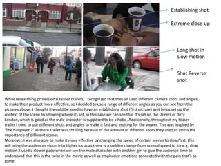
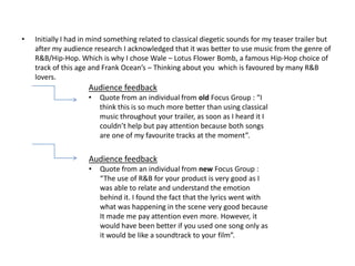
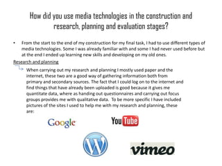
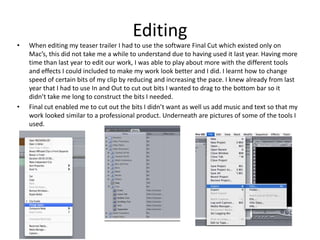
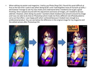
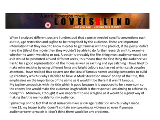
The document discusses how the media creator used conventions from real media products like teaser trailers and magazine covers to make their own media work more professional. They analyzed trailers like Valentine's Day to understand conventions like being snappy, not revealing too much of the plot, and keeping the audience interested. The creator challenged some conventions by giving the female character a higher status than typical. They used techniques like camera shots, music, and poster design elements to engage audiences in a way inspired by analyzing professional works.
The document discusses the production of a horror film trailer. It analyzes conventions used in the film "The Conjuring" and plans to apply similar techniques. These include using woodland as a setting, low-key lighting, establishing shots, close-ups to show character emotion, appropriate props, costumes in black and casual wear, and limiting dialogue with an emphasis on music and sound effects to create tension. Font and poster design will also take cues from other horror films to clearly communicate the genre and grab audience attention.
The document discusses the use of conventions in the creation of a media trailer. It examines how the trailer uses conventions from other thriller genres, such as mysterious music, isolated settings, and vulnerable female characters. It also discusses how the trailer challenges some conventions, such as starting calmly rather than with immediate suspense. The document analyzes the trailer's use of editing techniques, camera work, mise-en-scene, and sound to create suspense and engage audiences in typical thriller style. It provides examples from the trailer to illustrate its use and challenging of real media conventions.
The document discusses the use of conventions in the creation of a trailer for a media production project. It summarizes that the trailer borrows conventions from other thriller trailers, such as using dark lighting when the female character is held hostage. It also challenges some conventions, like starting the trailer with a calm scene rather than immediate suspense. Editing techniques like jump cuts and fast pacing were used to build suspense. Camera shots focused on characters' emotions. Mise-en-scene established settings and used props and clothing relevant to the storyline. Sound also helped build tension throughout the trailer.
My partner and I created a teaser trailer and poster for a psychological thriller film. We drew inspiration from films like "Split" and "Inception" that target a youthful audience. The trailer incorporates elements of both the horror and thriller genres to create a hybrid product. It includes scary and violent scenes like a horror film but also psychological suspense like a thriller. We used conventions like a dark color palette, possessed object as the central image, and ominous soundtrack. However, we also challenged some conventions by not including the main character's face or a specific release date to generate mystery. The goal was to attract audiences with a unique product that fits in the psychological thriller genre.
The document discusses the filmmaking process for a romantic thriller project. It covers choosing the genre, using conventions like beautiful locations, music, and color schemes. It discusses developing characters, capturing different shots, and the importance of planning through storyboards and scheduling. Marketing strategies included social media promotion and a film website. The student learned about different angles, lighting, framing, and managing a shoot. Technologies used were a Canon 5D Mark III with 50mm and 70-300mm lenses to capture various shots.
The document discusses the creation of a teaser trailer, film poster, and film magazine for a media studies project. It outlines the conventions of these media forms that were researched, such as teaser trailers being short and building suspense without revealing much of the plot. Elements like music, camera shots, lighting, locations, and editing were considered when making the teaser trailer, and care was taken to challenge some conventions as well. A process of research, analysis of other examples, photo editing, and design was used to create the poster and magazine following their respective conventions. Connections between the main products and ancillary texts were established through visual elements like characters, crosses, and color schemes. Feedback was gathered from a focus
This document summarizes the analyses conducted by the author on various romantic films and trailers as part of genre research for an upcoming trailer project. The analyses included annotated videos of trailers examining elements like camera work, editing, and mise-en-scène. Magazine and poster designs were also analyzed to identify conventions for ancillary products. A content analysis of "The Lucky One" trailer tracked shot details. Key learnings included conventions for representing masculinity and femininity, effective scene lengths, and use of music to build emotion. The research provided insights into romantic genre conventions to apply to the author's own trailer and ancillary products.
The document discusses the effectiveness of combining a film poster and film review as ancillary tasks for a short film project. The poster uses a close-up image of the main character to convey her neutral sadness and follows drama film conventions. Inspiration was drawn from the poster for "Precious." The review uses simpler fonts and colors with images that provide context about the characters and plot. Both the poster and review aim to promote the film and provide insight in different ways to raise awareness and interest in the film.
The document discusses the effectiveness of combining a film poster and film review as ancillary tasks for a short film project. The poster uses a close-up image of the main character to convey emotion and intrigue, following drama film conventions. Inspiration was drawn from the successful film Precious. The review also aims for simplicity, using different fonts and images to portray the film's tone. Both the poster and review aim to promote the film and raise awareness through different perspectives.
The document discusses the creation of a 30 second film opening for a drama film called "Before I Die". The creator chose to focus on a teenage girl suffering from a terminal illness. To make the opening look professional, the creator used various camera shots like close-ups, over-the-shoulder shots, and establishing shots. The creator also added a voiceover and slow instrumental music to create emotion. Based on research of drama films, the creator set the opening on a cold, windy beach to reflect the character's lonely and vulnerable feelings. Through practicing and improving planning, lighting, costumes, and editing, the creator learned important filmmaking skills between the preliminary task and full project.
The document discusses the effectiveness of combining a short film with ancillary tasks of a poster and film review magazine page. It describes how the poster uses a close-up image of the main character to convey emotion and intrigue without context, and features a simple color scheme to uphold the film's serious drama genre. The review compares the poster's inspiration from the successful film "Precious" and analyzes font and image choices to effectively promote the film within the constraints of magazine conventions. Both the poster and review aim to intrigue audiences and give insight into the film's plot and execution in a clear, simple manner to evaluate the combination of main product and supplementary marketing materials.
Evalution Question 2: How Effective Is The Combination Of Your Main Product A...mags249
The document discusses the effectiveness of combining a film poster and film review as ancillary tasks to promote a short film. The poster focuses on the main character's facial expression to convey emotion and intrigue without revealing details. Inspired by the poster for "Precious", it uses a simple color scheme and font. The review provides a plot summary, ratings, and images depicting relationships between characters in a darker light. Both follow conventions of their genres and complement each other in marketing the film while maintaining a theme of simplicity.
The document discusses ideas for advertising a crime thriller film through a trailer, magazine cover, and movie poster. For the trailer, key action scenes and locations are selected to attract crime thriller fans. The magazine cover features a close-up of the murderer's mask and uses dark colors. The movie poster displays images of the murderer and victim with the tagline "Your Fate Is In The Hands Of Time." Consistent colors, taglines, and actors are used across products to clearly link them to the same film.
The document provides an evaluation of a film trailer created by the author. It analyzes how the trailer uses, develops, or challenges conventions of real media products. The trailer challenges conventions in several ways: 1) It focuses viewers' attention on the simple film title for an extended period, 2) It films locations in a skatepark and urban areas from a first-person perspective to create immersion, 3) It lets actors choose their own clothes to suit characters naturally. The trailer also challenges conventions through its editing, titles, storytelling approach, character introductions, and genres suggested without dialogue or revealing the full story.
The document describes the process of creating a teaser trailer, poster, and magazine for a horror film media project. It discusses researching conventions of these media forms, analyzing existing examples, and planning shots based on a storyboard. Various software programs were used including Final Cut Pro to edit footage, Photoshop to design the poster and magazine, and Soundtrack Pro to add music. Feedback from test audiences confirmed the products successfully linked the narrative and genre. Overall, working on the project helped develop new and existing media skills.
The document analyzes and describes the process of creating a horror movie poster. The creator was inspired by the poster for the movie Insidious. They edited a photo of one of the protagonists, adjusting colors and effects to make her eyes orange and scary. Text was added including the title, tagline, release date, and production company logos. Formatting and effects were applied to make the text stand out. The final poster uses a black, white, and orange color scheme to be intriguing while representing the horror genre.
AS FOUNDATION PORTFOLIO FOR CIE( CREATIVE CRITICAL REFLECTION) + HELP aylatareen
The document provides details about a student's movie project titled "Help". It discusses how the student used conventions of the thriller genre in the movie, such as dim lighting, tense music, and an ambiguous title. It also challenges some conventions by leaving the girl's reaction ambiguous at the end. The student aims to attract audiences aged 16-40 with suspense and mystery. For distribution, the student chooses Universal Studios for their experience with both high and low budget films. Through this project, the student developed skills in camerawork, editing, adding effects, and researching audiences. The student also learned to use technologies like Windows Movie Maker, blogs, and audio/video apps.
The document discusses an opening title sequence for a film project. It provides analysis of several shots from the sequence. The shots establish the setting as a college, introduce the main character as a student, and hint at the genre as a thriller through props like a weapon. Feedback was gathered through questionnaires to help engage the intended audience of male students interested in similar films. The filmmakers learned skills in using camera and editing equipment to construct the title sequence.
The document discusses how the author's main film product and ancillary texts (magazine, poster, trailer) relate to and support each other. Specifically:
- The magazine, poster, and trailer use similar colors, fonts, images, and references to build relationships between the pieces and make the film recognizable.
- Horror conventions like a demon identity, creepy music and scenes, and implied danger are used across the pieces to clearly signal the horror genre.
- While layouts differ between pieces for variety, other shared elements like title treatments and cast images create connections to link the texts together.
The document discusses the effectiveness of combining a short film with ancillary tasks of a poster and film review magazine page. It describes how the poster uses a close-up image of the main character to convey neutral sadness and intrigue without revealing details, following drama genre conventions. Fonts, colors, and comparisons to successful posters are also discussed. The film review aims for simplicity with a black-blue color scheme, plot summary box, and fonts that stand out subtly. Images provide context between characters. Both poster and review effectively promote the film in different ways and complete each other.
The document provides an evaluation of a student media project titled "Trapped" by Omega Group Productions. It discusses how the thriller genre conventions were used and developed in the project. Specifically, it maintained the mystery element but showed the antagonist from the beginning. The evaluation also discusses the representation of social groups, target audience, and what was learned about camera techniques and editing software through constructing the project.
The document provides feedback from multiple reviewers on marketing materials produced for a horror film project. Key points included improving consistency of fonts, logos and settings across materials, balancing sound elements in the trailer, and further developing the retro theme in the magazine. The respondent agreed with most feedback, noting areas they would adjust if reproducing the work, but felt the overall materials were effective given the resources available.
Matthew moffatt evaluation_proper_finishedmattmoff
This document discusses Matthew Moffatt's media trailer for a soap opera. It begins by explaining how the trailer uses conventions of existing soap operas, such as parallel narratives and representations of time. It describes the narrative and characters in the two storylines featured. Later sections discuss the use of mise-en-scene, camera work, sound, and editing techniques. Audience feedback suggested adding title cards and transitions between scenes, as well as choosing a channel like Channel 4 that would appeal more to a younger audience. The document concludes by outlining the media technologies used in construction, research, planning and evaluation of the project, including Adobe Premiere and Photoshop for editing and titles, YouTube for research, and blogs and
The student feels they have greatly improved in designing magazine covers and contents pages from their preliminary task to the final product. In the preliminary cover, there were many flaws like unaligned text, poor image cutting, and a lack of consideration for layout and style. However, in the final cover significant thought went into mimicking industry styles, using statement colors, professional fonts, and carefully selecting imagery. Similarly, the preliminary contents page showed a lack of research and conventions, while the final version had realistic sections, aligned elements, and consideration for aesthetics and emphasis on the cover. Overall, the student learned the importance of preparation, research, feedback, and refinement for creating a polished magazine.
Spain is located on the Iberian Peninsula in southwestern Europe. Some top attractions in Spain include running with the bulls at the Fiestas de San Fermin in Pamplona and the annual tomato fight festival in Bunol. Food is an important part of Spanish culture and brings together regional dishes and influences from Moorish and Arab settlers. Traditional Spanish customs include flamenco, which blends song, dance, and guitar into passionate rhythms.
La Universidad Técnica de Ambato estudia los tipos de relaciones en su Facultad de Ciencias Administrativas. El documento presenta un resumen de un trabajo realizado por la estudiante Clara Cobo sobre los tipos de relaciones para su semestre de cuarto año en la carrera de Computación.
Comparison between preliminary task and main taskRaya Yibrsh
The document compares the preliminary and main tasks of a film project. For the preliminary task, the location and mise en scene were poor which made the ideas unclear. The author learned they needed a setting that suited the storyline. They also learned not to show characters from behind without facial expressions. For the main task, the author made sure emotions were clear and used different camera angles and shots to make the work less boring.
The document is a magazine evaluation written by Holly James. It summarizes how her magazine uses and develops conventions of real media products. It discusses how she used bold fonts and colors for the masthead like Kerrang magazine. Images take up full pages with band names and descriptions of other content. The color scheme is similar to Rock Sound magazine with bold black, red, and white. Bauer Media would be suited to distribute the magazine since they produce similar rock/alternative magazines and media. The target audience is teenagers who listen to alternative music and attend concerts. The magazine title, bands featured, colors, and language are meant to attract this audience. Through making the magazine, Holly learned how to use Photoshop and InDesign to lay
Comparison between preliminary task and main taskRaya Yibrsh
The document compares the preliminary task to the main task in filmmaking. For the preliminary task, the setting was poor which hindered the ideas from being clear to the audience. Additionally, character's emotions were not conveyed since their faces were not shown. However, for the main task, a location was chosen that fit the storyline and character's emotions were made clear by seeing their facial expressions. Different camera angles were also used which improved the overall work.
This document discusses how traditional media is facing new competition from social media platforms and how content needs to be optimized for social sharing. It introduces Newsmonkey, a new free and exclusively digital news brand targeting 18-34 year olds. Newsmonkey will focus on topical, entertaining content that is interactive and encourages user contributions and communities. The document outlines plans to stimulate social interaction and viral sharing through gamification of user status and rewards. It also discusses using crowdfunding and social advertising like native ads that emulate editorial style to promote the new brand without a media budget.
This document discusses various camera shots and angles used in a film trailer to convey meaning and emotion without dialog. Key shots include showing a female character's shoes and hair to suggest mystery and class without seeing her face; showing a male character's bare feet to signal he is homeless; and using close-ups, mid-shots and over-the-shoulder shots to focus on characters' facial expressions and body language as their relationship develops and later deteriorates.
This chapter outlines ten approaches teachers should avoid when differentiating assessment and grading. These include incorporating non-academic factors into grades, penalizing multiple attempts at mastery, grading practice work, withholding assistance, using assessments that don't accurately measure mastery, allowing extra credit, assigning group grades, grading on a curve, giving zeros, and using norm-referenced terms for criterion-referenced attributes. The chapter provides guidance on differentiated assessment and grading to ensure grades accurately reflect students' academic achievement.
o Are you faced with increasing pressure to deploy technology faster? You’re not alone. This year, over half of enterprises will be prioritizing building a private cloud, a concept introduced less than five years ago. They are on a journey to improve IT agility, increase cloud-based service usage and reduce costs. Join Brocade and guest Forrester Research, Inc. as they discuss first-hand industry experience to learn where companies are today, and the #1 reason people are held back.
Critical approaches in foreign policy analysis refer to theoretical perspectives like post-modernism, post-structuralism, and feminism. Critical theory challenges traditional forms of theorizing and seeks to dismantle social constraints on human freedom. It questions concepts like states and the international system. In contrast to problem-solving theories, which take the world as it finds it, critical theories ask how the prevailing world order came to be. Feminist perspectives focus on gender inequality and how power structures reproduce it. Analyzing the "War on Terror" shows how women were invisible in media coverage and national security discussions, which reinforced men's legitimacy while creating barriers for women.
G321 Final Evaluation for AS Media Coursework - Dean Pattinsonsuebennett
The document summarizes the student's media evaluation of their final piece, an action/thriller film. The student aimed to create a typical action flick genre piece with quick pacing and tension, though with a limited budget instead of large special effects. Sound effects and music were used to create atmosphere. Camera techniques included shot reverse shot dialogue and zooms on faces to show emotion. The intended audience is ages 15-50, attracted to the genre. Through the project, the student learned filmmaking skills like shooting, editing, and industry conventions as well as technological skills like using editing software.
The document summarizes the student's media evaluation of their final piece, an action/thriller film. The student aimed to create a typical action flick genre piece with quick pacing and tension, though with a limited budget instead of big Hollywood effects. Sound effects and music were used to create atmosphere. Camera techniques included shot reverse shot dialogue and zooms on faces to show emotion. The piece would appeal to a broad audience aged 15-50, distributed on a smaller scale initially due to production values. Through this process, the student learned filmmaking, editing, and organizational skills to progress from their preliminary task.
The document summarizes the student's media evaluation of their final AS Media piece, which was an action/thriller film. The student aimed to create a typical action flick genre piece with tension and quick pacing, within a limited budget. While conventional in some techniques like shot reverse shot, the film also challenged conventions through use of zoomed shots, shaky camera work, and diegetic sound. The intended audience was stereotypical action film fans aged 15-50. Overall, the student felt they had gained valuable experience in storytelling, filming, editing, and film industry conventions and processes through completing this project.
This document discusses the process of researching and creating an art house film. It begins by analyzing conventions of art house films to better understand what techniques are commonly used or subverted in the genre. This allows the filmmaker to be more creative in developing their own film. Various drafting and planning techniques are discussed, including storyboarding, testing effects, and gaining audience feedback through surveys. Media technologies play a key role in all aspects of filmmaking, from research and planning to shooting, editing, and sharing the final product. The goal is to either follow or challenge conventions to effectively communicate the intended message.
The document provides details about a student's media evaluation project focusing on creating the opening to a film. The student chose to focus on an interview clip using camera shots like medium shots and over the shoulder shots. For the main task, the student created a drama film opening about a teenager with a terminal illness. Shots like close-ups, over the shoulder, and establishing shots were used to add emotion and context. The student researched film techniques and aimed to create a realistic and professional opening through matching shots, camera angles, and natural lighting.
The document summarizes a student's media evaluation of their final piece for a class project on creating an action/thriller film with no budget. The student aimed to create a typical enjoyable action flick with quick pace and tension through using music, sound effects, and camera techniques like shaky shots. Though low budget, the student felt the film was conventionally similar to the genre through techniques like shot reverse shot dialogue scenes but also differed in uses of zooms and shaky shots. The intended broad audience was ages 15-50 but perhaps most popular with teens who could relate to the school setting. Through the project, the student learned skills in story writing, filming, editing and technologies used in the film industry.
This document discusses how the student's media product uses and develops conventions of real drama films and media products. Specifically:
- The student chose to create a drama film trailer, which influenced choices of shots (close-ups, long establishing shots) and pace of editing to match drama genre conventions.
- Conventions the trailer develops include realistic characters/locations/situations and a dramatic storyline to make the audience emotional.
- The opening shot establishes the location to immediately spark audience interest, as drama films conventionally do.
- The poster was influenced by the 'Fish Tank' poster to keep it simple but effective, using a dramatic mysterious image without direct eye contact, drawing inquisitiveness.
The document discusses the student's drama/mystery film trailer and how it develops or challenges conventions of real films and trailers.
1) The student chose to follow conventions like using production company logos, shots of characters running from unknown threats to build intrigue, close ups during intense scenes, fast-paced dramatic music, and ending with a question caption.
2) Some conventions the student challenged included using shorter "dip to black" cuts, changing the duration of one, and including prison bar shots and lighting to create an ominous atmosphere.
3) The student felt their combination of the trailer with ancillary tasks like a poster and magazine cover were effective at conveying the mysterious genre through minimalist
JordonClifton created a short film, film poster, and film review as part of a media evaluation. The documents discusses how these works used, developed, and challenged conventions of similar real media products. Specifically, the short film used conventions like a small cast and plot twist but challenged conventions through unique locations and props. The film poster and review also both conformed to conventions while innovating in some areas of design. Overall, the combination of the main short film and ancillary texts of poster and review were effective due to their similarities in genre, symbols, and style.
The document discusses the student's media product which is a film opening for a thriller. It uses conventions like flashbacks and dim lighting to set the tone. The main character is a male teenager to appeal to that age group. The film could be distributed by a major studio. Through filming and editing, the student learned about using cameras, shots, and iMovie to construct the product and felt they improved significantly from their preliminary task.
The document discusses the process of creating a teaser trailer, poster, and magazine cover for a film. It describes researching conventions of different media types and analyzing existing examples. Various software programs and online tools were used to plan, shoot, edit, and gather feedback on the media products. Key aspects like establishing setting, characters, and plot within a short time frame were considered in designing the trailer.
The document discusses the process of creating a teaser trailer, poster, and magazine cover for a film project. It describes researching conventions of different media types and analyzing example trailers. Various software like Adobe Premiere Elements and Audacity were used to film, edit, and add audio to the trailer. Feedback was gathered through surveys on the author's blog to improve the media products.
The document discusses the process of creating a teaser trailer, poster, and magazine cover for a film project. It describes researching conventions of different media types and analyzing example trailers. The document outlines filming shots with a camera and tripod, editing footage in Adobe Premier Elements by adding effects, text, and audio. It discusses challenges encountered and how social media was used to gather feedback to improve the media products.
The document discusses the effectiveness of a short film, film review, and film poster. It includes links to the short film and behind-the-scenes footage. The main message of the short film is about the long-term consequences of short-term pleasures like drinking and drink driving. Both the poster and review aim to portray a dark storyline and the grief and dangers of drink driving through ominous imagery and desaturated colors. The review, poster, and film represent each other through similar imagery, fonts, and color schemes. The mode of address for each is informal to appeal to audiences but maintains a serious tone. The unique selling points are the large ominous image in the review and the intriguing photograph and tagline in the poster. The
The document discusses how the media product, a film trailer, uses and develops conventions of real film trailers. It begins by evaluating recent thriller trailers to understand their formats. The trailer sticks closely to conventions, using established production companies, camera shots, and editing techniques seen in other trailers. However, it challenges conventions by not including any dialogue to build mystery. Overall, the trailer aims to conform to genre expectations to attract audiences while adding ambiguity through lack of dialogue.
The document discusses how the media product, a film trailer, uses and develops conventions of real film trailers. It begins by evaluating recent thriller trailers to understand their formats. The created trailer sticks closely to conventions for camera work, editing techniques, and mise-en-scene to ensure the genre is recognizable. However, it challenges conventions by not including any dialogue to create mystery and intrigue. Overall, the trailer aims to conform to horror stereotypes through techniques analyzed from other trailers.
The document discusses the aims and conventions used in the creation of a film poster, magazine cover, and teaser trailer for a media evaluation assignment. For the poster, the aims were to catch attention and intrigue audiences about the film. Dim colors and a focus on the character's eyes were used to set a dark tone. The magazine cover was meant to promote the film and entice people to learn more inside. Realistic plugs and a coordinated design followed industry conventions. The teaser trailer aimed to tease the plot just enough to interest viewers without giving too much away. Lighting and location were used to convey mood and leave audiences wanting more.
The document provides an evaluation of Luke Mayes' short film project. It discusses how the film used conventions of short films such as limited characters and exaggerated reactions. It analyzes how the film challenged conventions by leaving the narrative unfinished. Feedback was gathered through surveys which showed that most viewers were male, aged 16-18, and enjoyed the film and characters. The feedback indicated areas for improvement like camera work. Overall, the project met its goal of entertaining audiences.
The document discusses the evaluation of the author's media product, a short psychological thriller film. It describes how the author researched conventions of the genre and was influenced by the film "Portal: No Escape." Key conventions used in the author's film include close-ups of the main character's confused facial expressions, positioning the character off-center according to the rule of thirds, and using a silhouette to represent the antagonist. The author aimed to challenge conventions by mixing elements of amateur and professional filmmaking to create ambiguity. Feedback from audiences confirmed the film should be classified as a psychological thriller.
The document discusses the filmmaker's short film titled "Faces" and how it uses various conventions of the drama genre. Some key points:
- Camera shots, music, storyline, and a reverse video effect were used to portray the drama genre. Conventions like dim lighting and different locations were also employed.
- A one-word title, "Faces", was chosen to describe the film's exploration of how people can have different faces than they seem.
- Marketing elements like a film festival invite postcard and webpage were created with consistent branding elements like colors, fonts, and imagery to promote the film.
How to Make a Field Mandatory in Odoo 17Celine George
In Odoo, making a field required can be done through both Python code and XML views. When you set the required attribute to True in Python code, it makes the field required across all views where it's used. Conversely, when you set the required attribute in XML views, it makes the field required only in the context of that particular view.
Gender and Mental Health - Counselling and Family Therapy Applications and In...PsychoTech Services
A proprietary approach developed by bringing together the best of learning theories from Psychology, design principles from the world of visualization, and pedagogical methods from over a decade of training experience, that enables you to: Learn better, faster!
हिंदी वर्णमाला पीपीटी, hindi alphabet PPT presentation, hindi varnamala PPT, Hindi Varnamala pdf, हिंदी स्वर, हिंदी व्यंजन, sikhiye hindi varnmala, dr. mulla adam ali, hindi language and literature, hindi alphabet with drawing, hindi alphabet pdf, hindi varnamala for childrens, hindi language, hindi varnamala practice for kids, https://www.drmullaadamali.com
Strategies for Effective Upskilling is a presentation by Chinwendu Peace in a Your Skill Boost Masterclass organisation by the Excellence Foundation for South Sudan on 08th and 09th June 2024 from 1 PM to 3 PM on each day.
This document provides an overview of wound healing, its functions, stages, mechanisms, factors affecting it, and complications.
A wound is a break in the integrity of the skin or tissues, which may be associated with disruption of the structure and function.
Healing is the body’s response to injury in an attempt to restore normal structure and functions.
Healing can occur in two ways: Regeneration and Repair
There are 4 phases of wound healing: hemostasis, inflammation, proliferation, and remodeling. This document also describes the mechanism of wound healing. Factors that affect healing include infection, uncontrolled diabetes, poor nutrition, age, anemia, the presence of foreign bodies, etc.
Complications of wound healing like infection, hyperpigmentation of scar, contractures, and keloid formation.
Philippine Edukasyong Pantahanan at Pangkabuhayan (EPP) CurriculumMJDuyan
(𝐓𝐋𝐄 𝟏𝟎𝟎) (𝐋𝐞𝐬𝐬𝐨𝐧 𝟏)-𝐏𝐫𝐞𝐥𝐢𝐦𝐬
𝐃𝐢𝐬𝐜𝐮𝐬𝐬 𝐭𝐡𝐞 𝐄𝐏𝐏 𝐂𝐮𝐫𝐫𝐢𝐜𝐮𝐥𝐮𝐦 𝐢𝐧 𝐭𝐡𝐞 𝐏𝐡𝐢𝐥𝐢𝐩𝐩𝐢𝐧𝐞𝐬:
- Understand the goals and objectives of the Edukasyong Pantahanan at Pangkabuhayan (EPP) curriculum, recognizing its importance in fostering practical life skills and values among students. Students will also be able to identify the key components and subjects covered, such as agriculture, home economics, industrial arts, and information and communication technology.
𝐄𝐱𝐩𝐥𝐚𝐢𝐧 𝐭𝐡𝐞 𝐍𝐚𝐭𝐮𝐫𝐞 𝐚𝐧𝐝 𝐒𝐜𝐨𝐩𝐞 𝐨𝐟 𝐚𝐧 𝐄𝐧𝐭𝐫𝐞𝐩𝐫𝐞𝐧𝐞𝐮𝐫:
-Define entrepreneurship, distinguishing it from general business activities by emphasizing its focus on innovation, risk-taking, and value creation. Students will describe the characteristics and traits of successful entrepreneurs, including their roles and responsibilities, and discuss the broader economic and social impacts of entrepreneurial activities on both local and global scales.
বাংলাদেশের অর্থনৈতিক সমীক্ষা ২০২৪ [Bangladesh Economic Review 2024 Bangla.pdf] কম্পিউটার , ট্যাব ও স্মার্ট ফোন ভার্সন সহ সম্পূর্ণ বাংলা ই-বুক বা pdf বই " সুচিপত্র ...বুকমার্ক মেনু 🔖 ও হাইপার লিংক মেনু 📝👆 যুক্ত ..
আমাদের সবার জন্য খুব খুব গুরুত্বপূর্ণ একটি বই ..বিসিএস, ব্যাংক, ইউনিভার্সিটি ভর্তি ও যে কোন প্রতিযোগিতা মূলক পরীক্ষার জন্য এর খুব ইম্পরট্যান্ট একটি বিষয় ...তাছাড়া বাংলাদেশের সাম্প্রতিক যে কোন ডাটা বা তথ্য এই বইতে পাবেন ...
তাই একজন নাগরিক হিসাবে এই তথ্য গুলো আপনার জানা প্রয়োজন ...।
বিসিএস ও ব্যাংক এর লিখিত পরীক্ষা ...+এছাড়া মাধ্যমিক ও উচ্চমাধ্যমিকের স্টুডেন্টদের জন্য অনেক কাজে আসবে ...
Communicating effectively and consistently with students can help them feel at ease during their learning experience and provide the instructor with a communication trail to track the course's progress. This workshop will take you through constructing an engaging course container to facilitate effective communication.
How to Setup Warehouse & Location in Odoo 17 InventoryCeline George
In this slide, we'll explore how to set up warehouses and locations in Odoo 17 Inventory. This will help us manage our stock effectively, track inventory levels, and streamline warehouse operations.
IGCSE Biology Chapter 14- Reproduction in Plants.pdf
Media coursework evaluation A2
1. In what ways does your media product use, develop or challenge forms
and conventions of real media products?
• I was able to get my media work near to a professional product by
carrying out research on teaser trailers, magazine covers and
posters that have already been done. This helped me as I was able
to pick up on the good things and bad things I need to consider
when creating my own product. Because I was doing a romantic
comedy, I didn’t have to follow any specific conventions I would
have had to if I done for e.g. a horror movie. Rom-coms are pretty
flexible in the way you can present your ideas to your audience seen
as there easy to understand. This means you can play about and try
different things that would keep the audience focused and
interested. I used real media products such as Valentine’s day teaser
trailer to help me see what conventions they had used in their work,
I understood from looking at this that teaser trailers are usually
snappy and short, they also don’t give away too much of the story
line but the do keep it interesting enough so that the audience want
more.
2. • I learnt a lot of different conventions from looking at teaser trailers such as using text
throughout the clip so that the audience can understand what is happening further, using
text is a useful way of engaging the reader as it makes them concentrate on what is written
on the screen. The fact that the two texts are in different fonts and size makes the audience
aware of what the important thing is, the ‘one’ stands out making the audience realise that
this is a romantic film because they will acknowledge that two people become one when
they fall in love. This would have already set up the context for the trailer which is good as
the audience wouldn’t be confused as it progresses. Moreover, I decided to make the
colour red stand out more than the rest as it symbolize energy, passion and deep love, red
is usually associated with Valentine’s day which most of us know is connected with
romance. This emphasise on the idea of love I am trying to convey to my audience. I
decided to have a plain black background as I wanted my target audience to focus on what
was written rather than concentrating on an image or a clip. This also helps with continuity
as it makes it more smooth and connects the shots together.
3. • I understood from looking at real media products, there always has to be something
memorable in the trailer that would stick in the audiences mind after the trailer has finished.
I chose to use an extreme close up of my main characters teary eye as it represents pain, love
and the fact that love is blind which is the title of my movie. Most of us would know that eyes
are the windows to our soul. Our eyes are probably the only facial feature that shows really,
the emotions and thoughts a person's having. This is good as the audience would be able to
recognize genuinely how she is feeling at the time, this makes them engage with her and
favour her character which is what I want to achieve by the end. Moreover, because I used
her eye as the image for my poster, it helps connect my products.
4. • I challenged the conventions of real media products by making the female role have a higher
status than the female. In most professional products, the men are the ones with the highest
power and role, however for my teaser trailer I wanted to move away from this expectation
and show that women are the important characters. I done this from the start by using mise
en scene, we can see how when the trailer starts the female character is in a house and
wearing what looks like a dress and heels. Her clothing shows us that she is wealthy and
classy as heels represent sexiness and power. Where as we can see the male character
walking along the street with out any shoe wear, this contradiction shows us a clear
difference between their status and undermines the male character because shoes are an
essential part of a guys image. Moreover, we see as the scene progresses that she’s the one
that has the highest power as we see her story unfold and leave his to be untold. We see how
she explains her feelings to her friend making her emotions and her self important in the clip,
I have done this to make the audience connect and engage with her mental state.
5. Establishing shot
Extreme close-up
Long shot in
slow motion
Shot Reverse
shot
While researching professional teaser trailers, I recognized that they all used different camera shots and angles
to make their product more effective, so I decided to use a range of different angles as you can see from the
pictures above. I thought it would be good to have an establishing shot (first picture) as it helps set up the
context of the scene by showing where its set, in this case we can see that it’s set on the streets of dirty
London, which is good as the male character is supposed to be a hobo. Additionally, throughout my teaser
trailer I tried to use different shots and angles to make it fast and exciting for the viewer. This was inspired by
‘The hangover 2’ as there trailer was thrilling because of the amount of different shots they used to stress the
importance of different scenes.
Moreover, I was also able to make it more effective by changing the speed of certain scenes to slow/fast, this
will bring the audiences vision into higher focus as there is a sudden change from normal speed to for e.g. slow
motion. I used a slower pace when we see the male character with another girl to give the audience time to
understand that this is the twist in the movie as well as emphasize emotions connected with the pain that’s to
come.
6. When I analysed different posters I understood that a poster needed specific conventions such
as title, age restriction and tagline to be recognised by the audience. These are important
information that they need to know in order to get familiar with the product, if the poster didn’t
have the title of the movie then they wouldn’t be able to do further research on it to examine
whether its worth watching or not. A poster is probably the first thing most audience would see
as it would be promoted around different areas, this means that the first thing the audience see
has to be a good representation of the movie as well as exciting and eye catching. I have tried to
make mine exciting by using different fonts and bright colours such as red which catch peoples
attention. I have realised that posters use the idea of famous names and big companies to build
up credibility which is why I decided to have ‘A Mark Stevenson movie’ on top of the title, this
emphasises on the importance of the name as it wouldn’t be there if it wasn't famous.
My tagline contradicts with the title which is good because it is supposed to be a rom-com so
the cheesy line would make the audience laugh which is the response I am aiming to achieve by
doing this. Moreover, I thought it was important to use a tagline as it would be a good way of
making the title memorable for my audience.
I picked up on the fact that most rom-coms have a low age restriction which is why I made
mine 12, my teaser trailer doesn’t contain any swearing or violence so even if younger
audience were to watch it I don’t think there would be any problems.
7. I wanted my poster to relate a lot to the title similarly to ‘Jumping the broom’ which is
why I have used her eye and the two characters at the back. The fact that the title is
love is blind emphasises on the use of her eye as they both share the idea of sight. We
can see how the eye is on top of the male character hinting that she is the one that is
being lead astray by his false feelings, this again undermines the male character as he is
put across as the bad person and the audience are made not to like his character.
I chose to stick with the normal conventions of a poster by including; name of
characters, music used and other important information at the bottom, this is known as
the Hollywood credits. This helped me create a sense of comfort with my audience as
they would expect to find those things there. However, this is done in very small writing
just like professional products as there are more important things the audience should
be paying attention to.
8. I decided to make the image darker than
the original picture as I wanted the
audience to understand the pain in her
eyes. The black shadow around the
picture emphasises on the gloominess I
wanted my audience to feel. I wanted
there to be a contradiction of humour
and pain so that it creates a sense of
mystery on what might happen during
the movie, this suspense makes the
audience eager to watch the movie
I thought it was important for my
poster to relate a lot with my
teaser trailer which is why I
decided to screen grab an image
from my teaser trailer to use for
the background of my poster. I
was able to make the quality of
the image better by smoothing
out the images roughness on
Photoshop.
9. From looking at professional products that have
already been done I was able to construct a magazine
that followed all the conventions expected. Magazines
that sell live up to peoples expectations of containing
informing, exciting and illustrative pieces of work.
Which is why I thought it would be appropriate to use
similar styles as professional products like the
magazine cover beside this. I researched on Total Film
and Empire but decided to use Sight & Sound for my
own work because it’s a British monthly film magazine
which relates to my work more than the other two
seen as my chosen location is London. When I
analysed three of my magazine covers, I picked up on
the fact that the magazine cover didn’t have to be
related to the movie and poster, as long as it contained
an actor from the movie it was enough. Which is why I
decided to use the main character from my teaser
trailer for the cover of my magazine, this is similar to
Megan Fox being used for Empire to advertise
Transformers 2.
10. Moreover, her make up and
clothing emphasise the idea
I’ve used the sight and of sexiness and class that has
sound logo to make my been constructed around her
audience aware that this is a character on my other two
film magazine. The fact that products. The bright colours;
it is an international film blue, purple and pink make
magazine which is familiar to her stand out as well as
most British audience makes creating a theme of royalty.
it more appropriate to use.
The tagline used underneath
the masthead promotes the
magazines importance and The main cover line on the
credibility. magazine is the biggest text on
the page, this is the same as
the professional products I has
The main image is of my researched, this has been done
main character from my so that fans who are interested
teaser trailer, once again in the film will have a reason to
we can see here how the buy it. In my case, I am trying
importance of her eyes to advertise my movie ‘LOVE IS
are stressed in this image BLIND’ which is why I decided
as she is wearing glasses. to make it bigger and bolder.
Because glasses are not
something natural, they
are bound to draw the
audiences attention to Barcode – typical convention of a
her eyes. magazine
11. How effective is the combination of your main product and ancillary
texts?
• When I was researching professional products I understood that they had similar things that
were produced for one specific movie. I acknowledged that for audience to be easily
interested and familiar with my work I had to make important things such as title and
characters consistent through out. When looking at ‘The Hangover 2’ I recognised that both
for their poster and teaser trailer they had kept the font, characters, location and tagline
identical. We can see below how the location looks pretty similar to the poster as well the
characters being dressed the same way. They have also used the same tag line ‘The Wolf
pack’ to make it something memorable for the audience.
• We can also see how they have stuck to the colour of white for all their fonts
which is good as it is bright and can create a sense of space or add highlights.
• I have followed this idea to produced something familiar for myself
12. • Name of product
I made sure that the name of my movie appeared on all my three products to keep the
continuity of my campaign going. If all three products had been different, the audience would
have assumed they were separate pieces of work. However the consistency of imagery and
written information throughout makes it strong as the audience are exposed to the same
thing over and over again which eventually makes it memorable and familiar to them.
• Use of same people
The consistence use of the same
character throughout my work
makes her important and familiar to
the human eye. The fact that they
see her on all three products
stresses her importance and also
helps create a relationship between
the audience and her.
13. The consistent reference of the females eyes creates a selling point that attracts the
audience as they would have made a connection with the uniqueness of the idea behind
it. Moreover, if there's something that stands out, it gives audience something to go off
and think about or talk about with friends, family etc. which is good as my product will
be getting more recognition from more and more people.
In addition, eyes are a good way of engaging with people as they tell a lot of emotion
and help create some sort of feeling in the audience.
14. We can see how the typography has been kept the same for all my
three products. I chose to use the font ‘IMPACT’ because it is bold and
vibrant, this is good as it would make the texts I want to be easily
noticed by my target audience stand out. Moreover, the fact that its
only certain texts like ‘Love’ that have been done using this
font, stresses the importance of them. I decided to do this to
emphasise on the point of ‘love is a big word’ that most audience are
familiar with.
We can see how the font goes soft and small when it moves away
from these important words.
15. I tried to keep the colours the same through
out by sticking to white, red, black and gold.
This doesn’t only relate to love and class but
because I have used a wide range of different
colours, I will be pleasing a wider number of
people. Colours are what attract a human eye
to specific things which is why I have chosen
to use bright colours that stand out against
darker surfaces.
16. What have you learnt from your audience feedback?
• Before I started constructing my main product I had to complete audience research in which I
had to collect information from various individuals. This did not only help me get an idea of
what's good and bad but it also helped me change some of my ideas I had in mind when
initially coming up with the concepts for my work.
• This was a good way of producing the perfect product for my chosen target audience, as I
was able to understand what kind of genre’s, music, clothing style etc. they were interested
in. This meant that I was able to focus on certain things more than others seen as its of my
audiences interest. For e.g. when I carried out my focus group I understood from a lot of my
participants that music was the main thing that caught their attention. This made me think in
depth about the kind of music that was popular among the type of people I was aiming to
attract.
• After taking my focus groups constructive criticism into consideration, I was able to produce
something that pleased most of my target audience. This was clear from the good feedback I
received after showing the same group of people from my focus group and a new group of
people my main task. I decided to separate these groups when carrying out my final research
into audience feedback so that they can’t influence each other in any way.
17. • Initially I had in mind something related to classical diegetic sounds for my teaser trailer but
after my audience research I acknowledged that it was better to use music from the genre of
R&B/Hip-Hop. Which is why I chose Wale – Lotus Flower Bomb, a famous Hip-Hop choice of
track of this age and Frank Ocean’s – Thinking about you which is favoured by many R&B
lovers.
Audience feedback
• Quote from an individual from old Focus Group : “I
think this is so much more better than using classical
music throughout your trailer, as soon as I heard it I
couldn’t help but pay attention because both songs
are one of my favourite tracks at the moment”.
Audience feedback
• Quote from an individual from new Focus Group :
“The use of R&B for your product is very good as I
was able to relate and understand the emotion
behind it. I found the fact that the lyrics went with
what was happening in the scene very good because
It made me pay attention even more. However, it
would have been better if you used one song only as
it would be like a soundtrack to your film”.
18. • My feedback shows me that my audience are pleased with the music I chose for my main
task, when showing them the clip they all seemed to sing along and dance which is the
reaction I was hoping to get. As soon as the music came on at the start, I recognised that
those people who weren't paying much attention were instantly drawn to the screen as it
was something that was familiar to them. This teaches me that familiarity is important when
presenting products to a target audience.
• Moreover, I have also learnt from the new focus group that maybe using only one track
throughout my whole teaser trailer is a good way of keeping the consistency. I realised after
that most of the trailers I analysed had a soundtrack that run from the start to the end. This is
good because the next time the audience hear the song, they will be able to associate it with
the movie.
• This will be something I will keep in mind if I have to do anything similar to this task.
• On the next page I have created questions based on all my three products that I have
presented to a media student so that I can gain perspective on how well my three products
go together and etc.
19. • What relation can you spot between my three products (magazine, poster and teaser
trailer)?
I thought the constant use of the same character for all three things was a good way of
conveying that’s the central character. This made me aware of the fact that I'm supposed to
be focusing on her which made me want to find out more about her as I saw her over and
over again, the mystery became unbearable. I also picked up on the fact that the colour of her
clothing is the same throughout, she’s wearing blue for everything.
• What improvements do you think I need to make on any of the three products?
The teaser trailer could’ve been a bit shorter and snappier. I don’t think any improvement
need to be made to the poster, I thought everything I needed to know was clear and the
poster was very creative. However, the magazine doesn’t really relate to the two products, it
would’ve been good if you used an image from the movie to make it more obvious that’s
what your trying to advertise.
• Do you think my products used conventions of real media products well? And from the
three which do you think looks more professional?
Yes, I was able to understand what each product was without being informed by just looking
at the context, setup and conventions you used. This is good because it means its similar to
real media products. I think the poster looks professional more than the other two because of
the editing and good use of imagery.
• Do you think my three products together would be successful if on sale?
I think the teaser trailer and poster would do great but you have to put more work into the
magazine.
20. From that I concluded…
• I found that using the same character throughout was good as my audience were able to
make a bond with them, it made them want more in depth info on my main character which
is what I was aiming to achieve. If the audience are kept wanting more then the simplest
things are bound to please their needs.
• Moreover, I found that I should’ve made my magazine similar to my poster and teaser trailer
as most people didn’t think it linked in anyway. Also the quality of my magazine was the
poorest out of all three, which I was disappointed with because I tried to make it similar to
professional products. But the idea of consistency for audience is more important which is
why, next time I will be using very similar images for all my products.
• From further research not included on the questions, I found that the fact I used a female as
the central character was largely favoured by a lot of people including males as they thought
it was different and new. Most said it would’ve been better if you didn’t show her power
being taken away when he cheats on her, this made me think about how effective it would’ve
been if she had the power throughout the clip.
• I will be considering all of these points in the future if asked to produce something similar to
this.
21. How did you use media technologies in the construction and
research, planning and evaluation stages?
• From the start to the end of my construction for my final task, I had to use different types of
media technologies. Some I was already familiar with and some I had never used before but
at the end I ended up learning new skills and developing on my old ones.
Research and planning
When carrying out my research and planning I mostly used paper and the
internet, these two are a good way of gathering information both from
primary and secondary sources. The fact that I could log on to the internet and
find things that have already been uploaded is good because it gives me
quantitate data, where as handing out questionnaires and carrying out focus
groups provides me with qualitative data. To be more specific I have included
pictures of the sites I used to help me with my research and planning, these
are:
22. • By using Google and YouTube I was able to research different trailers and information about what
went in to the making of a trailer so that I had a good idea when constructing my own work.
YouTube was a good way of doing this as I could find any clip I wanted very easily.
• Using programmes such as Word, Excel and Word press was an appropriate method for sorting
and organising my work out. I was able to write and even create pie charts for the things I wanted
by having easy access to these. Word Press helped me present all my work to my teacher, class
mates etc. I learnt how to upload pictures, videos and more which I may find useful when creating
my own blog.
• I also used YouTube convertor when downloading the songs I wanted to use for my teaser trailer.
VIDTOMP3
Word
23. Filming & Post production
• During my filming process I used different kind of equipment's that helped me capture what I
wanted on film and image. Last year we had to film a trailer which meant that I was already
familiar with most of the equipment so I didn’t waste anytime trying to film. When filming my
teaser trailer I had to use a number of different equipment's such as a small hand held canon
camcorder, this was easy to use as well us flexible due to its size. I had to make sure the
camera was on record at the times I needed it to be rather than not because last year we got
it mixed up and ended up not filming half of our work which had a huge effect on our final
piece. Moreover, I also had to shoot scenes more than twice from different angles so that I
could pick and chose when it came to editing.
• In addition, because this was an individual project I had to get people from outside the
college to help me out with things like holding the microphone so that the sound was heard
clear in my clips, this went well as you could hear my characters louder than any background
noise.
24. • To get the image for my poster I used a Mac Computer to screen grab an image from my
teaser trailer as I thought it was very effective and eye catching. To use the screen grab on
Mac’s you would have to press Command-Control-Shift-3 which lets you screen grab a chosen
area of the screen.
• However when taking the picture for my magazine, I used a SONY Cyber Shot camera, this
lets me take pictures and using a USB upload the on to the desktop of the Mac’s ready to
edit. Using Mac’s allowed me to use software's such as Final Cut and Photoshop which aren't
available on any other types of Pc’s.
25. Editing
• When editing my teaser trailer I had to use the software Final Cut which existed only on
Mac’s, this did not take me a while to understand due to having used it last year. Having more
time than last year to edit our work, I was able to play about more with the different tools
and effects I could included to make my work look better and I did. I learnt how to change
speed of certain bits of my clip by reducing and increasing the pace. I knew already from last
year that I had to use In and Out to cut out bits I wanted to drag to the bottom bar so it
didn’t take me long to construct the bits I needed.
• Final cut enabled me to cut out the bits I didn’t want as well us add music and text so that my
work looked similar to a professional product. Underneath are pictures of some of the tools I
used.
26. • When editing my poster and magazine, I had to use Photo Shop CS4, I found this quiet difficult at
first as the last time I used it was when doing GCSE’s and I had forgotten most of my built up skills, I
did however manage to ask my class mates and understand what I needed to do to get a good
finishing. Once I played around with the adjustment and tones of images, all I needed to do was
add text. However, when doing my poster I wanted a black shadow to be present around my image
and I was not able to do that on Photoshop which made me find a different site (Photobucket) to
carry out that effect. I was happy with what I achieved because it looked near enough to a
professional product. You can see below the difference in the original image for my magazine and
the edited version after Photoshop CS4.
27. Further info…
• I over came copyright issues by stating clearly that I do not own any of the music present on
my teaser trailer.