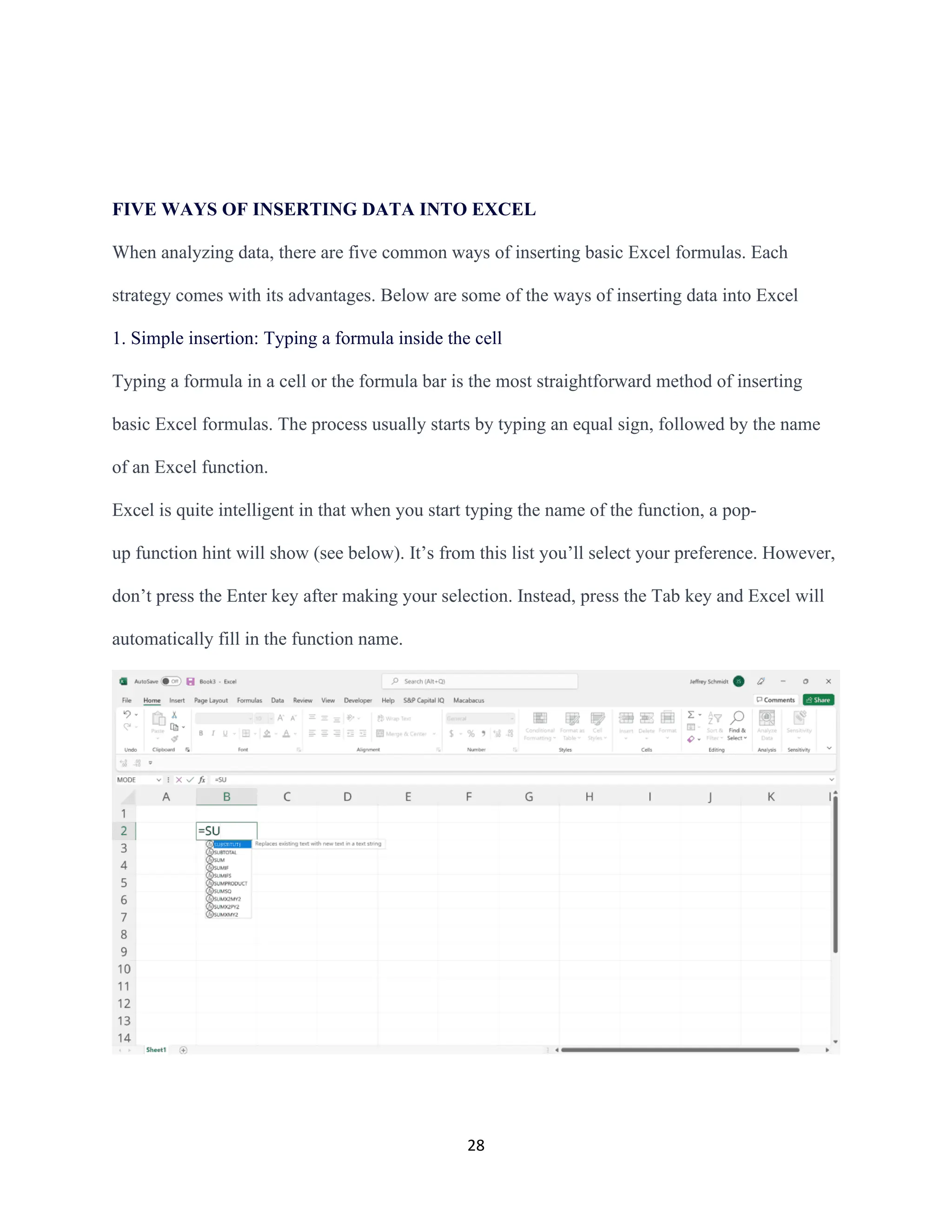
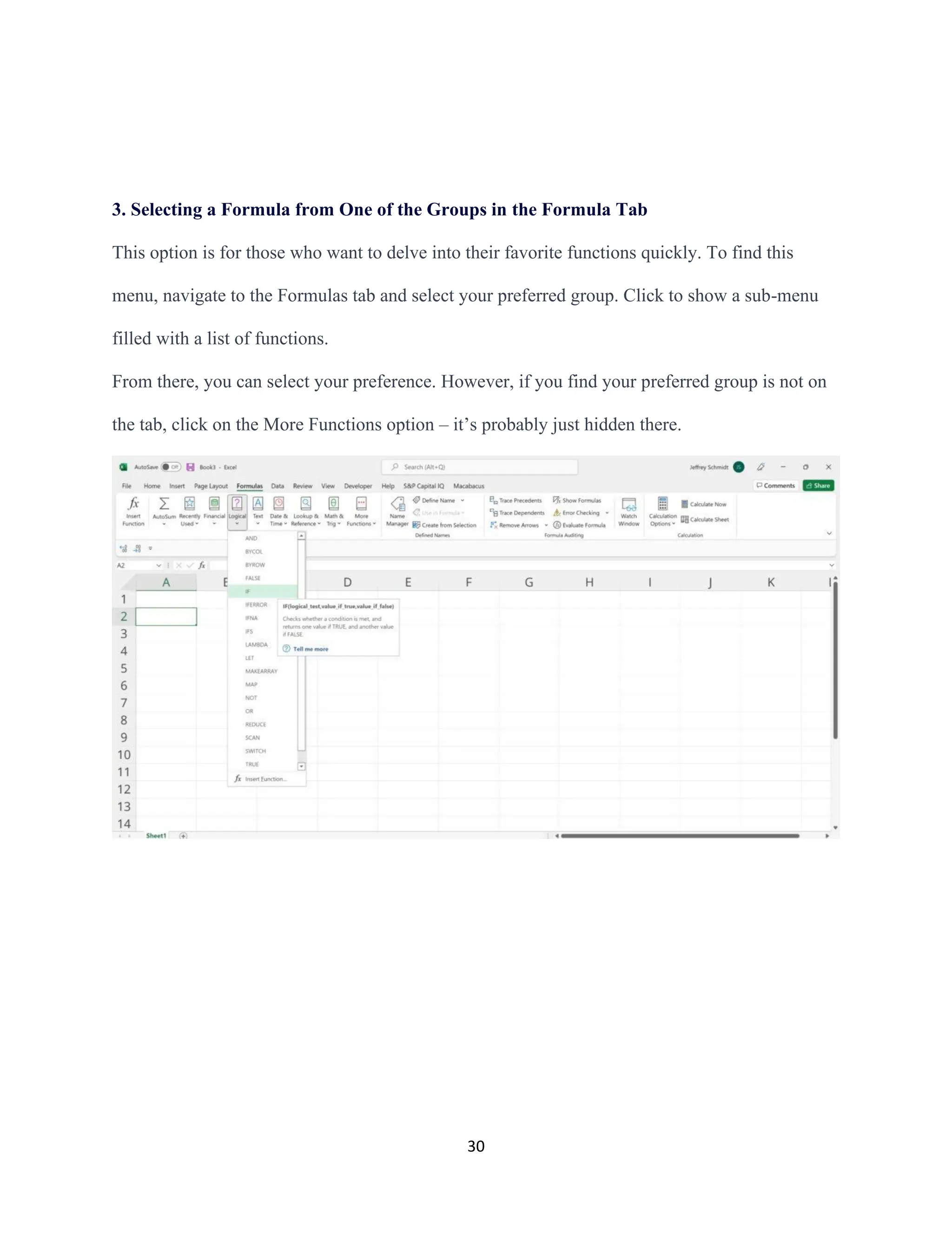
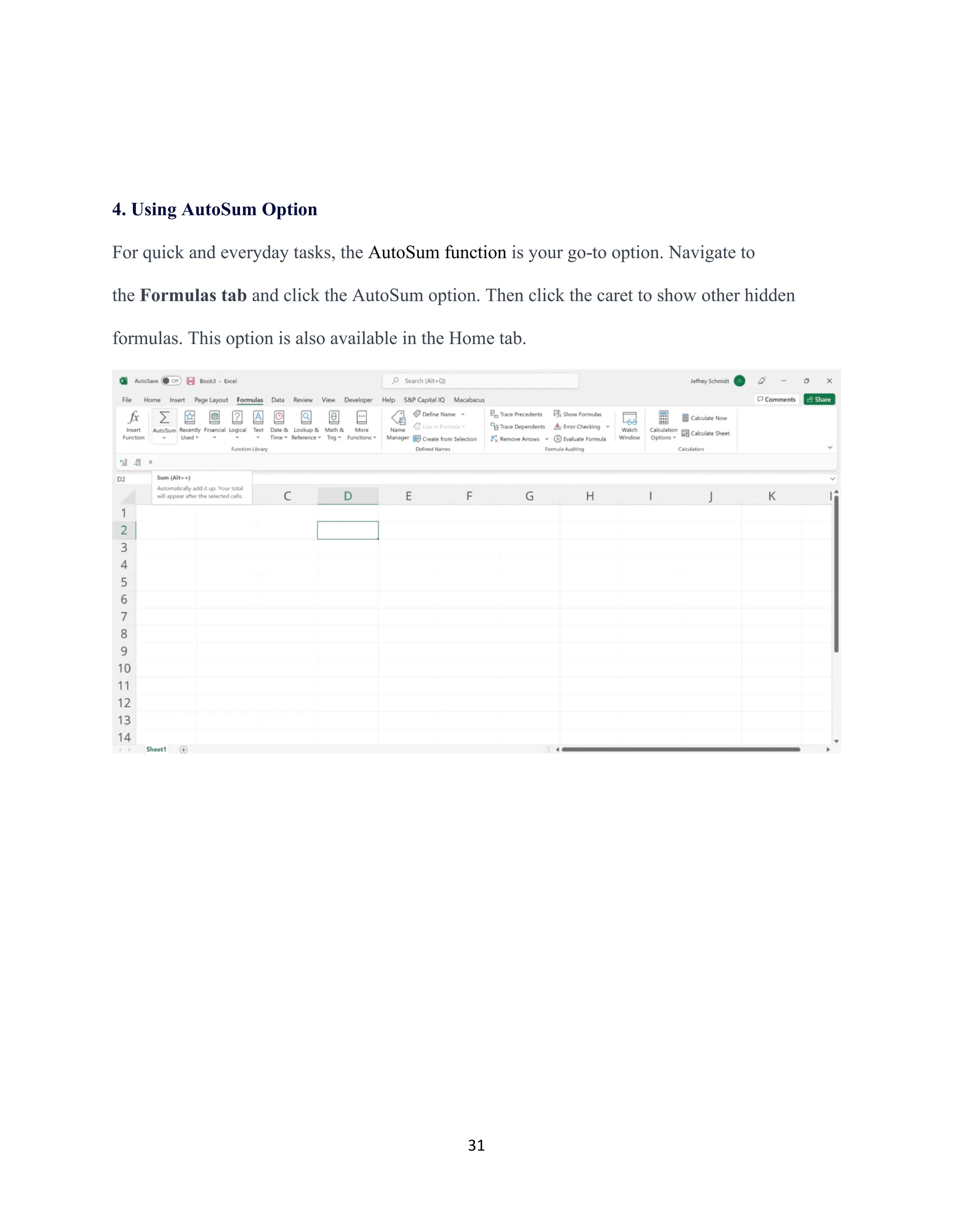
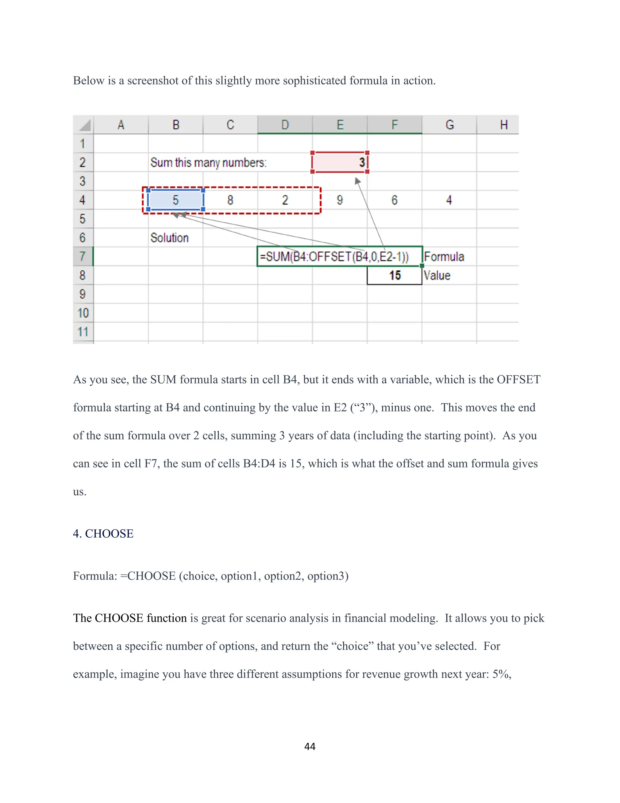
The document provides an extensive overview of data analysis and its significance, emphasizing its role in informed decision-making and problem-solving. It covers various data types, methodologies, and historical developments in data analysis, including distinctions between data analysis and data analytics. Additionally, it outlines different analysis types—descriptive, diagnostic, predictive, and prescriptive—highlighting their applications and importance in extracting actionable insights from data.


![33
BASIC FUNCTIONS OF EXCEL
1. SUM
The SUM function is the first must-know formula in Excel. It usually aggregates values from a
selection of columns or rows from your selected range.
=SUM (number1, [number2], …)
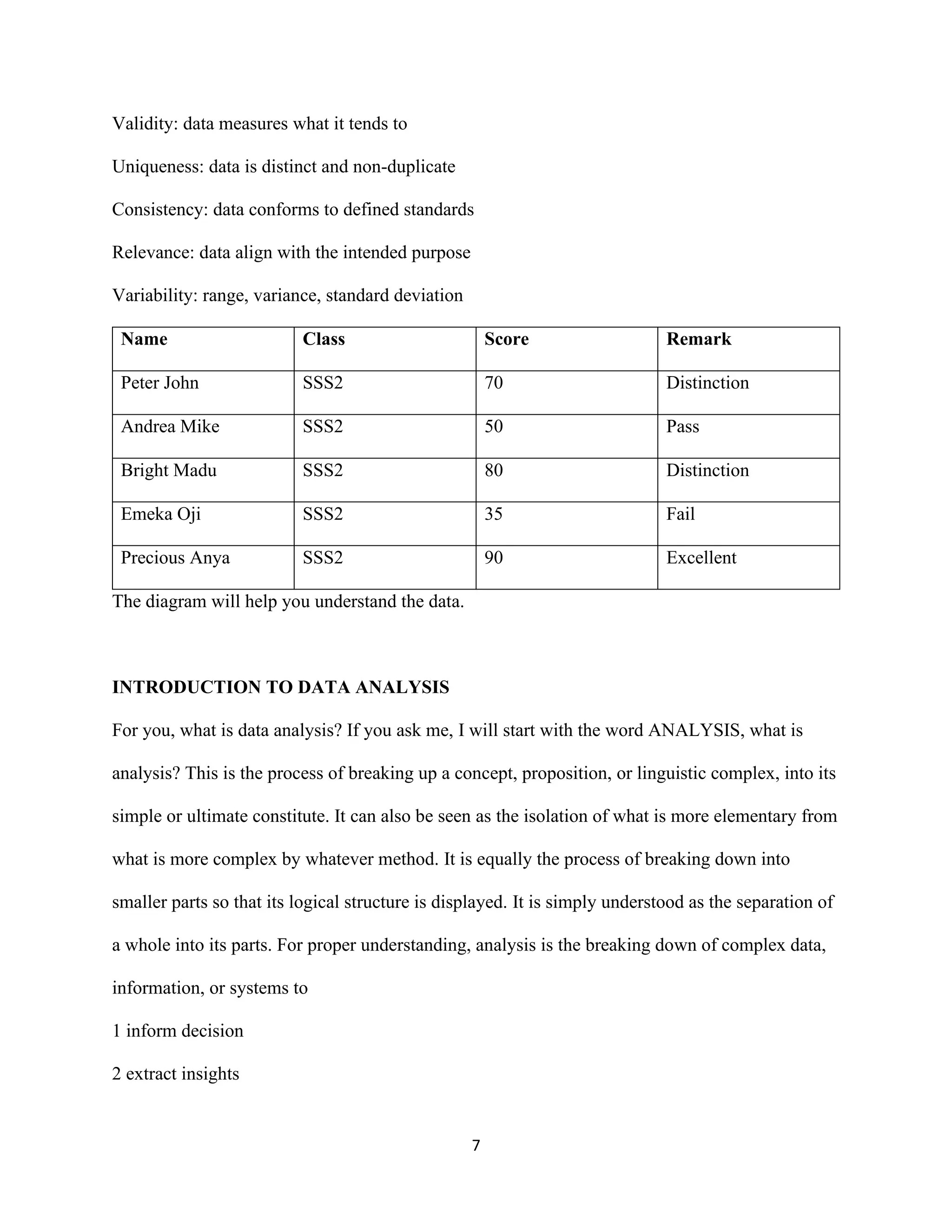
Example:
=SUM (B2:G2) – A simple selection that sums the values of a row.
=SUM (A2:A8) – A simple selection that sums the values of a column.
=SUM (A2:A7, A9, A12:A15) – A sophisticated collection that sums values from range A2 to
A7, skips A8, adds A9, jumps A10 and A11, then finally adds from A12 to A15.
=SUM (A2:A8)/20 – This shows you can also turn your function into a formula.](https://image.slidesharecdn.com/masterpiecetoexcelindataanalysiswithexcel-241222131108-05a2fe1c/75/MASTERPIECE-TO-EXCEL-IN-DATA-ANALYSIS-WITH-EXCEL-pdf-33-2048.jpg)
![34
2. AVERAGE
The AVERAGE function should remind you of simple averages of data, such as the average
number of shareholders in a given shareholding pool.
=AVERAGE (number1, [number2], …)
Example:
=AVERAGE (B2:B11) – Shows a simple average, also similar to (SUM(B2:B11)/10)](https://image.slidesharecdn.com/masterpiecetoexcelindataanalysiswithexcel-241222131108-05a2fe1c/75/MASTERPIECE-TO-EXCEL-IN-DATA-ANALYSIS-WITH-EXCEL-pdf-34-2048.jpg)
![35
3. COUNT
The COUNT function counts all cells in a given range that contain only numeric values.
=COUNT (value1, [value2], …)
Example:
COUNT(A: A) – Counts all values that are numerical in the A column. However, you must
adjust the range inside the formula to count rows.
COUNT (A1:C1) – Now it can count rows.
4. COUNTA
Like the COUNT function, COUNTA counts all cells in a given range. However, it counts all
cells regardless of type. That is, unlike COUNT which only counts numerics, it also counts dates,
times, strings, logical values, errors, empty string, or text.
=COUNTA (value1, [value2], …)](https://image.slidesharecdn.com/masterpiecetoexcelindataanalysiswithexcel-241222131108-05a2fe1c/75/MASTERPIECE-TO-EXCEL-IN-DATA-ANALYSIS-WITH-EXCEL-pdf-35-2048.jpg)

![37
5. IF
The IF function is often used when you want to sort your data according to a given logic. The
best part of the IF formula is that you can embed formulas and functions in it.
=IF (logical_test, [value_if_true], [value_if_false])
Example:
=IF (C2<D3, “TRUE”,” FALSE”) – Checks if the value at C3 is less than the value at D3. If
the logic is true, let the cell value be TRUE, otherwise, FALSE
=IF (SUM (C1:C10) > SUM (D1:D10), SUM (C1:C10), SUM (D1:D10)) – An example of a
complex IF statement. First, it sums C1 to C10 and D1 to D10, then it compares the sum. If the
sum of C1 to C10 is greater than the sum of D1 to D10, then it makes the value of a cell equal to
the sum of C1 to C10.](https://image.slidesharecdn.com/masterpiecetoexcelindataanalysiswithexcel-241222131108-05a2fe1c/75/MASTERPIECE-TO-EXCEL-IN-DATA-ANALYSIS-WITH-EXCEL-pdf-37-2048.jpg)

![39
7. MAX & MIN
The MAX and MIN functions help in finding the maximum number and the minimum number in
a range of values.
=MIN (number1, [number2], …)
Example:
=MIN (B2:C11) – Finds the minimum number between column B from B2 and column C from
C2 to row 11 in both columns B and C.
=MAX (number1, [number2], …)
Example:
=MAX (B2:C11) – Similarly, it finds the maximum number between column B from B2 and
column C from C2 to row 11 in both columns B and C.](https://image.slidesharecdn.com/masterpiecetoexcelindataanalysiswithexcel-241222131108-05a2fe1c/75/MASTERPIECE-TO-EXCEL-IN-DATA-ANALYSIS-WITH-EXCEL-pdf-39-2048.jpg)

![41
9 PROPER
The PROPER function in Excel sets the first letter in a text string as the upper case and any
other letters in the text string as the lower case that follows any character other than a letter.
=proper(text)
Let's look at the Excel PROPER function example and explore how to use the PROPER function
as a worksheet function in Microsoft Excel:
1. INDEX MATCH
Formula: =INDEX (C3:E9,MATCH(B13,C3:C9,0),MATCH(B14,C3:E3,0))
This is an advanced alternative to the VLOOKUP or HLOOKUP formulas (which have several
drawbacks and limitations). INDEX MATCH[1]
is a powerful combination of Excel formulas
that will take your financial analysis and financial modeling to the next level.](https://image.slidesharecdn.com/masterpiecetoexcelindataanalysiswithexcel-241222131108-05a2fe1c/75/MASTERPIECE-TO-EXCEL-IN-DATA-ANALYSIS-WITH-EXCEL-pdf-41-2048.jpg)
![42
INDEX[2]
returns the value of a cell in a table based on the column and row number.
MATCH[3]
returns the position of a cell in a row or column.
Here is an example of the INDEX and MATCH formulas combined. In this example, we look
up and return a person’s height based on their name. Since name and height are both variables in
the formula, we can change both of them!
2. IF combined with AND / OR
Formula: =IF(AND(C2>=C4,C2<=C5),C6,C7)
Anyone who’s spent a great deal of time doing various types of financial models knows that
nested IF formulas can be a nightmare. Combining IF with the AND or the OR function can be a
great way to keep formulas easier to audit and easier for other users to understand. In the](https://image.slidesharecdn.com/masterpiecetoexcelindataanalysiswithexcel-241222131108-05a2fe1c/75/MASTERPIECE-TO-EXCEL-IN-DATA-ANALYSIS-WITH-EXCEL-pdf-42-2048.jpg)


![82
Try to change the table name of the example data set.
4. Format it as a table then change the table name to “Sales Table “.
Analyze Data with Functions
Now you have your data table set up.
Let’s now add a few dashboard elements to the practice workbook.
Using formulas
You can reference a table’s elements in a formula using its name and an opening
bracket “[“.
For example:
1. In the “Dashboard” worksheet, try this formula to get the monthly average sales.
=SUM(Sales Table[Sub-total])/6](https://image.slidesharecdn.com/masterpiecetoexcelindataanalysiswithexcel-241222131108-05a2fe1c/75/MASTERPIECE-TO-EXCEL-IN-DATA-ANALYSIS-WITH-EXCEL-pdf-82-2048.jpg)


![ict_presentation_final_final_final[1].pptx](https://cdn.slidesharecdn.com/ss_thumbnails/ictpresentationfinalfinalfinal1-251230145259-2b4839bd-thumbnail.jpg?width=640&height=640&fit=bounds)


