Requirements.docxRequirementsFont Times New RomanI NEED .docxheunice
Requirements.docx
Requirements:
Font: Times New Roman
I NEED 7 APA Style reference and In-text citation
Spacing: SINGLE
All the number of words are included next to the questions.
__________________________________________________________________________________
BSBLDR511 - Develop and use emotional intelligence
Questions:
1. Explain emotional intelligence principles and strategies (100 words)
2. Describe the relationship between emotionally effective people and the attainment of business objectives (100 words)
3. Explain how to communicate with a diverse workforce which has varying cultural expressions of emotion (100 words)
4. List at least five (5) examples of emotional strengths and weaknesses. Explain all. (100 words)
5. Identify at least three (3) examples of emotional states you might identify in co-workers in the workplace, and outline the common cues for each. (100 words)
6. Why is it essential to consider varying cultural expressions of emotions when working and responding to emotional cues in a diverse workforce? (100 words)
7. There are a variety of opportunities you may provide in your workplace for others to express their thoughts and feelings. List two (2). ( 100 words)
8. Why is it important to assist others to understand the effect of their behavior and emotions on others in the workplace? ( 100 words)
9. What information will you need to consider to ensure you use the strengths of workgroup members to achieve workplace outcomes? (100 words)
Quiz 8 Notes
Scatterplots, Correlation and Regression
We are turning to our last quiz topic; regression. To get to regression, we need to understand several concepts first.
To start with, we will be working with two quantitative variables. The goal is to see if there is a relationship/association between the two variables. As one variable increases, what does the second variable do? If the second variable makes a consistent change then a relationship may exist. MAJOR POINT: saying a relationship exists does NOT mean there is Causation. The greatest abuse of statistical work is here, when a person runs a regression then says Variable A causes Variable B to change. You must have experimental results to establish causation.
Looking at the two variables that will be in a regression you need to know that each variable plays a specific role. One of the variables, X, will be the independent/explanatory variable and the other, Y, will be the dependent/ response variable. In a regression we are looking to see if changes in, Y; occur as X changes. It is very important that you establish at the beginning which of your variables will be X and which will be Y. Swapping the places for the two variables may not work. Let’s do an example.
In economics, we discuss the relationship of the quantity demand and the price of a good. Which one would be the X in a regression, and which would be, Y? The Law of Demand says, “as the price of a good increases, the quantity demanded decreases”. Which is allow.
Contains different types of Data Visualizations, best practices to follow for each case and what type of visualization should be made for different kinds of datasets.
TitlenameInstructor namedateWhere do you live.docxedwardmarivel
Title
name
Instructor name
date
Where do you live?
Give me some basic information about your community..
Location
Size
Race/ethnic makeup
Sentence or so of history
Sign number one of progress
Take a picture of your community that shows that progress has been made since the social movements of the 60’s.. This could be a picture of your family if it is multiracial, a picture of women being more involved in the business community, access for the disabled, more racial and ethnic participation in government, de-segregated schools, etc.
Tell me about the progress here.. Do not clutter up the main slide with information, just provide a nice picture and heading.
3
Example of progress:
Children with disabilities are part of the community
This is a picture of my daughter Sarah. In the 1960’s, only the most severe forms of autism were recognized, and there was little understanding of where such conditions came from. The blame was often placed on the mother, leading to the phrase “refrigerator mother” coined by Kanner in the early 1960’s. Treatment often consisted of institutionalization (History of Autism). Now autism is a more widely recognized condition and children are often mainstreamed in school systems and invited to participate in cultural rituals of the community.
4
Sign of progress number three
More signs if you can find them
You will need 6 substantive slides, 1 title slide and 1 reference slide at a minimum
Summary slide
Tell me if there was progress in your community
Do your photos prove or disprove progress?
What other information can you share about your community that shows progress?
references
The references are mostly for your community facts page, however you may have references for the information in your notes for each photo or for the summary slide
History of Autism. Retrieved March 30, 2012. http://autism.lovetoknow.com/History_of_Autism
· Copy and paste the Task List data table from spreadsheet 1 (Part I labeled as “fat”) of your spreadsheet in exact location inside a new as the second spreadsheet so that the actual data would be placed between rows 2 and 253 of columns B and C. I showed during Week 4 live chat session how to add new spreadsheet to your current EXCEL spreadsheet. Then, follow the steps shown below to find the slope and intercept of the regression line, and to create the graph of scatter plot and the regression line, as required, in Part 3.
PART 3
Slope
1. place the cursor inside an empty cell to right side of the data table in spreadsheet Part III.
2. Open "formula" tab at the top of the spreadsheet.
3. Open "more functions" tab at the top of the spreadsheet.
4. Open "statistical" tab from the menu that opens.
5. Select and open "SLOPE" tab from a vertical menu that opens.
6. Type in exactly "C2:C253" inside the top window labeled as “Known_Y’s”
7. Type in exactly "B2:B253" inside the lower window labeled as “Known_X’s”
8. Left click on "OPEN" tab of the window.
9. Move the curso ...
Chapter 4 Problem 31. For problem three in chapter four, a teac.docxrobertad6
Chapter 4: Problem 3
1. For problem three in chapter four, a teacher wants to display her students number of responses for each day of the week. And she wants to do that with a bar chart. Since she hasn't taken a stats class, she comes to you for help. You first enter her data into SPSS and the results look like this-- When you look at your data set, you'll see that it actually has the wrong level of measurement. Notice that there's a little Venn diagram at the top of each column, which indicates that your data has been entered as nominal. That would be correct if you were noting which day of the week a student participated, but since you're noting how often a given student participated, the correct level of measurement is a scale. Go ahead and change that. Watch how I do that. Under variable view, under measure, you just want to click each one and turn it into a scale. You can also cut and paste these, and I can show you that in another video. Once you have them changed, go back to data view, and you'll see that at the top it has changed in two little rulers. The next question is, how do I get SPSS to display the average score per day rather the total number of individual scores, which might look like a mess, and it's why this question is a toughie. To do that we go under graphs, and you'll see that you have two options, you can do a Chart Builder or a Legacy Dialog. For this question we want to use the Legacy Dialog. We go to Bar and when we click that, there are two questions-- one, what type of bar chart? We want a simple one. And then, how do you want the data in their area displayed? Do we want to summarize for the groups? We really don't. We want summary of separate variables where each day of the week is a variable. We click on Define and then here you'll see every day of the week. You want to bring that over and you see your bar charts are going to represent the mean for every day of the week. As a good habit you want to make sure you title it, I called it "Students' Engagement During Group Discussion." The second one is by day of week. We hit Continue, and then when we hit OK, you're going to see your output pop up. And here is our bar chart-- every day of the week showing the average student engagement. And this is how you answer problem 3 in chapter 4. Good luck.
2. Identify whether these distributions are negatively skewed, positively skewed, or not skewed at all and explain why you describe them that way.
a. This talented group of athletes scored very high on the vertical jump task.
b. On this incredibly crummy test, everyone received the same score.
c. On the most difficult spelling test of the year, the third graders wept as the scores were delivered and then their parents complained.
3. Use the data available as Chapter 4 Data Set 3 on pie preference to create a pie chart ☺ using SPSS.
4. For each of the followin.
How to Start a Compare and Contrast Essay?. How to write a compare contrast paragraph. How to Write a Compare-and-Contrast Essay 2023 - AtOnce. How to Write a Compare and Contrast Essay: Outline, Body, and Conclusion. Compare And Contrast Essay Conclusion - slidesharedocs. A conclusion for a compare and contrast essay. Compare And Contrast Conclusion Example. Compare and Contrast Essay: Conclusion Paragraph by Mrs Masters' Materials. HOW TO WRITE A GOOD COMPARE AND CONTRAST ESSAY CONCLUSION – Epinan1977 Blog. Compare and Contrast on High School and College - Free comparison essay .... Best compare and contrast essay - College Homework Help and Online .... Writing a Compare/Contrast Essay:.
Learn the basics of bubble charts and how they can help your team answer complex marketing questions.
What can bubble charts do for you? Well, for starters, they show the relationship between up to four categories or dimensions in a single chart. Plus, they’re statistically powerful, use colors, sizes and patterns for easy insight, and give a great sense of correlations between outcomes.
Similarities Essay. Comparative Essay - 10 Examples, Format, Pdf ExamplesClaire Flanagan
Cultural Similarities and Differences - PHDessay.com. 001 Essay Example Comparison Compare And Contrast Basic Thatsnotus. What similarities and differences have you found between - GCSE English .... Essay Websites: Sample comparative analysis essay. write an essay about the similarities and differences between studying .... Compare and Contrast Essay Topics. Compare and Contrast Essay Outline Easy Guide amp; Examples. Similarities differences essay. Comparative Essay - 10 Examples, Format, Pdf Examples. Similarities and comparison essay - GCSE Drama - Marked by Teachers.com. Writing a Compare/Contrast Essay:. PPT - Comparison and Contrast Essay Guide PowerPoint Presentation, free .... Similarities And Differences Essay Introduction. Similarities of the People and the Differences in their Cultures Essay .... Writing your Similarities paragraph - YouTube. Persuasive Essay: Essay on similarities and differences. 2 Comparison Essay Examples That Make Cool Comparisons. Comparison and contrast outline format. A Compare and Contrast Essay .... Similarities and Differences Between PeerPeer Interactions and .... Linking words and phrases: Addition, Contrast, Comparison, Summary .... Essay websites: How to write a contrasting essay. Strong Compare and Contrast Essay Examples. Writing A Comparative Essay How to write a perfect comparative essay .... Similarity and Differences Between Narrative and Descriptive Essay. What are the similarities and differences between essays and .... Making a speech - Year 9. Similarities and differences Assignment Example Topics and Well .... How to write similarities and differences essay. Similarities And .... Similarities between art and architecture. What are the similarities .... Similarities and differences between a paragraph and an essay 1 - YouTube. Compare and Contrast Essay Topics for College Students Essay topics .... How to Write a Compare and Contrast Essay Outline Point-By-Point With .... How to write a compare and contrast essay. How to Write a Compare and .... How to write a comparison. A Step by Step Guide to Writing a Product .... Essay on similarities and differences SAC Homberg Similarities Essay Similarities Essay. Comparative Essay - 10 Examples, Format, Pdf Examples
A slight edit on Prioryman's excellent Spearman ppt - adds in the idea of sample and chance to complete the picture - not much improvement possible on this well done ppt. I'd highlight the need for a minimum sample size of 15 though.
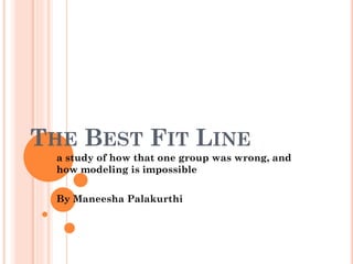
3. THIS IS THE GRAPH THAT GROUP E3 USED TO
REPRESENT PEOPLE’S ECONOMIC PATHS.
As you can see, their concept was that in the cycle of loss and gain, the
rich gain more than they lose (and so get continually richer), the middle class
breaks even (and so remain stagnant wealth-wise), and the poor's gains don't
make up for their losses (and so get progressively poorer). This graphs refers to
wealth in amounts. There are two glaring mistakes in this representation.
4. THE FIRST PROBLEM
The first is that the three lines begin
so close together. The wealth gap does widen
over time, true, but that doesn't mean that it
starts so small. In this case it would be more
accurate to have the following:
For reference:
5. THE SECOND PROBLEM
The other large issue with their graph
is that there are far too many "outliers".
Considering that their wealth axis is set on a
basis of specific economic values, only people
who begin with the exact amount of the three
y-intercepts are shown on this graph. So if you
were to give the axes the following values: (see
below graph)
For reference:
…only people who begin with 4,
8, or 12 units of wealth are
represented. Those who begin
with any other amount are
unaccounted for.
6. SOLUTION FOR THE SECOND PROBLEM
The graph should really look more like the
following one.
For reference:
However, it would
need infinitely more lines, but
creating this same basic shape.
The pink line would be
stationed at whatever y-value
is considered at the time to be
median wealth/wage.
7. ANOTHER APPROACH
Now there's another entirely different approach that yields the same
meaning, using relativity and percentiles. It is drawn as one of the most basic
graphs of all, the y=x graph. Here, the x and y axes both represent a wealth
percentile. The x axis represents your financial standing when you start, and your
y axis represents your financial standing when you finish.
8. A SIMPLIFIED EXPLANATION
Say there's 100 people in a city. You happen to be the
second richest person in the city, so you are the 99th
percentile. Similarly to the fashion that group E3 had been
trying to demonstrate with their graph, you as one of the rich,
are getting richer. However, your wealth doesn't increase
faster than the one richest person, or slower than the people
who started poorer than you, so you continue to rank as the
second richest person in town. Thus, your final percentile
value is 99, and you fall on the y=x line.
For reference:
9. SCATTER PLOTTED
Now that graph also has outliers
not taken into account, though in this
case they are actually a minority. If you
were to scatter plot the percentile graph,
it would look something like this:
For reference:
The red dots are outliers.
However, as you can see the
line is what is commonly
known as a best fit line, and is
therefore acceptable.
10. BUT.
(Here starts part two in which I contradict some of what
I just said mostly because I'm switching topics to the
best fit line discussion.)
11. Best fit lines should never be
considered acceptable! The are
one of the most prevalent
examples of humans and our
dependency on taxonomy!
12. HERE’S WHY…
When given the below
scatterplot…
People attempt to draw
what they call a best fit
line. Which ends up looking
like the following.
From four unconnected points on the graph, we conjure up
a best fit line, and say that it represents them. But it doesn't! Only
one of the points is actually on the line, yet we deem this the line
that represents the data. Unless your best fit line goes through at
least 90% of the points on the graph, it should be considered invalid.
13. SO WHY DO WE DRAW BEST FIT LINES?
It's a form of taxonomy. A way to say
that things (or points) are a part of a
category (or line) that they really aren't. It
helps us to associate things with whatever
is similar, and ignore outliers.
14. WHICH BRINGS ME TO MY NEXT POINT.
(HAHA, POINT, GET IT?)
The gravest form of the best fit line and
taxonomy is...
THE MODEL.
Modeling is the worst kind of best fit line.
15. WHY MODELS ARE UNACCEPTABLE
So we study three different revolutions, and then create a
model/system based off of those three that should be applicable to
every other situation. Not only are outliers disregarded, but nearly
all other events are too!
Let me explain visually.
16. The red dots represent the events that we studied. This
graph shows only the data that we studied.
Key:
Red dots = Events Studied
17. Here the gray line is the best fit line or the model, made
based on the data.
Key:
Red Dots = Events Studied
Gray Line = Best Fit Line for Red Dots
18. The green dots are all the events that took place that we
didn't study. So it's obvious that the events fell in a very
wide range.
Key:
Red Dots = Events Studied
Gray Line = Best Fit Line for
Red Dots
Green Dots = Unstudied Events
in History
19. So here are all the events throughout history, and the one
model that was made to represent all of them. I don't think
it quite works, do you?
Key:
Red Dots = Events Studied
Gray Line = Best Fit Line/Model
for Red Dots
Green Dots = Unstudied Events
in History
20. IN CONCLUSION…
We draw best fit lines and create models in order to
fool ourselves into thinking that:
a) It's actually possible to categorize the world
b) There is actually one line or model that applies
to every point of data
c) We understand the world