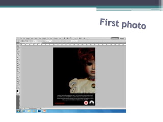
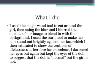
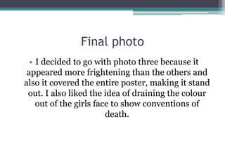
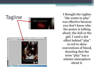
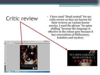
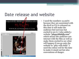
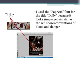
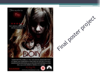
SlideShare a Scribd company logo
1 of 15
I began with the basic conventions of a poster such
  as the BDFC certificate, the company which had
  made the film i.e. Hammer and paramount and
also the institutional information. This means that
     I have all the basic conventions of a poster.
•I then began experimenting
with three different photos to
 see which one I thought was
        more effective.
• I uses the brush tool to blacken out the dolls eyes
    which I believe makes the doll look evil. I then
     contrasted the colours to make the dolls hair
   stand out more vibrant and red, which can also
    be a convention of danger. I believe that only
  showing half of the dolls face shows conventions
           that the doll is hiding something.
• I did the same as the first photo only this time a
  blackened out the girls eyes and not the doll,
  which shows conventions that the girl has been
  possessed and also suggests that she has no soul.
  I used the “magic wand” tool to cut around the
  girl and I then blurred her hair so that she would
  blend in with the backdrop. I then used the burn
  tool to make her hair darker so that her face
  looks hidden, showing conventions of mystery
  behind the girl.
What I did
• I used the magic wand tool to cut around the
  girl, then using the blur tool I blurred the
  outside of her image to blend in with the
  background. I used the burn tool to make her
  hair stand out brightly against her face which I
  then saturated to show conventions of
  lifelessness as her face has no colour. I darkened
  her eyes out again but kept the eyes of the doll,
  to suggest that the doll is “normal” but the girl is
  not.
Final photo
  • I decided to go with photo three because it
 appeared more frightening than the others and
also it covered the entire poster, making it stand
 out. I also liked the idea of draining the colour
    out of the girls face to show conventions of
                        death.
I thought the tagline
Tagline    “she wants to play”
          was effective because
           you don’t know who
           the poster is talking
          about; the doll or the
              girl. I used a dot
           effect behind “play”
               in red to show
          conventions of blood,
             denoting that the
             term “play” has a
           sinister atmosphere
                   about it.
• I have used “Dead central” for my
Critic review     critic review as they are known for
                     their reviews on various horror
                  movies. I used the phrase “its spine
                    chilling” because the language is
                 effective in the colour grey because it
                     has conventions of lifelessness,
                          isolation and mystery.
Date release and website
                 • I used the numbers 13 and 6
                   because they are associated with
                   the devil so if it is released on
                   this date it will make the
                   audience feel nervous but
                   excited to see it. I also added a
                   website “playwithdolly.com”
                   which means the audience can
                   interact with the film as well as
                   make them excited to see what
                   will happen if you go onto the
                   website to “play with dolly” I
                   used the colour red for the date
                   to make it stand out but also
                   conventions of danger.
• I used the “Papryus” font for
Title     the title “Dolly” because it
          looks simple yet sinister as
          the red shows conventions of
          blood and danger
Making my poster

More Related Content

What's hot

Powerpoint treatment
Powerpoint   treatmentPowerpoint   treatment
Powerpoint treatmentRobyn60
 
Changes to our horror opening
Changes to our horror openingChanges to our horror opening
Changes to our horror openingjackfowler16
 
New props media
New props mediaNew props media
New props mediamark shaw
 
Changes to our horror opening
Changes to our horror openingChanges to our horror opening
Changes to our horror openingjackfowler16
 
Film opening preview- Scarlett
Film opening preview- ScarlettFilm opening preview- Scarlett
Film opening preview- Scarlettbethbouchareb
 
Horror Poster Analysis
Horror Poster AnalysisHorror Poster Analysis
Horror Poster Analysismeganhall46121
 
Horror Poster Analysis
Horror Poster AnalysisHorror Poster Analysis
Horror Poster Analysismeganhall46121
 
Analysis of still images in the horror genre
Analysis of still images in the horror genreAnalysis of still images in the horror genre
Analysis of still images in the horror genresophielunny
 
The Inspiration behind Rosie Black
The Inspiration behind Rosie BlackThe Inspiration behind Rosie Black
The Inspiration behind Rosie Blackhardeep23
 
My draft film posters
My draft film postersMy draft film posters
My draft film postersmollysmith123
 
Evaluation - Question 1
Evaluation - Question 1Evaluation - Question 1
Evaluation - Question 1Jan Sychrava
 
Question 1
Question 1Question 1
Question 1Sandalyn
 
Evaluation Question 1
Evaluation Question 1Evaluation Question 1
Evaluation Question 1Sandalyn
 

What's hot (20)

Powerpoint treatment
Powerpoint   treatmentPowerpoint   treatment
Powerpoint treatment
 
Changes to our horror opening
Changes to our horror openingChanges to our horror opening
Changes to our horror opening
 
New props media
New props mediaNew props media
New props media
 
Changes to our horror opening
Changes to our horror openingChanges to our horror opening
Changes to our horror opening
 
The box media_coursework
The box media_courseworkThe box media_coursework
The box media_coursework
 
Film opening preview- Scarlett
Film opening preview- ScarlettFilm opening preview- Scarlett
Film opening preview- Scarlett
 
Horror Poster Analysis
Horror Poster AnalysisHorror Poster Analysis
Horror Poster Analysis
 
Film Poster Analysis
Film Poster AnalysisFilm Poster Analysis
Film Poster Analysis
 
Horror Poster Analysis
Horror Poster AnalysisHorror Poster Analysis
Horror Poster Analysis
 
Analysis of still images in the horror genre
Analysis of still images in the horror genreAnalysis of still images in the horror genre
Analysis of still images in the horror genre
 
The Inspiration behind Rosie Black
The Inspiration behind Rosie BlackThe Inspiration behind Rosie Black
The Inspiration behind Rosie Black
 
Poster images
Poster imagesPoster images
Poster images
 
My draft film posters
My draft film postersMy draft film posters
My draft film posters
 
Question 1
Question 1Question 1
Question 1
 
Moodboard
MoodboardMoodboard
Moodboard
 
Coursework eval
Coursework evalCoursework eval
Coursework eval
 
Moodboard analysis
Moodboard analysisMoodboard analysis
Moodboard analysis
 
Evaluation - Question 1
Evaluation - Question 1Evaluation - Question 1
Evaluation - Question 1
 
Question 1
Question 1Question 1
Question 1
 
Evaluation Question 1
Evaluation Question 1Evaluation Question 1
Evaluation Question 1
 

Viewers also liked

mural painting epc
mural painting epcmural painting epc
mural painting epcclaudwietan
 
Making of the Poster
Making of the PosterMaking of the Poster
Making of the Posteremily1082
 
The power of poster design
The power of poster design The power of poster design
The power of poster design angeswadling
 
mural presentation slide
mural presentation slidemural presentation slide
mural presentation slideyongseenyee
 
Mural Art Presentation EPC
Mural Art Presentation EPCMural Art Presentation EPC
Mural Art Presentation EPCyangkanglim
 
304 lecture 2 lesson 2
304 lecture 2 lesson 2304 lecture 2 lesson 2
304 lecture 2 lesson 2jon_zee
 
Mural art presentation
Mural art presentation Mural art presentation
Mural art presentation Madeline Liew
 
Mural-power point =)
Mural-power point =)Mural-power point =)
Mural-power point =)Adan Figueroa
 
Mural art powerpoint presentation
Mural art powerpoint presentationMural art powerpoint presentation
Mural art powerpoint presentationJunXiang97
 
Materials and Process of Making Murals
Materials and Process of Making MuralsMaterials and Process of Making Murals
Materials and Process of Making MuralsNazish
 
Visual Elements
Visual ElementsVisual Elements
Visual ElementsAlaa Sadik
 

Viewers also liked (20)

mural painting epc
mural painting epcmural painting epc
mural painting epc
 
Making of the Poster
Making of the PosterMaking of the Poster
Making of the Poster
 
Making the poster
Making the posterMaking the poster
Making the poster
 
Mural Project
Mural ProjectMural Project
Mural Project
 
The power of poster design
The power of poster design The power of poster design
The power of poster design
 
Poster design
Poster designPoster design
Poster design
 
How to design a poster
How to design a posterHow to design a poster
How to design a poster
 
mural presentation slide
mural presentation slidemural presentation slide
mural presentation slide
 
Poster Design
Poster DesignPoster Design
Poster Design
 
Poster Design
Poster DesignPoster Design
Poster Design
 
Mural Art Presentation EPC
Mural Art Presentation EPCMural Art Presentation EPC
Mural Art Presentation EPC
 
Making a poster
Making a posterMaking a poster
Making a poster
 
MURALS
MURALSMURALS
MURALS
 
304 lecture 2 lesson 2
304 lecture 2 lesson 2304 lecture 2 lesson 2
304 lecture 2 lesson 2
 
Mural art presentation
Mural art presentation Mural art presentation
Mural art presentation
 
Mural-power point =)
Mural-power point =)Mural-power point =)
Mural-power point =)
 
Mural art powerpoint presentation
Mural art powerpoint presentationMural art powerpoint presentation
Mural art powerpoint presentation
 
Materials and Process of Making Murals
Materials and Process of Making MuralsMaterials and Process of Making Murals
Materials and Process of Making Murals
 
Visual Elements
Visual ElementsVisual Elements
Visual Elements
 
Foothill Technology High School - Art & Design: Elements of Design: Value
Foothill Technology High School - Art & Design: Elements of Design: ValueFoothill Technology High School - Art & Design: Elements of Design: Value
Foothill Technology High School - Art & Design: Elements of Design: Value
 

Similar to Making my poster

Media Studies, Evaluation Q1
Media Studies, Evaluation Q1Media Studies, Evaluation Q1
Media Studies, Evaluation Q108atg
 
Question 1, poster
Question 1, posterQuestion 1, poster
Question 1, posteraeap95
 
Question 1
Question 1Question 1
Question 1hamhall
 
Evaluation question 1: In what way does your media product use, develop or ch...
Evaluation question 1: In what way does your media product use, develop or ch...Evaluation question 1: In what way does your media product use, develop or ch...
Evaluation question 1: In what way does your media product use, develop or ch...Zainab1311
 
Character Profile
Character ProfileCharacter Profile
Character ProfileJessBrown97
 
FMP:3. research(1)
FMP:3. research(1)FMP:3. research(1)
FMP:3. research(1)JoshEastham2
 
Evaluating my poster
Evaluating my posterEvaluating my poster
Evaluating my posterabcdsmile
 
Evaluating my poster
Evaluating my posterEvaluating my poster
Evaluating my posterabcdsmile
 
Analysing horror posters
Analysing horror postersAnalysing horror posters
Analysing horror postersjessicak95
 

Similar to Making my poster (20)

Question 1
Question 1Question 1
Question 1
 
Media Studies, Evaluation Q1
Media Studies, Evaluation Q1Media Studies, Evaluation Q1
Media Studies, Evaluation Q1
 
Question 1, poster
Question 1, posterQuestion 1, poster
Question 1, poster
 
Question 1
Question 1Question 1
Question 1
 
Question 2
Question 2Question 2
Question 2
 
Evaluation question 1: In what way does your media product use, develop or ch...
Evaluation question 1: In what way does your media product use, develop or ch...Evaluation question 1: In what way does your media product use, develop or ch...
Evaluation question 1: In what way does your media product use, develop or ch...
 
Costume inspiration
Costume inspirationCostume inspiration
Costume inspiration
 
Character Profile
Character ProfileCharacter Profile
Character Profile
 
Alice new
Alice newAlice new
Alice new
 
1!!!!
1!!!!1!!!!
1!!!!
 
1!!!!
1!!!!1!!!!
1!!!!
 
Question 1
Question 1Question 1
Question 1
 
FMP:3. research(1)
FMP:3. research(1)FMP:3. research(1)
FMP:3. research(1)
 
Evaluation
EvaluationEvaluation
Evaluation
 
Evaluating my poster
Evaluating my posterEvaluating my poster
Evaluating my poster
 
Evaluating my poster
Evaluating my posterEvaluating my poster
Evaluating my poster
 
She's the killer
She's the killer She's the killer
She's the killer
 
Evaluation
EvaluationEvaluation
Evaluation
 
Question 1
Question 1Question 1
Question 1
 
Analysing horror posters
Analysing horror postersAnalysing horror posters
Analysing horror posters
 

Making my poster

  • 1.
  • 2. I began with the basic conventions of a poster such as the BDFC certificate, the company which had made the film i.e. Hammer and paramount and also the institutional information. This means that I have all the basic conventions of a poster.
  • 3. •I then began experimenting with three different photos to see which one I thought was more effective.
  • 4.
  • 5. • I uses the brush tool to blacken out the dolls eyes which I believe makes the doll look evil. I then contrasted the colours to make the dolls hair stand out more vibrant and red, which can also be a convention of danger. I believe that only showing half of the dolls face shows conventions that the doll is hiding something.
  • 6.
  • 7. • I did the same as the first photo only this time a blackened out the girls eyes and not the doll, which shows conventions that the girl has been possessed and also suggests that she has no soul. I used the “magic wand” tool to cut around the girl and I then blurred her hair so that she would blend in with the backdrop. I then used the burn tool to make her hair darker so that her face looks hidden, showing conventions of mystery behind the girl.
  • 8.
  • 9. What I did • I used the magic wand tool to cut around the girl, then using the blur tool I blurred the outside of her image to blend in with the background. I used the burn tool to make her hair stand out brightly against her face which I then saturated to show conventions of lifelessness as her face has no colour. I darkened her eyes out again but kept the eyes of the doll, to suggest that the doll is “normal” but the girl is not.
  • 10. Final photo • I decided to go with photo three because it appeared more frightening than the others and also it covered the entire poster, making it stand out. I also liked the idea of draining the colour out of the girls face to show conventions of death.
  • 11. I thought the tagline Tagline “she wants to play” was effective because you don’t know who the poster is talking about; the doll or the girl. I used a dot effect behind “play” in red to show conventions of blood, denoting that the term “play” has a sinister atmosphere about it.
  • 12. • I have used “Dead central” for my Critic review critic review as they are known for their reviews on various horror movies. I used the phrase “its spine chilling” because the language is effective in the colour grey because it has conventions of lifelessness, isolation and mystery.
  • 13. Date release and website • I used the numbers 13 and 6 because they are associated with the devil so if it is released on this date it will make the audience feel nervous but excited to see it. I also added a website “playwithdolly.com” which means the audience can interact with the film as well as make them excited to see what will happen if you go onto the website to “play with dolly” I used the colour red for the date to make it stand out but also conventions of danger.
  • 14. • I used the “Papryus” font for Title the title “Dolly” because it looks simple yet sinister as the red shows conventions of blood and danger