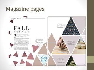
Design principles
Magazine pages
Editor page
Magazine cover
Design Principles
• “4 Principles of Design Everyone Should Know” and that
is because I think most people are inherently aware of
them. These are things that we all notice in every day
life. Though they are simple, having them pointed out so
you can help you understand why a design is appealing
and can guide your own design efforts.
• An acronym that we learned in class spells a lovely four-
letter word: C.R.A.P. C.R.A.P. stands for contrast,
repetition, alignment, and proximity. I used all of these
principles in my design to create balance and unity.
1- Contrast
• The best example of contrast in this layout would have to
be the triangles. By having smaller, darker colored
triangles on the left page and larger, lighter colored
triangles on the right, there is a sense of flow from one
side to the other and more visual interest than if I had
done all of the triangles in one size and color.
• Using contrast like this is a great way to create balance.
Darker objects are visually heavier than lighter ones, and
by making the dark triangles smaller, there is no
competition between the two. Instead, the spread as a
whole feels balanced.
2- Repetition
• Repetition is a pretty simple concept. It’s basically just
using the same or similar elements to create a pattern.
This design principle is appealing because people
naturally look for patterns in their surroundings all the
time.
• I used repetition in the triangles, which I placed in such a
way to create a pattern. Repetition can also be achieved
by using similar colors and this helps create a sense of
unity. I chose a neutral/nude palette and used it
throughout the project. I only used two fonts in the
entire project and this was done to establish consistency
in the magazine.
3- Alignment
• I love alignment. Because it is something we see so much, it
can often be overlooked. Without proper alignment, the
elements in a design can feel disconnected from one
another. You can align objects in a lot of different ways, but
the most common are aligning them by edge or by their
centers.
• I spent a good amount of time playing around with the kerning
of my words (a fancy word that refers to the space between
letters), especially with the titles ‘Fall Trends’ and ‘Editor’s
Note’. By spacing out the second word in both of those
phrases, I was able to align the words edge to edge. It gave the
titles a much cleaner look. Other than that, there is alignment
on every page of the magazine design, such as the spacing
between the triangles and the center alignment on the
magazine cover.
4-Proximity
• This is probably the design principle that I was most unaware
of before my class. Proximity refers to how close related
elements are in a design. It makes sense that related objects
would be closer to one another. This helps promote
organization in a design.
• For my project, I used proximity on the cover with the
featured article titles and proximity with the triangles. Most
notably, on my “Editor’s Note” page, I clustered the colored
boxes, my picture, and the words in the center of the page.
The social information has its own space, as does the title of
the page.

magazine Design principles.pptx

  • 1.
  • 2.
  • 3.
  • 4.
  • 5.
    Design Principles • “4Principles of Design Everyone Should Know” and that is because I think most people are inherently aware of them. These are things that we all notice in every day life. Though they are simple, having them pointed out so you can help you understand why a design is appealing and can guide your own design efforts. • An acronym that we learned in class spells a lovely four- letter word: C.R.A.P. C.R.A.P. stands for contrast, repetition, alignment, and proximity. I used all of these principles in my design to create balance and unity.
  • 6.
    1- Contrast • Thebest example of contrast in this layout would have to be the triangles. By having smaller, darker colored triangles on the left page and larger, lighter colored triangles on the right, there is a sense of flow from one side to the other and more visual interest than if I had done all of the triangles in one size and color. • Using contrast like this is a great way to create balance. Darker objects are visually heavier than lighter ones, and by making the dark triangles smaller, there is no competition between the two. Instead, the spread as a whole feels balanced.
  • 7.
    2- Repetition • Repetitionis a pretty simple concept. It’s basically just using the same or similar elements to create a pattern. This design principle is appealing because people naturally look for patterns in their surroundings all the time. • I used repetition in the triangles, which I placed in such a way to create a pattern. Repetition can also be achieved by using similar colors and this helps create a sense of unity. I chose a neutral/nude palette and used it throughout the project. I only used two fonts in the entire project and this was done to establish consistency in the magazine.
  • 8.
    3- Alignment • Ilove alignment. Because it is something we see so much, it can often be overlooked. Without proper alignment, the elements in a design can feel disconnected from one another. You can align objects in a lot of different ways, but the most common are aligning them by edge or by their centers. • I spent a good amount of time playing around with the kerning of my words (a fancy word that refers to the space between letters), especially with the titles ‘Fall Trends’ and ‘Editor’s Note’. By spacing out the second word in both of those phrases, I was able to align the words edge to edge. It gave the titles a much cleaner look. Other than that, there is alignment on every page of the magazine design, such as the spacing between the triangles and the center alignment on the magazine cover.
  • 9.
    4-Proximity • This isprobably the design principle that I was most unaware of before my class. Proximity refers to how close related elements are in a design. It makes sense that related objects would be closer to one another. This helps promote organization in a design. • For my project, I used proximity on the cover with the featured article titles and proximity with the triangles. Most notably, on my “Editor’s Note” page, I clustered the colored boxes, my picture, and the words in the center of the page. The social information has its own space, as does the title of the page.