
Recommended
More Related Content
Similar to LVNDR Branding Guidelines Araxie 2023 aaaa
Similar to LVNDR Branding Guidelines Araxie 2023 aaaa (20)
Recently uploaded
Recently uploaded (20)
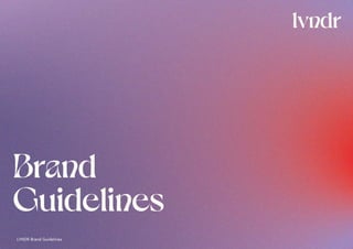
LVNDR Branding Guidelines Araxie 2023 aaaa
- 2. Table of contents 3-10 Logo 11-14 Colours and Gradients 15-16 Typefaces 17-20 Photography 21 Shapes and Layout 2 LVNDR Brand Guidelines
- 3. Primary Logo This is the primary logo of LVNDR. It should be used as often as required, most often over the gradient from the branding. This logo brings some curvy type details that are a reminder of sex, but don’t take away from the professional aspect of your brand. 3 LVNDR Brand Guidelines
- 4. 4 LVNDR Brand Guidelines Secondary Logo The secondary logo, containing the gradient, should be used when needed over a non-gradient background.
- 5. 5 LVNDR Brand Guidelines Black Logo The black version of the logo can be used when the content is neutral and more serious, or when in need of a black logo (for example outside of the branding context).
- 6. Logo Use Ensure adequate spacing between logo and other graphic elements. The margins around the logo correspond to the width of the “r”. This is our recommendation regarding the size of the logo. 6 LVNDR Brand Guidelines Design by Studio Lutalica This is the smallest size we would recommend for the logo. 50px
- 7. Place the logo in a clear and visible place, and respect the logo clear space. When using the primary logo, prefer center-alignement. Prefer using the logo over photography and gradients. Make sure it is visible and that it has enough contrast. Do not crop, turn or modify the logo in any way. Do not use it in a colour not approved by this guideline (White, Black or Gradient). This is to ensure legibility and brand coherence. Logo Placement When the logo is clear, visible and over a simple background, use the primary logo. When using a small logo, an icon or in front of a busy background (ie. a photo) use the secondary logo. The wordmarque can be used as a logo when in need, and can be used next to the icon. Avoid using it next to the primary logo. 7 LVNDR Brand Guidelines
- 8. Dark Background Over a dark background, use the White logo. This logo should also be used over a gradient background. 8 LVNDR Brand Guidelines
- 9. Light Background Over a light backrgound, use the Secondary logo or the Black logo. 9 LVNDR Brand Guidelines
- 10. Written Name Writing your brand name in a uniform manner over your content allows for more brand cohesion. The brand name is pronouced “lavender” out loud, however it should NEVER be written as such. When written in the font Dahlia, use lowercase, like in the logo. When written in the font Europa, use capital letters. This will make your brand name stand out. 10 LVNDR Brand Guidelines Sign-uptolvndrnow. LVNDR is creating an app which will connect queer fo LGBTQ-informed healthcare, remotely. Lavender lavender LAVENDER lvndr is creating an app. LVNDR
- 11. Colour Palette LVNDR’s colour palette balances fun and safety, sex and health - the main colours of the identity, the Purple and Lavender are warm and reaussring and represent xxx The Mint Green is a medical colour, bright and sharp, that contrast perfectly with the red, bright and passionate. This allows the branding to oscillate between two vibes. 11 LVNDR Brand Guidelines Red #FA3732 Purple #493668 Lavender #B890D8 Mint Green #D7EAD9 White #FFFFF5 Black #232323
- 12. 12 LVNDR Brand Guidelines Main Gradients There are many variations of the main gradients. They all follow the same line, but each of them is unique. More gradients can be created by following these guidelines. Use the Colour Palette. Add Noise. Bring textures and depth.
- 13. Background and overlays gradients These secondary gradients are used as photo overlays or as page backgrounds. They should be more subtle and opaque, and bring soft textures. More gradients can be created by following these guidelines. The range of colours is a bit broader here. Pink and beiges can be used to some extent. Always add an opacity of 20% - 50% to the gradient. Pink*: #FF3046 *NEVER use it as a full colour. It should always be opaque and soft. 13 LVNDR Brand Guidelines
- 14. NO YES YES* *these colours can be used for large text. for the logo and for illustrative purposes. We DO NOT recommend these for web. Colour Guide This is a guide for colour combination. All can be used together, except for the NO column. This is mainly valid for text or any elements that are key to navigation. Please refer to the following page for preferred colour combinations. 14 LVNDR Brand Guidelines
- 15. Secondary Header Main header FONT DETAILS Lorem ipsum dolor sit amet, consectetur adipiscing elit, sed do eiusmod tempor incididunt ut labore et dolore magna aliqua. Ut enim ad minim veniam, quis nostrud exercitation ullamco laboris nisi ut aliquip ex ea commodo consequat. Typefaces 15 LVNDR Brand Guidelines buttons
- 16. Secondary Font Headers, Buttons Europa Bold A B C D E F G H I J K L M N O P Q R S T U V W X Y Z a b c d e f g h i j k l m n o p q r s t u v w x y z 1 2 3 4 5 6 7 8 9 0 Line Height: 150% Letterspace: 1% Style: Sentence Case Secondary Font Body Copy Europa Regular A B C D E F G H I J K L M N O P Q R S T U V W X Y Z a b c d e f g h i j k l m n o p q r s t u v w x y z 1 2 3 4 5 6 7 8 9 0 Line Height: 150% Letterspace: 1% Style: Sentence Case Main Font, Headers, Small font details Dahlia Medium* A B C D E F G H I J K L M N O P Q R S T U V W X Y Z a b c d e f g h i j k l m n o p q r s t u v w x y z 1 2 3 4 5 6 7 8 9 0 *We use Stylistic Set 2, with ligatures. Line Height: 115% Letterspace: 0% Style: Sentence Case Typeface As in the colour palette, the typefaces balance the same identity, sex and health. The main font, Dahlia, is rouded and intricate. Its design makes it unique, and it’s inspiration from flowers bring curves that echoes body shapes. It is paired with Europa, an accessible geometric font. NOTE: Dahlia should be used sparingly and for short titles, as it can be hard to read. Keep its use to taglines and font details. Do not use it to share key information (especially on web). 16 LVNDR Brand Guidelines
- 17. Photography Treatment Treatment 1: add a gradient opaque filter over an image when text and image overlay Opacity: 30%-40 Colours: See Gradient Page Treatment 2: Image au-naturel - no filters, no photoshop, just natural bodies. The body and the skin must be the center of the photo. Don’t be afraid to crop to create variaty of scales. 17 LVNDR Brand Guidelines
- 18. Photography 2+ People This is a selection of photography that fit with LVNDR ideal - diverse, sexy, loving, inclusive and fun. If more content is needed, follow the same direction and guidelines to comply with the branding. Prefer studio photo or discreet backgrounds. YES: Textures, skin, natural beauty, diversity, colours, naked, scale variety, proud, inclusive, smiles, unique, NO: normative, traditional, dressed, uniform, boring 18 LVNDR Brand Guidelines
- 19. Photography 1 Person This is a selection of photography that fit with LVNDR ideal - diverse, sexy, loving, inclusive and fun. If more content is needed, follow the same direction and guidelines to comply with the branding. Prefer studio photo or discreet backgrounds. YES: Textures, skin, natural beauty, diversity, colours, naked, scale variety, proud, inclusive, smiles, unique, NO: normative, traditional, dressed, uniform, boring 19 LVNDR Brand Guidelines
- 20. Photography Body Details This is a selection of photography that fit with LVNDR ideal - diverse, sexy, loving, inclusive and fun. If more content is needed, follow the same direction and guidelines to comply with the branding. Prefer studio photo or discreet backgrounds. YES: Textures, skin, natural beauty, diversity, colours, naked, scale variety, proud, inclusive, smiles, unique, NO: normative, traditional, dressed, uniform, boring 20 LVNDR Brand Guidelines
- 21. Shapes and Layouts Use curved lines, round shapes and blobs. This can be used, for example as sections separators within content, as masks for imagery, stickers, small text path or as visuals. 21 LVNDR Brand Guidelines
- 22. LVNDR Brand Guidelines Thank you so much for your time and attention For additional information or clarification, please contact araxie@lvndr.com