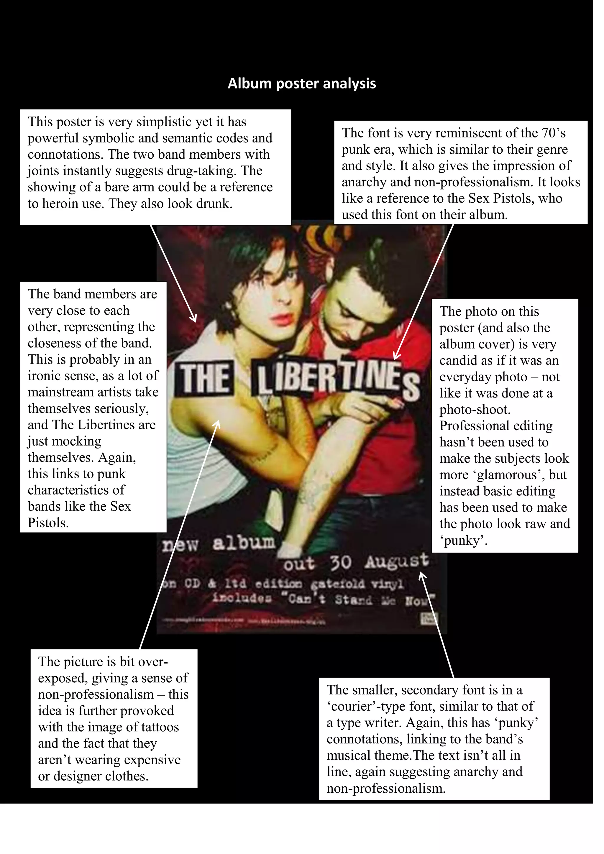
Album poster analysis
This poster is very simplistic yet it has
powerful symbolic and semantic codes and
connotations. The two band members with
joints instantly suggests drug-taking. The
showing of a bare arm could be a reference
to heroin use. They also look drunk.

The band members are
very close to each
other, representing the
closeness of the band.
This is probably in an
ironic sense, as a lot of
mainstream artists take
themselves seriously,
and The Libertines are
just mocking
themselves. Again,
this links to punk
characteristics of
bands like the Sex
Pistols.

The picture is bit overexposed, giving a sense of
non-professionalism – this
idea is further provoked
with the image of tattoos
and the fact that they
aren’t wearing expensive
or designer clothes.

The font is very reminiscent of the 70’s
punk era, which is similar to their genre
and style. It also gives the impression of
anarchy and non-professionalism. It looks
like a reference to the Sex Pistols, who
used this font on their album.

The photo on this
poster (and also the
album cover) is very
candid as if it was an
everyday photo – not
like it was done at a
photo-shoot.
Professional editing
hasn’t been used to
make the subjects look
more ‘glamorous’, but
instead basic editing
has been used to make
the photo look raw and
‘punky’.

The smaller, secondary font is in a
‘courier’-type font, similar to that of
a type writer. Again, this has ‘punky’
connotations, linking to the band’s
musical theme.The text isn’t all in
line, again suggesting anarchy and
non-professionalism.

Libertines album poster analysis

  • 1.
    Album poster analysis Thisposter is very simplistic yet it has powerful symbolic and semantic codes and connotations. The two band members with joints instantly suggests drug-taking. The showing of a bare arm could be a reference to heroin use. They also look drunk. The band members are very close to each other, representing the closeness of the band. This is probably in an ironic sense, as a lot of mainstream artists take themselves seriously, and The Libertines are just mocking themselves. Again, this links to punk characteristics of bands like the Sex Pistols. The picture is bit overexposed, giving a sense of non-professionalism – this idea is further provoked with the image of tattoos and the fact that they aren’t wearing expensive or designer clothes. The font is very reminiscent of the 70’s punk era, which is similar to their genre and style. It also gives the impression of anarchy and non-professionalism. It looks like a reference to the Sex Pistols, who used this font on their album. The photo on this poster (and also the album cover) is very candid as if it was an everyday photo – not like it was done at a photo-shoot. Professional editing hasn’t been used to make the subjects look more ‘glamorous’, but instead basic editing has been used to make the photo look raw and ‘punky’. The smaller, secondary font is in a ‘courier’-type font, similar to that of a type writer. Again, this has ‘punky’ connotations, linking to the band’s musical theme.The text isn’t all in line, again suggesting anarchy and non-professionalism.