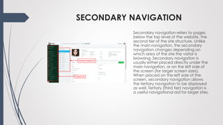
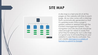
Lesson 6
ANATOMY OF A WEB PAGE
The Anatomy of a Web Page covers
the individual elements on a page,
what they're for and why you need
them. To see what page formats are
commonly used and to learn about
responsive designs.
PAGE HEADER
The area at the top of the page is
usually referred to as the page
header. On a typical page such
as Microsoft or eBay, this area is
between 50 and 100 pixels high. It
features the company logo, perhaps
a strap line and main navigation. It
often includes key information or
calls to action, such as a phone
number, contact button or search
box. This is the first thing that your
visitors will see, and will be a
common theme throughout your
site.
SITE STRUCTURE
You can think of a site structure as a
tree diagram or a directory with
nested sub folders. At the top of the
structure is home, immediately below
that the most important sections or
topics and inside those, further sub-
sections
MAIN NAVIGATION
The main navigation is usually a
horizontal row of 5-8 page links, which
are either at the top of the site
structure, or are the most important
pages on the website. These are
clearly visible and obvious, and are
often highlighted when the visitor is in
that section of the site. The first item is
usually a link back to the Home page,
although if you want to squeeze in
more navigation tabs this can be
removed as it's standard practice for
the logo in the page header to also be
a link back to the home page. With
more than 8 main navigation links, a
website can look cluttered.
SECONDARY NAVIGATION
Secondary navigation refers to pages
below the top level of the website, the
second tier of the site structure. Unlike
the main navigation, the secondary
navigation changes depending on
which area of the site the visitor is
browsing. Secondary navigation is
usually either placed directly under the
main navigation, or on the left side of
the screen (for larger screen sizes).
When placed on the left side of the
screen, secondary navigation allows
the tertiary navigation to be displayed
as well. Tertiary (third tier) navigation is
a useful navigational aid for larger sites.
META TAGS
Meta tags are fields which aren't
displayed on the screen to visitors
but are used by search engines. You
can read more about meta tags
and other behind-the-scenes
features of websites in our blog
about SEO (search engine
optimisation).
PAGE TITLE
The heading at the top your page is
crucial to attract a visitor's interest.
Studies have found that the vast
majority of visitors will look at a web
page for less than 30 seconds, so
your page needs a snappy (and
relevant) title to draw them in. The
page title should use the HTML H1
tag because it has special
significance to search engines
indexing your page.
BREADCRUMB TRAIL
A useful navigational aid, the
breadcrumb trail is usually placed
just below the page header and
shows at a glance where the visitor is
located in the site structure,
e.g. Home > Blog > Anatomy of a
web page. The breadcrumb trail
begins at the home page and each
link except the last should be
clickable to take the visitor up to that
section.
HERO IMAGES OR BANNER IMAGES
These terms refer to the large images
at the top of the page that grabs
the visitor's attention. If you have a
number of them that fade in and out
automatically or that visitors can
click through, this is often referred to
as a carousel. Its use should be
restricted to key pages such as the
home page in order to maximise the
effect.
FULL-SCREEN AND EMBEDDED VIDEOS
If you have a video you want to
include in a web page, the best way
is to upload it to a platform like
YouTube or Vimeo, then embed it in
your content (YouTube and Vimeo
give you the code to do this). Videos
take up a lot of disk space (physical
space on your website server) and
bandwidth (download traffic), so
you probably want to avoid hosting
them on your own website. In
addition, embedded videos come
with players so visitors can play,
pause, jump back and forward etc.
CONTENT WIDTH
An important consideration for
readability is the width of the main
content of a page. Text that spans
the whole page can be hard to
follow, which is why newspapers use
a series of narrow columns. On a
web page, content wider than
around 30 words can be hard for the
visitor's eye to track, so we
recommend breaking wide sites up
into columns to make them easier to
read.
SITE MAP
A site map is a text-only list of all the
pages on the website with links to each
page. All our sites come with a sitemap
that's automatically generated so that
it's updated every time a page is
added, edited or deleted through the
Content Management System. Your
navigation and site structure should be
clear enough for visitors to easily find
what they're looking for, but a site map
is a good way to list everything on your
website in case they're confused. You
can create sitemaps in a variety of
formats to submit to Google.

Lesson 6

  • 1.
  • 2.
    ANATOMY OF AWEB PAGE The Anatomy of a Web Page covers the individual elements on a page, what they're for and why you need them. To see what page formats are commonly used and to learn about responsive designs.
  • 3.
    PAGE HEADER The areaat the top of the page is usually referred to as the page header. On a typical page such as Microsoft or eBay, this area is between 50 and 100 pixels high. It features the company logo, perhaps a strap line and main navigation. It often includes key information or calls to action, such as a phone number, contact button or search box. This is the first thing that your visitors will see, and will be a common theme throughout your site.
  • 4.
    SITE STRUCTURE You canthink of a site structure as a tree diagram or a directory with nested sub folders. At the top of the structure is home, immediately below that the most important sections or topics and inside those, further sub- sections
  • 5.
    MAIN NAVIGATION The mainnavigation is usually a horizontal row of 5-8 page links, which are either at the top of the site structure, or are the most important pages on the website. These are clearly visible and obvious, and are often highlighted when the visitor is in that section of the site. The first item is usually a link back to the Home page, although if you want to squeeze in more navigation tabs this can be removed as it's standard practice for the logo in the page header to also be a link back to the home page. With more than 8 main navigation links, a website can look cluttered.
  • 6.
    SECONDARY NAVIGATION Secondary navigationrefers to pages below the top level of the website, the second tier of the site structure. Unlike the main navigation, the secondary navigation changes depending on which area of the site the visitor is browsing. Secondary navigation is usually either placed directly under the main navigation, or on the left side of the screen (for larger screen sizes). When placed on the left side of the screen, secondary navigation allows the tertiary navigation to be displayed as well. Tertiary (third tier) navigation is a useful navigational aid for larger sites.
  • 7.
    META TAGS Meta tagsare fields which aren't displayed on the screen to visitors but are used by search engines. You can read more about meta tags and other behind-the-scenes features of websites in our blog about SEO (search engine optimisation).
  • 8.
    PAGE TITLE The headingat the top your page is crucial to attract a visitor's interest. Studies have found that the vast majority of visitors will look at a web page for less than 30 seconds, so your page needs a snappy (and relevant) title to draw them in. The page title should use the HTML H1 tag because it has special significance to search engines indexing your page.
  • 9.
    BREADCRUMB TRAIL A usefulnavigational aid, the breadcrumb trail is usually placed just below the page header and shows at a glance where the visitor is located in the site structure, e.g. Home > Blog > Anatomy of a web page. The breadcrumb trail begins at the home page and each link except the last should be clickable to take the visitor up to that section.
  • 10.
    HERO IMAGES ORBANNER IMAGES These terms refer to the large images at the top of the page that grabs the visitor's attention. If you have a number of them that fade in and out automatically or that visitors can click through, this is often referred to as a carousel. Its use should be restricted to key pages such as the home page in order to maximise the effect.
  • 11.
    FULL-SCREEN AND EMBEDDEDVIDEOS If you have a video you want to include in a web page, the best way is to upload it to a platform like YouTube or Vimeo, then embed it in your content (YouTube and Vimeo give you the code to do this). Videos take up a lot of disk space (physical space on your website server) and bandwidth (download traffic), so you probably want to avoid hosting them on your own website. In addition, embedded videos come with players so visitors can play, pause, jump back and forward etc.
  • 12.
    CONTENT WIDTH An importantconsideration for readability is the width of the main content of a page. Text that spans the whole page can be hard to follow, which is why newspapers use a series of narrow columns. On a web page, content wider than around 30 words can be hard for the visitor's eye to track, so we recommend breaking wide sites up into columns to make them easier to read.
  • 13.
    SITE MAP A sitemap is a text-only list of all the pages on the website with links to each page. All our sites come with a sitemap that's automatically generated so that it's updated every time a page is added, edited or deleted through the Content Management System. Your navigation and site structure should be clear enough for visitors to easily find what they're looking for, but a site map is a good way to list everything on your website in case they're confused. You can create sitemaps in a variety of formats to submit to Google.