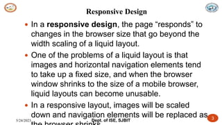
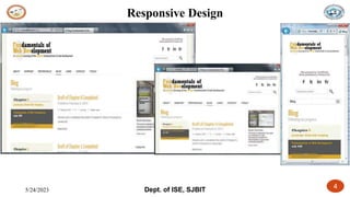
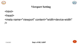
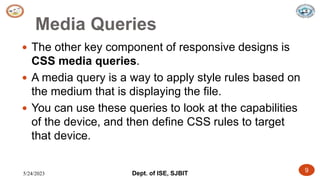
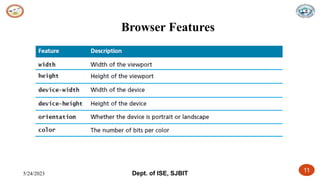
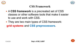
This document discusses responsive web design and its key components: liquid layouts, scaling images, viewports defined by meta tags, and media queries customized with CSS. It describes grid systems from frameworks like Bootstrap and 960 that make multi-column layouts easier. CSS preprocessors are also covered, which allow variables, inheritance and other programming features to enhance CSS. Examples are provided of grid systems and using a preprocessor like Sass.