Download to read offline
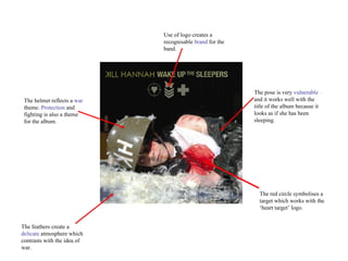
The band's logo uses a red circle symbolizing a target to create a recognizable brand that works with their "heart target" logo. The helmet reflects a war theme of protection and fighting that is also present on the album, while contrasting feathers create a delicate atmosphere that contrasts with the idea of war. The vulnerable pose looks like she has been sleeping and works well with the album title.


