Download as PDF, PPTX


![Theme - set up
• As a link tag
• Component level
• Scss
• Angular-cli.json , styles
<link rel="stylesheet" href="/node_modules/@progress/kendo-theme-default/dist/all.css" />
styleUrls: [
‘../../node_modules/@progress/kendo-theme-default/dist/all.css' ]
ViewEncapsulation.None
@import "~@progress/kendo-theme-default/scss/all";
"styles": [
"styles.css",
"../node_modules/@progress/kendo-theme-default/dist/all.css"
]](https://image.slidesharecdn.com/kendoui-171123161947/75/Kendoui-8-2048.jpg)


![Install & Usage
Buttons
npm install --save
@progress/kendo-angular-buttons
@progress/kendo-angular-l10n
@angular/animations
@NgModule({
imports : [ ButtonsModule ]
})
export class SomeModule {}
import { ButtonsModule } from '@progress/kendo-angular-buttons';
All buttons
@NgModule({
imports : [ ButtonModule ]
})
export class SomeModule {}
import { ButtonModule } from '@progress/kendo-angular-button'; Specific button](https://image.slidesharecdn.com/kendoui-171123161947/75/Kendoui-12-2048.jpg)
![Buttons
Display buttons
@Component({
selector: 'buttons-example',
template: `
<div>
<button kendoButton [icon]="'refresh'">Default button</button>
// Image icon
<button kendoButton [imageUrl]="'https://demos.telerik.com/kendo-ui/content/shared/icons/sports/
snowboarding.png'">Snowboarding</button>
// FontAwsome icon
<link rel="stylesheet" href="https://maxcdn.bootstrapcdn.com/font-awesome/4.5.0/css/font-awesome.min.css"
<button kendoButton [iconClass]="'fa fa-key fa-fw'">Button</button>
</div>
`
})
export class ButtonsExampleComponent implements OnInit {
constructor() { }
ngOnInit() { }
}
Built in Kendo icons
Point out url
Point out CSS class,
ex font-awesome](https://image.slidesharecdn.com/kendoui-171123161947/75/Kendoui-13-2048.jpg)
![Buttons with Ripple effect,
i.e Material Look and Feel
import { RippleModule } from '@progress/kendo-angular-ripple';
@NgModule({
imports: [
RippleModule
]
})
export class AppModule {
}
npm install @progress/kendo-angular-ripple
<div kendoRippleContainer>
<link rel="stylesheet" href="https://maxcdn.bootstrapcdn.com/font-awesome/4.5.0/css/font-awesome.min.css">
<button kendoButton [iconClass]="'fa fa-key fa-fw'">Button</button>
</div>](https://image.slidesharecdn.com/kendoui-171123161947/75/Kendoui-14-2048.jpg)

![Install & usage
npm install --save
@progress/kendo-angular-charts
@progress/kendo-angular-intl
@progress/kendo-angular-l10n
@progress/kendo-drawing
hammerjs
@angular/animations
npm packages needed
@NgModule({
imports : [ ChartsModule ]
})
export class SomeModule {}
import { ChartsModule } from '@progress/kendo-angular-charts';
All charts
@NgModule({
imports : [ ChartModule ]
})
export class SomeModule {}
import { ChartModule } from '@progress/kendo-angular-charts';
Specific chart
Charts](https://image.slidesharecdn.com/kendoui-171123161947/75/Kendoui-16-2048.jpg)
![Display a chart
Charts
@Component({
selector: 'my-app',
template: `
<kendo-chart [resizeRateLimit]="2">
<kendo-chart-series>
<kendo-chart-series-item [data]="seriesData">
</kendo-chart-series-item>
</kendo-chart-series>
</kendo-chart>
`
})
export class AppComponent {
seriesData: number[] = [1, 2, 3, 5];
}
Responsive](https://image.slidesharecdn.com/kendoui-171123161947/75/Kendoui-17-2048.jpg)
![Handle events
Charts
export class AppComponent {
private seriesData: number[] = [1, 2, 3, 5];
private onSeriesClick(e): void {
console.log(e.value);
}
}
@Component({
selector: 'my-app',
template: `
<kendo-chart [resizeRateLimit]=“2" onSeriesClick($event)>
<kendo-chart-series>
<kendo-chart-series-item [data]="seriesData">
</kendo-chart-series-item>
</kendo-chart-series>
</kendo-chart>
`
})
Clicking on
this column returns a 2](https://image.slidesharecdn.com/kendoui-171123161947/75/Kendoui-18-2048.jpg)

![Dropdowns
Install & usage
npm install --save
@progress/kendo-angular-dropdowns
@progress/kendo-angular-l10n @angular/animations
import { DropDownsModule } from '@progress/kendo-angular-dropdowns';
@NgModule({
imports: [DropDownsModule]
})
export class AppModule {
}
All dropdown
import { AutoCompleteModule } from '@progress/kendo-angular-dropdowns';
@NgModule({
imports: [AutoCompleteModule]
})
export class AppModule {
}
Specific dropdown](https://image.slidesharecdn.com/kendoui-171123161947/75/Kendoui-20-2048.jpg)
![Dropdowns
import { Component } from '@angular/core';
@Component({
selector: 'dropdown-example',
template: `
<kendo-autocomplete [data]="data"
[filterable]="true"
(valueChange)="valueChange($event)"
(filterChange)="filterChange($event)"
(open)="open()"
(close)="close()"
(focus)="focus()"
(blur)="blur()"
>
</kendo-autocomplete>
`
})
export class DropdownExampleComponent {
public events: string[] = [];
public source: Array<string> = ["Luke", "Vader", "Palpatine", "Yoda", "Dokuu"];
public data: Array<string> = this.source;
public filterChange(filter: any): void {
console.log("filterChange", filter);
this.data = this.source.filter((s) => s.toLowerCase().indexOf(filter.toLowerCase()) !== -1);
}
}
Assign data property
with your list
Filter, as user types](https://image.slidesharecdn.com/kendoui-171123161947/75/Kendoui-21-2048.jpg)

![Install & usage
Grid
import { GridModule } from '@progress/kendo-angular-grid';
@NgModule({
imports: [BrowserModule, BrowserAnimationsModule, GridModule]
})
export class AppModule {
}
npm install --save
@progress/kendo-angular-grid
@progress/kendo-angular-dropdowns
@progress/kendo-angular-inputs
@progress/kendo-angular-dateinputs
@progress/kendo-data-query
@progress/kendo-angular-intl
@progress/kendo-angular-l10n
@progress/kendo-drawing
@progress/kendo-angular-excel-export
@angular/animations
Quite a few dependencies!](https://image.slidesharecdn.com/kendoui-171123161947/75/Kendoui-23-2048.jpg)
![Display a Grid
Grid
import { Component } from '@angular/core';
import { customers } from './customers';
@Component({
selector: 'grid-example',
template: `
<kendo-grid
[kendoGridBinding]="gridData"
[pageSize]="10"
[pageable]="true"
[sortable]="true"
[filterable]="true"
[groupable]="true"
[height]="510">
<kendo-grid-column field="CompanyName" [width]="140"></kendo-grid-column>
<kendo-grid-column field="ContactName" [width]="120"></kendo-grid-column>
<kendo-grid-column field="City" [width]="100"></kendo-grid-column>
<kendo-grid-column field="ContactTitle" [width]="130"></kendo-grid-column>
</kendo-grid>
`
})
export class GridExampleComponent {
gridData: any[] = customers;
}](https://image.slidesharecdn.com/kendoui-171123161947/75/Kendoui-24-2048.jpg)

![Install & usage
Layout
npm install --save
@progress/kendo-angular-layout
@progress/kendo-angular-l10n
@angular/animations
import { LayoutModule } from '@progress/kendo-angular-layout';
@NgModule({
imports: [LayoutModule]
})
export class AppModule {
}
All layout
import { PanelBarModule } from '@progress/kendo-angular-layout';
@NgModule({
imports: [PanelBarModule]
})
export class AppModule {}
Specific layout](https://image.slidesharecdn.com/kendoui-171123161947/75/Kendoui-26-2048.jpg)
![Layout
@Component({
selector: 'layout-example',
styles: [`
.custom-template {
padding: 30px;
text-align: center;
}
`],
template: `
<kendo-panelbar [items]="items"
(stateChange)="onPanelChange($event)">
<ng-template kendoPanelBarItemTemplate let-dataItem>
<div [class]="'custom-template'">
<h4>Custom template: </h4>
<p>{{dataItem.content}}</p>
</div>
</ng-template>
</kendo-panelbar>`
})
export class LayoutExampleComponent {
private items: Array<PanelBarItemModel> = [
<PanelBarItemModel>{ title: "First item", content: "Item content", expanded: true },
<PanelBarItemModel>{
title: "Second item", children: [
<PanelBarItemModel>{ title: "Child item", content: "More content" }
]
}
];
public onPanelChange(event: any) { console.log("stateChange: ", event); }
Nested
Title,
Content,
Expanded,
Children](https://image.slidesharecdn.com/kendoui-171123161947/75/Kendoui-27-2048.jpg)

![Install & usage
Popup
npm install --save
@progress/kendo-angular-popup
@angular/animations
import { PopupModule } from '@progress/kendo-angular-popup';
@NgModule({
imports: [PopupModule]
})
export class AppModule {
}](https://image.slidesharecdn.com/kendoui-171123161947/75/Kendoui-29-2048.jpg)
![@Component({
selector: 'popup-example',
template: `
<button #anchor (click)="onToggle()" class="k-button">{{toggleText}} Popup</button>
<kendo-popup [animate]="false" [anchor]="anchor" [popupClass]="'content popup'" *ngIf="show">
Popup content.
</kendo-popup>
`,
styles: [`
.content {
padding: 30px;
color: #787878;
background-color: #fcf7f8;
border: 1px solid rgba(0,0,0,.05);
}
`]
})
export class PopupExampleComponent {
private toggleText: string = "Show";
private show: boolean = false;
public onToggle(): void {
this.show = !this.show;
this.toggleText = this.show ? "Hide" : "Show";
}
}
Popup with component offset
Anchor next to an element](https://image.slidesharecdn.com/kendoui-171123161947/75/Kendoui-30-2048.jpg)
![Popup with absolute offset
@Component({
selector: 'popup-example',
template: `
<kendo-popup [popupClass]="'content'" [offset]="offset">
Popup content.
</kendo-popup>
`,
styles: [`
.content {
padding: 30px;
color: #787878;
background-color: #fcf7f8;
border: 1px solid rgba(0,0,0,.05);
}
.test {
margin-top: 50px;
min-height: 200px;
border: solid 2px gray;
}
`]
})
export class PopupExampleComponent {
public offset: offset = { left: 100, top: 100 };
}
Absolute offset](https://image.slidesharecdn.com/kendoui-171123161947/75/Kendoui-31-2048.jpg)
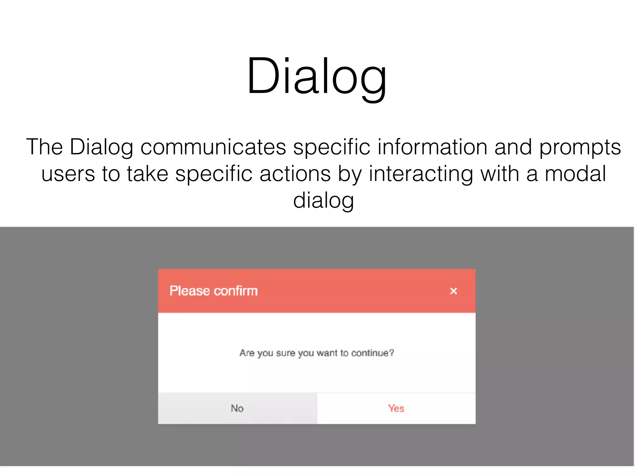
![Install & usage
Dialog
npm install --save
@progress/kendo-angular-dialog
@progress/kendo-angular-l10n
@angular/animations
import { DialogModule } from '@progress/kendo-angular-dialog';
@NgModule({
imports: [DialogModule]
})
export class AppModule {
}](https://image.slidesharecdn.com/kendoui-171123161947/75/Kendoui-34-2048.jpg)


![Install & usage
Date inputs
npm install --save
@progress/kendo-angular-dateinputs
@progress/kendo-angular-intl
@progress/kendo-angular-l10n
@angular/animations
import { DateInputsModule } from '@progress/kendo-angular-dateinputs';
@NgModule({
bootstrap: [AppComponent],
imports: [DateInputsModule]
})
export class AppModule {}
All DateInputs
import { CalendarModule } from '@progress/kendo-angular-dateinputs';
@NgModule({
bootstrap: [AppComponent],
imports: [CalendarModule]
})
export class AppModule {}
Specific DateInput](https://image.slidesharecdn.com/kendoui-171123161947/75/Kendoui-39-2048.jpg)
![Display date inputs
Date inputs
import { Component, OnInit } from '@angular/core';
@Component({
selector: 'date-input-example',
template: `
<kendo-calendar [disabled]="true"></kendo-calendar>
`
})
export class DateInputsExampleComponent implements OnInit {
constructor() { }
ngOnInit() { }
}
Possible to set
in disabled state](https://image.slidesharecdn.com/kendoui-171123161947/75/Kendoui-40-2048.jpg)
![Date inputs
import { Component, OnInit } from '@angular/core';
@Component({
selector: 'date-input-example',
template: `
<kendo-calendar [disabled]="true"></kendo-calendar>
<kendo-calendar [focusedDate]="focusedDate" ></kendo-calendar>
<kendo-calendar [value]="value"></kendo-calendar>
`
})
export class DateInputsExampleComponent implements OnInit {
public focusedDate: Date = new Date(2017, 11, 10);
public value: Date = new Date(2017, 11, 10);
constructor() { }
ngOnInit() { }
}
Open calendar in the right week
Select a specific day](https://image.slidesharecdn.com/kendoui-171123161947/75/Kendoui-41-2048.jpg)

![Install & usage
Inputs
npm install --save
@progress/kendo-angular-inputs
@progress/kendo-angular-intl
@progress/kendo-angular-l10n
@angular/animations
import { InputsModule } from '@progress/kendo-angular-inputs';
@NgModule({
imports: [InputsModule]
})
export class AppModule {
}
All Inputs
import { MaskedTextBoxModule } from '@progress/kendo-angular-inputs';
import { NumericTextBoxModule } from '@progress/kendo-angular-inputs';
@NgModule({
imports: [
MaskedTextBoxModule, NumericTextBoxModule
]
})
export class AppModule {
Specific Input](https://image.slidesharecdn.com/kendoui-171123161947/75/Kendoui-43-2048.jpg)
![Inputs
import { Component } from "@angular/core";
@Component({
selector: 'input-example',
template: `
<div class="example-config">
<input id="ac" type="checkbox" [(ngModel)]="includeLiterals">
<label for="ac">Include literals in the value</label>
</div>
<div class="example-wrapper">
<kendo-maskedtextbox
[includeLiterals]="includeLiterals"
[(value)]="value"
[mask]="mask">
</kendo-maskedtextbox>
Component value: {{value}}
</div>
`
})
export class InputExampleComponent {
public includeLiterals: boolean = false;
public value: string = "5748157000194334";
public mask: string = "0000-0000-0000-0000";
}
mask dictates
form and length](https://image.slidesharecdn.com/kendoui-171123161947/75/Kendoui-44-2048.jpg)
![@Component({
selector: 'my-app',
template: `
<div class="example-config">
<p>{{ mask }}</p>
<ul>
<li>Y - cyrillic only</li>
<li>L - latin only</li>
</ul>
</div>
<kendo-maskedtextbox
[value]="value"
[mask]="mask"
[rules]="rules">
</kendo-maskedtextbox>
`
})
class AppComponent {
public value: string = "абвг abcd";
public mask: string = "YYYY LLLL";
public rules: { [key: string]: RegExp } = {
"L": /[a-zA-Z]/,
"Y": /[u0400-u0481u048A-u04FF]/
};
}
Inputs
Mask with RegEx rules](https://image.slidesharecdn.com/kendoui-171123161947/75/Kendoui-45-2048.jpg)

![Install & usage
Sortable
npm install --save
@progress/kendo-angular-sortable
@progress/kendo-angular-l10n
@angular/animations
import { SortableModule } from '@progress/kendo-angular-sortable';
@NgModule({
bootstrap: [AppComponent],
declarations: [AppComponent],
imports: [SortableModule]
})
export class AppModule {
}](https://image.slidesharecdn.com/kendoui-171123161947/75/Kendoui-47-2048.jpg)
![Sortable
import { Component, ViewEncapsulation } from '@angular/core';
@Component({
selector: 'sortable-example',
template: `
<div class="example-config">
<h5>Items: {{items | json}}</h5>
<h5>Disabled items: {{disabledIndexes}}</h5>
</div>
<div class="container-fluid">
<kendo-sortable
[data]="items"
[navigatable]="true"
[animation]="true"
[disabledIndexes]="disabledIndexes"
class="row"
itemClass="item col-xs-6 col-sm-3"
activeItemClass="item col-xs-6 col-sm-3 active"
disabledItemClass="item col-xs-6 col-sm-3 disabled">
>
</kendo-sortable>
</div>
`,
encapsulation: ViewEncapsulation.None
})
export class SortableExampleComponent {
public disabledIndexes: number[] = [0, 2, 5, 7];
public items: string[] = [];
constructor() {
Won’t be
drag n drop targets](https://image.slidesharecdn.com/kendoui-171123161947/75/Kendoui-48-2048.jpg)

![Install & usage
Upload
npm install --save
@progress/kendo-angular-upload
@progress/kendo-angular-l10n
@angular/animations
import { UploadModule } from ‘@progress/kendo-angular-upload';
import { HttpClientModule } from ‘@angular/common/http’;
@NgModule({
imports: [HttpClientModule, UploadModule]
})
export class AppModule {
}](https://image.slidesharecdn.com/kendoui-171123161947/75/Kendoui-50-2048.jpg)
![Upload
import { Component, ViewChild, ElementRef } from '@angular/core';
import { FileRestrictions, SelectEvent, ClearEvent, RemoveEvent, FileInfo } from '@progress/kendo-angular-
upload';
@Component({
selector: 'upload-example',
template: `
<kendo-upload
[autoUpload]="false"
[saveUrl]="uploadSaveUrl"
[removeUrl]="uploadRemoveUrl"
[restrictions]="uploadRestrictions"
(select)="selectEventHandler($event)"
(clear)="clearEventHandler($event)"
(remove)="removeEventHandler($event)"
(complete)="completeEventHandler($event)">
</kendo-upload>
<event-log title="Event log" [events]="events"></event-log>
<div *ngIf="imagePreviews.length" class="img-preview example-config">
<h3>Preview selected images</h3>
<img *ngFor="let image of imagePreviews"
[src]="image.src"
alt="image preview"
style="width: 200px; margin: 10px;" />
</div>
`
POST with this url
Press upload button
Select file and get preview](https://image.slidesharecdn.com/kendoui-171123161947/75/Kendoui-51-2048.jpg)

![Install & usage
Data query
npm install --save @progress/kendo-data-query
import { filterBy } from '@progress/kendo-data-query';
const data = [
{ name: "Pork", category: "Food", subcategory: "Meat" },
{ name: "Pepper", category: "Food", subcategory: "Vegetables" },
{ name: "Beef", category: "Food", subcategory: "Meat" }
];
const result = filterBy(data, {
logic: 'and',
filters: [
{ field: "name", operator: "startswith", value: "p", ignoreCase: true },
{ field: "subcategory", operator: "eq", value: "Meat" },
]
});
console.log(JSON.stringify(result, null, 2));
/* output
[
{ "name": "Pork", "category": "Food", "subcategory": "Meat" }
]
light weight impl
of common functions](https://image.slidesharecdn.com/kendoui-171123161947/75/Kendoui-53-2048.jpg)


This document provides an overview of using Kendo UI components with Angular. It discusses why one might choose to use Kendo UI, describes some of the main component groups like buttons, charts, dropdowns, grids, layout, popup, dialog, date inputs and inputs. It also covers how to install and configure themes, and how to import, display and handle events of the different components. The document is intended as a guide for developers looking to get started with building applications using Kendo UI and Angular.
Presentation by Chris Noring from Digital McKinsey introducing Kendo UI with Angular.
Discusses the importance of Kendo UI for developers facing time constraints and needing UI components.
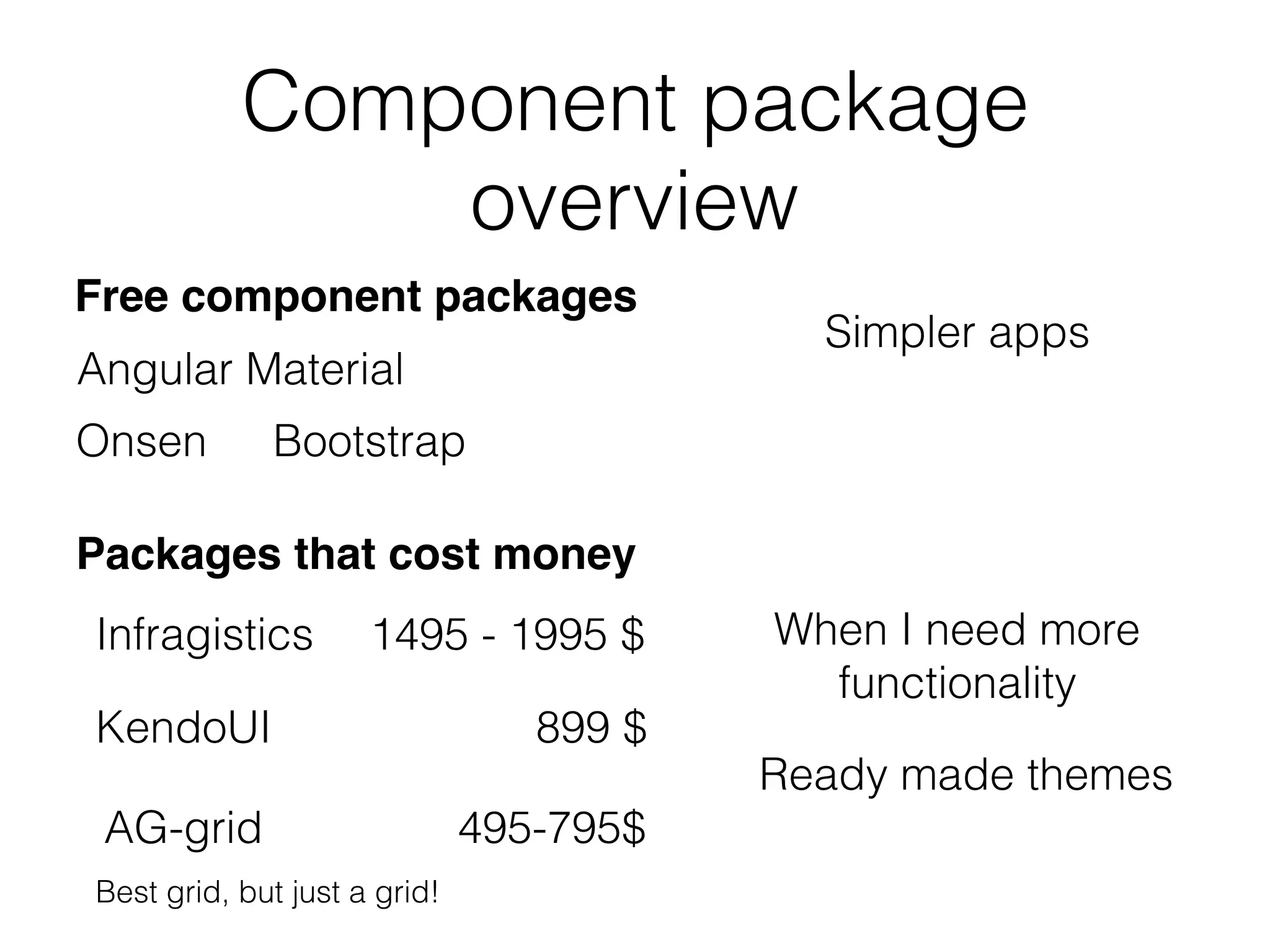
Overview of free and paid component packages, with pricing and functionality details.
Lists various Kendo UI component groups like buttons, charts, grids, among others.
Describes what is expected from component frameworks, including input controls, themes, and export functions.
Instructions on how to install Kendo UI themes and necessary npm libraries for use in Angular apps.
Commands for installing various Kendo UI themes using npm.
Details on how to set up themes in Angular applications using style links and file imports.
Demonstrates how to apply different Kendo UI themes in an Angular project.
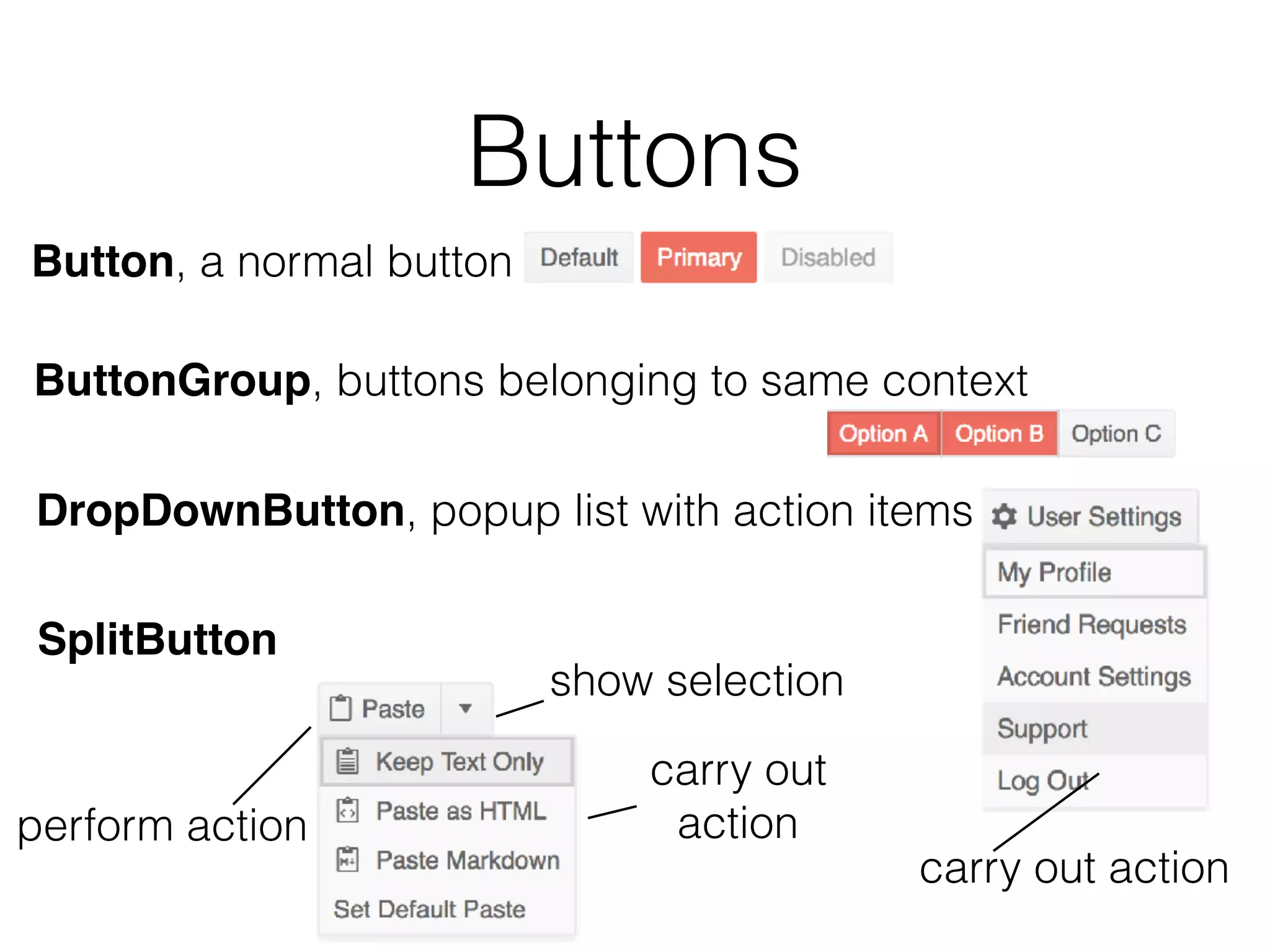
Overview and installation details for different button components, including examples of usage.
Shows how to add ripple effects to buttons for a modern look, utilizing specific Kendo modules.
Describes various chart types available in Kendo UI, how to install them, and examples of implementation.
Introduction to different dropdown types, installation commands, and examples of their use in Angular.
Overview of grid functionalities in Kendo UI including binding, filtering, and installation.
Introduces layout components like TabStrip and PanelBar, along with installation guidelines.
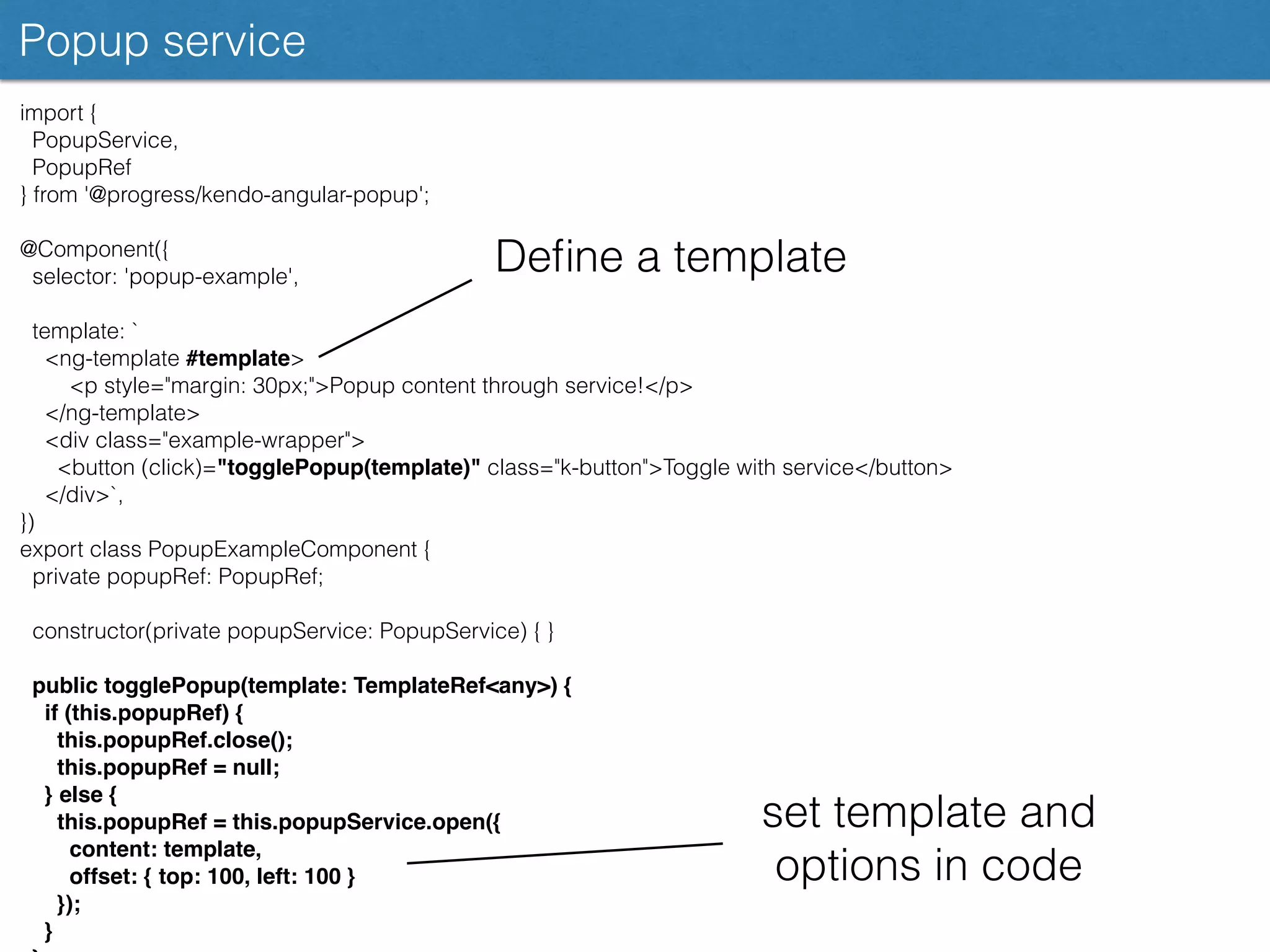
Details on using Kendo UI Popup components including installation and example implementations.
Introduction to Dialog components for user interactions, including installation and usage examples.
Discusses various date input components that Kendo provides along with installation and usage.
Introduces input components like MaskedTextBox and NumericTextBox, with installation instructions.
Describes sortable functionalities for lists, along with usage examples and installation.
Highlights the Upload component for file handling with installation instructions and example usage.
Introduces data query functionalities such as sorting and filtering using Kendo's data query package.
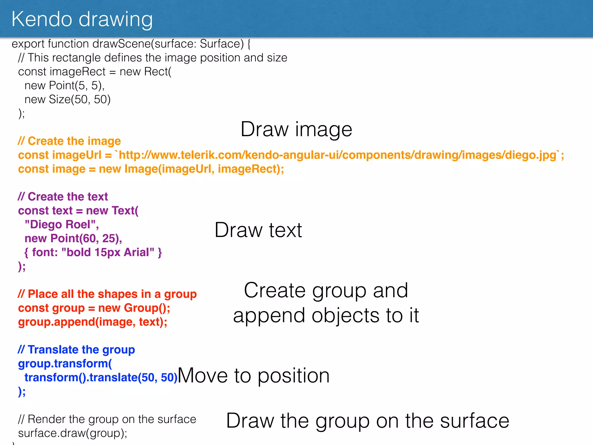
Explains Kendo drawing capabilities for creating and manipulating visual elements programmatically.
Summarizes the capabilities of Kendo UI, including component variety and functionalities for developers.
Provides links to additional resources and demos for exploring Kendo UI further.
Thank you slide by Chris Noring concluding the presentation.


