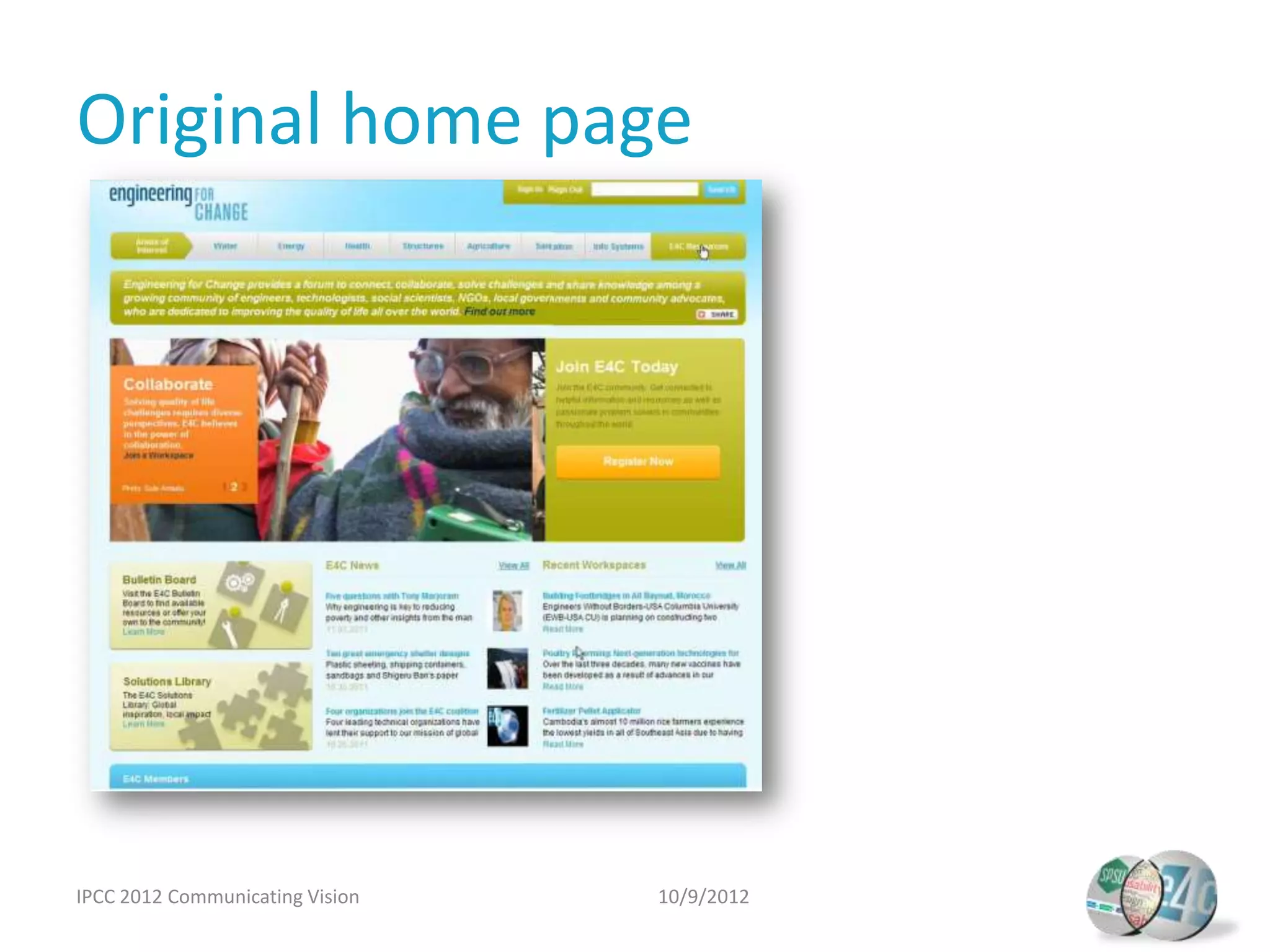
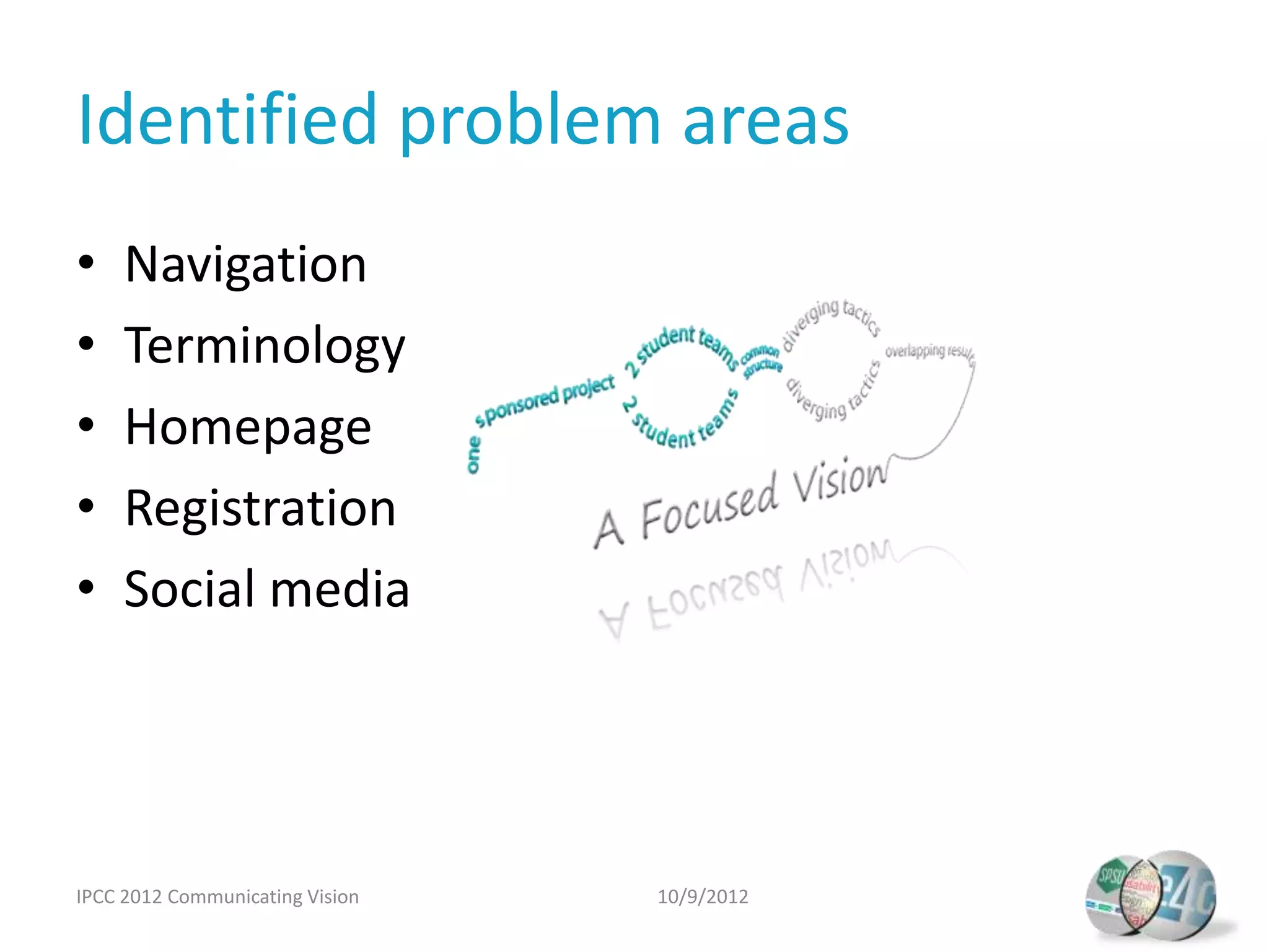
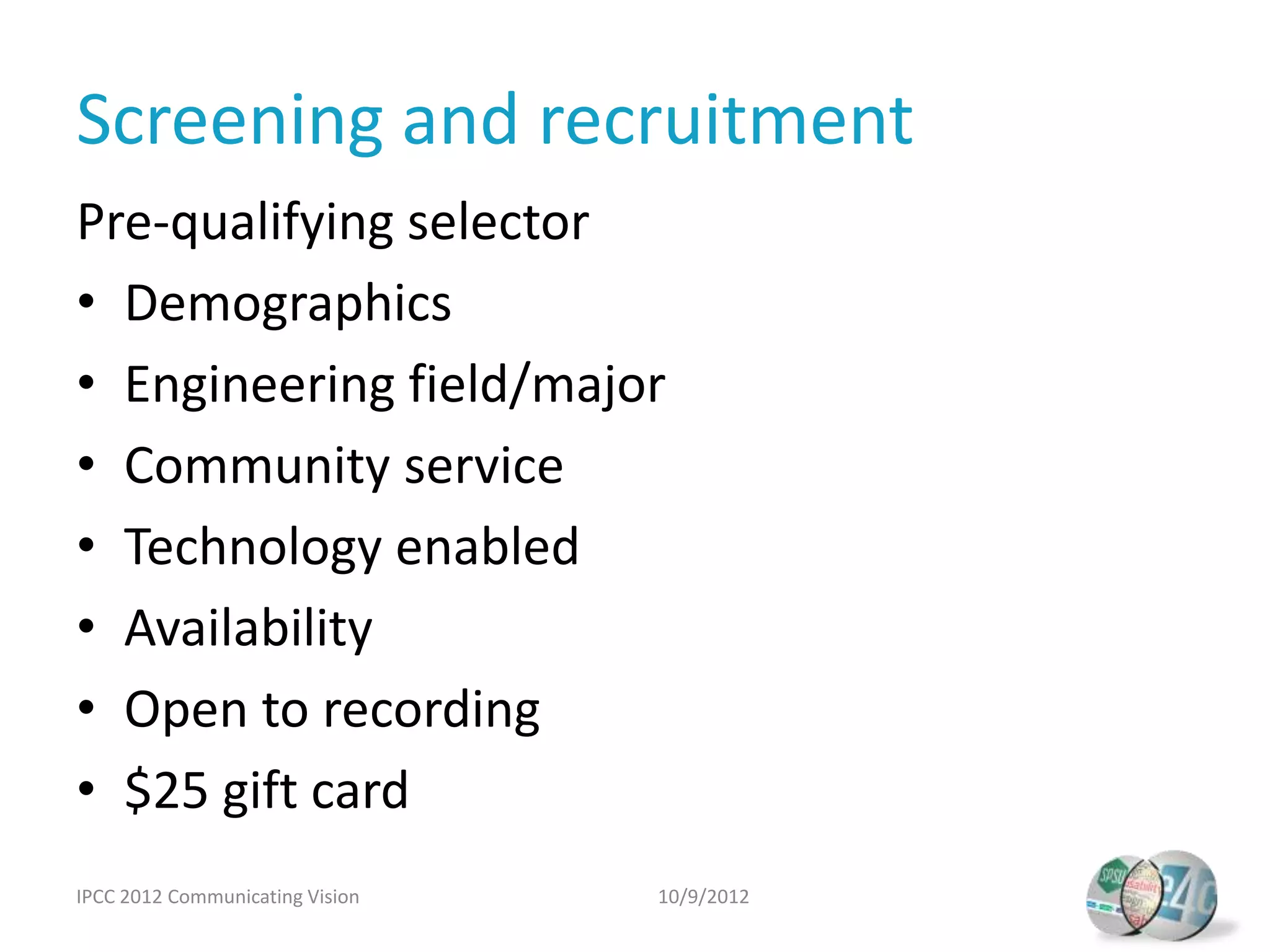
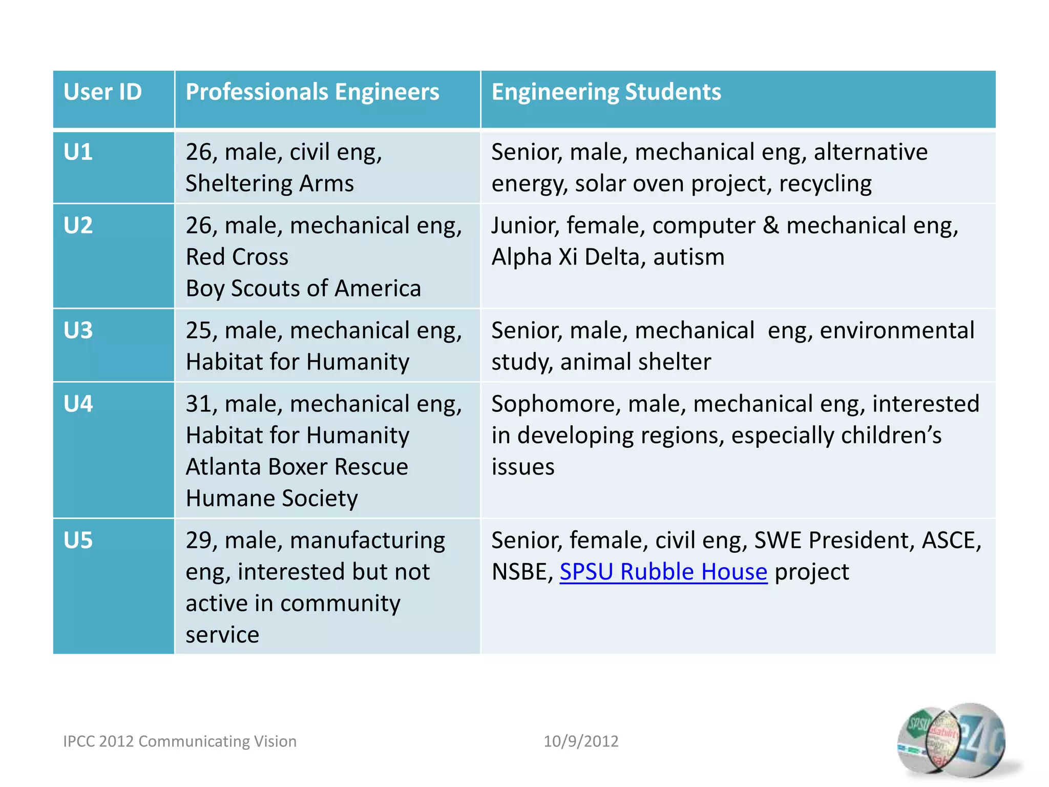
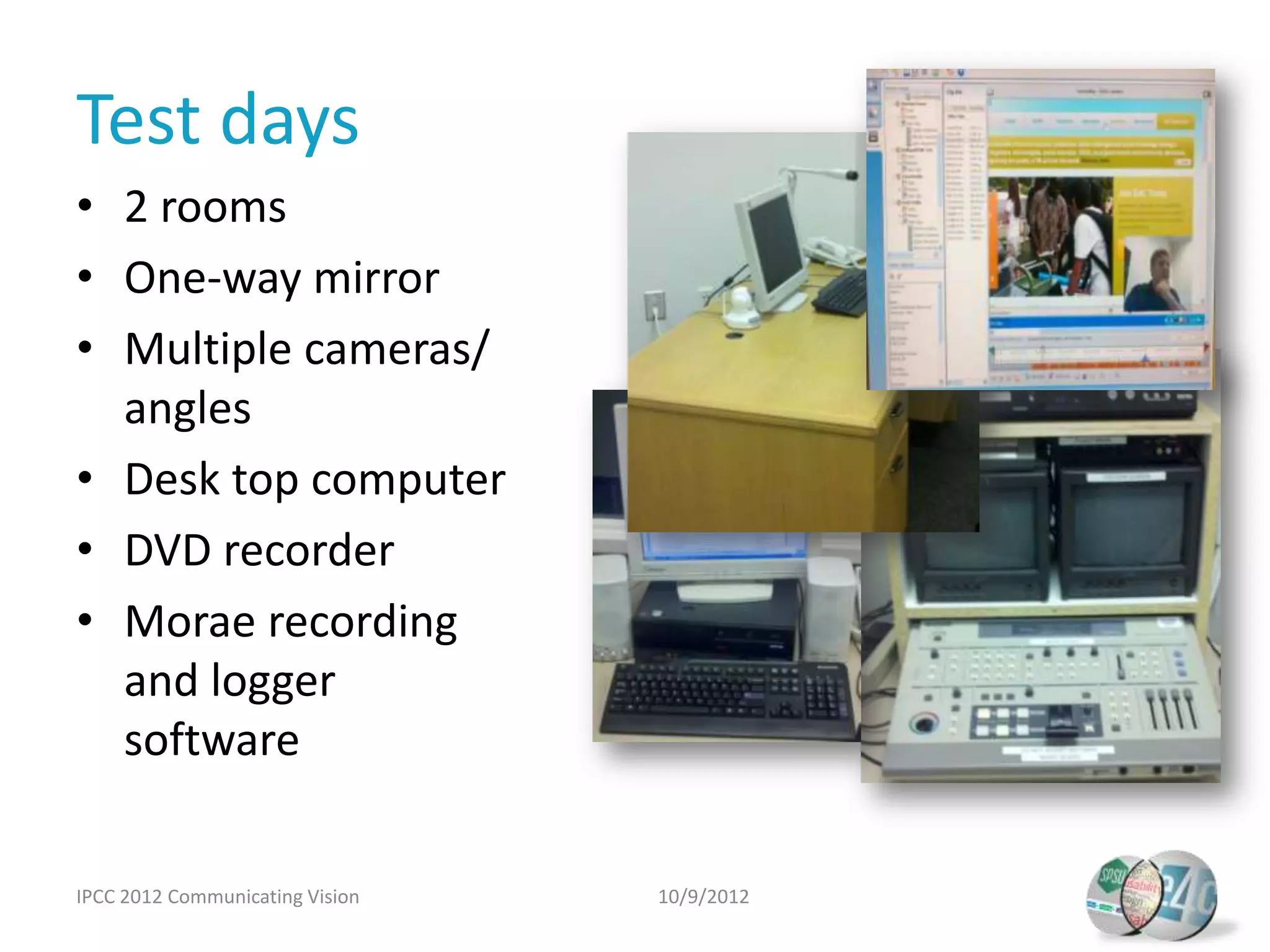
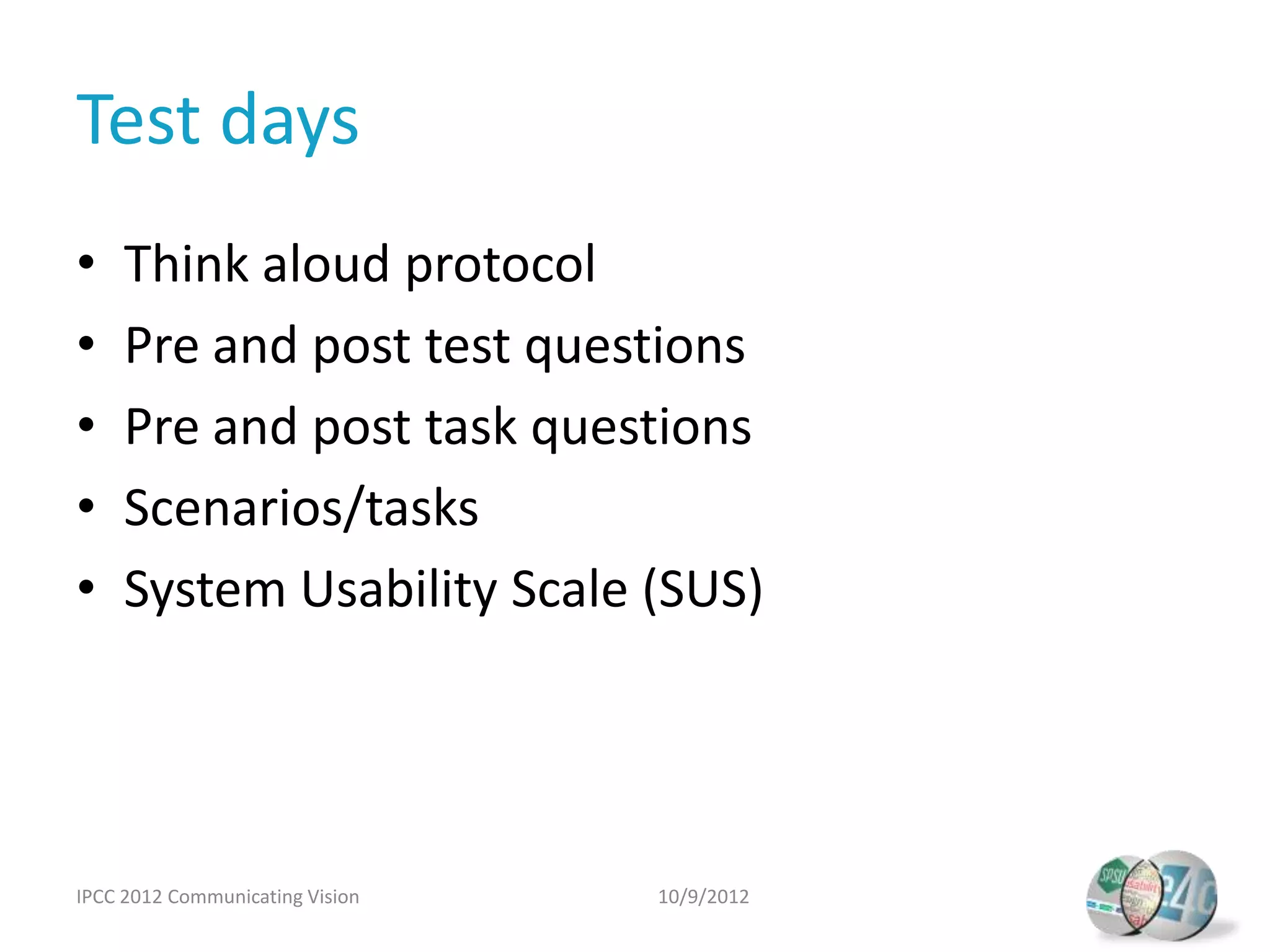
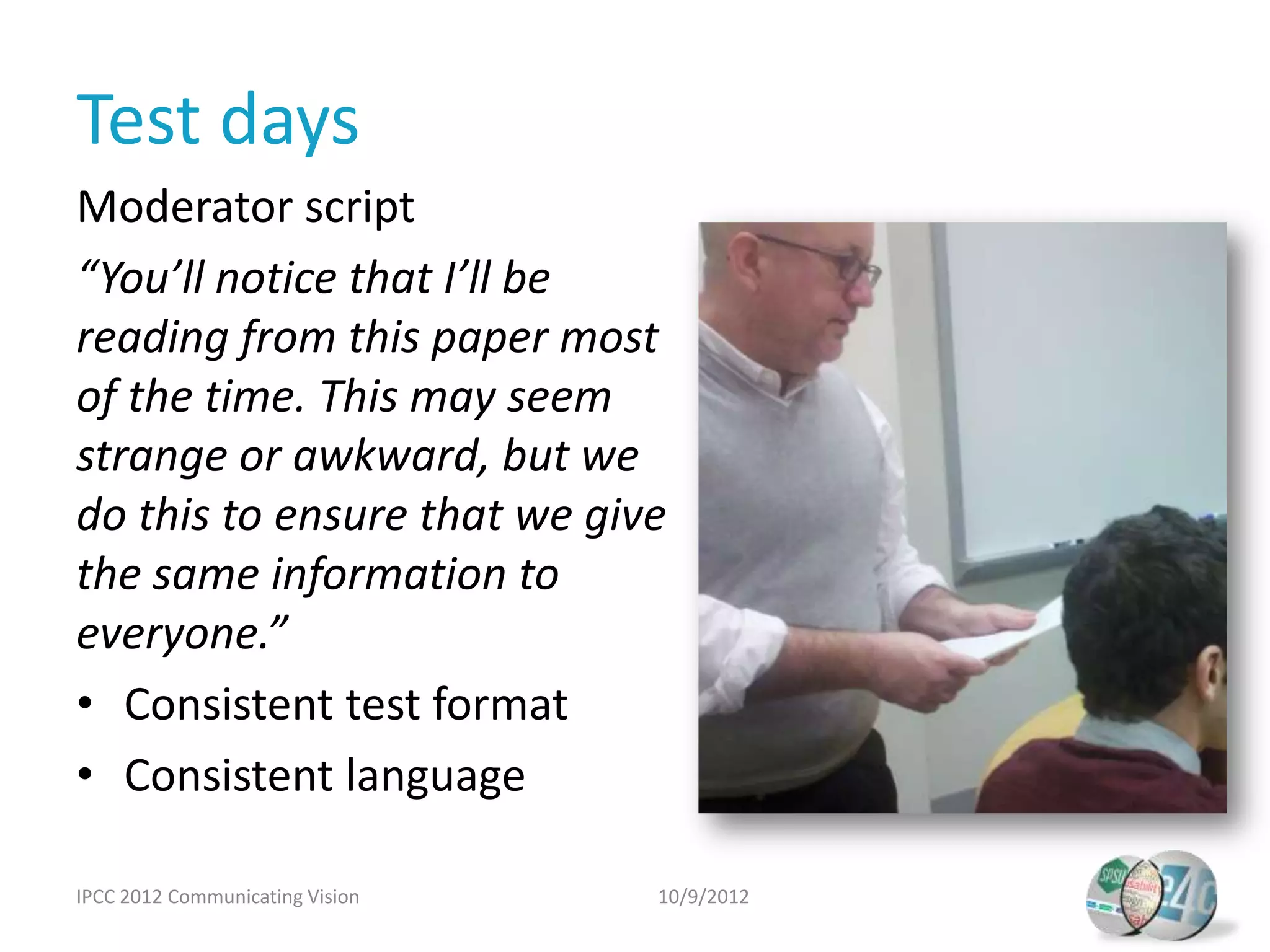
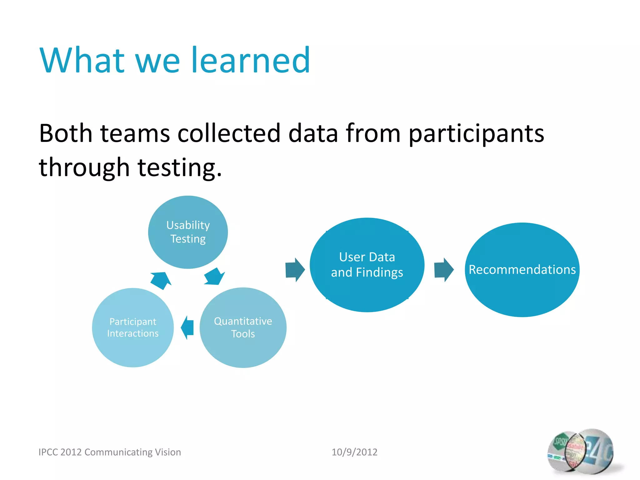
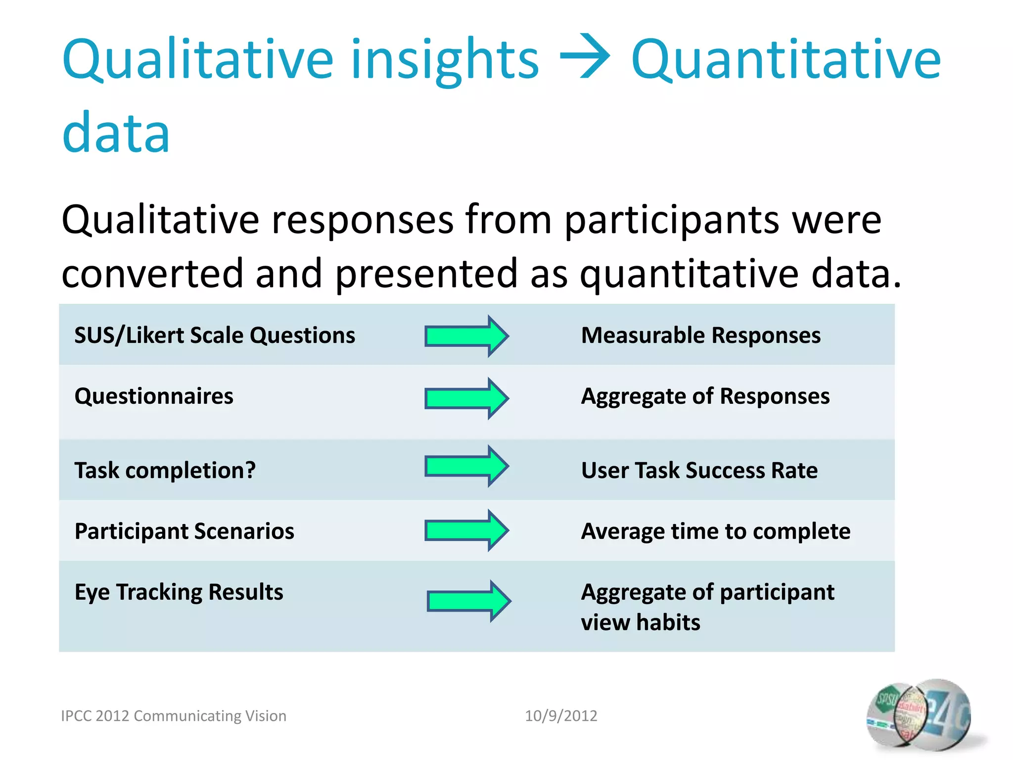
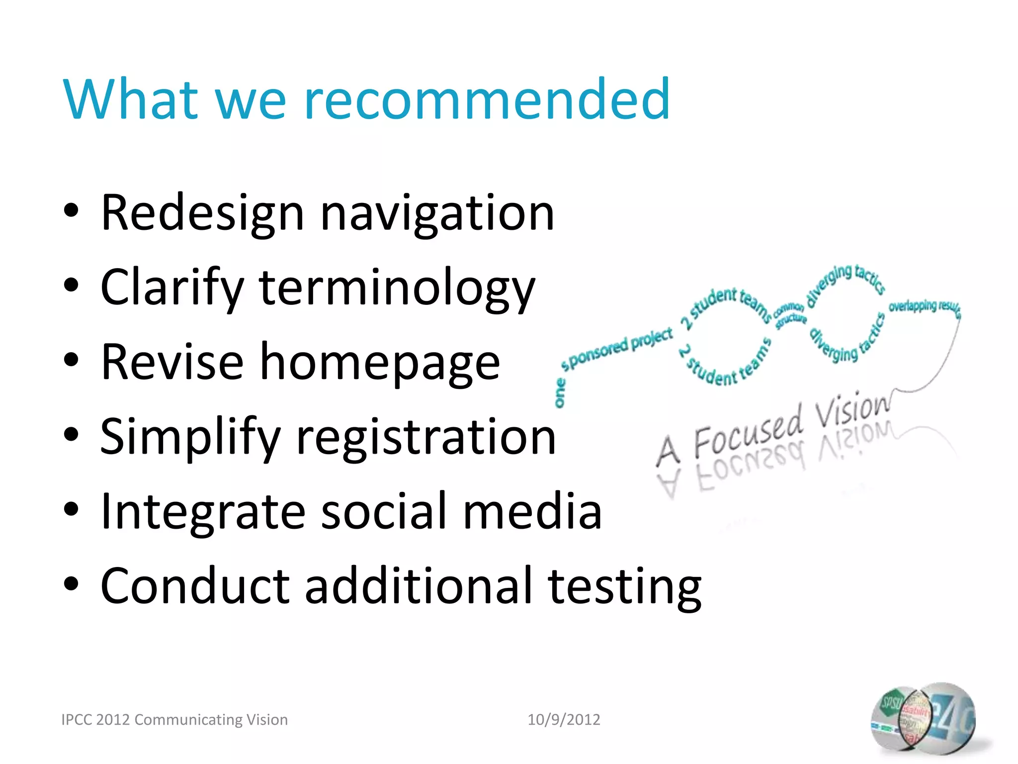
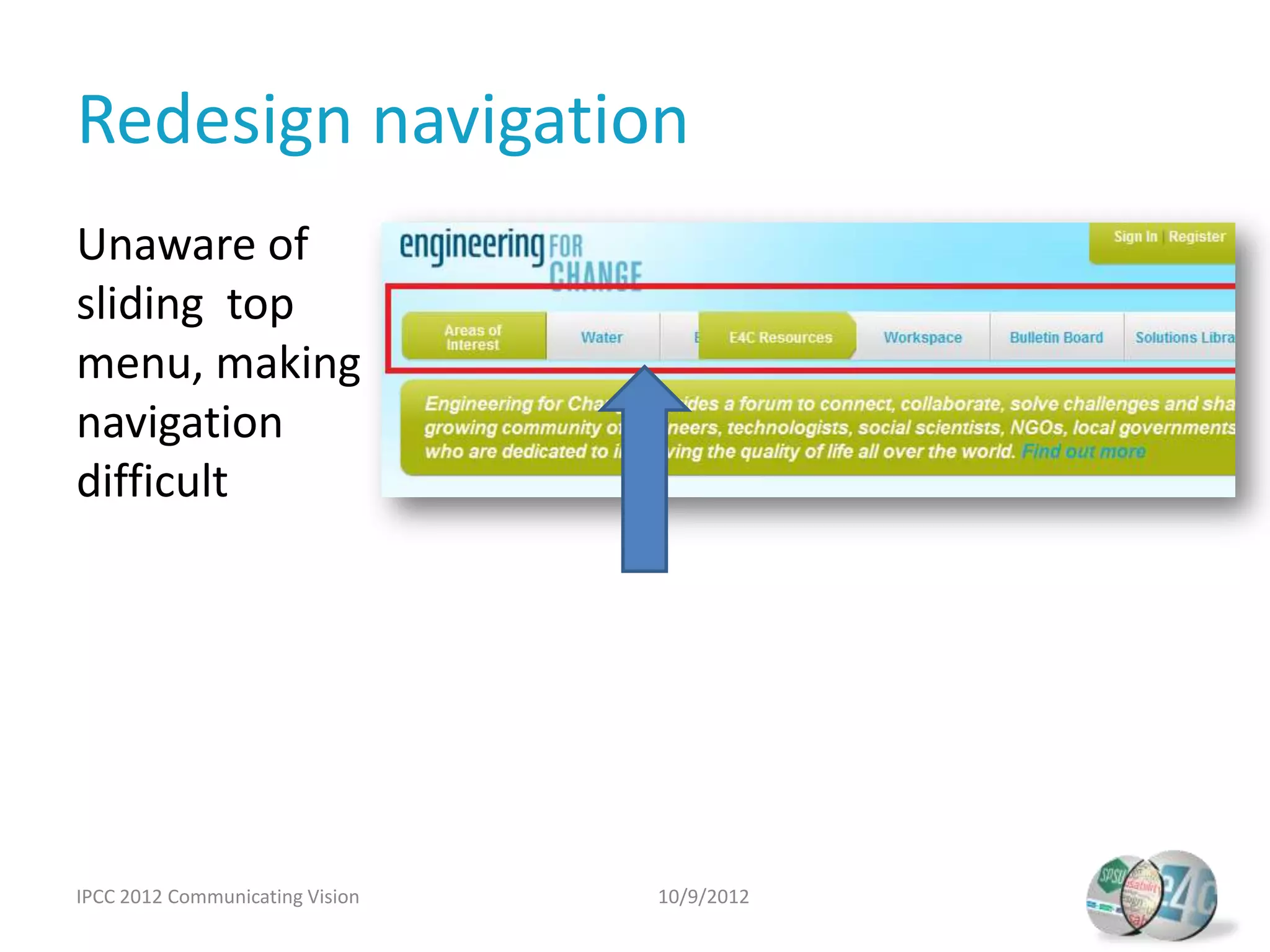
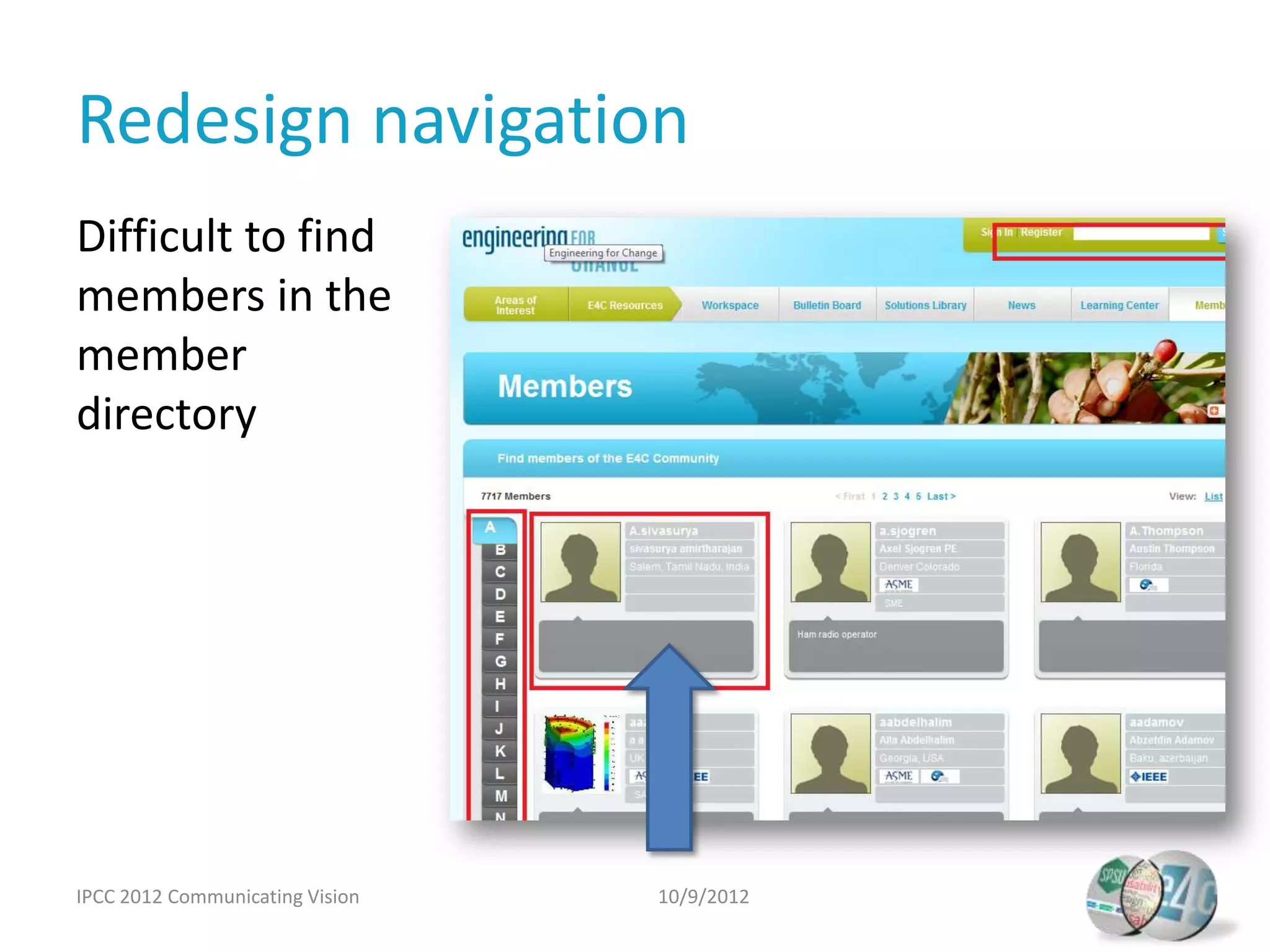
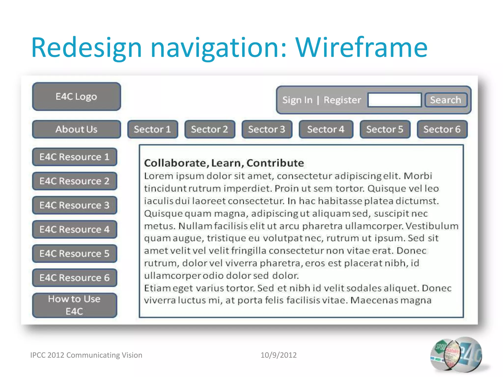
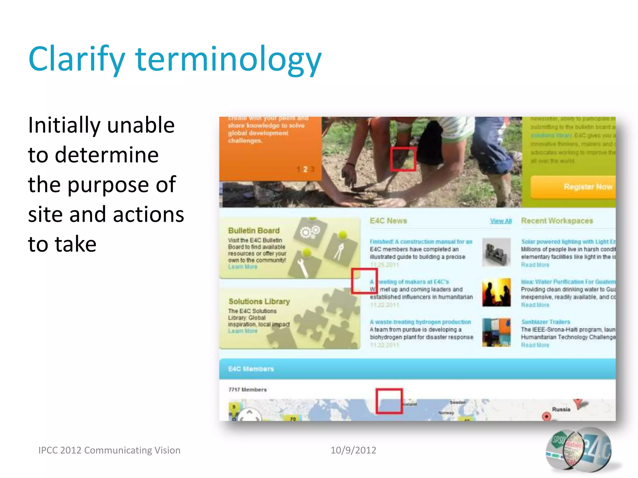
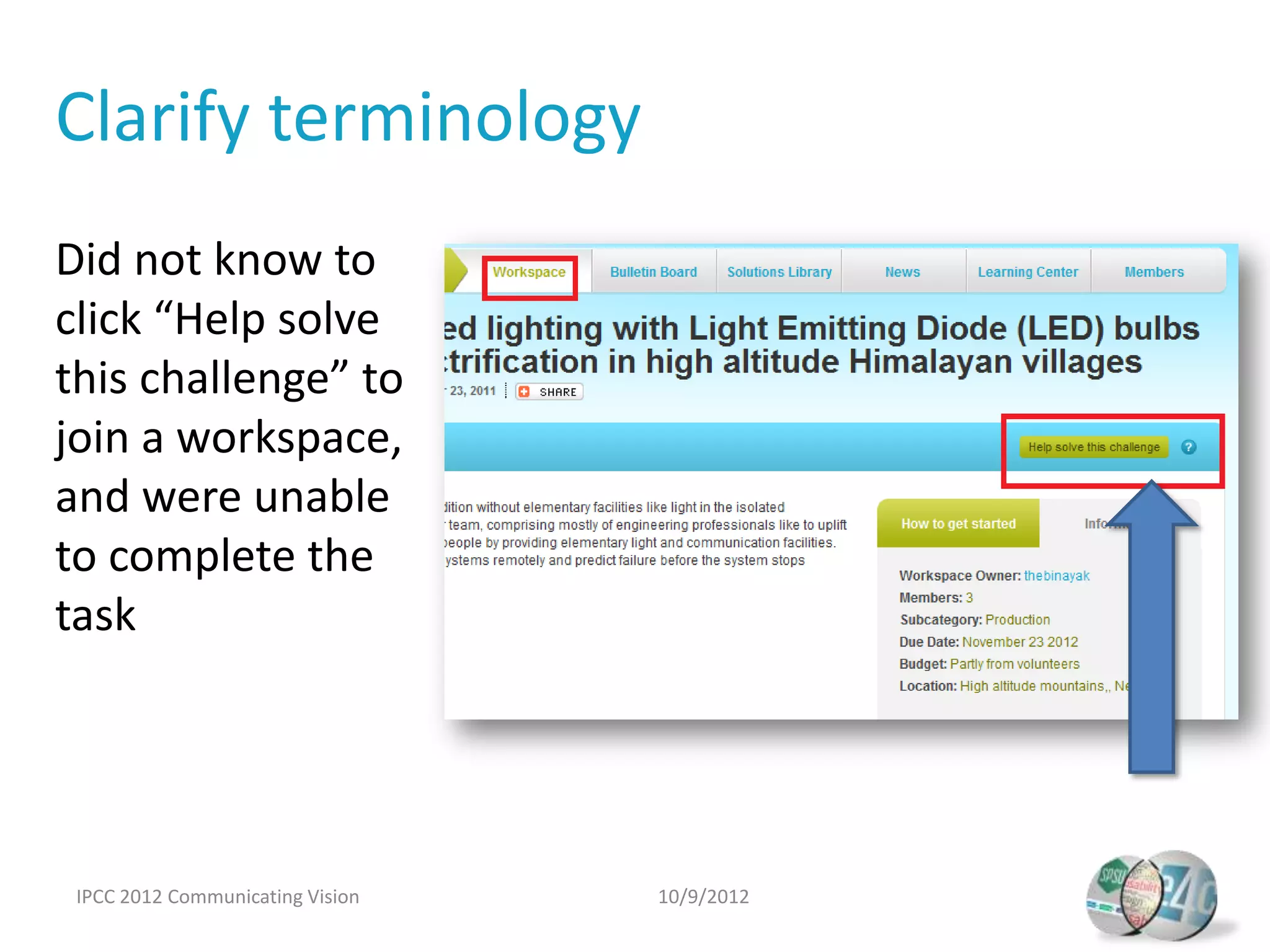
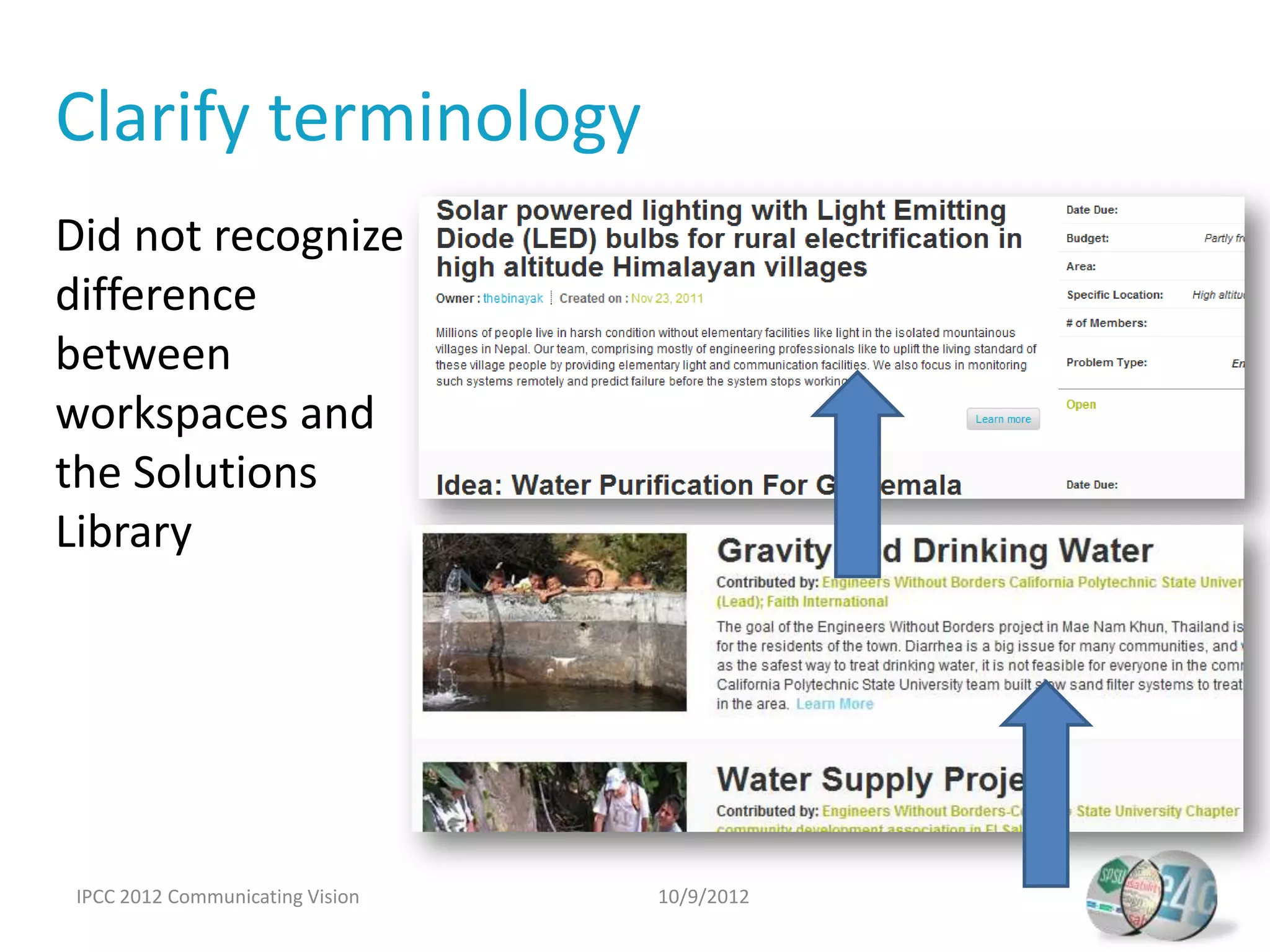
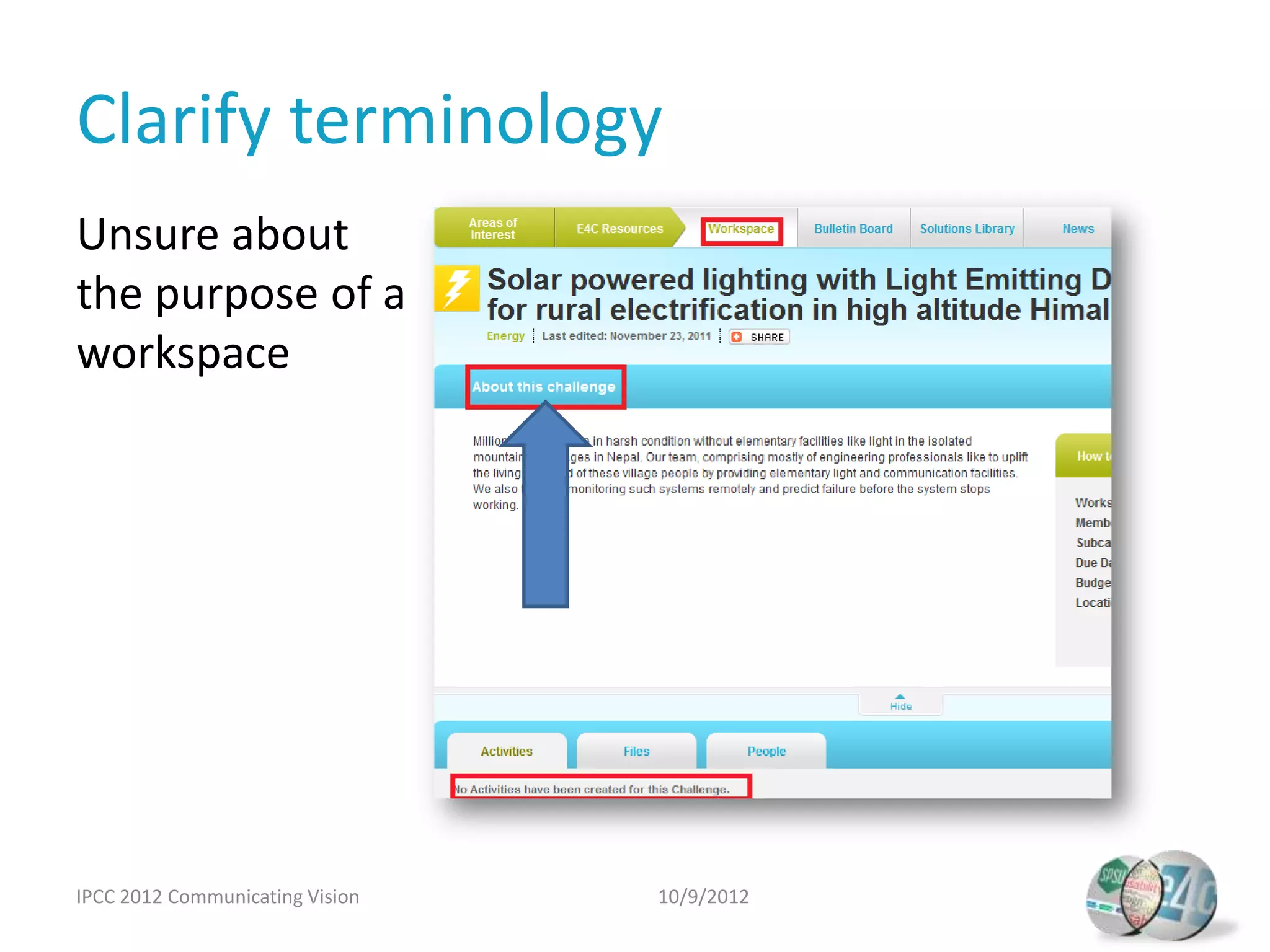
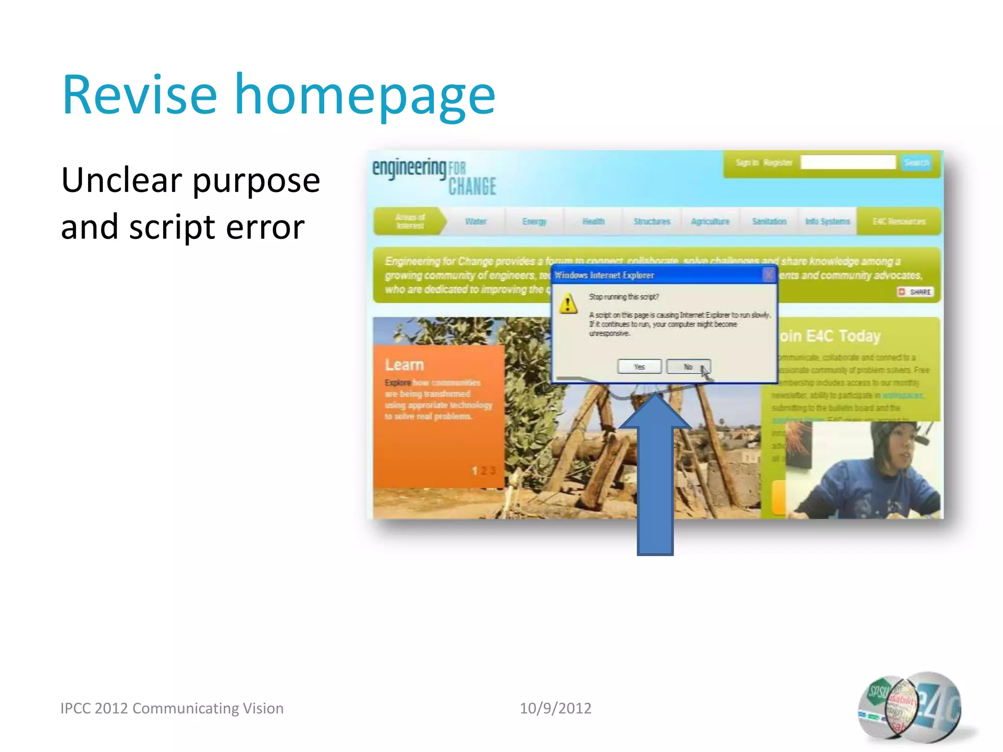
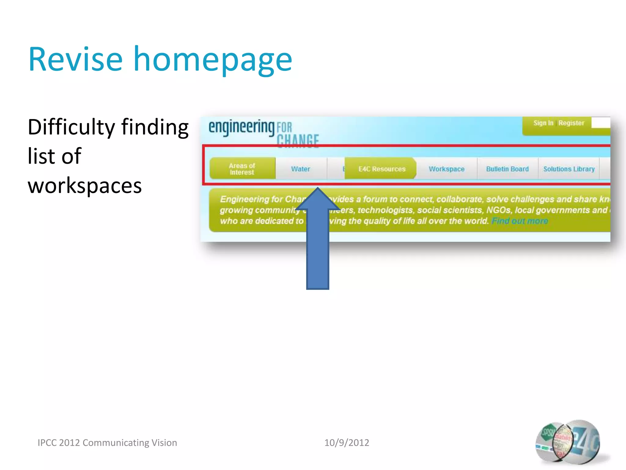
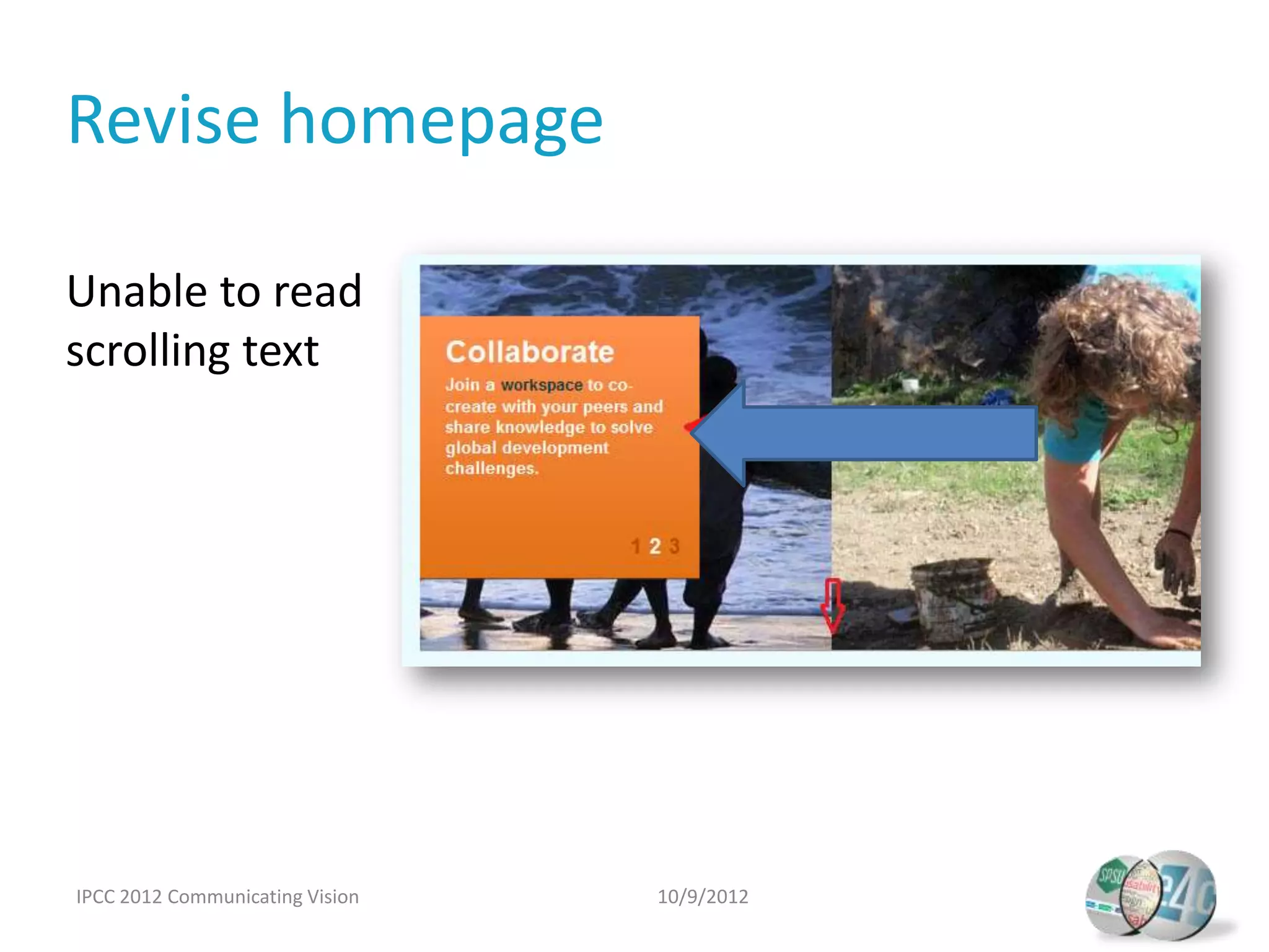
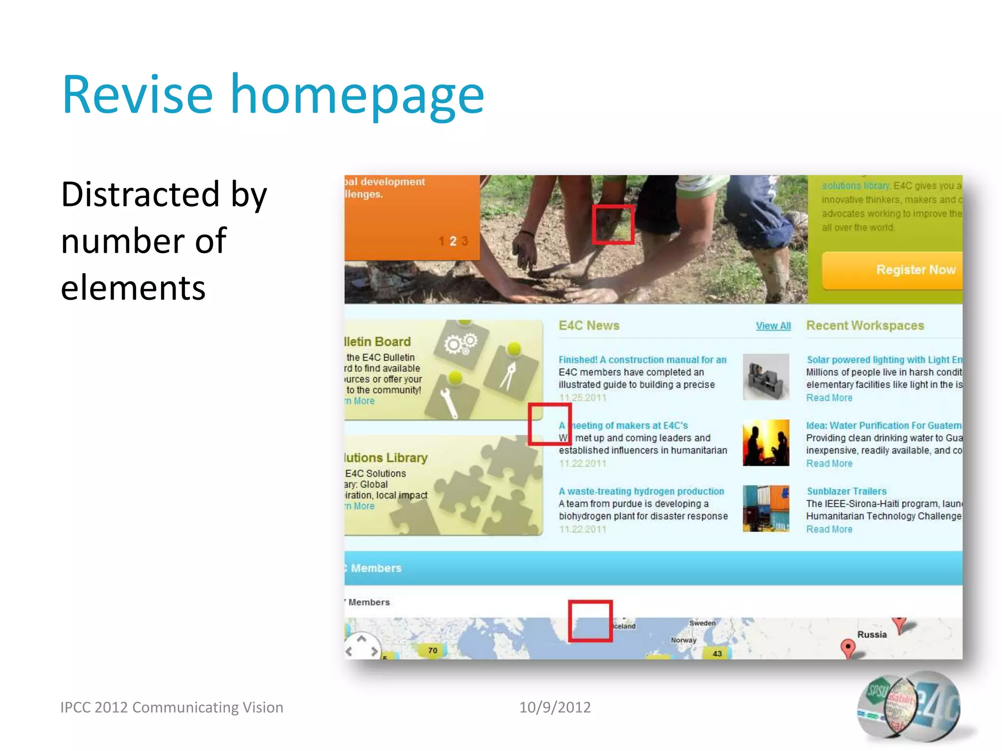
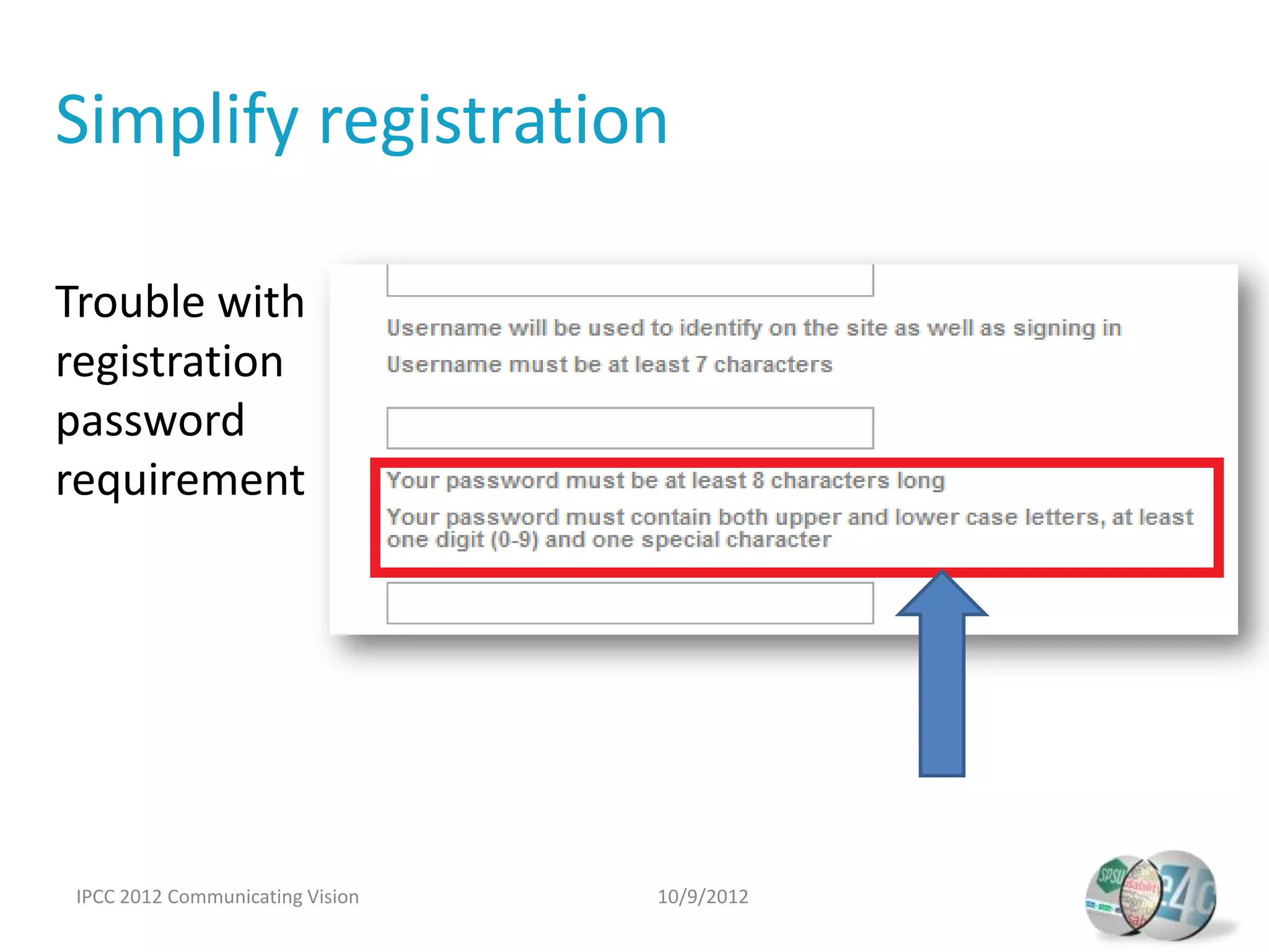
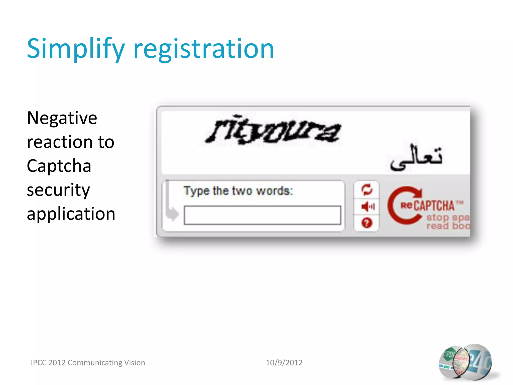
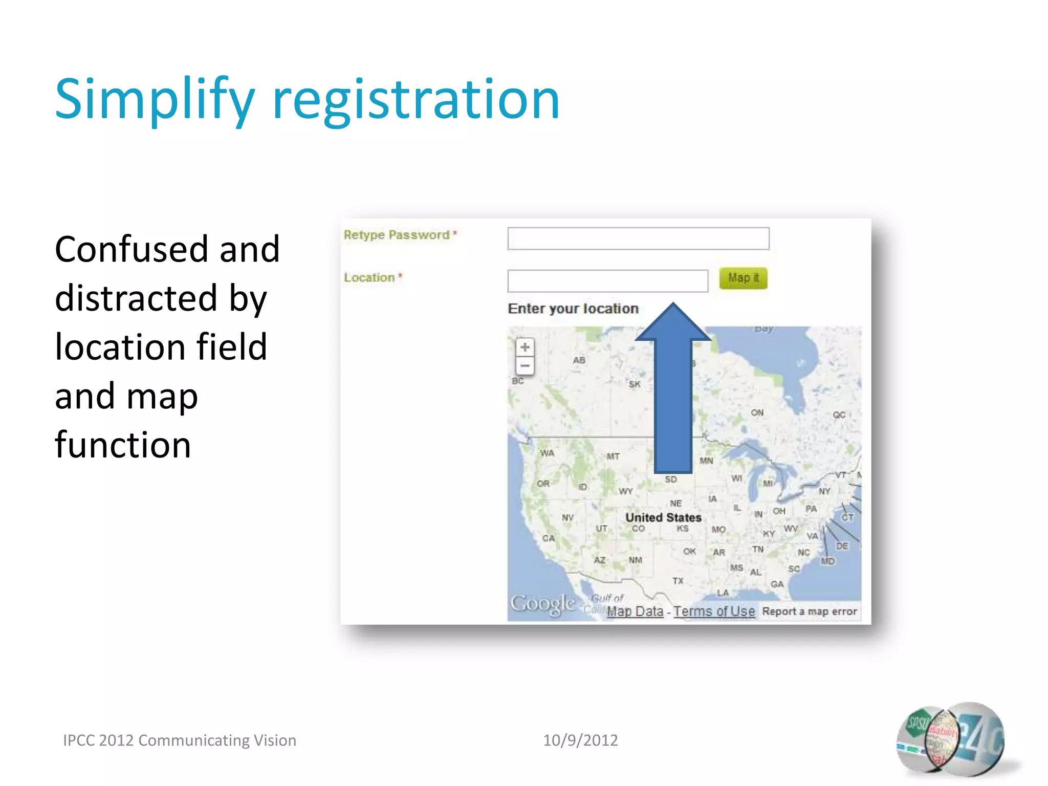
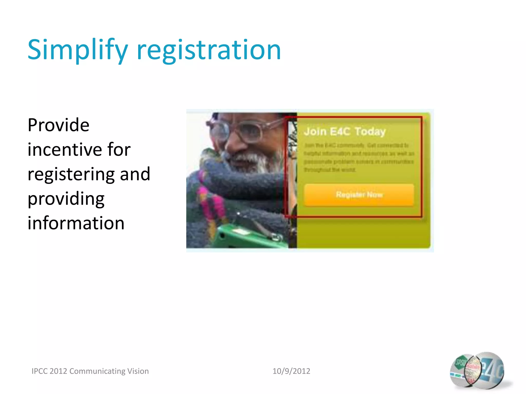
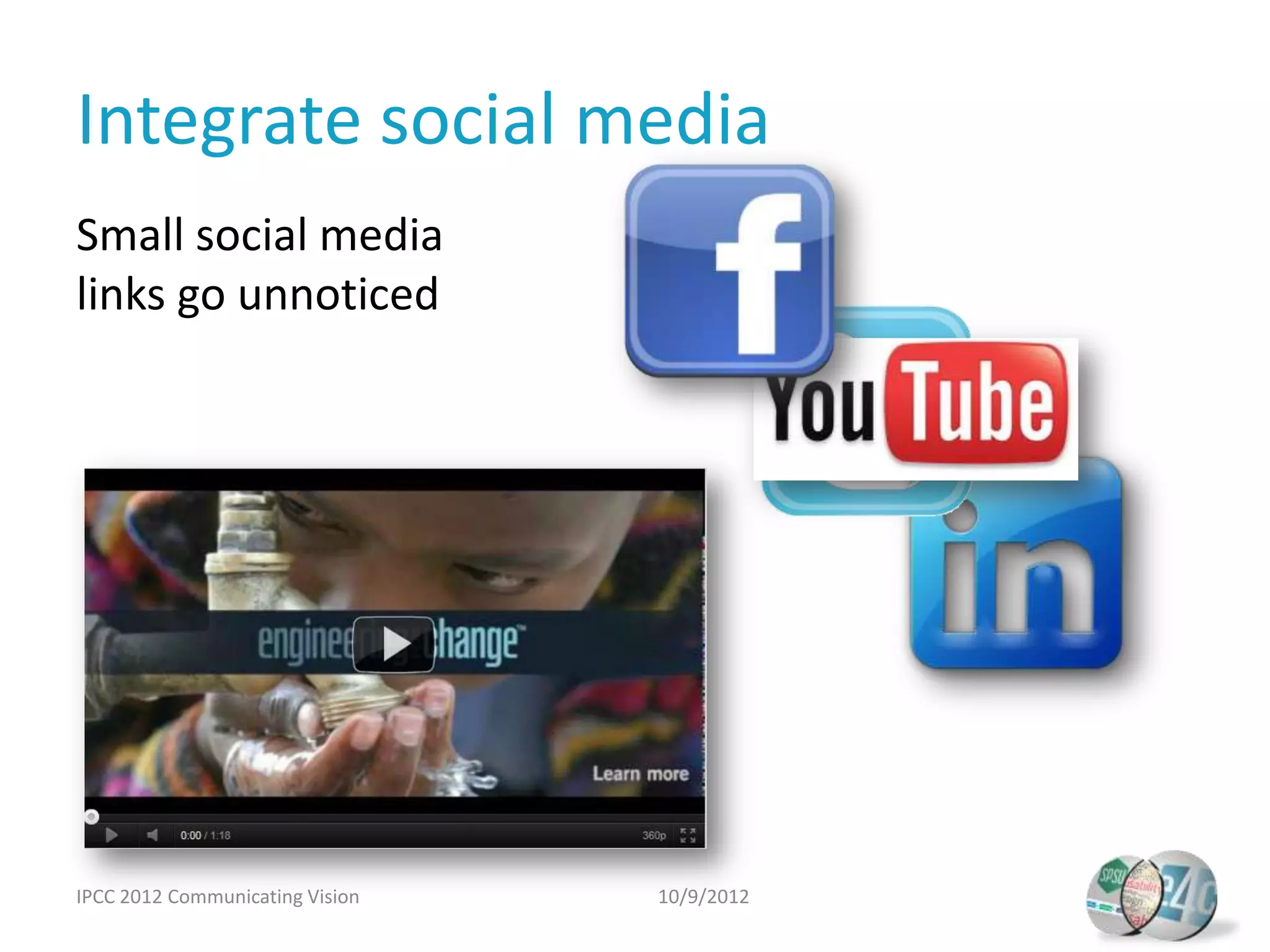
One project sponsored by IEEE, two teams of Southern Polytechnic State University graduate students, one structured approach taught by Dr. Carol Barnum, amazing overlapping results. Professor Carol Barnum, together with her graduate students, Laurie Bennett, Jay Jones, and John Weaver present the approach, findings, and recommendations revealed during their usability study conducted for the IEEE website, Engineeringforchange.org. Learn how their different paths taken during the usability study resulted in identifying the same show stopping problem areas.
How to Be Famous in your Field just visit our Site
Adjusting the Focus: Usability Study Aligns Organization Vision with Community Needs
1. Adjusting the Focus: Usability Study Aligns
Organization Vision with Community Needs
Dr. Carol Barnum
Southern Polytechnic
State University
With:
Laurie Bennett
Jay Jones
John Weaver
October 9, 2012
2. In this session, you will learn…
• Who we are
• How we set up this sponsored project
• How we structured our user research
• How the teams approached user testing
• What the teams learned
• What happened after test results were in
IPCC 2012 Communicating Vision 10/9/2012
3. Who we are
Carol Barnum, Ph.D.
Southern Polytechnic State University, Marietta/Atlanta, Georgia
Professor, Information Design and Communication
Director, SPSU IDC Graduate Program and Usability Center
Award-winning consultant, author, speaker
Laurie Bennett Jay Jones
Communications Consultant U.S. Internal
McKing Consulting Corporation Communications Manager
Deloitte
John Weaver
Information Designer,
Technical Writer
InComm
IPCC 2012 Communicating Vision 10/9/2012
4. How we set up this sponsored project
• Find a sponsor
– IEEE, Candace Beach, Sr. Mgr., Web Presence
– Kasmore Rhedrick, Webmaster, IEEE/ASME
• Review sponsor requirements
• Preview the Engineeringforchange.org site
IPCC 2012 Communicating Vision 10/9/2012
5. Sponsor goals
• Content, Communication, Collaboration
– How well does the site communicate its purpose?
– Member-to-member collaboration--how does it
work?
– Workspaces—how do people use this feature?
– News content—how is it assessed?
– Membership process—any barriers?
IPCC 2012 Communicating Vision 10/9/2012
7. Sponsor-suggested tasks
• Learn about the site
• Find and comment on a news item
• Navigate the site
• Return to the homepage
• Find a member/workspace of interest
• Become a member
• Find a solution in the Solutions Library
IPCC 2012 Communicating Vision 10/9/2012
8. How we structured user research
• Created personas from research
• Conducted heuristic evaluation
• Developed test plan
• Recruited users from one of the personas
• Conducted testing with 6 participants
• Analyzed and reported results
• Discovered amazing overlap in findings!
IPCC 2012 Communicating Vision 10/9/2012
10. How teams approached testing
Diverging Tactics
Team 1
Sponsor Overlapping
Structured Approach
Input Results
Team 2
Diverging Tactics
IPCC 2012 Communicating Vision 10/9/2012
11. Personas
Professional
Engineers
Sponsor input
E4C user profile data
Engineering
Students
IPCC 2012 Communicating Vision 10/9/2012
12. Personas
Professional Engineers
• Primary users
• Recruiting concerns
Typical E4C users
Conducted interviews
Engineering Students
• Secondary users
• Abundant pool
IPCC 2012 Communicating Vision 10/9/2012
13. Heuristics
Nielsen’s 10 Heuristics
Well known, Specific, Objective
Quesenbery’s 5 Es
Comprehensive, Flexible, Holistic
Easy to learn
IPCC 2012 Communicating Vision 10/9/2012
14. Heuristics
Nielsen’s 10 Heuristics Quesenbery’s 5 Es
1. Visibility of system status 1. Effective
Easy to learn
2. Match between system and the real 2. Efficient
world 3. Engaging
3. User control and freedom 4. Error tolerant
4. Consistency and standards 5. Easy to learn
5. Error prevention
6. Recognition rather than recall
7. Flexibility and efficiency of use www.wqusability.com
8. Aesthetic and minimalist design
9. Help users recognize, diagnose, and
recover from errors
10. Help and documentation
www.useit.com/papers/heuristic/
heuristic_list.html
IPCC 2012 Communicating Vision 10/9/2012
15. Identified problem areas
• Navigation
• Terminology
• Homepage
• Registration
• Social media
IPCC 2012 Communicating Vision 10/9/2012
16. Screening and recruitment
Pre-qualifying selector
• Demographics
• Engineering field/major
• Community service
• Technology enabled
• Availability
• Open to recording
• $25 gift card
IPCC 2012 Communicating Vision 10/9/2012
17. User ID Professionals Engineers Engineering Students
U1 26, male, civil eng, Senior, male, mechanical eng, alternative
Sheltering Arms energy, solar oven project, recycling
U2 26, male, mechanical eng, Junior, female, computer & mechanical eng,
Red Cross Alpha Xi Delta, autism
Boy Scouts of America
U3 25, male, mechanical eng, Senior, male, mechanical eng, environmental
Habitat for Humanity study, animal shelter
U4 31, male, mechanical eng, Sophomore, male, mechanical eng, interested
Habitat for Humanity in developing regions, especially children’s
Atlanta Boxer Rescue issues
Humane Society
U5 29, male, manufacturing Senior, female, civil eng, SWE President, ASCE,
eng, interested but not NSBE, SPSU Rubble House project
active in community
service
IPCC 2012 Communicating Vision 10/9/2012
18. Test days
• 2 rooms
• One-way mirror
• Multiple cameras/
angles
• Desk top computer
• DVD recorder
• Morae recording
and logger
software
IPCC 2012 Communicating Vision 10/9/2012
19. Test days
• Think aloud protocol
• Pre and post test questions
• Pre and post task questions
• Scenarios/tasks
• System Usability Scale (SUS)
IPCC 2012 Communicating Vision 10/9/2012
20. Test days
Moderator script
“You’ll notice that I’ll be
reading from this paper most
of the time. This may seem
strange or awkward, but we
do this to ensure that we give
the same information to
everyone.”
• Consistent test format
• Consistent language
IPCC 2012 Communicating Vision 10/9/2012
21. Test days
Teams diverge again
• Product reaction cards
• Eye tracking
IPCC 2012 Communicating Vision 10/9/2012
22. What we learned
Both teams collected data from participants
through testing.
Usability
Testing
User Data
and Findings Recommendations
Participant Quantitative
Interactions Tools
IPCC 2012 Communicating Vision 10/9/2012
23. Eye Guide eye tracking system
• EyeGuide developed by Grinbath, run by
several Texas Tech professors
• Easy to set up and use
• Less than $2500
http://www.grinbath.com
IPCC 2012 Communicating Vision 10/9/2012
25. Product reaction cards
Developed by Microsoft, includes 118 index cards with
a single adjective (60% positive, 40% negative). 5
participants selected cards after test.
Positive Negative
Ease of Use Effortless, Simplistic, Simplistic, Easy Difficult, Hard to Use
to use, Predictable, Flexible, Intuitive
Content Valuable, High Quality, Engaging,
Optimistic, Meaningful, Innovative,
Entertaining
Design Clean Inconsistent, Disruptive
IPCC 2012 Communicating Vision 10/9/2012
26. Additional qualitative tools
• Comments recorded from Morae
• Organic interactions with participants – gave
the team an opportunity to get to know
participants
• Questionnaires – pre-test, post-task, and post-
test
IPCC 2012 Communicating Vision 10/9/2012
27. Qualitative insights Quantitative
data
Qualitative responses from participants were
converted and presented as quantitative data.
SUS/Likert Scale Questions Measurable Responses
•Questionnaires
Eye Tracking Results Aggregate Responses
Aggregate of
view of
participants natural tendencies Success Rate
Task completion? User Task
Participant Scenarios Average time to complete
Eye Tracking Results Aggregate of participant
view habits
IPCC 2012 Communicating Vision 10/9/2012
28. Positive findings
• Look and feel
• Mission
• Wealth of information
• Expressed interest in returning to site
IPCC 2012 Communicating Vision 10/9/2012
29. Additional findings
• Navigation was difficult
• Terminology was confusing
• Homepage was unclear
• Registration was frustrating
• Searching for members was difficult
IPCC 2012 Communicating Vision 10/9/2012
30. Similar results
• All participants had trouble with the password
requirements during registration. Participants
averaged 3 attempts.
• It took participants an average of 11:07
minutes to complete the registration process.
IPCC 2012 Communicating Vision 10/9/2012
31. Different methods, same conclusions
• Different personas
• Different heuristics
• Different tools
• Developed separate, but similar test plans
• Findings and recommendations overlapped
IPCC 2012 Communicating Vision 10/9/2012
38. Clarify terminology
Did not know to
click “Help solve
this challenge” to
join a workspace,
and were unable
to complete the
task
IPCC 2012 Communicating Vision 10/9/2012
39. Clarify terminology
Did not recognize
difference
between
workspaces and
the Solutions
Library
IPCC 2012 Communicating Vision 10/9/2012
50. Conduct additional testing
• Conduct follow up testing to confirm
effectiveness of recommended
improvements
• Use broader participant pool
IPCC 2012 Communicating Vision 10/9/2012
51. Implementation
• E4C reaction to test
• Goals met
• Changes
• Results
• Way forward
Kasmore Rhedrick
Online Content & Community
Manager,
ASME International
IPCC 2012 Communicating Vision 10/9/2012
54. Detailed findings and recommendations can be found in the
team reports listed on the Usability Testing Essentials Web
site under, “Engineering for Change Web site (New, Dec.
2011)” at the following link:
Engineeringforchange.org Usability Study reports
URL: booksite.mkp.com/barnum/testingessentials/reports.php
Thank you for coming.
IPCC 2012 Communicating Vision 10/9/2012
Editor's Notes
Thank you Dr. Barnum, and thank you all for being here today. I’m going to talk about how the teams approached testing. The theme you are going to hear is that we had 2 teams, there were some commonalities in our approaches, then we diverged , but we still ended up with overlapping results, leading to a more focused vision for the E4C website.As Dr. Barnum mentioned, we had two teams of 4 working on this study. Both teams attended the project kickoff meeting, had access to the same background information, and sponsor concerns. We both structured our user research in the manner that Dr. Barnum described, creating personas and conducting heuristic evaluations. However, almost immediately the team approaches began to diverge. Let’s start with the commonalities. Common process:planning for testing-Test planning:personas,heuristics,pre-test questions,scenarios/taskspost-test questionsParticipants:screening, recruitingTest day:lab, moderator script, test toolsAnalyzed dataReported and presented findings and recommendations
Starting with our user research, we created personas. Using input from the sponsor and data from the E4C user profiles, we all agreed the typical users included American and international professional engineers and engineering students. They came from a variety of engineering disciplines and were overwhelmingly interested in using their skills to solve problems that could benefit others. Once the personas were completed, the teams began to diverge in their approaches. Given the time constraints, each team could conduct testing for only one user type. Team 1 chose to test professional engineers to give the sponsor test results from the view point of their primary users. They planned to test the website from the POV of their persona, Elsie Manning, a 52 year old manufacturing engineer. Team 1 recognized they may face problems finding professional engineers willing to participate in the study but they were confident that their personal networks would provide a supply of recruits. Team 2 chose to test engineering students, who are a high percentage of secondary users, this also gave the sponsor an alternate view point. They planned to test from the POV of their persona, Michael Samford, a 22 year old civil engineering student. Team 2 knew would have no problem recruiting participants later since they had a large student population they could draw from at SPSU.
Using this typical user information, we conducted personal interviews of people that match the types and came up with personas. Although more than one persona exists for the e4c site, each team could only choose one and here the teams diverged in their choices. Once the personas were completed, the teams began to diverge in their approaches. Given the time constraints, each team could conduct testing for only one user type. Team 1 chose to test professional engineers to give the sponsor test results from the view point of their primary users. They planned to test the website from the POV of their persona, Elsie Manning, a 52 year old manufacturing engineer. Team 1 recognized they may face problems finding professional engineers willing to participate in the study but they were confident that their personal networks would provide a supply of recruits. Team 2 chose to test engineering students, who are a high percentage of secondary users, this also gave the sponsor an alternate view point. They planned to test from the POV of their persona, Michael Samford, a 22 year old civil engineering student. Team 2 knew would have no problem recruiting participants later since they had a large student population they could draw from at SPSU.
The next step was for each team to perform a heuristic evaluation. The teams followed a common approach which was to choose a set of heuristics and each member on the team was to independently evaluated the E4C website based on the heuristics chosen and from the viewpoint of their user type. That being said, the teams immediately diverged and chose different sets of heuristics. Team 1 chose Nielsen’s 10 heuristics which are well known but also for the specific and objective evaluation criteria and Team 2 chose Quesenbery’s5Es – they provided the same comprehensive assessment while also providing enough flexibility to provide a holistic evaluation of the various site elements and functions. Although the decisions were made independently, as it turned out, the choices provided an opportunity to test the ‘process’..where would the different heuristic choices take us?
Here is a list of the heuristics for anyone not familiar with them and where you can access them online
These were possible show stoppers – these categories are repeated in findings/recommendations sectionsThe heuristic evaluations led each team to identify problem areas for further testing, and the teams drafted scenarios or stories with tasks embedded for participants to walk through in order to test their reactions – the two teams came up with different criteria for drafting those scenarios, due to the difference in the heuristics chosen
It was time to start identifying qualified participants for testing. For the commonalities, both teams used a pre-screening questionnaire or a selector to begin qualifying participants- they asked basic demographic questions, confirmed that candidates were engineers, either professionally or as students and which engineering discipline they were involved in, asked about their interest or participation in community service, verified they were technically literate, and verified they were available to attend the testing sessions, and were open to being recorded for this study. We also let them know that a $25 would be provided by the sponsor to selected participants. Again, at this point the teams diverged.Team 2 on the other hand had no trouble finding candidates that fit their user profile, as you can see they received over 60 responses indicating interest in participating.The user types the teams chose immediately impacted the recruitment process and results – team 1 immediately faced challenges attracting a pool large enough to be selective –due to a lack of response we modified the participant requirements - while we preferred a combination of men and women engineers, aged 45 and older, we modified the criteria to accept any age as long as they were a practicing engineer and community service minded.
Despite the differences encountered, both teams recruited 6 participants – 1 practice participant and 5 participants whose data points were collected, recorded, and evaluated as part of the study. Note the limitation of the Professionals participant pool – all males in similar age bracket
Once test day arrived, both teams used the same student usability lab – we had access to the same materials you see here – Note that each team conducted mulitple testing days that took place over the course of several weeks
And we followed similar procedures – although the questions, scenarios, and tasks varied by team
We both used a moderator script for consistency
John Weaver will nowaddress the findings
Team organized cards based on comments.Insert image of cards laid out on a table or maybe an image of a few cardsShould we make a comment how people generally try to be positive
Participants commented positively on the look of the E4C SITE, including imagery and media Participants recognized the good that E4C organization works toward. Participants commented favorably towards the wealth of information and content available. Over half of the participants expressed an interest in returning to the site.
After determining the issues, both groups provided recommendations, which fell into the following high-level categories:Navigation format/options, language, homepage changes, registration/membership, social media promotion.Recommendations to client based on data and verified by video- Recommendations were arrived at using qualitative and quantitative tools, which produced qualitative and quantitative findings. Our 2 groups using different tools to arrive at same insights (similar but different paths, we were not guessing – proven methodologies) Hufflepuff did not test/ask questions about Social Media.
Change the slidingmenu so that all major links are visible at once.
Change the sliding/hidden menu so that all major links are visible at once. Allow users to search E4C members by name and/or user name, and/or location in the members directory.
Expose all links (goes back to the sliding menu issue)Use conventional F-Pattern – possibly add navigation for specific groups or purposes Eyetracking shows not much viewing of links, more of picture and text
The current mission statement is long and difficult to read. Create a concise, and prominent mission statement on the home page.Use more meaningful pictures that show engineering projects in order to visually communicate the mission statement. Ensure all images relate to their corresponding text. Change the sliding/hidden menu so that all major links are visible at once.Rename primary links to communication actions that can be taken on the E4C website.
Consider renaming button to “Join this workspace” or “Work on this project.”Create labels based on the user’s languageConduct a card sort to determine the most meaningful button name.
Change the sliding/hidden menu so that all major links are visible at once. Evaluate link names and conduct a card sort to determine the most meaningful link names. Consider renaming “Solutions Library” to “WorkspaceLibrary” or “Projects Library”. Add a clear, concise, and meaningful statement that describes the purpose of these areas on their main pages.
Evaluate link names and conduct a card sort to determine the most meaningful link names. Consider renaming “Workspaces” to “Projects”. Use their language.Add a clear, concise, and meaningful statement that describes the purpose of a workspace on the main workspaces page.
Focus on purpose and identity, fewer words, more pictures and accessible links, Fix script error
Change the sliding menu so that all major links are visible at once.
Allow users to pause the scrolling pictures. Slow down the scroll speed.
Reduce the number of elements on the home page.Evaluate the purpose of the map function and whether it belongs on the home page. Create clear labels and visual cues for actions that can be taken from the home page. Consider color changes for contrast
Provide instant feedback at the field level.Evaluate the need for highly complex password requirements. Make instruction easier to read with larger, darker text.
Evaluate the need for this level of security.
Eliminate the map and location field on the registration page. Location information is useful; allow users to enter it into their member profiles after completing registration.
Provide a reason for users to register for the siteExplain how information is going to be displayed and who has access to itProvide confirmation email upon successfully registering
Move social media links to more prominent location.Embed YouTube video into homepage as an additinal visual aid to explain purpose of E4C and why/how they should participate.
Test each improvement as you implement.Use a more diverse participant pool.
Let’s listen now to our client’s thoughts about testing and plans for the future.
If Dr. Barnum wants to make comments before opening up to questions, we can leave this slide here…if questions before wrap up then we’ll switch this with questions slide.