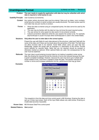
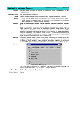
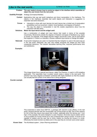
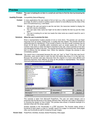
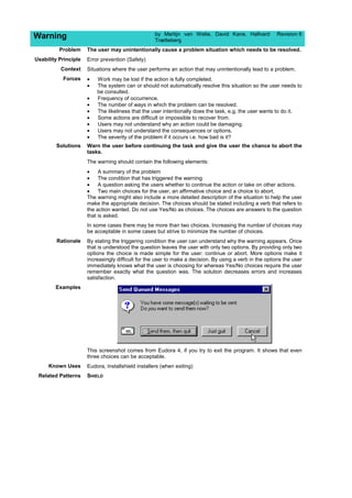
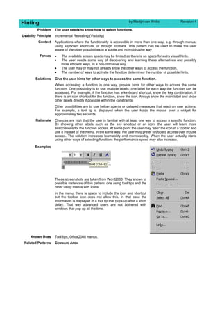
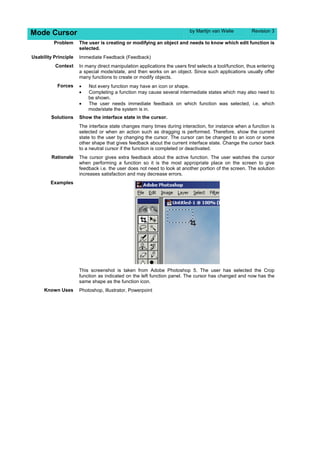
By Martin Van Welie: This paper discusses and presents interaction patterns in user interfaces. These patterns are
focused on solutions to problems end-users have when interacting with systems.
This document discusses patterns as tools for user interface design and proposes a structure for user interface design patterns. [1] Patterns are presented as a potential solution to some of the problems with guidelines, which can be too abstract, conflicting, and lack context. [2] A simple example pattern is provided to illustrate how patterns describe a problem, context, and proven solution instead of just rules. [3] The document argues that a proper structure for user interface design patterns needs to be developed to effectively capture usability knowledge for designers.
Chapter 7: Design rules
from
Dix, Finlay, Abowd and Beale (2004).
Human-Computer Interaction, third edition.
Prentice Hall. ISBN 0-13-239864-8.
http://www.hcibook.com/e3/
This document outlines the design process for human-computer interaction. It discusses defining design goals and constraints, understanding users and technology as key materials, and following a process of requirements analysis, design, prototype evaluation, and implementation with iterative improvement. The design process involves understanding stakeholders, capturing requirements through socio-technical modeling and contextual inquiry, then analyzing, designing, prototyping, and implementing an interactive system to meet user needs within constraints.
The document discusses various approaches to designing software architectures and systems. It covers the standard engineering design process, potential problems that can arise, and alternative design strategies like cyclic, parallel, adaptive, and incremental processes. It also discusses tools for design like abstraction, separation of concerns, and applying experience. Architectural patterns, styles, and domain-specific software architectures are introduced as ways to apply lessons learned to new designs.
This document provides an overview of an N-screen user experience design class. It includes the class schedule, which covers topics like environment research, methodology studies, user research, prototyping and exams. It also presents the N-screen concept model, which recommends design patterns for N-screen experiences, such as mobile first, adaptability, fluidity, seamless interaction and context relevance. Additionally, it discusses N-screen use contexts including use modes, situations, surroundings and transit. Personas and an egg-matrix framework are also introduced. The document aims to provide foundations for designing unified and coherent experiences across multiple screens.
The document discusses interaction design and human-computer interaction (HCI) in the software development process. It covers several key topics:
1. Interaction design principles like understanding users and reducing errors. The design process involves requirements gathering, analysis, design, and iterative prototyping.
2. HCI aspects are relevant at all stages of the software life cycle from requirements to maintenance. User research and iterative design are important given that requirements cannot be fully determined upfront.
3. Usability engineering specifies usability metrics early on but these are difficult to set without user testing prototypes. Iterative design overcomes this through incremental prototyping and testing with users.
The document discusses the differences between analysis modeling and design engineering/modeling. Analysis involves understanding a problem, while design focuses on creating a solution. Models can be used to better understand problems in analysis or solutions in design. The key aspects of design engineering are then outlined, including translating requirements into a software blueprint, iterating on the design, and ensuring quality through guidelines such as modularity, information hiding, and functional independence. Common design concepts like abstraction, architecture, patterns, and classes are also explained.
1. What it is?. Philosophy and Principles.
2. How to use it? methodology and basic tools.
3. Beyond UCD. Alternatives methodologies: Activity Centered Design and Goal Directed Design.
This document discusses HCI (human-computer interaction) in the software development process. It explains that HCI is used to create an intuitive interface between users and products. Usability, effectiveness, efficiency, and satisfaction are important traditional usability categories to consider. The software lifecycle involves designing for usability at all stages. Prototyping is discussed as a model where prototypes are built, tested, and refined with user feedback until an acceptable final system is achieved. Design involves understanding users, requirements, and balancing goals within technical constraints.
User-centered design (UCD) is an iterative design process that focuses on understanding user needs. It involves users throughout the design process through research and design techniques. The UCD process has four phases - understanding user context, specifying requirements, developing solutions, and evaluating designs. Feedback is used to iterate the four phases until designs satisfactorily meet user needs. UCD aims to capture the whole user experience by including professionals from different disciplines and involving users in evaluations. Investing in UCD pays off by using users as an early warning system to improve designs.
This document provides an overview of design patterns and pattern-based design. It discusses how design patterns capture solutions to common problems in a reusable form, and how a pattern language relates patterns to each other to solve problems across a domain. The document outlines the basic concepts of patterns, different types of patterns, and how to describe a pattern. It also discusses how patterns and pattern languages can be used in pattern-based design.
The document provides an overview of design process and factors that affect user experience in interface design. It discusses various principles and heuristics to support usability, including learnability, flexibility, and robustness. The document outlines principles that affect these factors, such as predictability, consistency and dialog initiative. It also discusses guidelines for improving usability through user testing and iterative design. The document emphasizes the importance of usability and provides several heuristics and guidelines to measure and improve usability in interface design.
HCI 3e - Ch 13: Socio-organizational issues and stakeholder requirementsAlan Dix
Chapter 13: Socio-organizational issues and stakeholder requirements
from
Dix, Finlay, Abowd and Beale (2004).
Human-Computer Interaction, third edition.
Prentice Hall. ISBN 0-13-239864-8.
http://www.hcibook.com/e3/
This literature review evaluates different usability and user experience evaluation methods. It discusses approaches like agile UX, design thinking, and lean UX. While the methods have similarities in aiming to improve productivity and collaboration, they differ in their approaches. For example, agile UX debates the merits of big upfront design versus minimal design. The review also identifies gaps, such as the need for more research on evaluating methods in real-world contexts versus labs.
Presented at NDC 2011 in Oslo (9th June 2011)
Video available via http://www.softdevtube.com/2011/11/01/framing-the-problem/
The focus of software development and technology tends to be very solution–centric, often at the expense or in the absence of a proper understanding of what problem is to be solved. Without necessarily intending to, developers, architects and other technical roles often try to force the problem domain into code–based thinking. Business analyst says number, developer hears int, double or decimal. Customer says stock data, architect hears database. The problem domain and motivation are often abstracted away altogether or too early in the technical solution process.
This session takes a look at ways of characterising system types and organising problems, so that problem domains are understood on their own terms. In addition to classic analysis techniques, problem frames are examined as a tool for structuring the phenomena that technical solutions need to express.
The document discusses key aspects of the software engineering design process including requirements specification, architectural design, detailed design, coding and testing. It emphasizes that usability engineering should occur throughout the design lifecycle. The document also discusses iterative design and prototyping techniques which help address limitations of incomplete requirements specifications. Design rationale is presented as an important part of the process to explain and communicate the reasons behind design decisions.
The document describes a research project aimed at improving the usability of enterprise resource planning (ERP) systems through increased collaboration between users and the system. The researchers apply principles of human-computer collaboration theory to the design and evaluation of ERP user interfaces. They conducted field studies to identify usability issues and developed design principles to guide more collaborative interface design. Prototypes were created and evaluated in lab studies. The goal is to make ERP systems more usable by strengthening their collaborative capabilities.
The document discusses interface design concepts and their relationship to business analysis and usability. It outlines eight golden rules of interface design including consistency, reducing memory load, and enabling shortcuts. It defines usability as the extent a product can be used effectively and efficiently to achieve goals. Business analysis should consider users, tasks, and context of use to incorporate elements of usability analysis.
This document provides an overview of concepts in engineering design taught by Dr. Yogesh Dewang. It discusses various topics including:
1. Designing a system by breaking it into subsystems and components in an iterative process.
2. Visualization by interpreting non-visual data and producing images.
3. Photography as a science, art, and practice of creating images.
4. Simplified iteration model showing design as an iterative process.
5. Comparison of engineering design method versus scientific method.
Mouse tracking is a technique for monitoring and visualizing mouse movement and activity of the users.
This is a Comparative study of cursor movement pattern between a touchpad and a mouse devices based on patterns of cursor movement.
“Markets are certainly looking at election results with some apprehension, but what is also true is that they are in for a correction. Elections might act as the trigger for such a correction,” said Jagannadham Thunuguntla, equity head at SMC Capitals.
Explain the system development process and basicsEdwin Lapat
The document discusses the systems development life cycle (SDLC) process and the role of a systems analyst. It provides details on the following:
- The SDLC includes phases such as planning, analysis, design, implementation, testing, deployment, operations, and maintenance.
- A systems analyst guides the SDLC process by defining requirements, prioritizing needs, and ensuring the system meets user and organizational goals.
- The analyst must possess strong interpersonal, analytical, management, and technical skills to effectively carry out their role.
Human Computer Interaction Chapter 3 HCI in the Software Process and Design ...VijiPriya Jeyamani
The document discusses various aspects of the software development life cycle and human-computer interaction design rules. It describes the typical phases of software development like requirements specification, architectural design, detailed design, coding, testing, and maintenance. It also discusses design principles, standards, guidelines, heuristics and patterns that can improve usability. Iterative design and prototyping approaches are presented as methods to refine requirements and designs. The importance of documenting design rationale is highlighted.
This document provides an overview of how human-computer interaction (HCI) affects the software development process. It discusses how usability engineering promotes interactive system design and the software life cycle. The software life cycle involves requirements specification, design, implementation, testing, and maintenance. Iterative design and prototyping are important to overcome the limitations of traditional software development models. Usability metrics and standards help specify and test usability requirements. While iterative design has benefits, initial design decisions and a lack of understanding problems can limit its effectiveness.
This document discusses strategies for achieving simplicity and power in product design. It begins by exploring the tension between simplicity and power, noting that both are important but sometimes at odds. It then provides examples of balancing the two through careful feature selection and presentation. The document also includes a deep dive on how to address challenges through requirements, design, and technical approaches. Specifically, it provides tips on avoiding feature creep in requirements, guidelines for solution architecture, UX design, and balancing workload between users. The goal is to thoughtfully reduce complexity while maintaining powerful functionality.
The document discusses prototyping techniques for software development. It defines prototyping as an essential element of user-centered design that involves testing design ideas with users early in the development process. Different types of prototyping are appropriate for different stages, from paper-based prototypes to test initial ideas to software-based prototypes that provide limited functionality for further testing. The goal of prototyping is to identify and address design errors and user requirements before significant development effort.
This document contains slides about user interface design from the textbook "Software Engineering: A Practitioner's Approach". The slides discuss key principles of interface design such as placing the user in control, reducing memory load, and consistency. They also cover the interface design process, including analysis of users, tasks, content and environments, as well as steps for defining interface objects, states, and events. The document is copyrighted and intended for educational use with the textbook.
This document discusses considerations for wiki design, including packaging design for web applications, rich interactions through invitation, transition and feedback, and approaches to content creation that empower users while establishing barriers to entry. It provides an overview of Luke Wroblewski's background and references additional resources on designing wikis and web applications.
The document discusses big data visualization and visual analysis, focusing on the challenges and opportunities. It begins with an overview of visualization and then discusses several challenges in big data visualization, including integrating heterogeneous data from different sources and scales, dealing with data and task complexity, limited interaction capabilities for large data, scalability for both data and users, and the need for domain and development libraries/tools. It then provides examples of visualizing taxi GPS data and traffic patterns in Beijing to identify traffic jams.
詹剑锋:Big databench—benchmarking big data systemshdhappy001
This document discusses BigDataBench, an open source project for big data benchmarking. BigDataBench includes six real-world data sets and 19 workloads that cover common big data applications and preserve the four V's of big data. The workloads were chosen to represent typical application domains like search engines, social networks, and e-commerce. BigDataBench aims to provide a standardized benchmark for evaluating big data systems, architectures, and software stacks. It has been used in several case studies for workload characterization and performance evaluation of different hardware platforms for big data workloads.
Usability engineering is a field that is concerned generally with human-computer interaction and specifically with devising human-computer interfaces that have high usability or user friendliness. It provides structured methods for achieving efficiency and elegance in interface design.
This document discusses various methods for providing user support systems, including the key considerations in designing an effective help system. It outlines different types of help features like command assistance, context-sensitive help, online tutorials, documentation, wizards, and adaptive help. It also discusses important design aspects such as availability, accuracy, consistency, flexibility, and unobtrusiveness. Finally, it covers challenges around knowledge representation and modeling the domain, tasks and advisory strategies for adaptive help systems.
Topics include:
Principles of user interface
UI design process
Design principles
Wireframe
Graphic icon, image and colour physiology
User experience and research
User Experience & Design…Designing for others…UEDPreeti Chopra
The document discusses user-centered design (UCD) and its multistage process of analyzing how users will interact with a product. It outlines the key phases of UCD - analysis, design, implementation, and deployment. It then provides descriptions and definitions of many important concepts in user experience design, human-computer interaction, and usability testing.
Principles of Health Informatics: Usability of medical softwareMartin Chapman
Principles of Health Informatics: Usability of medical software. Last delivered in 2023. All educational material listed or linked to on these pages in relation to King's College London may be provided for reference only, and therefore does not necessarily reflect the current course content.
You can easily understand Evaluation Techniques in HCI from this ppt.
Hope you understand in easy way by thoroughly reading this material.
For clear understanding I also give examples of each and every concept.
If you get any knowledge or understanding from this material then, Kindly share further wit your family members and friends, and don't forget to give likes to this material THANKS.
This document summarizes potential pitfalls that can occur in large process modeling projects based on focus groups and interviews. It discusses pitfalls related to:
1) Tools and requirements, such as underestimating the number of models needed and challenges matching tools to modeling frameworks.
2) Modeling practices, such as limitations of modeling languages and losing the translation between business and system models.
3) Designing future ("to-be") models, and
4) Dealing with modeling success and maintenance over time.
The document provides examples and advice to increase awareness of common mistakes in process modeling projects.
The document discusses various topics related to user experience, including defining user experience, modeling users, evaluating usability, and visual design guidelines. It explains that user experience is made up of dependent layers including the surface, skeleton, structure, scope, and strategy. Methods for understanding users such as personas, profiles, and scenarios are presented. The importance of usability testing to evaluate a product is emphasized.
Lectures for Masterclass Customer Experience Strategie & Executie @Business University Nyenrode
user/customer centric design principes voor digital touchpoints & Usability & user experience principes
User Interface Analysis and Design focuses on anticipating what users need to do. The goal is to translate how a machine works into how a person thinks through concepts from interaction design, visual design, and information architecture. UI design is an iterative process that involves user and task analysis, interface design with prototypes, and evaluation to refine the design based on usability testing. Key aspects of UI design include following principles like minimizing memory load, allowing undo and recovery from errors, and providing guidance for user diversity.
Defect Correction Is The Remediation Of A Software ConditionKristi Anderson
The document discusses defect correction in software development, noting that it involves remediating conditions that do not meet requirements, and that the agile test model allows for early identification and correction of defects through incremental testing and feedback, helping to minimize costs and ensure functionality before customer use. An empirical study found that the agile model was superior to the waterfall model in detecting defects and controlling costs.
This presentation taget basics of UX design fundamentals. It’s a quick overview, so you can go from zero-to-hero as quickly as possible. One more Advance course on UX practices is coming soon...
Accessibility, Usability and User Centred Design (Usabiltiy)David Lamas
The document discusses usability, including what it is, why it is important, and how to test for it. It defines usability as a quality attribute that assesses how easy user interfaces are to use. Usability is important because if a product or website is not usable, users will leave and sales or productivity will suffer. The document recommends testing usability throughout the design process, from testing competitors' products early on to testing each iteration of a new design. It provides guidance on planning usability tests, including defining goals, tasks, metrics, and selecting participants and methods. Common metrics mentioned are task success, time on task, errors, efficiency, and learnability over time.
The document provides an overview of the user interface development process, including analysis, design, prototyping, and usability principles. It discusses tasks such as defining user profiles and scenarios, wireframing, information architecture, visual design, and standards compliance. Web 1.0 is contrasted with newer collaborative and interactive aspects of Web 2.0.
This document provides summaries of several guidelines and methods for human-computer interaction (HCI). It discusses Shneiderman's Eight Golden Rules for designing user interfaces, Norman's seven principles of interaction design, Norman's model of the interaction process, Nielsen's ten usability heuristics, contextual inquiry for understanding user needs, and cognitive walkthrough for evaluating design. The summaries focus on key principles for making interfaces easy to use, learn, and remember through consistency, feedback, affordances, mapping to real world concepts, error prevention, and minimizing memory load.
This document discusses user-centered design (UCD) and usability testing. It defines UCD as a process that systematically researches end users' needs and incorporates them into each stage of design. Usability is defined as how effectively, efficiently, and satisfactorily users can complete tasks. The document outlines UCD activities like requirements analysis, design, development, and testing. It discusses benefits of UCD like eliminating assumptions and validating the product with users. Finally, it provides examples of usability metrics and sources for healthcare usability documentation.
This document discusses the principles of user-centered design. It emphasizes the importance of understanding users, conducting research to learn about their needs and tasks, and involving users throughout the design process. Some key user research methods mentioned include wants and needs analysis, card sorting, group task analysis, and contextual interviews. The document stresses that good design starts with the user, and that consulting with and keeping users as the central focus leads to designs that best solve the problems users face.
This document discusses the principles of user-centered design. It emphasizes the importance of understanding users, conducting research to learn about their needs and tasks, and involving users throughout the design process. Some key user research methods mentioned include wants and needs analysis, card sorting, group task analysis, and contextual interviews. The document stresses that good design starts with the user, and that innovation comes from addressing the right problems for the target users.
The Comprehensive machine learning canvas is A Tool for Scoping Machine Learning Projects and Defining Solutions.
The Comprehensive Machine Learning Canvas (CMLC) is a tool that helps teams scope machine learning projects and define solutions to business problems. It is based on the idea that machine learning is a creative process, and that the best way to approach it is to start with a hypothesis of how machine learning could help solve a particular business problem. The CMLC helps teams map out the problem, machine learning approach, and potential solutions.
The document discusses how to integrate user experience (UX) into projects by:
1) Ensuring corporate sponsors understand the value of UX;
2) Using internal marketing and customer service departments to obtain user data;
3) Conducting quick evaluations of your own product and getting feedback;
4) Creating a concept model to map user needs and goals.
Similar to Interaction Patterns In User Interfaces (20)
This document describes a study that aims to improve tag clouds as visual information retrieval interfaces. The researchers propose selecting tags based on their usefulness in representing resources rather than just frequency of use. They define tag usefulness based on how well a tag represents the resources it is assigned to compared to other tags of those resources, as well as how many unique resources it covers. They also propose grouping tags visually based on similarity using clustering techniques. An evaluation on a sample of tagged web resources found their proposed tag selection method achieved better coverage of resources with less overlap between tags compared to traditional frequency-based selection.
This document provides best practices for designing online forms. It discusses principles like minimizing pain for users, illuminating a clear path to completion, and ensuring consistent feedback. Specific guidelines are given for layout elements like labels, fields, and actions. Interaction patterns like progressive disclosure and dependent inputs are also covered. The document emphasizes usability testing and providing helpful validation, error messages, and completion feedback.
The document discusses emerging web interaction patterns and trends. It presents several patterns such as live search, auto-complete, drag and drop, inline editing, hover invitations, endless scrolling, and in-context expanding. It also discusses trends like rich content, direct interactions, lightweight interfaces without borders, and cinematic transitions between pages. Finally, it introduces Yahoo's design pattern library which provides representations of patterns in JSON for others to incorporate into custom pattern libraries.
This document discusses design patterns for web design. It begins with an introduction of Luke Wroblewski and his background in design. It then discusses how design patterns can provide shared design languages and capture best practices. Examples of design patterns are provided for interactions like drag and drop. The rest of the document discusses how patterns are used, what they include, examples of pattern libraries, and debates their usefulness. It concludes with a discussion of aligning form labels and a discussion of the future of design patterns.
Bill Scott, Director from the UI Engineering team at Netflix shows ways to use RIA to enhance the User Experience. If you take more interest in the field of design patterns than drop by at www.interaction-patterns.org.
James Reffell and Micah Alpern from the
User Experience & Design Group at eBay Marketplaces share lessons they have learned working with design patterns over the past few years.
TrustArc Webinar - 2024 Global Privacy SurveyTrustArc
How does your privacy program stack up against your peers? What challenges are privacy teams tackling and prioritizing in 2024?
In the fifth annual Global Privacy Benchmarks Survey, we asked over 1,800 global privacy professionals and business executives to share their perspectives on the current state of privacy inside and outside of their organizations. This year’s report focused on emerging areas of importance for privacy and compliance professionals, including considerations and implications of Artificial Intelligence (AI) technologies, building brand trust, and different approaches for achieving higher privacy competence scores.
See how organizational priorities and strategic approaches to data security and privacy are evolving around the globe.
This webinar will review:
- The top 10 privacy insights from the fifth annual Global Privacy Benchmarks Survey
- The top challenges for privacy leaders, practitioners, and organizations in 2024
- Key themes to consider in developing and maintaining your privacy program
In his public lecture, Christian Timmerer provides insights into the fascinating history of video streaming, starting from its humble beginnings before YouTube to the groundbreaking technologies that now dominate platforms like Netflix and ORF ON. Timmerer also presents provocative contributions of his own that have significantly influenced the industry. He concludes by looking at future challenges and invites the audience to join in a discussion.
GraphRAG for Life Science to increase LLM accuracyTomaz Bratanic
GraphRAG for life science domain, where you retriever information from biomedical knowledge graphs using LLMs to increase the accuracy and performance of generated answers
In the rapidly evolving landscape of technologies, XML continues to play a vital role in structuring, storing, and transporting data across diverse systems. The recent advancements in artificial intelligence (AI) present new methodologies for enhancing XML development workflows, introducing efficiency, automation, and intelligent capabilities. This presentation will outline the scope and perspective of utilizing AI in XML development. The potential benefits and the possible pitfalls will be highlighted, providing a balanced view of the subject.
We will explore the capabilities of AI in understanding XML markup languages and autonomously creating structured XML content. Additionally, we will examine the capacity of AI to enrich plain text with appropriate XML markup. Practical examples and methodological guidelines will be provided to elucidate how AI can be effectively prompted to interpret and generate accurate XML markup.
Further emphasis will be placed on the role of AI in developing XSLT, or schemas such as XSD and Schematron. We will address the techniques and strategies adopted to create prompts for generating code, explaining code, or refactoring the code, and the results achieved.
The discussion will extend to how AI can be used to transform XML content. In particular, the focus will be on the use of AI XPath extension functions in XSLT, Schematron, Schematron Quick Fixes, or for XML content refactoring.
The presentation aims to deliver a comprehensive overview of AI usage in XML development, providing attendees with the necessary knowledge to make informed decisions. Whether you’re at the early stages of adopting AI or considering integrating it in advanced XML development, this presentation will cover all levels of expertise.
By highlighting the potential advantages and challenges of integrating AI with XML development tools and languages, the presentation seeks to inspire thoughtful conversation around the future of XML development. We’ll not only delve into the technical aspects of AI-powered XML development but also discuss practical implications and possible future directions.
UiPath Test Automation using UiPath Test Suite series, part 5DianaGray10
Welcome to UiPath Test Automation using UiPath Test Suite series part 5. In this session, we will cover CI/CD with devops.
Topics covered:
CI/CD with in UiPath
End-to-end overview of CI/CD pipeline with Azure devops
Speaker:
Lyndsey Byblow, Test Suite Sales Engineer @ UiPath, Inc.
Full-RAG: A modern architecture for hyper-personalizationZilliz
Mike Del Balso, CEO & Co-Founder at Tecton, presents "Full RAG," a novel approach to AI recommendation systems, aiming to push beyond the limitations of traditional models through a deep integration of contextual insights and real-time data, leveraging the Retrieval-Augmented Generation architecture. This talk will outline Full RAG's potential to significantly enhance personalization, address engineering challenges such as data management and model training, and introduce data enrichment with reranking as a key solution. Attendees will gain crucial insights into the importance of hyperpersonalization in AI, the capabilities of Full RAG for advanced personalization, and strategies for managing complex data integrations for deploying cutting-edge AI solutions.
Removing Uninteresting Bytes in Software FuzzingAftab Hussain
Imagine a world where software fuzzing, the process of mutating bytes in test seeds to uncover hidden and erroneous program behaviors, becomes faster and more effective. A lot depends on the initial seeds, which can significantly dictate the trajectory of a fuzzing campaign, particularly in terms of how long it takes to uncover interesting behaviour in your code. We introduce DIAR, a technique designed to speedup fuzzing campaigns by pinpointing and eliminating those uninteresting bytes in the seeds. Picture this: instead of wasting valuable resources on meaningless mutations in large, bloated seeds, DIAR removes the unnecessary bytes, streamlining the entire process.
In this work, we equipped AFL, a popular fuzzer, with DIAR and examined two critical Linux libraries -- Libxml's xmllint, a tool for parsing xml documents, and Binutil's readelf, an essential debugging and security analysis command-line tool used to display detailed information about ELF (Executable and Linkable Format). Our preliminary results show that AFL+DIAR does not only discover new paths more quickly but also achieves higher coverage overall. This work thus showcases how starting with lean and optimized seeds can lead to faster, more comprehensive fuzzing campaigns -- and DIAR helps you find such seeds.
- These are slides of the talk given at IEEE International Conference on Software Testing Verification and Validation Workshop, ICSTW 2022.
GraphSummit Singapore | The Future of Agility: Supercharging Digital Transfor...Neo4j
Leonard Jayamohan, Partner & Generative AI Lead, Deloitte
This keynote will reveal how Deloitte leverages Neo4j’s graph power for groundbreaking digital twin solutions, achieving a staggering 100x performance boost. Discover the essential role knowledge graphs play in successful generative AI implementations. Plus, get an exclusive look at an innovative Neo4j + Generative AI solution Deloitte is developing in-house.
Why You Should Replace Windows 11 with Nitrux Linux 3.5.0 for enhanced perfor...SOFTTECHHUB
The choice of an operating system plays a pivotal role in shaping our computing experience. For decades, Microsoft's Windows has dominated the market, offering a familiar and widely adopted platform for personal and professional use. However, as technological advancements continue to push the boundaries of innovation, alternative operating systems have emerged, challenging the status quo and offering users a fresh perspective on computing.
One such alternative that has garnered significant attention and acclaim is Nitrux Linux 3.5.0, a sleek, powerful, and user-friendly Linux distribution that promises to redefine the way we interact with our devices. With its focus on performance, security, and customization, Nitrux Linux presents a compelling case for those seeking to break free from the constraints of proprietary software and embrace the freedom and flexibility of open-source computing.
Pushing the limits of ePRTC: 100ns holdover for 100 daysAdtran
At WSTS 2024, Alon Stern explored the topic of parametric holdover and explained how recent research findings can be implemented in real-world PNT networks to achieve 100 nanoseconds of accuracy for up to 100 days.
Climate Impact of Software Testing at Nordic Testing DaysKari Kakkonen
My slides at Nordic Testing Days 6.6.2024
Climate impact / sustainability of software testing discussed on the talk. ICT and testing must carry their part of global responsibility to help with the climat warming. We can minimize the carbon footprint but we can also have a carbon handprint, a positive impact on the climate. Quality characteristics can be added with sustainability, and then measured continuously. Test environments can be used less, and in smaller scale and on demand. Test techniques can be used in optimizing or minimizing number of tests. Test automation can be used to speed up testing.
Driving Business Innovation: Latest Generative AI Advancements & Success StorySafe Software
Are you ready to revolutionize how you handle data? Join us for a webinar where we’ll bring you up to speed with the latest advancements in Generative AI technology and discover how leveraging FME with tools from giants like Google Gemini, Amazon, and Microsoft OpenAI can supercharge your workflow efficiency.
During the hour, we’ll take you through:
Guest Speaker Segment with Hannah Barrington: Dive into the world of dynamic real estate marketing with Hannah, the Marketing Manager at Workspace Group. Hear firsthand how their team generates engaging descriptions for thousands of office units by integrating diverse data sources—from PDF floorplans to web pages—using FME transformers, like OpenAIVisionConnector and AnthropicVisionConnector. This use case will show you how GenAI can streamline content creation for marketing across the board.
Ollama Use Case: Learn how Scenario Specialist Dmitri Bagh has utilized Ollama within FME to input data, create custom models, and enhance security protocols. This segment will include demos to illustrate the full capabilities of FME in AI-driven processes.
Custom AI Models: Discover how to leverage FME to build personalized AI models using your data. Whether it’s populating a model with local data for added security or integrating public AI tools, find out how FME facilitates a versatile and secure approach to AI.
We’ll wrap up with a live Q&A session where you can engage with our experts on your specific use cases, and learn more about optimizing your data workflows with AI.
This webinar is ideal for professionals seeking to harness the power of AI within their data management systems while ensuring high levels of customization and security. Whether you're a novice or an expert, gain actionable insights and strategies to elevate your data processes. Join us to see how FME and AI can revolutionize how you work with data!
HCL Notes and Domino License Cost Reduction in the World of DLAUpanagenda
Webinar Recording: https://www.panagenda.com/webinars/hcl-notes-and-domino-license-cost-reduction-in-the-world-of-dlau/
The introduction of DLAU and the CCB & CCX licensing model caused quite a stir in the HCL community. As a Notes and Domino customer, you may have faced challenges with unexpected user counts and license costs. You probably have questions on how this new licensing approach works and how to benefit from it. Most importantly, you likely have budget constraints and want to save money where possible. Don’t worry, we can help with all of this!
We’ll show you how to fix common misconfigurations that cause higher-than-expected user counts, and how to identify accounts which you can deactivate to save money. There are also frequent patterns that can cause unnecessary cost, like using a person document instead of a mail-in for shared mailboxes. We’ll provide examples and solutions for those as well. And naturally we’ll explain the new licensing model.
Join HCL Ambassador Marc Thomas in this webinar with a special guest appearance from Franz Walder. It will give you the tools and know-how to stay on top of what is going on with Domino licensing. You will be able lower your cost through an optimized configuration and keep it low going forward.
These topics will be covered
- Reducing license cost by finding and fixing misconfigurations and superfluous accounts
- How do CCB and CCX licenses really work?
- Understanding the DLAU tool and how to best utilize it
- Tips for common problem areas, like team mailboxes, functional/test users, etc
- Practical examples and best practices to implement right away
Observability Concepts EVERY Developer Should Know -- DeveloperWeek Europe.pdfPaige Cruz
Monitoring and observability aren’t traditionally found in software curriculums and many of us cobble this knowledge together from whatever vendor or ecosystem we were first introduced to and whatever is a part of your current company’s observability stack.
While the dev and ops silo continues to crumble….many organizations still relegate monitoring & observability as the purview of ops, infra and SRE teams. This is a mistake - achieving a highly observable system requires collaboration up and down the stack.
I, a former op, would like to extend an invitation to all application developers to join the observability party will share these foundational concepts to build on:
Essentials of Automations: The Art of Triggers and Actions in FMESafe Software
In this second installment of our Essentials of Automations webinar series, we’ll explore the landscape of triggers and actions, guiding you through the nuances of authoring and adapting workspaces for seamless automations. Gain an understanding of the full spectrum of triggers and actions available in FME, empowering you to enhance your workspaces for efficient automation.
We’ll kick things off by showcasing the most commonly used event-based triggers, introducing you to various automation workflows like manual triggers, schedules, directory watchers, and more. Plus, see how these elements play out in real scenarios.
Whether you’re tweaking your current setup or building from the ground up, this session will arm you with the tools and insights needed to transform your FME usage into a powerhouse of productivity. Join us to discover effective strategies that simplify complex processes, enhancing your productivity and transforming your data management practices with FME. Let’s turn complexity into clarity and make your workspaces work wonders!
GraphSummit Singapore | The Art of the Possible with Graph - Q2 2024Neo4j
Neha Bajwa, Vice President of Product Marketing, Neo4j
Join us as we explore breakthrough innovations enabled by interconnected data and AI. Discover firsthand how organizations use relationships in data to uncover contextual insights and solve our most pressing challenges – from optimizing supply chains, detecting fraud, and improving customer experiences to accelerating drug discoveries.
Maruthi Prithivirajan, Head of ASEAN & IN Solution Architecture, Neo4j
Get an inside look at the latest Neo4j innovations that enable relationship-driven intelligence at scale. Learn more about the newest cloud integrations and product enhancements that make Neo4j an essential choice for developers building apps with interconnected data and generative AI.
UiPath Test Automation using UiPath Test Suite series, part 6DianaGray10
Welcome to UiPath Test Automation using UiPath Test Suite series part 6. In this session, we will cover Test Automation with generative AI and Open AI.
UiPath Test Automation with generative AI and Open AI webinar offers an in-depth exploration of leveraging cutting-edge technologies for test automation within the UiPath platform. Attendees will delve into the integration of generative AI, a test automation solution, with Open AI advanced natural language processing capabilities.
Throughout the session, participants will discover how this synergy empowers testers to automate repetitive tasks, enhance testing accuracy, and expedite the software testing life cycle. Topics covered include the seamless integration process, practical use cases, and the benefits of harnessing AI-driven automation for UiPath testing initiatives. By attending this webinar, testers, and automation professionals can gain valuable insights into harnessing the power of AI to optimize their test automation workflows within the UiPath ecosystem, ultimately driving efficiency and quality in software development processes.
What will you get from this session?
1. Insights into integrating generative AI.
2. Understanding how this integration enhances test automation within the UiPath platform
3. Practical demonstrations
4. Exploration of real-world use cases illustrating the benefits of AI-driven test automation for UiPath
Topics covered:
What is generative AI
Test Automation with generative AI and Open AI.
UiPath integration with generative AI
Speaker:
Deepak Rai, Automation Practice Lead, Boundaryless Group and UiPath MVP
2. Categorizing User Problems
Our patterns are task related and in this collection we categorize them according to the kind of usage problems
they address. In (Norman 1988) several user interface principles are suggested. The principles give an indication
of the kind of problems and questions (McKay 1999) users may have when interacting with a system.
• Visibility. Gives the user the ability to figure out how to use something just by looking at it. Hmm, I
think this feature might do it…
• Affordance. Involves the perceived and actual properties of an object that suggest how the object is to
be used. Now how does this object work? Oh, I get it…
• Natural mapping. Creates a clear relationship between what the user wants to do and the mechanism
for doing it. To perform my task, I need to select this option, enter that information, and then press this
button…
• Constraints. Reduces the number of ways to perform a task and the amount of knowledge necessary to
perform a task, making it easier to figure out. Oh no, what do I have to enter here? Ok, I just have these
choices…
• Conceptual models. A good conceptual model is one in which the user's understanding of how
something works corresponds to the way it actually works. This way the user can confidently predict the
effects of his actions. To perform the task, I provide the necessary information and gave this command
… and it seems to work as I expected it to...
• Feedback. Indicates to the user that a task is being done and that the task is being doing correctly.
Great it worked!
These principles assume that users always exhibit fully rational behavior. In practice, users make mistakes and
do things they do not really wanted to do. Therefore, additional principles are:
• Safety. The user needs to be protected against unintended actions or mistakes. Oops! I made a mistake
and here is how I correct it. Now I understand and I'll try again.
• Flexibility. Users may change their mind and each user may do thing differently. Now that I think about
it, that parameter should have been … Cancel it, I want to change the order.
As can be observed, the questions of the categories are quite general and in our patterns the context description
is important to distinguish the situations when to use the pattern. Additionally, these problems can often be
solved by several solutions which makes it even more important to be precise and concrete.
A Focus on Usability
If we focus on usability problems of user, we need to work out what the implications are for the way we write
patterns. A pattern for UID should focus on solutions that improve the usability of the system in use, which must
be measurable in usage indicators. Usability can be measured with the following usage indicators; learnability,
memorability, speed of performance, error rate, satisfaction, and task completion (van Welie, van der Veer, and
Eliëns 1999). Each pattern should therefore state the impact on these usage indicators. In short, if a quot;UID
patternquot; does not improve at least one usage indicator, it is not a UID pattern. We believe that UID patterns
always use a certain ergonomic principle and the rationale section should explain how the ergonomic principle as
used in the solution leads to an improvement of the usage indicators. Most of the common pattern elements can
be used directly for UID patterns as well. However, it is important to write them down from the right point of
“view”. In our patterns we use the following elements:
• Problem. Problems are related to usage of the system and are relevant to the user or any other stakeholder
that is interested in usability. In contrast to SE patterns, problems in UID patterns should not be focused on
constructional problems designers are facing. Hence, problem descriptions should often be user task
oriented and fall into one of the categories as defined by Norman.
• Usability Principle. Interaction patterns usually use a 'principle' on which the solutions are based. A
complete set of principles is not known yet but an initial set can be given. The following list of usability
principles is used grouped according to Norman’s (Norman 1988) user problem categories:
o Visibility: User guidance, Grouping, Incremental Revealing
3. o Affordance: Metaphors
o Natural Mapping: Compatibility
o Constraints: Minimizing actions, Self-explanation
o Conceptual Models: Significance of codes, Compatibility, Adaptability
o Feedback: Immediate Feedback, Legibility
o Safety: Error Prevention, Error Correction, Forgiveness
o Flexibility: Explicit control
• Context. The context is also focused on the user. What are the characteristics of the context of use, in terms
of the tasks, users and environment for which the pattern can be applied?
• Solution. A solution must be described very concretely and must not impose new problems. However, a
solution describes only the core of the solution and other patterns might be needed to solve sub-problems.
Other patterns relevant to the solution should be referenced.
• Rationale. This section describes how the pattern actually works, why it works, and why it is good. The
solutions section describes the visible structure and behavior of the system, while the rationale provides
insight into the deep structure and key mechanisms that lie under the surface of the system. The rationale
should provide a reasonable argumentation for the specified impact on usability when the pattern is applied.
This section also describes the impact the pattern has on usability when it is applied. It describes what
usability aspects have been improved, and which ones have become worse. It is usual that a pattern
optimizes one or two aspects while other aspects have to suffer. Each solution tries to provide the right
balance in the specified context. Usability literature has identified the following measurable aspects of
usability:
o Performance Speed. How fast users can work with the system.
o Learnability. How easy the system is to learn.
o Memorability. How well users remember how to use the system.
o Satisfaction. The satisfaction users get when using the system.
o Task Completion. How much of the task could be completed.
o Errors. The number of errors users made.
• Examples. The example should show how the pattern has been used successfully in a system. An example
can often be given using a screenshot and some additional text to explain the context of the particular
solution. It is preferable to use examples from real-life systems so that the validity of the pattern is
enforced. If a writer cannot find any real-life example, the pattern is not a pattern.
The fields and “view” needed to write UID patterns are important. For example if the view is taken wrongly, one
might write patterns on “how to use tab controls”. This is very tempting to do especially when guidelines are
rewritten into pattern format. However, such views take on the perspective of the designer and not the user.
Moreover, the design knowledge about “how to use tab controls” depends on the context of when it is applied,
the users and their task. In other words, it is looking at the problem from the point of the solution without
knowing the problem. Another addition we use in several patterns is a quot;Counterexamplequot; section. This is an
example of a real application when the pattern should have been applied but was not applied. It creates a kind of
anti-pattern effect as serves as an extra motivation for use of the pattern.
Using UI Model Fragments in UID Patterns
Similar to patterns in Software Engineering, for UID patterns there is need for both abstract and precise
descriptions. A pattern focuses on the essence of a problem and its solution, and abstracts away aspects of the
design that is coincidental and irrelevant to the addressed problem and solution. To find a pattern and then apply
the identified and chosen solution, the pattern should also be precise. For SE patterns, the use of class and
collaboration diagrams is well suited for this purpose.
However, UID patterns need different representations, and the user oriented design representations like
snapshots, storyboards and sketches are problematic, since they are surface representations that lack the
4. abstraction and precision needed. User interface modeling languages on the other hand, support explicit, semi-
formal representations of “every” aspect of the design throughout the process, and provide both abstraction and
precision needed. Hence, UI model fragments can be very useful when formulating interaction patterns. For our
collection of patterns we have started to develop a notation that is suitable for use in UID patterns, and believe
its usage can have several benefits:
1. When initially formulating the pattern, it helps us as patterns writers to abstract away particular irrelevant
aspects and focus on the core of the solution.
2. When classifying the pattern, it helps to see precisely what it addresses.
3. When selecting patterns for use it helps to see whether the pattern is applicable for the problems a designer
is facing.
4. When applying the pattern solution, the precision of the fragments makes it easier to apply the solution in a
particular context. It may even aid in the actual implementation of the user interface.
Structuring the Collection
We consider the pattern collection presented here a starting point for a pattern language. The patterns in this
collection are linked and hence form a network of patterns. Besides the fact that patterns reference to other
patterns, patterns could also be categorized. For patterns in UID several organizing principles/categories have
already been proposed (Mahemoff and Johnston 1998). Mahemoff proposes the following categories: task
related patterns, user related patterns, user interface element patterns and system based patterns. A categorization
gives structure to a pattern collection and facilitates both selection and understanding of patterns themselves and
the whole collection.
Patterns can be used to learn about design but also as reference material when there is a need for them. We
consider the latter reason most relevant and it has determined the way we write down the patterns. We think the
reason why a designer wants to search for a pattern, should actually determine the optimal structure of the
pattern collection. For our collection, several alternatives are plausible. For example, the designer might want to
address a particular problem or she might be looking for a pattern that closely matches a specified context. Other
possible indices are the usability principle, the usage indicators that are involved, or patterns that only address
presentational aspects. Table 1 shows an example of a structuring based on the type of end user problem. On our
website, we use XML to describe patterns which facilitates several 'views' on the collection and the designer
could use a view that is appropriate. Since not many interaction design patterns exist and they have hardly been
used, we consider it premature to settle on one particular structure. Therefore, we present the patterns simply as a
linked collection.
Figure 1 Patterns and user problem categories
Visibility Command Area, Wizard, Contextual Menu
Affordance Mode Cursor, Like in the real world, Setting Attributes
Natural Mapping Like in the real world, List Browser, Continuous Filter, Navigating between spaces,
Container Navigation
Constraints Unambiguous Format, Focus
Conceptual Models Grid Layout, Like in the real world
Feedback Progress, Hinting, Contextual Menu
Safety Warning, Shield
Flexibility Preferences, Favourites
5. aka Step-by-Step Instructions by Martijn van Welie Revision 10
Wizard
Problem The user wants to achieve a single goal but several decisions need to be made before the
goal can be achieved completely, which may not be known to the user.
Usability Principle User Guidance (Visibility)
Context A non-expert user needs to perform an infrequent complex task consisting of several subtasks
where decisions need to be made in each subtask. The number of subtasks must be small e.g.
typically between ~3 and ~10.
Forces • The user wants to reach the overall goal but may not be familiar or interested in the steps
that need to be performed.
• The subtask can be ordered but are not always independent of each other i.e. a certain task
may need to be finished before the next task can be done.
• To reach the goal, several steps need to be taken but the exact steps required may vary
because of decisions made in previous steps.
Solution Take the user through the entire task one step at the time. Let the user step through the
tasks and show which steps exist and which have been completed.
When the complex task is started, the user is informed about the goal that will be achieved and
the fact that several decisions are needed. The user can go to the next task by using a
navigation widget (for example a button). If the user cannot start the next task before completing
the current one, feedback is provided indicating the user cannot proceed before completion (for
example by disabling a navigation widget). The user is also able to revise a decision by
navigating back to a previous task.
The users are given feedback about the purpose of each task and the users can see at all times
where they are in the sequence and which steps are part of the sequence. When the complex
task is completed, feedback is provided to show the user that the tasks have been completed
and optionally results have been processed.
Users that know the default options can immediately use a shortcut that allows all the steps to be
done in one action. At any point in the sequence it is possible to abort the task by choosing the
visible exit.
Rationale The navigation buttons suggest the users that they are navigating a path with steps. Each task is
presented in a consistent fashion enforcing the idea that several steps are taken. The task
sequence informs the user at once which steps will need to be taken and where the user
currently is. The learnability and memorability of the task are improved but it may have a
negative effect of the performance time of the task. When users are forced to follow the order of
tasks, users are less likely to miss important things and will hence make fewer errors.
Examples
This is the ’Pack ’n Go Wizard’ from PowerPoint. The user wants to package a presentation so
that the presentation can be given on another computer. Several relevant decisions need to be
taken and the wizard helps the user take these decisions. The green box shows the current
position in the sequence of tasks.
Known Uses Microsoft PowerPoint Pack and Go wizard; Installshield installation programs
Related Patterns NAVIGATING BETWEEN SPACES, LIST BROWSER
6. by Martijn van Welie Revision 4
Grid Layout
Problem The user needs to quickly understand information and take action depending on that
information.
Usability Principle Consistency, Predictability (Conceptual Models)
Context Any circumstance where several information objects are presented and arranged spatially on
a limited area. Typically in the design of dialog screens, forms and web pages.
Forces • The users need to see many objects but want to see them in a clear organized way.
• The users want to minimize the time it takes to scan/read/view objects on the screen.
• The objects are often related and can be grouped conceptually.
• The presentation needs to be compact, but still clear, pleasant and readable.
Solutions Arrange all objects in a grid using the minimal number of rows and columns, making
the cells as large as possible.
The objects are arranged in a matrix using the minimal number of rows and columns.
Objects that are of the same type must be aligned and displayed in the same way. If several
objects can be grouped, the grid applies on the level of groups as well. Short elements can
be stretched, beginning and ending on grid boundaries. Long elements can span multiple
grid cells. Certain objects may have a fixed size that increases the number of rows and
columns in which case they should keep their fixed size. Standard response buttons may
have predefined positions and can be regarded as being outside the grid.
Rationale Minimising the number of rows and columns improves the time needed to scan the
1
information and to take the appropriate action (Fitts Law ). Additionally, it causes a very
consistent layout with minimal visual clutter and is perceived to be non-obtrusive to the user.
The time needed to read the information is reduced which can increase the task
performance time. The resulting layout is pleasant to see and increases the satisfaction.
Examples
This screenshot is taken from Word 97. Several objects are placed in a dialog box. The
elements have been arranged in a grid and objects have been aligned and sized evenly to
reduce the number of rows and columns.
1
FITTS, P.M. “The information capacity of the human motor system in controling the amplitude of movement”, Journal of
Motor Behavior, 1954, vol. 47, pp. 381-391
Fitts’ Law says that the time to point at an object is proportional to the logarithm of the distance to the object in units of
the grid.
7. Known Uses Microsoft Word Frame Options
Counter
Example
This image is taken from IBM’s Aptiva Communication Center, and demonstrates that the
developers simply wanted to get the settings on the screen, rather than make it easy for
people to adjust the settings. There is no flow to the screen; your eyes just jump around from
place to place as your brain tries to elicit some sort of order.
8. by Martijn van Welie Revision 8
Progress
Problem The user wants to know whether or not the operation is still being performed as well
as how much longer the user will need to wait.
Usability Principle Guidance (Feedback)
Context Systems tasks that take a long time (typically more than a few seconds) and must be
completed before the next tasks can be started.
Forces • The performance of the operation cannot always be controlled/avoided by the user (or
designer), e.g. because it relies on an external system or hardware, which may fail,
block or have low performance.
• The users do not want to wait need clear feedback on the progress and estimated time
to completion.
• The users may not be familiar with the complexity of the task.
• During the operation the user might decide to interrupt the operation because it will
take too long.
Solutions Show that the application is still working and give an indication of the progress.
Provide feedback at a rate that gives the user the impression that the operation is still
being performed e.g. every 2 seconds using animation. Additionally, provide a valid
indication of the progress. Progress is typically the remaining time for completing, the
number of units processed or the percentage of work done. The progress can be shown
using a widget such as a progress bar. The progress bar must have a label stating the
relative progress or the unit in which it is measured.
Rationale By providing new feedback at a rate around 1 or 2 seconds, the user can see whether the
application is still processing and has not died. The progress indication gives feedback on
how long the application will remain in this state. Combining these two aspects relieves the
user’s worries. Leaving one of the two out would not solve the user’s problem. The solution
increases satisfaction because the user knows what is going on and how much longer the
user needs to wait. It increases the sense of control. The pattern also avoids additional
system load by avoiding retries from users.
Examples
When downloading a file using Internet Explorer 5, the user is presented with this dialog. It
shows the progress in percentage as well as the amount of kilobytes of received data.
Additionally the estimated time left is shown and updated couple of seconds. An animation
of a flying document shows that the download has not stalled.
Known Uses Netscape's Download box, Apple's file copy
9. by Martijn van Welie Revision 6
Shield
Problem The user may accidentally select a function that has irreversible (side) effects.
Usability Principle Error Management (Safety)
Context Functions that have irreversible (side) effects or require a lot of resources to undo/reverse.
The (side) effects may lead to unsafe or highly undesired situations. Often it is the
combination of action arguments that makes it severe, and the user may not be aware of
this, since it is normally safe.
Forces • The user needs to be protected but normal operation should not be changed.
• The user is striving for speed while trying to avoid mistakes.
• Some (side) effects may be more undesirable than others.
Solutions Protect the user by inserting a shield.
Add an extra protection layer to the function to protect the user from making mistakes. The
user is asked to confirm her intent with the default answer being the safe option.
Rationale The extra layer causes the user to require 2 repetitive mistakes instead of 1. The safe
default decreases the chances for a second mistake. The solution increases safety,
reduces errors and increases satisfaction. However, it requires extra user action which
leads to lower performance time.
Examples
A copy of the file already exists at the specified location. Overwriting it will result in loss of
the copy. The default is “No” so that the speedy user has to take the effort of saying “Yes”.
Here is another example, taken from a Sony' Mavica digital camera. The user has selected
the format function and is asked to confirm the action, the safe option being default.
Known Uses Microsoft Explorer, Apple Finder
Related Patterns WARNING
10. by Martijn van Welie Revision 7
Preferences
Problem Each user is different and prefers to do things slightly different.
Usability Principle Adaptability (Flexibility)
Context The application is very complex and many of its functions can be tuned to the user’s
preference. Not enough is known about the user's preferences in order to assume defaults
that will suit all users. The potential users can range from novice to expert.
Forces • Letting the user streamline usage can improve satisfaction but at the same time, it
becomes more complex to use.
• The user may not be familiar with the possible options for adaptation.
• The user needs to know the consequences of the adaptations.
• Many options are possible but users will only want to change a subset.
Solutions Allow the user to adjust their preferences.
Instead of forcing a single profile for each user, allow users to change their preferences.
Provide choices for the user which will become the default for this user on further use. The
options can often be grouped. If the number of groups is small, property pages can be used
for each group but when the number of groups is high, use a tree. Each option must be
explained so that the users know the consequences.
Rationale The navigational structure is used to choose the category of adaptations. Trees can
accommodate more categories than tab controls. Showing all the settings together will give
the user the impression of a “profile” that belongs to that user. Expert users can tweak the
application for their particular purposes which increases satisfaction and possible
performance. The solution increases satisfaction and performance times but decreases
memorability and learnability.
Examples
This is the preferences dialog box from Netscape 4. In all kinds of areas, users can set their
preferences.
Known Uses Netscape Preferences, IE5 Internet Options, Mac OS9 Multiple user feature.
Related Patterns GRID LAYOUT, LIST BROWSER
11. by Martijn van Welie Revision 5
Contextual Menu
Problem At any point in time, users need to know what their possibilities are in order to
decide what to do.
Usability Principle User Guidance (Visibility)
Context An application typically contains a lot of functionality and the user needs to know her
possibilities at any point during use. The user is typically a novice or casual user and the
functions are used infrequently.
Forces • The user may not be familiar with the meaning of a possibility.
• The number of possibilities may be large and the user needs to locate the desired one.
• Not all possibilities may be available in the current context, but the user may
nevertheless want to know about the existence of the possibilities.
• Integrating learning and using, while not hindering the expert.
Solutions Put the choices in a menu.
Show a list of all functions that are available in the current context. Make the functions
accessible in one action. If the number of functions is high (> ~7), group the functions and
make the groups distinguishable. If the total number of functions is low (in general or within
a group), the list should show all functions and show which ones are possible to select in
the current context. For users who are not familiar with the function label there should be a
description available that explains the function. Functions should be ordered according to
one or more of the following criteria; semantics, similarity, frequency of usage or
alphabetically. If the list of possibilities does not differ much between contexts, the list
should show all possibilities and highlight the possibilities of the current context.
Rationale The list of functions gives the user an immediate overview of all possibilities. Humans are
familiar with such list (e.g. a dinner menu) and will quickly recognise its function. The
solution improves memorability and satisfaction. It decreases performance speed because
extra actions are needed.
Examples
This is the quot;Editquot; submenu from Word97. This menu shows all the functionality related to
editing things in a document. The functions are semantically grouped and only the
possibilities of the current context are highlighted.
Known Uses Any application with menu’s, Web site menu’s
Related Patterns GRID LAYOUT
12. by Martijn van Welie Revision 6
Focus
Problem Users want to quickly know information about an object they see and possibly
modify the object.
Usability Principle Guidance (Constraints)
Context An application where several visual objects are manipulated, typically drawing packages or
browsing tools.
Forces • Many objects can be visible but the user usually works on one object at a time.
• The user wants both an overview of the set of objects and details on attributes and
available functions on the objects.
• The user may also want to apply a function to several objects.
Solutions Introduce a focus in the application.
The focus always belongs to an object present in the interface. The focus i.e. object the
user is working on determines the context of the available functionality. The focus must be
visually shown to the user for example by changing its colour or by drawing a rectangle
around it. The user can change the focus by selecting another object. When an object has
the focus, it becomes the target for all the functionality that is relevant for the object.
Additionally, windows containing relevant functionality are activated when the focus
changes.
Rationale Humans are used to working with objects. The focus is the equivalent of quot;grabbing an
objectquot;. Hence it is natural that the functionality that belongs to the object is activated and
presented to the users. This reduces the number of actions needed to select the function
and execute it for a specified object. The solution improves the performance speed and
memorability.
Examples
This screenshot is taken from Adobe Illustrator. With this drawing application the user can
draw graphical objects. When the circle is selected the object specific windows display the
state of the object. This example shows the colour and dimensions of the circle.
Additionally menu items that are not available for this object are disabled.
Known Uses Adobe Illustrator, Many other applications that use direct manipulation, Microsoft File
Explorer, Forms.
Related Patterns SETTING ATTRIBUTES
13. by Martijn van Welie Revision 6
Unambiguous Format
Problem The user needs to supply the application with data but may be unfamiliar with which
data is required or what syntax to use.
Usability Principle User Guidance (Constraints)
Context Any system where structured data must be entered. Data such as dates, room numbers,
social security numbers or serial numbers are usually structured. The exact syntax used for
such data may vary per country or product.
Forces • When the data is entered using an unexpected syntax, the data cannot be used by the
application.
• The user may be familiar with the data but may not know the exact required syntax.
• The user strives for entry speed but also wants it to be entered correctly.
• Cultural conventions determine what the user expects the syntax to be. For example,
day/month/year is usual in Europe while month/day/year is used in the United States.
Solutions Only allow the user to enter data in the correct syntax.
Present the user with fields for each data element of the structure. Label each field with the
name of the data unit if there can be doubt about the semantics of the field. The field does
not allow incorrect data to be entered. Avoid fields where users can type free text.
Additionally, explain the syntax with an example or a description of the format. Provide
sound defaults for required fields, fields that are not required should be avoided or
otherwise marked as optional. When optional fields are used, the consequences for the
user must be explained.
Rationale The main idea is avoid entering incorrect data by not making it possible to enter wrong
data. By showing the required format the chances of errors are reduced because the user
is given complete knowledge. However, because the user now has to give multiple data
inputs instead of one, more time is needed to enter the data. The solution reduces the
number or errors and increases satisfaction but the performance time may go down.
Examples
This snapshot is from the date and time control panel in MS Windows. Entering the date is
spit up in three input areas. Each of the input fields allows only valid entries. Entering an
invalid date becomes impossible.
Known Uses MS Windows Date/Time control panel
Related Patterns GRID LAYOUT
14. by Martijn van Welie Revision 6
Navigating between Spaces
Problem The user needs to access an amount of information which cannot be put on the
available space.
Usability Principle User Guidance (Natural Mapping)
Context Systems with a lot of states, functionality and objects, that are relevant only in groups.
Forces • Large amounts of data require a lot of space but the available display space is limited.
• Large amounts of data are usually not unrelated and can be divided into categories
that match the user’s conceptual model of the data.
Solutions Show the information in several spaces and allow the user to navigate between
them.
Group the information elements in separate spaces. Allow the user to select only one
space at a time. Each space should be labelled with the name of the category. All the
individual spaces should be accessible in one action from an area that is intended for
navigating. Navigation areas should be placed at the top or left of the spaces and must be
connected to the areas. If the number of spaces is low (e.g. <8), the navigation area should
be placed at the top. When the number of spaces is large, the navigation area should be
placed on the left side of the spaces using a tree structure.
Rationale Grouping of elements makes it easier for the user to find a particular element. Placing the
navigation at the top or left reduces the needed screen space. The reason for this is that
the labels are usually text which is wide and small. Additionally, in western society people
read from left to right and from top to bottom. The solution improves the performance time.
Examples
This is the “options” window of MS PowerPoint. The users can navigate through all the
options using the tab control. Each tab shows a category of options.
Known Uses MS PowerPoint, Netscape, Many web sites.
Related Patterns WIZARD
15. by Martijn van Welie Revision 6
Like in the real world…
Problem The user needs to known how to control an object in the interface which resembles an
object the user knows from the real world.
Usability Principle Analogy (Conceptual Models)
Context Applications that use real world metaphors and direct manipulation in the interfaces. The
objects in the interfaces resemble real world objects and interaction is suggestion to
resemble real world interaction.
Forces • Interaction is done with input devices but each device has a limited set of manipulation
possibilities such as movement, rotation, force feedback, and degrees of freedom.
• The way the object is manipulated in real life creates expectations about how the
interaction will take place.
Solutions Match the input device and the widget used.
Use a combination of widget and input device that match in terms of the possible
movements. Movements include the degrees of freedom and types of feedback (e.g. haptic
or visual). For example, If the widget requires rotation around the z-axis, use an input device
that supports it. If there is a mismatch, choose a different input device or change the widget.
Rationale If real world metaphors are used it is important that the metaphor is used in the same way as
in the real world. Otherwise, the user may initially recognise the widget but then finds
unexpected behaviour. The solution decreases learning time, improves performance time
and satisfaction.
Examples
This image shows how a special input device, called The Phantom, is used in a 3D modelling
application. This resembles how a sculptor would create a statue in the real world. The
phantom has many degrees of freedom combined with haptic feedback so that the sculptor
can actually feel the surface of the statue that is being designed.
Counter example
This screenshot is taken from DSP-FX, a package with real-time audio effects. In the real
world, physical devices with this functionality use turning knobs as well. One of the reasons
for this is that they require less space than a slider, especially when the devices are 1 inch
high. In this example, the same metaphor is used. However, the knobs require rotation which
is not a problem for human hands but is very unnatural when using a mouse. A mouse is not
capable of rotation and the user has to mimic rotation by moving the mouse in a circle.
Effectively the knobs function as sliders and in this case they do not even save screen space.
Known Uses The Worldbeat system , Urban Planning workbench
16. by Martijn van Welie Revision 7
Preview
Problem The user is looking for an item in a small set and tries to find the item by browsing the
set.
Usability Principle Compatibility (Natural Mapping)
Context In many applications the user needs to find an item e.g. a file, a presentation, video clip, or
an image, for which a visual or auditory search criterion is more effective but the index of the
set is not audiovisual (e.g. a text label).
Forces • Although the user just wants to see the real item, the resources needed to display the
real item may be unavailable.
• The user sees index name but might not be able to identify the item by just the index
name.
• The user is looking for an item but needs the index name as a search result for use in
other tasks.
Solutions Allow the user to preview the item.
Show a representative in-place preview of one or more items. The preview can use fewer
resources such as screen, loading time, or quality than the original. The preview should be
sufficiently good for identifying it. If the number of items in the set is small, a preview may be
shown for all items (if possible within constraints such as screen space etc). If the set
contains many items or when the label is important to the user, show a preview of one item
only alongside the label of the item. The preview should then be positioned near the selected
item to enforce the link between then. When the selection changes the preview is also
immediately updated.
Rationale The search time is decreased because the user can “see” or quot;hearquot; if the item was found.
Otherwise, users would need to open the item first before they know if it is the right one.
Because the preview uses less resources than the original it is much more efficient and
searching becomes more effective as long as the preview is representative. The solution
improves performance time and satisfaction.
Examples
This example is taken from Microsoft PowerPoint. The user can select designs and is
presented with the filenames of the design definition files. What the user really is interested in
is choosing the design on how it looks. The preview area shows a miniature example of a
standard sheet with the design applied.
Another example is the quot;thumbnailsquot; in a PDF document. The Acrobat viewer shows a
thumbnail of each paper in order to quot;visuallyquot; search for a page in a document. Web pages
often use thumbnails as well for browsing through images.
Known Uses PowerPoint, ACDSee, Acrobat, Adobe Photoshop, Web pages
17. by Martijn van Welie, Hallvard Trætteberg Revision 8
Favourites
Problem The user needs to find a regularly used item in a large set of items.
Usability Principle Minimizing Actions (Flexibility)
Context The user is looking for an item that is contained in a large set of items. The item is of
importance and the user requires it regularly. Items are typically files, colours, web pages
or database records and are part of large collections, respectively a file system, the web or
a database.
Forces • The user knows of the item’s existence and uses it regularly; hence the items need to
be at hand.
• The number of items contained in the space influences the time it takes to search for
the item each time it is needed.
• The user is interested in the item but may use the item only for a short period of time.
Solutions Allow the user to use favourites that point to the items of choice.
Introduce a possibility to create and remove favourites. A favourite is a label that points
directly to the particular item. A label can be a textual description or something else that
helps the user identify the item. Favourites should be made accessible in a minimum
number of user actions, typically directly or from a menu. However, the number of
favourites can become high. Therefore, it should be allowed that favourites are
hierarchically ordered, if necessary.
Rationale The user is likely to know this concept from their experiences in reading books using
bookmarks. The favourite allows the user to get the item without remembering the precise
location of the item. Finding it again is reduced to searching in the set of favourites that is
much smaller than the whole collection, hence searching time in reduced. The solution
increases the performance speed and satisfaction.
Examples
This is the favourites menu from Internet Explorer 5. A web page is made accessible by
selecting the label.
Another example is a colour chooser. In this case the item is a colour and the user can
make quot;user definedquot; colours to access a colour quickly.
Known Uses Web browsers (Netscape, IE, Opera), Most recent used file section in many applications,
Colour choosers.
Related Patterns HINTING
18. by Martijn van Welie Revision 5
Command Area
Problem The user needs to know where to find the possible commands and how to activate them.
Usability Principle Consistency, User Guidance (Visibility)
Context In every application the functionality needs to be made known to the user.
Forces • Some functions need additional function parameters to be set by the user before it can be executed.
• The available screen estate is limited and the main working area should be kept as large as possible.
• Immediate function access using widgets increases the speed of interaction but consumes valuable
screen estate.
• Many different visual elements on a display clutter the overall image and increase the cognitive load to
handle the different elements.
• Some functions are more often used than other functions.
Solutions Put the commands in a specific recognizable area.
Reserve an area on the screen for access to functions. The area should be placed at the top or on the left to
ensure good visibility. Make the areas distinguishable from other working areas on the screen using colour,
texture or other visual characteristics The command areas should stretch the whole width or height of the
screen or window. If the number of functions is large they should be conceptually grouped. The command
areas can then be subdivided to give access to a group of commands. Sub command areas should have the
same appearance and behaviour. The commands should be accessible as direct as possible especially for
often-used functions. The command area should not occupy more that 1/6 of the screen estate. The number
of function entrances should not exceed 60 so that the user does not get a visual overload.
Rationale Providing a command area at a fixed location gives the user a consistent way to find functionality. Providing
direct access areas provides direct access to often used function and facilitates quick interaction. The
placement of the area is such that the area is always visible. The solution increases memorability and
satisfaction but reduces speed of interaction.
Examples
This screenshot is taken from Word2000 and shows just two toolbars and a menu. The command area is
clearly present but does not occupy too much screen space.
Counterexample
This screenshot is Microsoft Word and just about all the toolbars activated. The screen is highly cluttered
and the user loses the overview. The command area occupies too much space and simply contains too
many direct access functions. Even worse, the toolbars not only contain command shortcuts but they also
contain status information or attribute settings. This difference is not visually distinguishable.
Known Uses Any windows based application or web page.
19. by Hallvard Trætteberg and Martijn van Welie Revision 5
Container Navigation
Problem The user needs to find an item in a collection of containers.
Usability Principle Grouping of Elements (Natural Mapping)
Context Many applications contain aggregated data, which the user must browse through. Quite often, the user
wants to invoke a function taking one of the parts as input parameter.
Forces • The importance for the task that the user sees all containers and an item at the same time.
• The number of items is large but only a portion of the items needs to be visible at a particular
moment.
• The user may need to switch from one container to the other.
Solution
1.2
1.1
1.3
Split up the screen in three areas showing the containers and the final selection.
Split a window into three panes, one for the viewing a collection of containers, one for viewing a
container, and one for viewing individual items. The selection of a container should determine the
content of the container pane, and the selected item should determine the content of the item pane.
The selections may be used as parameters to invoked functions. Each pane should be specialized to
the type of content it presents. E.g. if the containers form a hierarchy a tree pane providing selection of
leaf nodes could be used. The panes should be individually scrollable and resizable.
Rationale By configuring the panes according to the western way of reading (left to right, top to bottom), we
support the causal relationship based on selection. By providing selection, other functionality besides
navigation is supported. The layout should aid in understanding the causality among the panes. Each
pane can be tailored to the domain and user. Individually resizable panes give user freedom.
Examples
This is Netscape's Mail/News viewer. In the left pane the set of containers (in this case newsgroups) is
displayed. The other panes show the list of messages in the selected group and the selected message.
Known Uses Microsoft Outlook; Netscape Mail/News, Eudora Mail
Related Patterns GRID LAYOUT
20. by Hallvard Trætteberg Revision 4
Setting Attributes
Problem Users want to see the attributes of the object they are working on and additionally they
need to know how to modify them.
Usability Principle User Guidance (Visibility)
Context In many applications, a document can hold many different objects with many different attributes.
Forces • Some of these attributes are partly visible in the document, but are difficult to modify by
directly manipulating the objects in the context of the document.
• Setting attributes requires different controls than when visualizing them.
• Objects are usually of several types and have different sets of attributes.
• Some attributes are unique for one type of object while other attributes might be shared by
objects.
Solutions
Get Attribute
Attr
Attribute
Set
Attr
Document
pane
Selection
Attribute
(set)
Create special widgets that show the attribute values.
Frame the document pane with dialog elements for showing the various attribute types. Include
only the most common/generic ones and let the user customize the available elements. Provide
access through these to dialog elements for setting the same attribute types. Populate the dialog
elements with the attribute values of the current selection, or in the case of multi-selection, the
common attribute values. Dim the dialog elements holding attributes not supported by the
selection. When accessing a dialog element and setting its value, set the corresponding attribute
value of the selection.
Rationale Many attributes are partly visualized in the main document pane, but not with the same precision
as a specific dialog element can provide. By providing specialized dialog elements for each
attribute, precision is improved. Space can also be saved if a pop-up or pull-down style of dialog
element is provided for input. By providing specialized dialog elements for each attribute type,
the values should be are easier to read and understand. The set of undimmed dialog elements
for a particular selection, aids the learnability of the available attributes of each object type.
Selection based population of elements, lets the user control the focus. By letting the user set
the attributes using the same dialog elements, the user is provided with a sense of direct
manipulation.
Examples Word processors and style (font, justification, ruler) attributes, drawing applications and graphic
(font, color, pen) attributes, spreadsheets and cell (formatting, font, color) attributes.
Known Uses Word, Visio, Excel
Related Patterns COMMAND AREA
21. by Martijn van Welie, David Kane, Hallvard Revision 6
Warning Trætteberg
Problem The user may unintentionally cause a problem situation which needs to be resolved.
Usability Principle Error prevention (Safety)
Context Situations where the user performs an action that may unintentionally lead to a problem.
Forces • Work may be lost if the action is fully completed.
• The system can or should not automatically resolve this situation so the user needs to
be consulted.
• Frequency of occurrence.
• The number of ways in which the problem can be resolved.
• The likeliness that the user intentionally does the task, e.g. the user wants to do it.
• Some actions are difficult or impossible to recover from.
• Users may not understand why an action could be damaging.
• Users may not understand the consequences or options.
• The severity of the problem if it occurs i.e. how bad is it?
Solutions Warn the user before continuing the task and give the user the chance to abort the
tasks.
The warning should contain the following elements:
• A summary of the problem
• The condition that has triggered the warning
• A question asking the users whether to continue the action or take on other actions.
• Two main choices for the user, an affirmative choice and a choice to abort.
The warning might also include a more detailed description of the situation to help the user
make the appropriate decision. The choices should be stated including a verb that refers to
the action wanted. Do not use Yes/No as choices. The choices are answers to the question
that is asked.
In some cases there may be more than two choices. Increasing the number of choices may
be acceptable in some cases but strive to minimize the number of choices.
Rationale By stating the triggering condition the user can understand why the warning appears. Once
that is understood the question leaves the user with only two options. By providing only two
options the choice is made simple for the user: continue or abort. More options make it
increasingly difficult for the user to make a decision. By using a verb in the options the user
immediately knows what the user is choosing for whereas Yes/No choices require the user
remember exactly what the question was. The solution decreases errors and increases
satisfaction.
Examples
This screenshot comes from Eudora 4, if you try to exit the program. It shows that even
three choices can be acceptable.
Known Uses Eudora, Installshield installers (when exiting)
Related Patterns SHIELD
22. by Martijn van Welie Revision 4
Hinting
Problem The user needs to know how to select functions.
Usability Principle Incremental Revealing (Visibility)
Context Applications where the functionality is accessible in more than one way, e.g. through menus,
using keyboard shortcuts, or through toolbars. This pattern can be used to make the user
aware of the other possibilities in a subtle and non-obtrusive way
Forces • The available screen space may be limited so there is no space for extra visual hints.
• The user needs some way of discovering and learning these alternatives and possibly
more efficient ways, in a non-obtrusive way.
• The user may or may not already know the other ways to access the function.
• The number of ways to activate the function determines the number of possible hints.
Solutions Give the user hints for other ways to access the same function.
When accessing a function in one way, provide hints for other ways to access the same
function. One possibility is to use multiple labels; one label for each way the function can be
accessed. For example, if the function has a keyboard shortcut, show the key combination. If
there is an icon shortcut for the function, show the icon. Always show the main label and show
other labels directly if possible within the constraints.
Other possibilities are to use helper agents or delayed messages that react on user actions.
For example, a tool tip is displayed when the user holds the mouse over a widget for
approximately two seconds.
Rationale Chances are high that the user is familiar with at least one way to access a specific function.
By showing other labels such as the key shortcut or an icon, the user will learn more
associations for the function access. At some point the user may quot;seequot; the icon in a toolbar and
use it instead of the menu. In the same way, the user may prefer keyboard access over mouse
access. The solution increases learnability and memorability. When the user actually starts
using other ways of selecting functions the performance speed may also increase.
Examples
These screenshots are taken from Word2000. They shown to
possible instances of this pattern: one using tool tips and the
other using menus with icons.
In the menu, there is space to include the icon and shortcut
but the toolbar icon does not allow this. In that case the
information is displayed in a tool tip that pops up after a short
delay. That way advanced users are not bothered with
windows that pop up all the time.
Known Uses Tool tips, Office2000 menus.
Related Patterns COMMAND AREA
23. by Martijn van Welie Revision 3
Mode Cursor
Problem The user is creating or modifying an object and needs to know which edit function is
selected.
Usability Principle Immediate Feedback (Feedback)
Context In many direct manipulation applications the users first selects a tool/function, thus entering
a special mode/state, and then works on an object. Since such applications usually offer
many functions to create or modify objects.
Forces • Not every function may have an icon or shape.
• Completing a function may cause several intermediate states which may also need to
be shown.
• The user needs immediate feedback on which function was selected, i.e. which
mode/state the system is in.
Solutions Show the interface state in the cursor.
The interface state changes many times during interaction, for instance when a function is
selected or when an action such as dragging is performed. Therefore, show the current
state to the user by changing the cursor. The cursor can be changed to an icon or some
other shape that gives feedback about the current interface state. Change the cursor back
to a neutral cursor if the function is completed or deactivated.
Rationale The cursor gives extra feedback about the active function. The user watches the cursor
when performing a function so it is the most appropriate place on the screen to give
feedback i.e. the user does not need to look at another portion of the screen. The solution
increases satisfaction and may decrease errors.
Examples
This screenshot is taken from Adobe Photoshop 5. The user has selected the Crop
function as indicated on the left function panel. The cursor has changed and now has the
same shape as the function icon.
Known Uses Photoshop, Illustrator, Powerpoint
24. by Martijn van Welie and Hallvard Trætteberg Revision 4
List browser
Problem The user needs to browse or process several items out of a set or list.
Usability Principle Minimizing Actions (Natural Mapping)
Context In many applications the user needs to go through a list of items. For example, when
reading news items on a news website or when browsing through the results of a database
query. The user typically selects an initial item out of a list and then wants to move on to
other articles, typically the next one or the previous one. In general, the user wants to read
several items of the list in the order, backwards or forwards.
Forces • The user wants to see an overview of the set/list and at least one item, but the screen
space may not be sufficient to show both.
• The user needs to be able to select an individual item as well as to process several
items.
Solutions Find a natural ordering and allow the user to navigate directly from one item to the
next and back.
Based on knowledge of the task, impose an ordering on the set/list. The ordering can be
based on a ranking e.g. relevance, on field values e.g. date/time or a projection of an
existing structure e.g. flattening/traversing a tree. Even an arbitrary ordering is useful.
For every item that is presented to the user, a navigation widget allows the user to choose
the next or previous item in the list. The ordering criterion should be visible (should it be
user configurable). To support orientation, the current item and a partial index list should
be clearly visible. If increased complexity is not considered a problem, the current item
number indicator could be a dialog that supports jumping to arbitrary items, dialog
elements for jumping to the top and bottom could be added, as well as an element for
switching to a full list/index/TOC view.
Rationale By giving the user a simple navigation model and allowing the user to go directly to the
next or previous item, the user does not need to go back to the index to select the next
item. The solution improves the performance speed and satisfaction.
Examples
Examples are news websites or the event viewer. One news item is shown and then you
can go to the next one. This way the user doesn’t need to go back to the index. Preferably
the index is also there, at least partially (showing the context of the current item).
Known Uses Atlas F1 News Website, NT4 Event viewer
Related Patterns WIZARD, NAVIGATING BETWEEN SPACES
25. by Karri-Pekka Laakso and Martijn van Welie Revision 4
Continuous Filter
Problem The user needs to find an item in an ordered set.
Usability Principle Immediate feedback (Feedback)
Context This pattern allows the user to dynamically narrow the search depending on the immediate
feedback given by the continuous filter.
Forces • The user is searching for an item in a large ordered set and may not be familiar with
the exact item, nor is the user sure the item exists.
• The user searches for an item but the search term may lead to multiple results.
Solutions Provide a filter component with which the user can in real time filter only the items in
the data that are of his interest.
The filtered set is shown concurrently with the search term from the moment the user starts
entering the search term. If relevant, the closest matches are highlighted while some
previous and successive items might be shown as well.
Rationale Because the user gets immediate feedback on the search term, the user searches very
efficiently and may even see other relevant items. Because the filtered items are shown the
user can adjust the search term in real time or even bypass completing the search term
and go directly to the preferred item. The solution improves the performance time and
satisfaction.
Examples
This screenshot taken from Cakewalk 9 uses the common help functionality. In the index
function the user is guided towards the item while typing.
This screenshot shows the URL history of Internet Explorer 5. As you type in a URL it
shows the list of possible URLs that match the unfinished URL.
Known Uses Help systems (Cakewalk, MS Word 2000, Visual Studio 6), Internet Explorer 5,
IntelliSense.
Related Patterns FAVOURITES
26. Status of the Patterns and the Collection
The patterns in this collection have mainly been developed by examining often-used applications and by going
through guidelines. Most of our efforts have concentrated on writing down the patterns with a consistent focus as
described in the previous sections. The patterns presented here are part of an ongoing collaborative effort;
patterns were distributed by email and discussed by a group of three persons. Lately, we have started using a
BSCW collaborative workspace to host a quot;virtual writers’ workshopquot; for validating and improving the patterns.
We hope that our work sensitises others so that we can together work on the development of a true pattern
language.
Acknowledgements
Thanks to David Kane and Nicolò de Faveri Tron for discussing some of these patterns with us. Also many
thanks to Jutta Eckstein our shepherd who gave a many insightful comments.
References
Bayle, E. (1998), Putting it All Together: Towards a Pattern Language for Interaction Design, SIGCHI Bulletin,
vol 30, no. 1, pp.17-24.
Hartson, H.R. (1998), Human-computer interaction: Interdisciplinary roots and trends, The Journal of Systems
and Software, vol 43, pp.103-118.
Mahemoff, M. J. and Johnston, L. J. (1998), Pattern Languages for Usability: An Investigation of Alternative
Approaches, Asia-Pacific Conference on Human Computer Interaction (APCHI) 98.
McKay, E. N. (1999), Developing User Interfaces for Microsoft Windows, Microsoft Press,
Norman, D. (1988), The Design of Everyday Things, Basic Books,
Perzel, K. and Kane, D. (1999), Usability Patterns for Applications on the World Wide Web, PloP '99.
Rijken, D. (1994), The Timeless Way .. the design of meaning, SIGCHI Bulletin, vol 6, no. 3, pp.70-79.
Tidwell, J. (1998), Interaction Design Patterns, PloP '98.
van Welie, M., van der Veer, G. C., and Eliëns, A. (1999), Breaking down Usability, Proceedings of Interact
'99, Edinburgh, Scotland.