Inspirational email marketing; Red C's Email Marketing WOW Book 5

Yet again we've been astounded by the amazing feedback we received on our previous edition of the Email Marketing WOW Book. A big thanks to those who shared their thoughts on the brilliant emails this time round. Anyway, it's been a while, but the wait is over. Since our last edition we've been busy creating hundreds of fantastic emails for our clients. But we always keep an eye out for any gems that appear in our inboxes too, and we've picked out the best to showcase to you. Whether it's enticing copy, great design or clever ideas that have caught our eye. We believe good email marketing should be celebrated. So take a look - we hope this edition of the WOW Book provides you with some great inspiration for your future email campaigns. Enjoy!

Recommended
Recommended
More Related Content
What's hot
What's hot (20)
Viewers also liked
Viewers also liked (20)
Similar to Inspirational email marketing; Red C's Email Marketing WOW Book 5
Similar to Inspirational email marketing; Red C's Email Marketing WOW Book 5 (20)
More from Red C
More from Red C (9)
Recently uploaded
Recently uploaded (20)
Inspirational email marketing; Red C's Email Marketing WOW Book 5
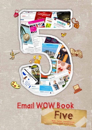
- 1. EmailWOWBook FiveRetail... Fashion... Financial Services...Travel & Leisure... & much more...
- 2. Contents Retail Fashion The Email Wow Book Wow! Yet again we’ve been astounded by the amazing feedback we received on our previous edition of the Email Marketing WOW Book. A big thanks to those who shared their thoughts on the brilliant emails this time round. Anyway, it’s been a while, but the wait is over. Since our last edition we’ve been busy creating hundreds of fantastic emails for our clients. But we always keep an eye out for any gems that appear in our inboxes too, and we’ve picked out the best to showcase to you. Whether it’s enticing copy, great design or clever ideas that have caught our eye, We believe good email marketing should be celebrated. So take a look – we hope this edition of the WOW Book provides you with some great inspiration for your future email campaigns. Enjoy! Steve White Strategy Director Red C 07739950996 0161 872 1361 Steve White Strategy Director Financial Services Travel & Leisure Miscellaneous
- 3. Retail
- 4. A subject line of ‘Like food? Like summer? Love this!’ is likely to grab the attention of most recipients. Harvey Nichols’ emails are always lovely to look at – and the copy, cute and concise. I’ve never seen a brand capture a mood so well in an email.The imagery is perfect and makes me feel a little bit trendier just by opening it.The navigation couldn’t be clearer, and the CTA is bold without being brash. Date: 22nd June 2014 Subject line: Like food? Like summer? Love this! Luci Salt Account Manager Harvey NicholsCurrys PC World Date: 13th August 2014 Subject line: Need a helping hand? Azania McFarlane Junior Account Executive I remember the excitement I felt when I learnt that I’d passed my A Levels and was off to university.All I wanted to do is stock up on shiny new stationary and saucepans. So when A Level results day came round this year, Currys sent out this beautifully timed email. Yes it’s promoting essential items for students off to university but it doesn’t feel sales-y, just helpful and exciting.That could be down to the brilliant timing of it and the alluring 20% discount. The design is cool and clean, and it’s simple to navigate. It’s enough to convince anyone that they need a tablet as well as a laptop.
- 5. John Lewis Date: 11th August 2014 Subject line: Hard-working ideas to inspire Date: 18th August 2014 Subject line: Ssshhh Secret just for you - Hurry ends Monday | Win £100 Sophie Bardsley Account Executive Photobox I think the idea behind this email is great. It’s aimed at the working woman and serves to pick out her perfect work outfit, deck out her work space, and throw in some gadgets for when she’s off-duty.The simplicity of design makes the product heavy email very easy to follow and navigate.And all in all, it provides a one-stop-shop for all your retail needs.Thanks Mr Lewis! The most captivating element of this email has to be the subject line.The use of the box blocking out the text kept me guessing what Photobox had for me, so I couldn’t help but click open! The copy implies that they are doing me a favour by offering me this discount, by using phrases like “we would hate for you to miss out” and “this is a friendly reminder”...They even used a ticking clock GIF to add to the increasing sense of urgency! Natalie Lowe Account Manager
- 6. Date: 28th August 2014 Subject line: Send your little learners back to the classroom with.... Not on the High Street Adrian Rowe Chairman This perfectly timed email arrived to coincide with the start of the new school year, full of unusual products for all ages from primary school to university students. I especially like the succinct and empathetic copy, aimed at aspirational and anxious parents.“For kids, the best part of going back to school is having cool new stuff…” and “One day, you’re walking hand in hand into the playground, now they’re off to university.” Not on the High Street have Middle England all sewn up.With personalised products illustrated with names like Casper, Carrie and Harper, they are tapping into a well-heeled demographic that values individuality highly, and this email is superbly tuned to their aspirations.
- 7. Fashion
- 8. Date: 27th July 2014 Subject line:This colour looks good on you ModCloth Date: 13th July 2014 Subject line:A few tidbits on sizing & fit. Tanya Cebaseva Junior Account Executive New Look This email caught my eye because of how user friendly it is.The idea behind it is finding the best fit of a dress (something that can seem almost impossible at the best of times, let me tell you!) The email details all the ways that ModCloth can help you find the best fitting dress.Whether it’s through customer reviews, a ‘how-to’ video, their ‘Ask the Modstylists’ feature, or their ‘Fit For Me’ app. The concept is strong, the navigation is easy, the messaging is clear and the design is clean and simple. I’m left impressed and better dressed! Frankie Metzinger Account Executive My scepticism over the subject line is what made me open this email. I don’t even know what colour looks good on me, so how does New Look? My question was answered in the email.The animated GIF flicked between styles and colours to ensure it could be relevant to different people. It’s a clever approach as knowing a new style or colour would pop up held my attention. In fact, I let the GIF run its course a couple of times to decide which style I liked most. The email ends with an unmissable bright red sign saying ‘sale continues’.After being hypnotised by fancy graphics, I’ve lost the time between reading the email and ending up at the checkout with a basket full of sale items… wait a minute!
- 9. Date: 1st July 2014 Subject line: Fit for a King Pro Direct Who says guys don’t engage with fashion emails? Burton send out the Friday Re:Fresh every week, and they’ve got plenty of tricks up their sleeve to keep it fresh and engaging. Think animated GIFs, image captions, customer reviews, lively use of colour, style advice and, crucially, plenty of opportunities to click through and shop. It’s the classic “something for the weekend, sir” idea and I love it. Ahhhhh, GIFs and polka dots – could this be the finest visual combination for an email? The GIFs feature a rotating model sporting Monki’s jean collection which is much more attention grabbing than a simple photo. It also features ‘jean guru’ Martin Gustavsson’s thoughts on exactly why I need a new pair of jeans.Well he is the expert… Date: 19th August 2014 Subject line:Your new FAVOURITE jeans Emma Beagrie Special Projects Manager I always keep a lookout for emails from Pro-Direct for two reasons: I love anything football related, and I love good email design. Pro-Direct rarely disappoints.Their latest addition to my inbox had me sold on the subject line ‘Fit for a King’. Inside, the copy is kept short giving the slick, stylish design prominence.The images are detailed and bold, and the ‘pre-order now’ button takes pride of place.A royal gem of an email. Reuben Lauder Interactive Designer Monki o
- 11. PayPal Date: 1st July 2014 Subject line: Ooh...aaahh...yyyeeeesssss...Jess SCORES! Swinton The subject line made me open this email from PayPal. Not only because of it’s use of personalisation, but because it prompted me to ‘view my recent transactions’. Seeing as I’ve not recently made any transactions via PayPal, I opened the email to investigate. I discovered that PayPal was simply promoting its latest offers and encouraging me to check up on my account online. Sneaky, but it worked, I’ll give them that. This email was extremely effective in creating a sense of urgency and made me keen to click open (even if it was down to trickery!) Jonny Wilcox Account Manager Here we have an email that brightened my inbox and my day.The bold colours are mood-boosting.The boxy design is simple and clear.The navigation is simple. The personalisation is flattering, and even if I didn’t require insurance right now, the added content is interesting and useful – so they’ve got my attention either way. Date: 14th August 2014 Subject line: Jonny, view your recent transactions now Jess Williams Senior Account Executive
- 12. Travel & Leisure
- 13. James Villa Holidays Date: 14th July 2014 Subject line: Extraordinary villas… Jennie Ambrose Head of Creative Sometimes, the most successful emails are the simplest.All the information is neatly presented in rows and columns making it easy to read and navigate.And the bright pink branding is used to highlight the important stuff like the price and the CTA – so I’m instantly drawn to the information I need. No fuss, no nonsense, just clear, concise communication. Date: 6th July 2014 Subject line: Enjoy the best of British Last minute.com Katharine Mitchell Account Director A dreamy look in your eyes, mental calculations of available funds, yep, they’re the signs of a successful travel email. As soon as I opened this email I declared I wanted to go ‘there’ to no one in particular. The ratio of images to copy is ideal. The more I look, the more I want. The blue branding makes me think of swimming pools, the sea, and sunny skies. And as you scroll to the end you see the words ‘late deal’. Who’s going to say no to a good deal after that?
- 14. Virgin is probably one of my favourite brands. Their tone of voice paired with their striking design and image choices just work for me. After signing up to the Virgin Trains mailing list I promptly received this welcome email. I opened it to be greeted with ‘Hello Gorgeous’ – cheeky, but I like it. The copy is so charming and witty that I desperately want to be friends with the person who wrote this to me.The simple colour pallet and uncluttered design allows me to focus on their word wizardry.Then they only went and offered me money off my first journey. I’m swooning over an email! Date: 14th August 2014 Subject line:A warm welcome and £5 off your first journey Virgin Trains Sonya Clibbons Senior Art Director Date: 1st July 2014 Subject line: Since you’re under 26, we can hook you up with exclusive flight prices and travel deals,Abi STA Travel I don’t need much persuading to book a holiday; the only thing that would put me off is price. So receiving an email with the subject line ‘exclusive flight prices and travel deals’ has me opening it faster than a kid opening Christmas presents. ‘You’re so lucky to be young’ is the first thing I read.You’re right I am lucky, and life is too short not to go on holiday four times a year isn’t it?! The images and the to-the- point copy enforced my logic.‘Cheap flights and 1000s of discounts’ you say? Find out more? Yes please.And like that I’m on the website.What a fab email. Abi McSherry Copywriter
- 15. Secret Escapes has perfected the art of persuasion with their incredible discounts on luxury getaways.The subject line hooks you with the promise of a huge saving.And once they get you inside, there’s minimal copy to read because the beautiful images are enough to convince you. With constant reminders of the great saving you’d be making by booking it now and the numerous ‘Visit Sale’ CTAs, it’s hard to stop yourself from looking. A simple but effective email. Date: 6th August 2014 Subject line: Up to 66% off Great British breaks in Devonshire, Somerset and the Cotswolds, plus European and Caribbean escapes Secret Escapes Chris Morey Account Manager
- 16. Miscellaneous
- 17. Leigh Whitnall Account Director Date: 11th July 2014 Subject line: Create your own burger, and if it’s chosen we’ll make it McDonald’s Date: 18th August 2014 Subject line: Living room essentials: Must-have pieces for communal harmony. From £99 Made.com Steve White Strategy Director I love nothing more than an email with white space.The simplistic layout with the highlighted CTAs fit nicely with the company’s chic and contemporary branding.And then there’s its clever content.The concept of Made furniture bringing the whole family together is lovely. And the copy couldn’t be more current with its references to popular shows “Modern Family”,“Game of Thrones” and “Gogglebox”. It’s an email that grabs your interest and makes you want to read on. Cooking is definitely not my favourite thing to do and my local McDonalds knows this.That’s why they keep sending me emails with big pictures of burgers on.They always make me hungry, but this one really got my attention. Worried that I’d possibly become bored of their current menu, this email invited me to be the first to create my very own burger that could end up the next new thing on their boards. If, like me, you don’t like cooking because it takes time and effort, they’ve hit the nail on the head with the ease of this competition.You can create and share your new burger, and vote for others, in just three simple steps.There’s not much copy to read – just clear and concise instructions which makes the whole process feel incredibly quick and easy.The colour pallet is lovely and striking and the main image, well… I’m just popping out!
- 18. Alton Towers Date: 13th June 2014 Subject line: Stay over! Hannah Walker Artworker This email caught my attention and stayed in my mind.The choice of colours and the mix of images is kind of creepy, yet completely enchanting. Despite how active and busy the images make the email, the messaging still stands out and is clear to read – not an easy combination to achieve.The structure is clear and the CTA can’t be missed. Overall, it’s quite an unforgettable email.