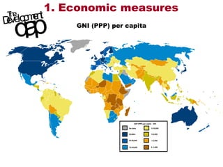
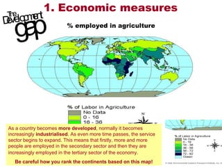
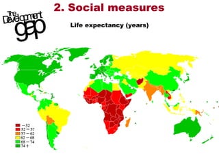
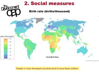
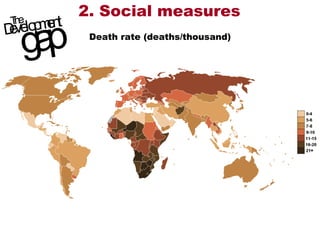
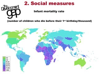
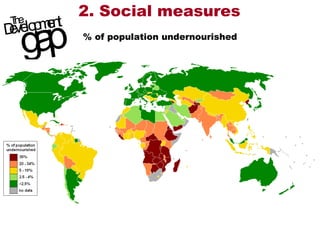
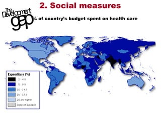
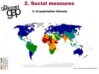
How accurate is this cartoon? Is the world divided into a simple ‘rich-poor’ division? Your task is to study the following maps and compare the three continents of the LEDCs, putting them into rank order from most to least developed.
1. Economic measures GNI (PPP) per capita
1. Economic measures % employed in agriculture As a country becomes  more developed , normally it becomes increasingly  industrialised . As even more time passes, the service sector begins to expand. This means that firstly, more and more people are employed in the secondary sector and then they are increasingly employed in the tertiary sector of the economy.   Be careful how you rank the continents based on this map!
2. Social measures Life expectancy (years)
2. Social measures Birth rate (births/thousand) People in more developed countries tend to have fewer children.
2. Social measures Death rate (deaths/thousand)
2. Social measures Infant mortality rate  (number of children who die before their 1 st  birthday/thousand)
2. Social measures % of population undernourished
2. Social measures % of country’s budget spent on health care
2. Social measures % of population literate
So how did you rank the continents? Which one came out consistently towards the bottom? Which was at the top? Have you a clearer picture of the development gap across the world?

Indicators of development

  • 1.
    How accurate isthis cartoon? Is the world divided into a simple ‘rich-poor’ division? Your task is to study the following maps and compare the three continents of the LEDCs, putting them into rank order from most to least developed.
  • 2.
    1. Economic measuresGNI (PPP) per capita
  • 3.
    1. Economic measures% employed in agriculture As a country becomes more developed , normally it becomes increasingly industrialised . As even more time passes, the service sector begins to expand. This means that firstly, more and more people are employed in the secondary sector and then they are increasingly employed in the tertiary sector of the economy. Be careful how you rank the continents based on this map!
  • 4.
    2. Social measuresLife expectancy (years)
  • 5.
    2. Social measuresBirth rate (births/thousand) People in more developed countries tend to have fewer children.
  • 6.
    2. Social measuresDeath rate (deaths/thousand)
  • 7.
    2. Social measuresInfant mortality rate (number of children who die before their 1 st birthday/thousand)
  • 8.
    2. Social measures% of population undernourished
  • 9.
    2. Social measures% of country’s budget spent on health care
  • 10.
    2. Social measures% of population literate
  • 11.
    So how didyou rank the continents? Which one came out consistently towards the bottom? Which was at the top? Have you a clearer picture of the development gap across the world?