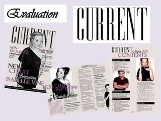
2. Current In what ways does your media product use, develop or challenge forms and conventions of real media products? For a large amount of my magazine I have used a conventional style. The genre of music that my magazine is based upon is POP. This is shown in my masthead, CURRENT. The name CURRENT connotates to the POP culture of constant current music. I adapted this from the name POD, the name wasn’t long enough and after my feedback, my teacher told me he didn't like it due to being boring, causing me to change it. I have placed my model over the top of the masthead which is very conventional of a magazine, this is shown in the magazine that I have chosen to compare my magazine to in this evaluation. I wanted my magazine to look quite girly yet have a slightly edge. I have used my colour scheme of purple white and black to do this and i think that it has worked quite well. My model is standing in quite a conventional pose, making her look girly and I think appealing to my audience. Although i have followed many conventional forms, I have challenged some of the convention of magazines, by using fancy font ‘Vivaldi’, this isn't used in many magazine as it can be too fussy but felt that the font is a change from the conventional style and worked well for my magazine.
3. Current Features of the magazine Masthead My masthead ‘CURRENT’ is very conventional, using the font EDITION, which is a magazine/newspaper style of font. IMAGE Image placed in front of the masthead isn't used all the time in music magazine but in fashion magazines it is done commonly, as the model is glamorous and catches the readers attention. Smiling into the camera to draw people in. Large font on ‘Win’ to draw in customers is common in conventional styled magazines. Conventional cover lines Featured artist Barcode placed neatly in the corner Strap-line Placed along the bottom to get the reader to subscribe to the magazine.