
Recommended
Recommended
More Related Content
What's hot
What's hot (20)
Similar to in the world of data analytics, there is a multitude of visualizat
Similar to in the world of data analytics, there is a multitude of visualizat (18)
More from LizbethQuinonez813
More from LizbethQuinonez813 (20)
Recently uploaded
Recently uploaded (20)
in the world of data analytics, there is a multitude of visualizat
- 1. in the world of data analytics, there is a multitude of visualization products. This article (Using Tableau to Visualize) discusses the methodology of teaching the use of these visualization products. After reading the article you will find a Gartner Magic Quadrant depicting the different manufacturers of visualization products. In the leader quadrant, there are three companies, Tableau, Qlik, and Microsoft Power BI. As the Subject Matter Expert (SME), compare one major difference between each of the products as it pertains to this article (i.e.: online resources, online training, tutorials, etc.). Read the scenario and assignment instructions in the You Decide Overview. You have been asked by the hospital's board of directors to prepare a risk management plan that will help to develop a culture of safety throughout Little Falls Hospital. The plan should address the National Patient Safety Goals and strategies to be implemented throughout the organization. Prepare a 750-word summary of the important components of the plan, the resources that are required to be implemented, and strategies to overcome some of the hospital's deficiencies. Your primary text and journal and/or website research must be used as a reference to support your analysis. Scenario Summary The Joint Commission has recently visited Little Falls Hospital for its accreditation visit. Overall, the survey went well except for the standards related to the 2010 National Patient Safety Goals. The Joint Commission surveyors indicated that the hospital has not devoted enough resources and staff into achieving these goals. As the new risk manager, you are aware of the following issues. · There is no specific plan on how Little Falls Hospital will address and achieve these goals. This has been handled on a department-by-department basis.
- 2. · Recently, there has been a significant plaintiff settlement paid by the hospital's insurance carrier, which involved a patient death related to the incorrect medication being administered. · The costs of the hospital's professional liability insurance continue to escalate, and the policy is due to expire in 6 months. Little Falls Hospital has had the same health professional liability insurance policy for 10 years. · The hospital is facing financial constraints and does not have a significant amount of cash on hand to invest in new technologies. Your Assignment You have been asked by the hospital's board of director's to prepare a risk management plan that will help to develop a culture of safety throughout Little Falls Hospital. The plan should address the National Patient Safety Goals and strategies to be implemented throughout the organization. Prepare a 750- word summary of the important components of the plan, the resources that are required to implement, and strategies to overcome some of the hospital's deficiencies. Your primary text and journal and website research must be used as a reference to support your analysis. Key Players Mr. Howard—Joint Commission Surveyor Overall, I believe that Little Falls Hospital provides good quality care to its patients. The hospital scored very high in many aspects of the survey, but it did not seem focused on the Joint Commission National Patient Safety standards. The knowledge and understanding of these goals was inconsistent among staff; however, some of the departments had little awareness on how these goals impact the operations. Communication is definitely a problem. Barbara Gillium—Director of Radiology I have attended several conferences in the last couple of years and these goals have always been an important topic of discussion. The radiology department has always prided itself in
- 3. quality care, and we do everything we can to make sure our patient care is not only the highest quality but also the safest possible. Max Dillon—Hospital Pharmacist The pharmacy department has always been one of the best departments in the hospital. I keep asking for the money to invest in technology but I always get denied. I think that our current systems are more effective than the latest technology. You invest all that money, but it is the same humans who are providing care and dispensing medicines. I think sometimes that computerized systems give staff a false sense of security when they should be doing their jobs accurately anyway. Grading Rubric Category Points Description Understanding 20 Demonstrate a strong grasp of the problem at hand. Demonstrate understanding of how the course concepts apply to the problem. Analysis 20 Apply original thought to solving the business problem. Apply concepts from the course material correctly toward solving the business problem. Execution 10 Write your answer clearly and succinctly using strong organization and proper grammar. Use citations correctly. Total 50 A quality paper will meet or exceed all of the above requirements.
- 4. Contents lists available at ScienceDirect Journal of Accounting Education journal homepage: www.elsevier.com/locate/jaccedu Using Tableau to visualize data and drive decision-making☆ Jamie Hoelschera,⁎ , Amanda Mortimerb a School of Business, Southern Illinois University Edwardsville, Box 1104, Edwardsville, IL 62026, United States b PricewaterhouseCoopers, United States A R T I C L E I N F O Keywords: Data analytics Data visualization software AACSB Accounting Standard A7 Business decision-making Accounting educational resource A B S T R A C T This case emphasizes the importance of data analysis through the usage of data visualization software to help you gain an understanding of data and how it can be transformed into in- formation that can enhance the decision-making process. In the data visualization software, Tableau, you will be asked to connect to an Access data file to analyze six months of sales
- 5. transaction data of a small start-up ice cream manufacturer. Consistent with AACSB Accounting Standard A7, the case focuses on familiarization with data visualization software to “convey data, results, and insights” (AACSB, 2013) and apply higher-order thinking. Upon familiarization with the data and data visualization software, you will be required to perform an exploratory analysis to identify key trends in the data to prepare and report that information to enhance the business decision-making process. This case is intended to be utilized in an undergraduate accounting information systems course; an introductory managerial course; or a course focusing on data analytics as a basic introduction to data visualization software. 1. Case Ivana’s Ice Cream just finished its first six months of manufacturing and selling ice cream. The company has two main product lines, ice cream cups and ice cream bars, both of which are available in vanilla or chocolate flavors. Ivana Cone, the sole owner of Ivana’s Ice Cream, has carefully recorded basic accounting data, including sales transaction data over the company’s first two quarters of operations using Microsoft Access. Unfortunately, Ivana lacks formal business and accounting training. You have been hired as a consultant to utilize Tableau data visualization software to analyze the company’s data from the first two quarters of operations and to provide a detailed breakdown of sales, product mix, and gross profit by product line and geographic region. In addition, Ivana
- 6. would like to expand the business in future years and you have been asked to provide insights and recommendations. First, you will need to understand the business and operations. The first step in any data analytics project is to thoroughly understand the data and its current format. To learn more about data analytics in the field of accounting and the benefits and uses of data visualization software see Appendices A and B, respectively. When creating visualizations, it is important to consider which type of graph or chart best fits the data. Although there are numerous types of visualizations (graphs and charts) from which to choose, some of the most common include bar charts, line graphs, pie charts, and maps. The data can help you determine which visualizations would help convey the information most effectively. For example, bar charts are useful when data are separated into different categories, while line graphs are useful to show changes in data over time. Pie charts display categories as a portion of a total, and maps represent data geographically and should only be used if the https://doi.org/10.1016/j.jaccedu.2018.05.002 Received 11 October 2017; Received in revised form 22 May 2018; Accepted 23 May 2018 ☆ This manuscript is one in a series of manuscripts that will appear in the virtual Special Issue 2017 Teaching, Learning and Curriculum Midyear Colloquium. In the virtual SI, this will appear under the heading “Educational Case”.
- 7. ⁎ Corresponding author. E-mail addresses: [email protected] (J. Hoelscher), [email protected] (A. Mortimer). Journal of Accounting Education 44 (2018) 49–59 Available online 14 July 2018 0748-5751/ © 2018 Elsevier Ltd. All rights reserved. T http://www.sciencedirect.com/science/journal/07485751 https://www.elsevier.com/locate/jaccedu https://doi.org/10.1016/j.jaccedu.2018.05.002 https://doi.org/10.1016/j.jaccedu.2018.05.002 mailto:[email protected] mailto:[email protected] https://doi.org/10.1016/j.jaccedu.2018.05.002 http://crossmark.crossref.org/dialog/?doi=10.1016/j.jaccedu.201 8.05.002&domain=pdf data contains location information. Furthermore, Tableau has the ability to suggest a visualization based on the types of fields that you select; this can be a very convenient feature when learning to create visualizations. Before you examine the Access database Ivana has given you, she would like to tell you a little about the current state of her startup company and the three tables she created to store the company data. She created individual tables for customers, orders, and company products. Currently, Ivana’s Ice Cream only sell s boxes of ice cream cups and ice cream bars, and each come in either vanilla
- 8. or chocolate. Below is the unit cost and sales price for each item Ivana’s Ice Cream currently sells (see Exhibit 1): Ivana’s Ice Cream currently has twenty-two customers. In general, these customers are smaller retailers, including convenience stores and local supermarkets. Currently, Ivana’s Ice Cream only sells to retailers in the Midwest states of Missouri and Illinois. Below is a list of all of the customers with which Ivana’s Ice Cream has done business with since its inception (see Exhibit 2). Ivana’s Ice Cream currently has four sales representatives. For simplicity, Ivana has assigned Levi Adams to western Missouri; Gabby Bennet to eastern Missouri; Russell Bishop to western Illinois; and Carly Marshall to eastern Illinois (see Exhibit 3). Your instructor will provide you with the Microsoft Access data files to complete the requirements of this case.1 Your instructor may also assign you specific training videos from the Tableau website (www.tableau.com) to familiarize you with the data visua- lization software, as well as information related to downloading your free student copy of Tableau. Watching the first few training videos at http://tableau.com.learn/training will help better prepare you for the requirements of this case study. Before beginning the following case requirements, download the Microsoft Access file provided to you by your instructor and save it to your desktop or a personal flash drive. Open the Access file and examine each of the tables, as well the data types of each of the fields, and any primary keys identified. You will connect to Ivana’s data and analyze the data using Tableau, as described
- 9. below. 2. Requirements Being new to Tableau, a colleague has provided the following tips to help you begin your analysis of Ivana’s Ice Cream using Tableau: 1. Ensure you have downloaded the latest version of Tableau. Visit https://www.tableau.com/academic/students to obtain a free one-year Tableau license for students. 2. Ensure you have saved the Ivana’s Ice Cream Access file provided by your instructor to your desktop or personal flash drive. 3. Double click on the Tableau Desktop icon to open Tableau. 4. Under “Connect To a File,” select “Access.” 5. Browse for the Ivana’s Ice Cream file and select “Open.”2 6. Drag each table to the open pane.3 7. Select Sheet 1 to go to your first worksheet. Before you conduct your own exploratory analysis, Ivana Cone would like to understand some basic information related to her enterprise. Specifically, she would like you to answer the following questions to be included and returned in a formal memo to her (below, your colleague has provided step-by-step instructions to enable you to successfully address each of Ivana’s questions in Tableau): 1. What is the total quantity sold of chocolate ice cream cups? • From the Dimensions pane, drag Flavor and Product to the
- 10. Rows pane (by holding the Ctrl button down after you select Flavor and before you select the Product dimension, you can drag and drop both dimensions at the same time). • From the Measures pane, drag Quantity to the Columns pane. • Hover your pointer over the bar for chocolate ice cream cups and record the quantity of chocolate ice cream cups sold during the period. • Click on the top of the graph where it is currently titled “Sheet 1.” Rename the graph “Quantity Sold by Product.” ProductID Product Flavor Unit cost Sales price 1 Ice Cream Cup Chocolate $2.55 $4.00 2 Ice Cream Cup Vanilla $2.50 $4.00 3 Ice Cream Bar Chocolate $3.00 $5.00 4 Ice Cream Bar Vanilla $2.85 $5.00 Exhibit 1. Product table. 1 Please e-mail [email protected] to request the Microsoft Access file for this case. 2 If you are unable to connect to your Access database in Tableau, please go to https://www.tableau.com/support/drivers and search for Microsoft Access to download the driver necessary to connect to your Access file. 3 Drag the tables over in order so they may properly join. Notice how the Customer table and Orders table are inner joined on the Customer ID field, and the Orders table and Products table are inner joined on the ProductID field. J. Hoelscher, A. Mortimer Journal of Accounting Education 44 (2018) 49–59
- 11. 50 http://www.tableau.com http://tableau.com.learn/traini ng https://www.tableau.com/academic/students mailto:[email protected] https://www.tableau.com/support/drivers ID Customer name Address City State ZIP Region C00101 Grandma’s Grocery 6524 Oaktree Dr. Springfield MO 65082 W MO C00102 K & K Quick Mart 4817 Main St. Joliet IL 60403 E IL C00103 Fresh Foods 436 Whitedge Blvd. Peoria IL 61602 W IL C00104 Sandy’s Superstore 1525 Parkview Dr. Rolla MO 64801 W MO C00105 Midwest Market 6401 Manor Circle
- 12. Galesburg IL 61401 W MO C00106 Food N Stuff 9452 Bridgeport Ln. Joplin MO 64801 W MO C00107 Capital City Grocery 684 First Street Jefferson City MO 65101 E MO C00108 John’s Supermarket 2174 Washington Ave. Warrensburg MO 64093 W MO C00109 Mini Mart 3355 President Ct. Aurora IL 60503 E IL C00110 MJC Deli 42 Greenview Blvd.
- 13. Champaign IL 61820 E IL C00111 Paul’s General Store 5551 Market St. Mount Vernon IL 62864 E IL C00112 Family Pantry 985 Wilson Dr. Jacksonville IL 62650 W IL C00113 Garry’s Mini Mart 7931 North 1st St. Sedalia MO 65301 W MO C00114 Market Deli 1 Harvard Dr. Belleville IL 62223 W IL C00115 B&B Convenience Store 160 Grand Ave. Columbia MO 65202 E MO
- 14. C00116 Express Grocery 252 Washington St. Bloomington IL 61704 E IL C00117 Bargain Mart 9956 Maple St. De Kalb IL 60115 E IL C00118 Quality Foods 112 Henley Ln Jefferson City MO 65109 E MO C00119 Local’s Cupboard 1411 West Park Dr. Fulton MO 65251 E MO C00120 Salem Wholesale 25 Willow Dr. Salem MO 65560 E MO C00121 Gas ‘N Go 9852 Peach St. Nashville IL 62263 W IL C00122 Dollar Deals 333 Main
- 15. St. Poplar Bluff MO 63901 E MO Exhibit 2. Customer table. J. Hoelscher, A. Mortimer Journal of Accounting Education 44 (2018) 49–59 51 • At the bottom of the toolbar where it also shows “Sheet 1,” right click on the tab and select “Rename Sheet.” Rename the sheet “Quantity Sold by Product.” 4,5 2. On what date were the most products sold (quantity-wise)? • From the Measures pane, drag Quantity to the Rows pane. • From the Dimensions pane, drag Order Date to the Columns pane. • The order date is being aggregated at the yearly level. To disaggregate and get a daily sum, click on the + in the YEAR (Order Date) to expand to a quarterly measure. Continue to expand until you get a daily measure. • View the line graph to identify the date with the largest quantity of products sold. • Name the graph “Quantity Sold by Date.” • Rename the sheet “Quantity Sold by Date.” 3. What is the total dollar amount of sales for vanilla ice cream bars?6
- 16. • In your new sheet, create a new calculated field, select “Analysis” from the tool bar, and then select “Create Calculated Field.”7 • Name the newly calculated field “Sales Total.” o The sales total should be calculated by multiplying Quantity by Sales Price. [Sales Price] ∗ [Quantity] o Notice you are told “the calculation is valid.” Select “OK.” • From the Dimensions pane, drag Flavor and Product to the Rows pane. • From the Measures pane, drag your newly created field, Sales Total, to the Columns pane. • Select the bar for vanilla ice cream bars to examine the sales total for this product line. • Name the graph “Sales by Product.” • Rename the sheet “Sales by Product.” 4. Which item has the highest sales for the period? What is the amount of sales for that item? • This answer can be determined by examining the “Sales by Product” visualization. • Document which item has the highest dollar sales for the period and what the amount of sales were for that item. 5. Which flavor has the lowest sales for the period? What is the amount of sales for that flavor? • This answer can also be determined by examining the “Sales by Product” visualization. • As this question only asks about flavors, and not a specific product, remove Product from the Rows pane by dragging and dropping Product back into the Dimensions pane.8
- 17. • To make the visualizations accurately color coded, drag Flavor from the Dimension pane and drop it on Color in the Marks pane. o Click on Color and then select “Edit Colors.” o Make chocolate brown and vanilla an off-white color. o Select “OK.” • Identify which flavor has the lowest sales for the period and the amount of sales for that flavor. • Rename the visualization and the sheet “Sales by Flavor.” 6. How much of the chocolate flavor sales are attributed to sales of ice cream bars? • This answer can be determined by examining the “Sales by Flavor” sheet. • From the Dimensions tab, select “Product” and drag and drop it on Color in the Marks pane. • You will now see how much of each flavor’s sales are attributable to which product. • Hover over the chocolate bar to determine how much of the chocolate flavor sales are attributed to the sale of ice cream bars. 7. Which graph type would be recommended to show sales by day of the week? Which day of the week has the highest dollar amount of sales? What is the total dollar value of sales on that day of the week? • In a new sheet, select Sales Total from the Measures pane, Ctrl and Day of the Week from the Dimensions Pane. • From the Show Me toolbar, see the variety of visualizations that can be used, but note which chart is recommended (bordered) to visualize your specific data.
- 18. Sales representative Region Levi Adams Western Missouri Gabby Bennet Eastern Missouri Russell Bishop Western Illinois Carly Marshall Eastern Illinois Exhibit 3. Sales representative table. 4 Click on the tab next to your newly created sheet name (with the + sign) to create a new sheet and begin work to answ er the next question. 5 Changing the sheet name first will automatically update the graph title to the same name. 6 You currently only have measures based on quantity, unit cost per item, and sales price per item. To capture the total sales price, a new measure must be created. 7 You can also right click in the Measures pane, select “Create,” and then select “Calculated Field.” 8 Alternatively, to keep the existing visualization intact, you can copy the existing sheet and begin working from the copy. Simply right click on the sheet tab of the sheet you would like to copy and select “Copy Sheet.” Then, on the tab for a new sheet, right click again and select “Paste Sheet.” J. Hoelscher, A. Mortimer Journal of Accounting Education 44 (2018) 49–59 52 • Double click on the suggested visualization type.9 • Verify the Sales Total measure was brought to the Columns pane and the Day of Week dimension was brought to the Rows
- 19. pane to illustrate your visualization. • Examine which day of the week has the highest dollar amount of sales. • Rename the graph and sheet “Sales by Day.” 8. Which sales representative has the lowest dollar amount of sales on Mondays? What is the total dollar amount of that sales representative on Mondays? • This answer can be determined by examining the “Sales by Day” sheet. • From the Dimensions pane, drag Sales Representative to the Rows pane. • Examine which sales representative has the lowest dollar amount of sales on Mondays. • Rename the graph and sheet “Sales Rep Sales by Day.” 9. What are the total sales for the period? • In a new sheet, drag Sales Total from the Measures tab to the Columns pane.10 • Examine total sales for the period. • Rename the graph and sheet “Total Sales.” 10. Which sales representative has the highest dollar amount of sales, and what was the dollar amount? • In the same sheet, change the chart type from Automatic to Pie in the Marks card. • Drag Sales Total from the Rows pane to Angle in the Marks card. • Drag Sales Representative from the Dimensions pane to Color in the Marks card. • For reference, in the Marks card, click on Label. Select “Show
- 20. Label” and under “Marks to Label,” select “All” to show the total sales revenue for each sales representative. • Examine which sales representative has the highest dollar amount of sales. • Rename the graph and sheet “Sales by Rep.” 11. What is the total gross profit for Ivana’s Ice Cream? • In a new sheet, create a new calculated field. o COGS = [Cost] ∗ [Quantity] o Select “OK” • Create another calculated field. o GP = [Sales Total] − [COGS] • Drag your newly created measure, GP, to the Columns pane. • Examine the total gross profit for Ivana’s Ice Cream. 12. What is the average gross profit among all sales representatives? • From the Dimensions pane, drag and drop Sales Representative into the Rows pane.11 • To determine the average gross profit per sales representative, select the Analytics tab and drag and drop the average line into the Graphic pane. • Examine the average gross profit per sales representative. • Rename the graph and sheet “Gross Profit.” 13. Which geographic region has the least customers? • If Tableau does not already recognize the ZIP code field as a geographical field (shown by the globe icon to the left of the
- 21. dimension), you will have to assign a geographic role. • Click on the down arrow next to ZIP code in the Dimensions pane. • Hover your mouse over Geographic Role, and then select “ZIP Code/Postal Code.” • In a new sheet, hold down Ctrl while selecting Latitude (generated) and Longitude (generated) from the Measures pane and ZIP Code from the Dimensions pane. • Select the recommended graph from the Show Me toolbar. • Drag Region from the Dimensions pane and drop it on Color in the Marks card. • Rename the graph “Customers by Region.” • Examine the customers by geographic region. 14. Which ZIP code generates the highest gross profit? • In the same sheet, drag Gross Profit from the Measures pane to Size on the Marks card. • Identify the ZIP code which has the largest gross profit. 9 Depending upon the type of data you are trying to visualize (i.e., how many dimensions and measures you have), it is important to know which type of chart is preferred to display your data. For example, bar charts are very intuitive and enable the user to quickly examine highs and lows in the data when you have categorical variables, whereas line charts enable a user to see changes or trends over time. Pie charts are helpful when you would like the user to examine relative proportions. Based on the dimensions and measures you are wanting to capture in a given visualization, Tableau recommends the type of visualization that would best display your
- 22. given data. See the Tableau Whitepaper entitled, “Which chart or graph is right for you?” for further information regarding how to select the appropriate visualization for your data (Tableau, 2017a). 10 Note that for one measure, Tableau recommends a horizontal bar graph. 11 Note that for one measure and one dimension, Tableau recommends a horizontal bar graph. To have a vertical bar graph, you can simply move the dimension (Sales Representative) to the Columns pane and the measure (GP) to the Rows pane. J. Hoelscher, A. Mortimer Journal of Accounting Education 44 (2018) 49–59 53 Compile each of your answers on a memo to Ivana in numerical form. 2.1. Additional case requirements Before you updated Ivana with the results of your previous analysis, Ivana emails you with a few additional questions. Unfortunately, your colleague who is a Tableau expert is on vacation and unable to provide you with guidance for the follow-up analysis. Address each of the following additional questions posed by Ivana in your memo: Ivana: “I want to make sure we treat our biggest customers the best, as it is vital we do not lose their business. I might consider offering discounts to our best customers in the future. Who is
- 23. our biggest customer, and what is the total revenue from that customer so far? Also, what is the total gross profit from that customer?” “I want to make sure my best sales representatives are rewarded. Since Ivana’s Ice Cream opened, I have been paying my sales representatives a flat rate, but I need to start paying them based on their production levels. Who sold the most units in September 2016? How many units did that sales representative sell?” “In your analysis, did you notice any trends in the data or general areas of concern that warrant my attention?” 3. Teaching notes 3.1. Learning objectives The case uses sales transaction data to engage students i n the utilization of data analytics to drive decision-making. The case has several objectives consistent with AACSB Accounting Standard A7 (AACSB, 2013) to stimulate student learning, including: 1. Applying data analytics to understand company data.12 2. Utilizing data visualization software to present results needed to make key business decisions. 3. Applying data analytics to observe key data trends.13 4. Applying data analytics to enhance the business decision- making process. 5. Enhancing verbal and written communication skills to effectively disseminate data trends and business recommendations.
- 24. Paralleling these objectives, the case also aligns with the AICPA Core Competency Framework (AICPA, 2017) as shown in Table 1. 3.2. Implementation guidance The case was created to provide an introduction to data visualization software and the basics of data analytics. Apostolou, Dorminey, Hassell, and Rebele (2014) emphasize the need for instructional educational cases that address emerging technologies and their usage in the accounting profession. While few accounting educational case studies have been developed to focus on data analytics (Igou & Coe 2016; Janvrin, Raschke, & Dilla, 2014; Kokina, Pachamanova, & Corbett 2017), many focus more on the accounting task and less specifically on the data visualization software functionality and user interface. More specifically, many cases (Igou & Coe, 2016; Janvrin et al., 2014; Kokina et al., 2017) do not focus on understanding the underlying data set, understanding dimensions and measures or understanding when different types of graphs are suitable for use. For example, Brazelton (2000) finds Bloom’s revised taxonomy of learning to be directly applicable to accounting students, but lower-level skill sets such as remembering, Table 1 Alignment with AICPA Accounting and Professional Competencies. Accounting competencies:
- 25. Technology and tools Students leverage data visualization software to better understand transaction data from a relational database, create new calculated fields, aggregate fields, data mine, observe key trends and document and present results Professional competencies: Decision making Students perform various data analytic techniques to examine and visualize data trends to instill the link between data, knowledge and insight to enhance the decision making process and make optimal recommendations Communication Whether done individually or in small groups, students fine-tune their written (and verbal skills if done in a group or presented to the class) communication skills to effectively deliver and convey data insights in a professional memo Collaboration If done in small groups, students work productively with diverse peers to achieve a common goal 12 Results of case efficacy related to students’ ability to apply data analytics to understand company data and utilize data visualization software to present results is shown in Panel A of Table 2. Additional results of indirect evidence related to case efficacy related to case objectives is shown in Table 3. 13 Results of case efficacy related to students’ ability to apply data analytics to observe key data trends and enhance verbal and written communication skills to effectively disseminate data trends and business recommendations to enhance the decision-making process are shown in Panel B of Table 2. Additional results of indirect evidence related to case efficacy related to case
- 26. objectives is shown in Table 3. J. Hoelscher, A. Mortimer Journal of Accounting Education 44 (2018) 49–59 54 understanding, and applying must first be acquired before higher-level skills such as analyzing, evaluating, and creating can be mastered. Oftentimes, students in undergraduate accounting information systems courses have not yet completed that course se- quence and are in differing levels of the accounting curriculum. This case study provides a basic introduction of data visualization software and encourages students to gain a thorough understanding of the data in order to determine which type of visualization would be most useful to display the underlying data to the end user, and thus work sequentially through Bloom’s taxonomy.14 The case can be used as a standalone case in or out of the classroom. Unlike many other data analytic cases (Igou & Coe 2016; Janvrin et al., 2014,15 Kokina et al., 2017) that require anywhere from two hours up to four 75-min class periods, this case can be structured to be completed within the confines of a normal 75- min class setting (or as a standalone homework assignment). For our initial pilot study, the case was assigned to an undergraduate accounting information systems class upon learning basic
- 27. database design skills within both Microsoft Excel and Access. The students had no previous exposure to data visualization software or Tableau.16 The case was assigned as an individual, take- home assignment. Students were required to submit their answers to each question, as well as the follow-up and exploratory analysis in a memorandum (sample memorandum shown in the case solutions). Students were not required to present their findings to the class. Upon completion of this introductory case study, students completed other, more advanced data analytic and data visualization cases with more ease and success than previous sections of the course where this case had not been administered. In later semesters, the case was administered in class, in small groups of two to three students. Students were instructed to read the case in its entirety, download Tableau to a PC (if not in a lab setting), and download the Access data files from the course website prior to class. Students were given the entire class period to work through the case. Most groups were able to complete the guided questions and exploratory portions of the case, but many groups did have to finalize the formal memo outside of class as homework. If the instructor is able to devote more class time to the case, the instructor may require students to prepare a formal presentation to the class to present their visualizations and memo. This will also facilitate class discussion, as it is unlikely all students will identify every key data trend that could be discovered and disseminated to Ivana. Conversely, if in-class time does not allow for formal
- 28. presentations, instructors may wish for their students to prepare a video presentation of key findings, visualizations, and re- commendations. 3.2.1. Alternative implementation guidance The case study could be incorporated into an introductory data analytics course or a higher-level auditing or internal auditing course. The emphasis of the case would then shift from the guided demo and related questions to the follow-up, self-guided ex- ploratory questions. Students could be asked to provide detailed visualizations (all visualizations provided below in the case solu- tions), including a dashboard or story detailing the key data trends they discovered and how Ivana should use the information to drive business decisions going forward. The case also lends itself well to an in-class small group exercise. The case could also be tailored for an introductory cost or managerial course. For brevity, the memo and additional requirements could be omitted to allow students to focus on the accounting related issues, such as: gross profit, cost of goods sold, pr ofit by product line, profit by sales representative, profit by geographic region, and other calculated fields. 3.3. Evidence of efficacy The case was tested at a residential campus of a public university in the Midwest, and the instructor was one of the authors. This case was tested for efficacy from three sections of an undergraduate accounting information systems course over the
- 29. spring 2017 and fall 2017 semesters. The case was also tested for efficacy in a graduate level internal auditing course.17 While the majority of students were not previously familiar with data visualization software in general, Table 2 provides a breakdown of case outcomes. Panel A reports the assessment results of the students’ ability to learn data visualization software and apply data analytic techniques.18 As the first half of the case was guided, with step-by-step instructions, only 5.94% of students did not meet expectations. Panel B reports assessment results of students’ ability to apply the data analytic techniques they were taught to answer questions pertaining to business operations and to then apply analytic techniques in an unstructured context.19 Lastly, stu- dents must report and disseminate their findings in a professional memo to enable users of the information to enhance their business decision making. All but 8.64% of students at least met expectations. In addition, almost 30% of students exceeded expectations and were able to prepare a professional memo in good form, while also addressing Ivana’s specific questions and also identifying many key data trends that Ivana should consider in future business decisions. To further assess case efficacy, a survey was administered upon completion of all case requirements, but prior to receiving graded 14 Students are encouraged to consult Tableau’s white paper entitled, “Which chart or graph is right for you?’ to understand
- 30. the choice of a visualization should be carefully considered and is dependent upon not only the type of data to be displayed but also the business decisions the user needs to make. 15 The appendix to “Vistabeans coffee shop data analytics teaching case” (Igou & Coe, 2016) does provide limited general guidance on using Tableau, but the majority of the case is more open-ended and exploratory in nature. In addition, the appendix demo does not illustrate the full functionality or plethora of visualization types offered in Tableau, nor is either one the focal point of the case study. “Vistabeans” would be an encouraged follow -up case after the completions of this case. 16 In order to gain a more thorough understanding of the company and the transaction data, students can be instructed to examine the Microsoft Access relational database prior to connecting to the data in Tableau and beginning the actual data analysis. 17 The graduate internal auditing course has a significant emphasis on data analytics and is an elective in the graduate school’s Specialization in Business Analytics program. 18 Panel A assesses students’ achievement of learning objectives 1 and 2. 19 Panel B assesses student’s achievement of learning objectives 3, 4, and 5. J. Hoelscher, A. Mortimer Journal of Accounting Education 44 (2018) 49–59 55
- 31. feedback on the case. Student questionnaires and surveys are commonly used metrics to both assess case efficacy and obtain student feedback (Braun, 2013; Churyk & Stenka, 2014). Students designated the extent to which they agreed or disagreed with the following statements by using a Likert scale from 1 to 7, in which “1” denoted they “strongly disagreed” and “7” denoted they “strongly agreed” to each debriefing question.20 Table 3 provides the basic descriptive statistics of student survey responses for each of the questions above. The debriefing survey results suggest that students used a variety of skills to solve the case and found the case to be both engaging and interesting. Consistent with the case learning objectives, the debriefing survey results also indicate that as a result of completing the case, students have a better understanding of how to analyze data, specifically in Tableau. In addition, as a result of completing the case, students report being more comfortable creating data visualizations in Tableau than in Excel. Lastly, consistent with overall case, AACSB Accounting Standard A7, and accounting information system course objectives in general, upon completion of the case study, students have a better understanding of the big picture (i.e., how data analytics and data visualizations can help drive better business decision making). The debriefing survey also contained an open-ended qualitative section where student feedback was solicited to provide other
- 32. comments and suggestions regarding the case. Student responses to this question further indicate the ease of use and benefit of this case, as denoted below. Table 2 Direct assessment of learning objectives and case outcomes. Panel A: Assessment of student's ability to learn data visualization software n = 81 Exceeds expectations: Correctly answers all questions 59.26% Meets expectations: Correctly answers all but one or two questions 35.80% Does not meet expectations: Incorrectly answers three or more questions 5.94% Panel B: Assessment of a student's ability to employ data analytics and report key findings Exceeds expectations and does all of the following: 29.63% Prepares a professional memo in good form AND Identifies largest customer and associated revenue and GP AND Identifies sales as seasonal AND Identifies Carly Marshall's sales have been declining OR Identifies Carly Marshall has few sales at week end OR Identifies Express Grocery is no longer a customer OR Identifies K&K Quick Mart is no longer a customer OR Identifies Gabby Bennett greatly surpasses other sales reps OR Identifies 4 or 5 key customers are in same region OR Identifies other, more subtle trends in the data Meets expectations: 61.73% Prepares a professional memo acceptable form AND Addresses questions specfically asked by Ivana AND Identifies at least one key data trend from above Does not meet expectations: 8.64%
- 33. Memo lacks professionalism or is not in good form AND/OR Does not correctly or adequately address questions asked by Ivana AND/OR Does not correctly or adequately address at least one key data trend from above Table 3 Results of student survey responses. Survey item Mean (n = 76) Std Min Max 1. I used a variety of skills to solve this case 6.17 0.97 4 7 2. This project was a engaging and interesting 6.17 0.89 3 7 3. Overall, this project was a good learning experience 6.50 0.64 4 7 4. I have a better understanding of how to analyze data 6.42 0.80 4 7 5. I am more comfortable with using Tableau for data analytics 6.53 0.79 4 7 6. I am more comfortable creating data visualizations in Tableau than in Excel 5.92 1.18 3 7 7. I have a better understanding of how data analytics and data visualizations can help make better business decisions 6.38 0.89 4 7 8. I am comfortable creating data visualizations in Tableau 6.29 0.81 4 7 Based on survey response results where “1” denotes “strongly disagree” and “7” denotes “strongly agree”. 20 The debriefing questionnaire was similar to those found in the educational case study literature and similar in design and structure to that of Detzen, Stork gennant Wersborg, and Zulch (2015). J. Hoelscher, A. Mortimer Journal of Accounting Education 44
- 34. (2018) 49–59 56 • “I really enjoyed diving deeper into the data. Being able to see how data can be used to help a business is very cool, and I would like to possibly explore it even further.” • “I like how it has step-by-step analysis and then allows you to figure more out on your own. Great assignment.” • “Honestly, I enjoyed this case because I thought the data was interesting and not too hard for me to complete with only having a little exposure to Tableau so far.” • “I thoroughly enjoyed using Tableau. It was very neat and interesting. I believe it will be very helpful for future work.” • “I thought this was a great learning opportunity. I wish we could have done more cases like this in class for homework.” • “Overall, it definitely added to my comfortability with Tableau.” • “Working with Tableau is a good learning experience.” 4. Case solutions Solution s may be obtained by e-mailing the contact author at [email protected]
- 35. Acknowledgements We would like to thank the two anonymous reviewers and the editor-in-chief, Natalie Churyk for the thorough feedback and helpful suggestions. In addition, we would like to acknowledge the helpful feedback we received from the participants at the 2017 AAA TLC Midyear Colloquium. We would also like to thank the Accounting Information System and Internal Auditing students at Southern Illinois University Edwardsville who enabled us to pilot test our case study. We would also like to thank graduate assistants, Kristina Ingold and Connor Creasey who aided in the many revisions. Lastly, Amanda Mortimer would like to recognize the research funding provided to her as the recipient of SIUE’s Competitive Graduate Award (CGA), that enabled her to collaborate on this case study. Appendix A. Introduction to data analytics In this case study, you will gain an understanding of company data and be asked to transform data into useful information to
- 36. aid in the decision-making process. Big data and data analytic topics continue to make headlines in a myriad of media outlets. Big data refers not only to the quantity of data now available (volume), but also the variety (form of data), velocity (analysis of streaming data), and veracity (uncertainty or quality) of data (IBM Big Data & Analytics Hub 2017). With roughly 2.5 quintillion bytes of data being created each day, and over 90% of all data in existence created within the last two years, there is now more data than ever for companies to capture, secure, analyze, and report. This digitization and automation across all facets of organizational processes has become known as Industry 4.0, or the fourth Industrial Revolution. With more companies capturing more data, the market demand for data analysis continues to grow. Accounting firm PwC, recently conducted a survey of roughly 2000 industrial companies across 26 countries and found 33% of companies have achieved “advanced digitization”, but 72% expect to do so by 2020 (PwC,
- 37. 2017). Many companies struggle to process, analyze, and utilize the copious amounts of data they are now capturing. PwC expects companies to spend 5% of annual revenues on Industry 4.0 capabilities, including robust data analytic technologies, processes and experienced personnel (PwC, 2017). Recent literature suggests that the first obstacle is turning raw data from different sources into something that can be used to make decisions (Sivarajah, Kamal, Irani, & Weerakkody, 2017). The amount of data can be overwhelming to organize and interpret, and managers can have a hard time sorting through the data to determine what is important. Without the ability to interpret and derive meaning from the influx of data, it is of no use. Data analysis requires a different skill set from traditional financial accounting. It requires individuals to go beyond line items in the financial statements and, instead, examine large data sets to identify trends, make predictions regarding future performance, and acquire a better understanding of company data to drive key business decisions based on empirical evidence. Accountants
- 38. are increasingly being asked to go beyond their traditional roles and analyze large data sets in order to provide support to management (Beaman & Richardson, 2007; Romney & Steinbart, 2015). It is clear that many companies are still trying to figure out how to use such large amounts of data to their advantage. Extant literature describes the importance of education on data analytics by saying the “human element” is one of the biggest challenges to the growth of analytics. In addition, in order to gain the biggest advantage from analytics, all workers - not just a few analytics experts - should have basic data analytics training (Tschakert, Kokina, Kozlowski, & Vasarhelyi, 2016). Without a basic understanding of the uses of data analytics, advanced analytics tools are underutilized, and the benefits are small or nonexistent. Public accounting firms are pushing for more data analytics experience from their new hires as digitization of the audit profession significantly lags the digitization in industry (Dai & Vasarhelyi 2016; Vasarhelyi, Kogan, & Tuttle 2015). A recent report by big four
- 39. accounting firm Deloitte names hiring workers with a background in data analytics as one of the best ways to make the most of the big data trend. Deloitte has even gone as far as to pair with universities to create new programs in the area of analytics (Deloitte, 2017). This is just one of many examples of how businesses are encouraging employees, as well as students, to obtain an under - standing of big data. The Association to Advance Collegiate Schools of Business (AACSB) is an organization that provides accreditation to schools in business and accounting. Schools must meet many minimum requirements to be accredited by AACSB, including a recent addition, AACSB Accounting Standard A7. Accounting Standard A7 requires “accounting degree programs include learning experiences that develop skills related to the integration of information technology and business. Included in these learning experiences is the J. Hoelscher, A. Mortimer Journal of Accounting Education 44 (2018) 49–59
- 40. 57 development of skills and knowledge related to data creation, data sharing, data analytics, data mining, data reporting, and storage within and across organizations”. More specifically, AACSB Accounting Standard A7 suggests accounting students should be able to comprehend basic information management related to relational and nonrelational databases, and possess, “knowledge of data visualization…and interpretation coupled with the ability to effectively convey data, results, and insights”, further emphasizing the increased demand for skills in data analytics for accountants (AACSB, 2013). Appendix B. Data visualization software Data visualization is the presentation of data in graphical formats. Data visualization helps users of data understand the data, and data visualization software enables the user to see and
- 41. understand the data in ways that could only previously be done through the usage of complex queries and time-consuming manipulation. Simply examining a huge data set line by line is unlikely to provide meaningful information or identify areas of concern. Data visualization software can create multiple graphs, charts, and other vi- sualizations from large data sets so users can quickly display data in the most efficient and effective manner. The visualizations can easily be changed to accommodate new information or to analyze the data differently. With these graphs, it is easier to see the big picture and identify trends and patterns in the data that would not have been apparent in the data’s original form. While a variety of data visualization software exists to enable users to easily create graphical representations of the data, the price and capabilities can vary greatly from one software package to the next. Important capabilities to consider include the types of data that can be imported, ease of use, visual capabilities, and ability to create, share, and present dashboards. Other concerns include
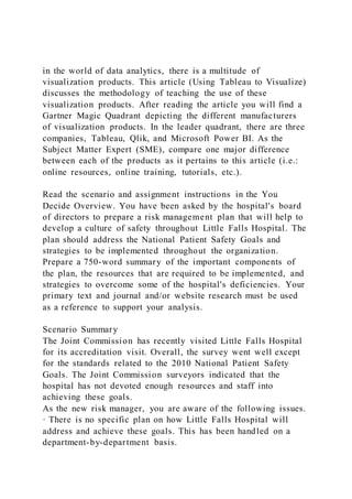
- 42. whether the program is cloud-based or stored on the device, as well as how much maintenance and customization is required. The Gartner annual report on Business Intelligence and Analytics Software ranks data visualization software based on the soft- ware’s completeness of vision and ability to execute. Tableau continues to be ranked as a leader in both categories (Gartner, 2017) (see Fig. 1). A company in the healthcare industry recently reported that their adoption of Tableau for data analysis and visualizations has saved the company “thousands of hours in redundant data analysis (Tableau, 2015).” Another company in the healthcare industry reported that, “With Tableau, we have eliminated more than 10,000 h of work (Tableau, 2017b).” In addition to increased func- tionality, Tableau was chosen as the data visualization software for this project as it used by many accounting firms and their clients and is free of cost to students. In addition, Tableau provides a plethora of free, easy to access training and how -to videos to
- 43. assist users in learning the software. Fig. 1. Gartner annual report on Business Intelligence and Analytics Software (photo taken from www.gartner.com). J. Hoelscher, A. Mortimer Journal of Accounting Education 44 (2018) 49–59 58 http://www.gartner.com Appendix C. Supplementary material Supplementary data associated with this article can be found, in the online version, at http://dx.doi.org/10.1016/j.jaccedu.2018. 05.002. References AACSB. (2013). Accounting Accreditation Standards: Standard A7. October 5, 2016. http://www.aacsb.edu/~/media/AACSB/Publications/white-
- 44. papers/accounting- accreditation-standard-7.ashx. AICPA. (2017). AICPA core competency framework. May 5, 2018. https://www.aicpa.org/interestareas/accountingeducation/resour ces/corecompetency.html. Apostolous, B., Dorminey, J., Hassall, J., & Rebele, J. (2014). A summary and analysis of education research in accounting information systems (AIS). Journal of Accounting Education, 32, 99–112. Beaman, I., & Richardson, B. (2007). Information technology, decision support and management accounting roles. Journal of Applied Management Accounting Research, 5(1), 59–68. Braun, K. (2013). Custom fabric ventures: An instructional resource in job costing for the introductory managerial accounting course. Journal of Accounting Education, 31, 400–429. Brazelton, J. (2000). Students may blossom using Bloom’s taxonomy in the accounting curriculum. Advances in Accounting Education, 2, 57–85.
- 45. Churyk, N., & Stenka, R. (2014). Accounting for complex investment transactions. Journal of Accounting Education, 32, 58–70. Dai, J., & Vasarhelyi, M. (2016). Imagineering audit 4.0. Journal of Emerging Technologies in Accounting, 13(1), 1–15. Deloitte. (2017). The analytics advantage: The results are in. January 4, 2017. https://www2.deloitte.com/global/en/pages/deloitte- analytics/articles/the-analytics- advantage.html. Detzen, D., Stork gennant Wersborg, T., & Zulch, H. (2015). Bleak weather for sun-shine AG: A case study of impairment of assets. Issues in Accounting Education, 30(2), 113–126. Gartner. (2017). Reviews for BI and analytics platforms. January 4, 2017. http://www.ga- rtner.com/reviews/market/business-intelligence-analytics- platforms. IBM Big Data & Analytics Hub (2017). Extracting business value from the 4 V's of big data. January 9, 2018. http://www.ibmbigdatahub.com/infographic/extracting- business-value-4-vs-big-data.
- 46. Igou, A., & Coe, M. (2016). Vistabeans coffee shop data analytics teaching chase. Journal of Accounting Education, 36, 75–86. Janvrin, D. J., Raschke, R. L., & Dilla, W. N. (2014). Making sense of complex data using interactive data visualizations. Journal of Accounting Education, 32(4), 31–48. Kokina, J., Pachamanova, D., & Corbett, A. (2017). The role of data visualization and analytics in performance management: Guiding entrepreneurial growth decision. Journal of Accounting Education, 38, 50–68. PwC. (2017). Industry 4.0: Building the digital enterprise. January 9, 2018. https://www.pwc.com/gx/en/industries/industry-4.0.html. Romney, M., & Steinbart, P. (2015). Accounting information systems (12th ed.). Upper Saddle River, NJ: Prentice Hall. Sivarajah, U., Kamal, M. M., Irani, Z., & Weerakkody, V. (2017). Critical analysis of Big Data challenges and analytical methods. Journal of Business Research, 70, 263–286. Tableau. (2015). A leader again. (2017). October 5, 2016. https://www.tableau.com/-gartner-magic-quadrant-2015. Tableau. (2017a). Which chart or graph is right for you? October 6, 2016.
- 47. https://www.tableau.com/learn/whitepapers/which-chart-or- graph-is-right-for-you. Tableau. (2017b). Cleveland Clinic Foundation saves hundreds of hours with Tableau. October 6, 2017. https://www.tableau.com/stories/customer/cleveland-clinic- foundation-saves-hundreds-hours- tableau?utm_source=Facebook&utm_ medium=Social&utm_ campaign=Prospecting-HCOP-HC-ALL. Tschakert, N., Kokina, J., Kozlowski, S., & Vasarhelyi, M. (2016). The next frontier in data analytics. Journal of Accountancy. Vasarhelyi, M., Kogan, A., & Tuttle, B. (2015). Big data in accounting: An overview. Accounting Horizons, 29(2), 381– 396. J. Hoelscher, A. Mortimer Journal of Accounting Education 44 (2018) 49–59 59 http://dx.doi.org/10.1016/j.jaccedu.2018.05.002 http://dx.doi.org/10.1016/j.jaccedu.2018.05.002 http://www.aacsb.edu/~/media/AACSB/Publications/white- papers/accounting-accreditation-standard-7.ashx
- 49. http://refhub.elsevier.com/S0748-5751(17)30195-1/h0065 http://refhub.elsevier.com/S0748-5751(17)30195-1/h0070 http://refhub.elsevier.com/S0748-5751(17)30195-1/h0070 https://www.pwc%20.com/gx/en/industries/industry-4.0.html http://refhub.elsevier.com/S0748-5751(17)30195-1/h0080 http://refhub.elsevier.com/S0748-5751(17)30195-1/h0085 http://refhub.elsevier.com/S0748-5751(17)30195-1/h0085 https://www.tableau.com/-gartner-magic-%20quadrant-2015 https://www.tableau.com/learn/whitepapers/which-chart-or- graph-is-right-for-you https://www.tableau.com/stories/customer/cleveland-clinic- %20foundation-saves-hundreds-hours- tableau?utm_source=Facebook%26utm_medium=%20Social%26 utm_%20campaign=Prospecting-HCOP-HC-ALL https://www.tableau.com/stories/cus tomer/cleveland-clinic- %20foundation-saves-hundreds-hours- tableau?utm_source=Facebook%26utm_medium=%20Social%26 utm_%20campaign=Prospecting-HCOP-HC-ALL http://refhub.elsevier.com/S0748-5751(17)30195-1/h0110Using Tableau to visualize data and drive decision- makingCaseRequirementsAdditional case requirementsTeaching notesLearning objectivesImplementation guidanceAlternative implementation guidanceEvidence of efficacyCase solutionsAcknowledgementsIntroduction to data analyticsData
- 50. visualization softwareSuppleme ntary materialReferences