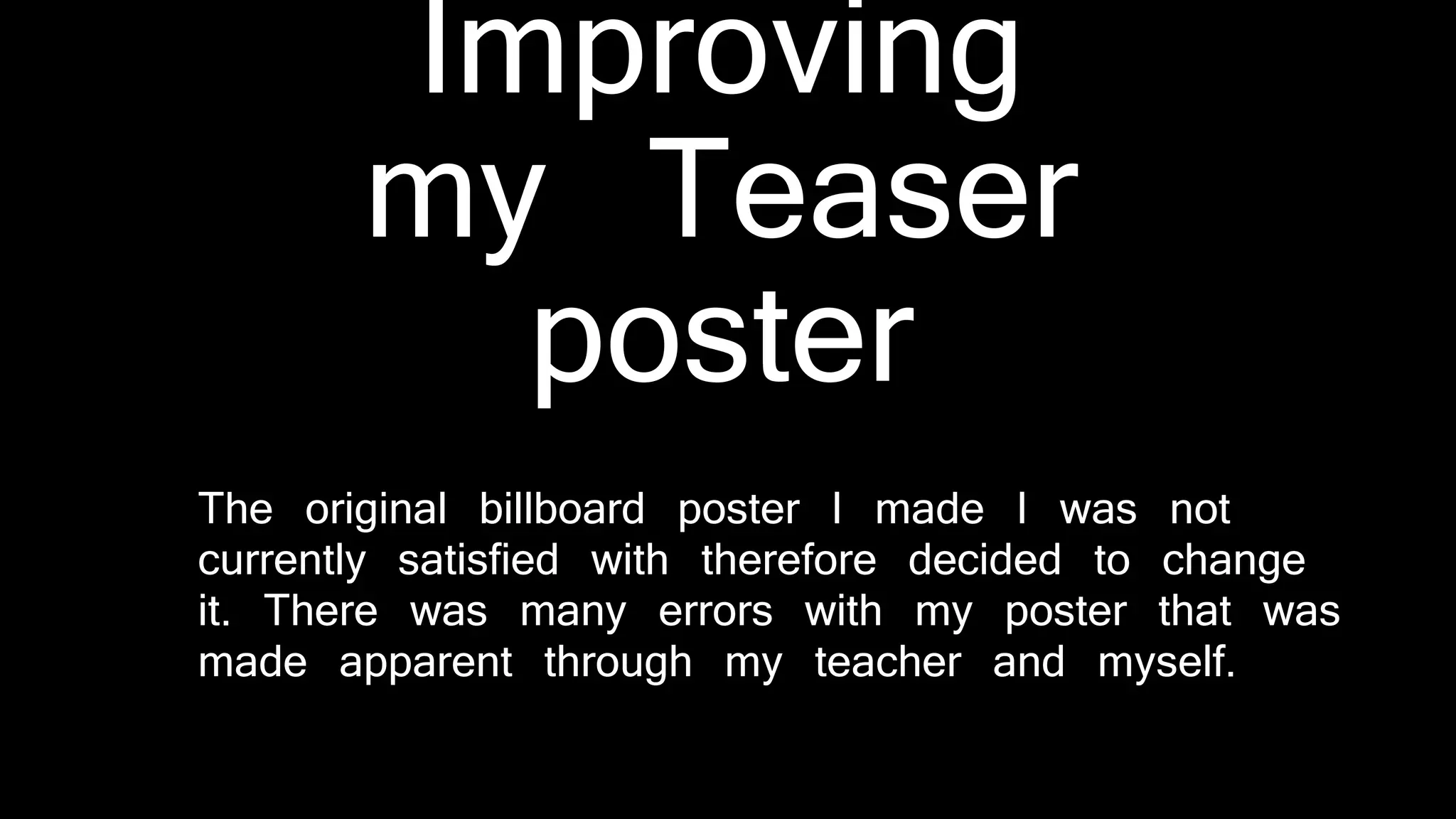
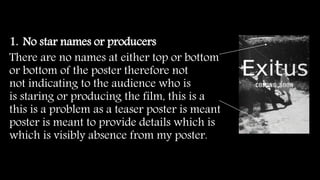
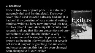
Improving
my Teaser
poster
The original billboard poster I made I was not
currently satisfied with therefore decided to change
it. There was many errors with my poster that was
made apparent through my teacher and myself.
1. No star names or producers
There are no names at either top or bottom
or bottom of the poster therefore not
not indicating to the audience who is
is staring or producing the film, this is a
this is a problem as a teaser poster is meant
poster is meant to provide details which is
which is visibly absence from my poster.
2. Too basic
Evident from my original poster it is extremely
extremely dull and lacking detail. The cover
cover photo used was one I already had and it is
had and it is consisting of very minimal writing.
minimal writing. I have now improved this to a
this to a photo I have taken myself recently and
recently and one that fits our conventions of our
conventions of our chosen thriller. A very
very common and boring font is present as the
present as the main title which does not serve it
not serve it purpose of grabbing the audiences
audiences attention, this has also been changed
been changed to fit our thriller.
3. Not a billboard poster
Claiming my original poster was a
‘billboard’ can be clearly seen to not be one,
not be one, billboards must be landscape as
landscape as they cover a large mass of area
mass of area within cities. My poster did not
poster did not match this as it was portrait,
was portrait, therefore transforming my
my poster into a teaser poster.

Improving my teaser poster

  • 1.
    Improving my Teaser poster The originalbillboard poster I made I was not currently satisfied with therefore decided to change it. There was many errors with my poster that was made apparent through my teacher and myself.
  • 2.
    1. No starnames or producers There are no names at either top or bottom or bottom of the poster therefore not not indicating to the audience who is is staring or producing the film, this is a this is a problem as a teaser poster is meant poster is meant to provide details which is which is visibly absence from my poster.
  • 3.
    2. Too basic Evidentfrom my original poster it is extremely extremely dull and lacking detail. The cover cover photo used was one I already had and it is had and it is consisting of very minimal writing. minimal writing. I have now improved this to a this to a photo I have taken myself recently and recently and one that fits our conventions of our conventions of our chosen thriller. A very very common and boring font is present as the present as the main title which does not serve it not serve it purpose of grabbing the audiences audiences attention, this has also been changed been changed to fit our thriller.
  • 4.
    3. Not abillboard poster Claiming my original poster was a ‘billboard’ can be clearly seen to not be one, not be one, billboards must be landscape as landscape as they cover a large mass of area mass of area within cities. My poster did not poster did not match this as it was portrait, was portrait, therefore transforming my my poster into a teaser poster.