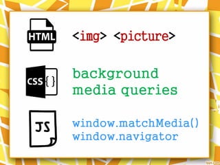
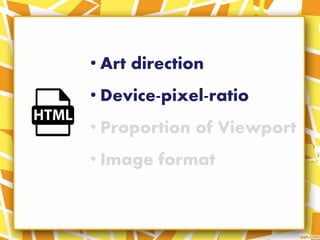
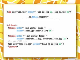
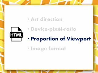
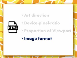
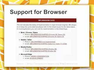
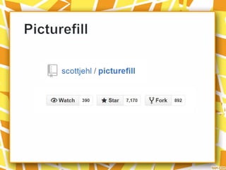
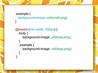
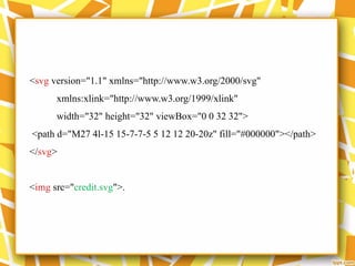
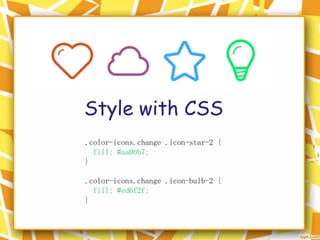
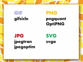
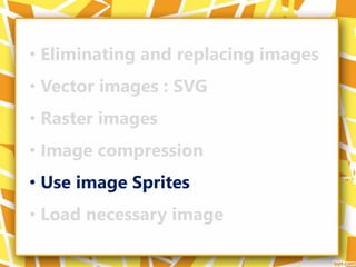
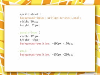
CSS Day 2017 Faenza, Italy.
They are a W3C recommendation since novembre 2016, featuring the new "picture" tag and the "srcset" and "sizes" attributes in the "img" tag.
In this talk we'll see what they are, how to use them in which cases to prefer what usage, and some best practices to give a boost you your web applications or websites.
The document discusses the status of emerging web technologies, including Web Components, Responsive Images, Service Workers, and JSON form data. It highlights several cool existing technologies like WebSockets and WebGL. It also outlines new and promising technologies under development like Web Components templates, custom elements, and shadow DOM. The document encourages supporting these technologies through community involvement, testing, and documentation to help the web platform progress.
CSS sprites consolidate multiple images into a single image to reduce server requests and bandwidth usage. The individual images are then selectively displayed using positioning. This improves page load times. Some advantages are reduced HTTP requests and bandwidth savings. Disadvantages include increased maintenance when modifying individual images and reduced accessibility without image tags. CSS sprites are commonly used for navigation buttons, icons, and hover effects. The document provides an example of how to create a navigation list using portions of a sprite image and add hover effects.
This document provides an overview of vectors and SVG, discussing their benefits over raster images in terms of scalability, file size and expressiveness. It outlines different ways vectors and SVG can be used in browsers and with tools like Illustrator, and provides tips on optimizing and integrating SVG files. The document concludes that SVG is now the best format for drawing vectors in browsers and encourages readers to start using vectors.
The <img> tag is used to embed images in web pages. It has a required "src" attribute to specify the image URL and optional attributes to set the image height, width, alternate text, and enable client-side image mapping when used with the <map> tag. For example, <img src="image.jpg" alt="Description" height="100" width="200"> displays an image with the specified source, height, width and alternate text.
SVG (Scalable Vector Graphics) is a XML-based format for defining vector graphics. It allows graphics to be scalable, zoomable and searchable. Common SVG shapes that can be created include circles, rectangles, ellipses, lines, and paths. Attributes like cx, cy, r are used to define properties of circles and ellipses, while x1, y1, x2, y2 define the start and end points of a line. SVG graphics do not lose quality when resized.
This document provides an introduction and overview of CSS3 properties and features. It begins with an introduction to CSS3 and discusses how it is backwards compatible with CSS2. It then outlines several new CSS3 properties including border-radius for rounded corners, box-shadow for drop shadows, text-shadow, multiple backgrounds, background-size, text-overflow, and resize. Examples are provided for each property. The document concludes with recommendations for CSS3 style samples and a demo combining HTML5 and CSS3.
This document provides an overview of HTML5 and CSS3 topics. It begins with an agenda for HTML5 that covers basics like tags, attributes and elements. It then discusses HTML5 semantic elements and features like video, audio, and forms. For CSS3, it outlines modules including borders, backgrounds, gradients, text effects, web fonts, transforms, transitions, animations, columns and user interface. The document aims to introduce key concepts and properties for front-end development.
CSS3 provides new features for layout, typography, visual effects and graphics. Some key features include multiple column layout, rounded corners, box shadows, opacity, gradients, reflections, transforms and animations. Browser support for CSS3 is evolving with many properties requiring vendor prefixes. CSS3 brings more powerful and flexible options for designing user interfaces beyond what is possible with CSS2.
Doug has been working on the new version of ThemeRoller for the jQuery UI site. In his talk, Doug aims to give you a peak of the code and show off some of the speed improvements that are being made. The new version of ThemeRoller is being built on top of the latest technologies like Canvas and HTML5. You will see how you can use client side technologies to reduce server load and maximize the speed of your app.
The document discusses HTML5 and SVG. It provides an overview of SVG, including that SVG describes 2D vector images, has full DOM support and scripting capabilities, and is an open standard supported by modern browsers. It also discusses how SVG and HTML5 can be used together, with examples of embedding SVG inline within HTML5, using SVG objects within HTML5, and combining SVG and HTML5 on the same page.
The document provides an overview of HTML5 forms, including new form attributes, input types, and elements. It discusses features like autocomplete, novalidate, and autofocus attributes that control form validation and autofilling. The document also notes that HTML5 makes marking up forms easier for developers and provides better consistency and performance for users by handling validation natively in the browser.
The document discusses ways to improve front-end performance and reduce page load times. It describes measuring load times and using tools like YSlow and Firebug to identify issues. Specific techniques mentioned include reducing the number of HTTP requests by combining CSS/JS files, using sprites for images, enabling compression, leveraging a CDN, setting long cache expiration headers, keeping CSS/JS files at the top/bottom of pages, and serving static assets like images from a cookie-free subdomain.
Use SVG to Bring the Web to Life (Quinton Jason Jr)Future Insights
Session slides from the Future Insights Live, Vegas 2015 event: https://futureinsightslive.com/las-vegas-2015/
SVG is more than just an image format. It’s a solution that solves many problems with today’s rapidly growing web, especially in responsive design. SVG also contains many features to enhance the user's experience: accessibility, resolution independence, and interactivity. We'll see why we should use SVG, how to style SVG using CSS, how to animate SVG to bring the web to life, and much more.
Vector Graphics on the Web: SVG, Canvas, CSS3Pascal Rettig
This document summarizes different vector graphic options for use on the web. It discusses the differences between vector and raster graphics, and why vectors are preferable for resolution independence and smaller file sizes. It then examines SVG, Canvas, VML, and CSS3 as vector graphic options, outlining browser support, APIs, and common uses for each. While SVG is ideal theoretically, browser support is still limited, so libraries like SVG Web and Raphael.js are recommended to abstract cross-browser differences. In the end, SVG is generally better than Canvas for interactive graphics with events, while Canvas may be better for full-screen animations and games.
Since the introduction of high pixel density displays, the classic notion of the pixel, as well as the concept of a standard dpi, are fading. Web designers are no longer constrained to fixed-width web elements. With the evolution of modern display devices, designers are now responsible for thinking beyond layout and must also consider the impact of resolution. This paper will focus on various tools and techniques web designers can use to achieve resolution independence. Topics will include the pros and cons of delivery methods, resolution independent design alternatives, common responsive design techniques and more.
SVG For Web Designers (and Developers) Sara Soueidan
1. The document discusses using SVG for web design, including creating SVG images, optimizing them, and embedding them onto web pages.
2. Designers are advised to use simple shapes over complex paths and to simplify paths when creating SVG images.
3. SVG images can be combined into a single file and referenced on web pages using the <symbol> and <use> elements, providing a method of "spriting" SVG images.
The document discusses the <img> tag in HTML 5 which is used to embed images on webpages. It describes the img src attribute to specify the image URL, the alt attribute to provide alternative text for accessibility or if images don't load, and the size attribute like width and height to resize images. The document also mentions using the <img> tag inside an <a> tag to make images into clickable links to other webpages for usability and to make the site more interesting.
The document summarizes a presentation about using Adobe Fireworks for designing HTML and CSS websites. It discusses how Fireworks is ideal for web design as it integrates well with other Adobe applications. It also explores how Fireworks allows for rapid prototyping through features like slicing images and exporting code. The presentation emphasizes writing code by hand and using frameworks like the 960 grid system to help maintain consistency and improve efficiency.
This document discusses animations in Angular applications. It begins by explaining the benefits of animations for user experience. It then covers different options for implementing animations, including JavaScript libraries, CSS animations, and the Web Animation API. The bulk of the document focuses on how Angular leverages the Web Animation API to provide a declarative animation system using triggers, states, transitions, and callbacks. It includes examples and a demonstration of adding basic animations to an Angular app.
Responsive Web Design - Web & PHP Conference - 2013-09-18Frédéric Harper
There is no mobile Web, there is no desktop Web, and there is no tablet Web. We view the same Web just in different ways. So how do we do it? By getting rid of our fixed-width, device-specific approaches and use Responsive Web Design techniques. This session will focus on what is Responsive Web Design and how you can use his 3-pronged approach on your current apps today which will also adapt to new devices in the future.
The document discusses responsive images and issues around their implementation. It begins by outlining the new <picture> element and srcset/sizes attributes that allow images to adapt based on screen size and resolution. It then discusses challenges like managing many images, the need for image breakpoints to determine appropriate file sizes, and the tension between responsive images and the browser's lookahead parser. Overall, the document examines both the promise and difficulties of responsive images on the modern web.
High Performance Images: Beautiful Shouldn't Mean SlowGuy Podjarny
(slides from the O'Reilly webcast, see recording here: http://www.oreilly.com/pub/e/3425)
The web is becoming increasingly image rich. Between high-resolution mobile screens, Pinterest-style design and big background graphics, the average image payload has more than doubled in the last three years. While visually appealing, these images carry a substantial performance cost, and — if not optimized correctly — can make a web experience slow and painful, no matter how beautiful it is.
These slides discuss how you can provide the eye-pleasing experience you want without sacrificing your site's performance. You'll learn about the three primary aspects of image optimization:
Image Compression: How to best encode your images, delivering the same picture with the fewest bytes.
Image Loading: Once your files are as small as they can be, we'll cover the best ways to make them show up quickly in the browser.
Image Operations: Different tools and techniques for integrating image optimization on your site.
Drawing a Circle Three Ways: Generating Graphics for the WebCloudinary
Amy Cheng
Web Developer, New York Magazine
Drawing a Circle Three Ways: Generating Graphics for the Web
There are multiple ways to generate graphics for the web. In this talk, we’ll learn three ways create a circle: CSS, SVGs, the Canvas. Each approach has its advantages and disadvantages. Which one is best for mobile performance? Which one should I use to create visualizations based on real-time data? Which one is the best for personalized user interfaces?
We’ll answer these questions and explore how these technologies offer us possibilities of visual expressiveness on the web, across different form factors and platforms.
The document discusses techniques for making SVG graphics responsive. It describes using media queries directly in SVG code to serve different background images based on viewport width. It also covers embedding SVG using inline, <img>, and <object> tags and their tradeoffs. The "Clown Car Technique" embeds the SVG as an <object> and uses media queries inside the SVG to switch background images. The "Poor Man's Method" defines all icon variants inside the SVG and shows/hides them with media queries. The "Man With A Gun's Method" uses transforms to adapt a single SVG to different sizes. JavaScript can also be added to SVG to make it more dynamic and responsive.
Responsive design sounds simple enough, but in practice it can have you banging your head against the wall. I conducted a poll with the readers on RWD Weekly to find out what was causing the biggest headaches.
We will look through the 6 most common issues and techniques on how you can get started or flip to expert mode.
Responsive Images
Improving Performance
Responsive Typography
Media queries in JavaScript
Layout
Delivering Responsive Images
Jason Grigsby
Co-Founder, Could Four
It took nearly four years, four proposed standards, the formation of a community group, and a funding campaign to pay for development, but we finally got what we've been clamoring for—a solution for responsive images baked into browsers. Now the hard work begins.
Responsive Web Design: Clever Tips and TechniquesVitaly Friedman
Responsive Web design challenges Web designers to adapt a new mindset to their design and coding processes. This talk provides an overview of various practical techniques, tips and tricks that you might want to be aware of when working on a new responsive design project.
Responsive Images in the Real World - presented at JavaScript Open 2015Morten Rand-Hendriksen
Slides from Morten Rand-Hendriksen's presentation at JavaScript Open in Vancouver, June 25th, 2015.
Responsive Images are one of the missing pieces in the puzzle that makes up our new responsive web. Using the new RICG spec for srcset, sizes, and the picutre element, web designers and developers can instruct the browser to serve the visitor with the best possible image for their screen resolution and size, all the while saving bandwidth and processing power. Learn how the new spec and markup works, how and when to use srcset, sizes, and the picture element, and how to implement Responsive Images in your live production sites today.
http://jsopen.lighthouselabs.ca/
"Responsive Web Design: Clever Tips and Techniques". Vitaly Friedman, Smashin...Yandex
Responsive web design challenges web designers to apply a new mindset to their design processes, as well as to techniques they are using in design and coding. This talk provides an overview of various practical techniques, tips and tricks that you might want to be aware of when working on a new responsive design project.
This document discusses CSS3 border properties including border-radius, box-shadow, and border-image. It provides an overview of each property and examples of how to apply them to round corners, add shadows, and use images for borders without additional design programs. Browser support information is given for each property.
A presentation that was held by Aleksandra Hristov as a guest lecturer during the class of "Advanced Web Design" at the Faculty of computer science and engineering. The presentation was held as part of the regular studies during the faculty program of computer science. The point was to give an overview on responsive design: what it is, how it can be used and how it applies in the industry.
Let's face it; we're not really artists (except for the artists). But that doesn't mean we can't contribute to the images on the internet. Whether you're a Photoshop guru, or don't even own a Mac, we can still make valuable contributions to ensure our digital assets are crisp and professional. In this talk, we'll look at some basic command-line tools for creating, modifying, and managing images, and look at how we can manage them properly on the web. We'll play with sprites, responsive images for these new retina displays, and techniques for optimizing performance on lower bandwidth connections and mobile web.
The document discusses making SVG images accessible and optimizing them for search engines. It found that the <text> element and role="img" attribute combined with aria-label descriptions were supported by most screen readers and browsers tested. It also found that the <desc> and <text> elements caused the image content to be indexed by all the tested search engines like Google, Yahoo and Bing. The conclusion is that using these techniques can improve accessibility of SVG images for screen reader users and improve indexing by search engines.
This document discusses responsive web design trends for 2012, including responsive design which allows websites to automatically resize content to fit any screen resolution from mobile to desktop. It highlights that 15% of users now browse on mobile and responsive design improves the user experience and conversion rates. CSS3 features like media queries, fonts, borders, shadows and images are also covered to create impactful designs.
The document provides information on various CSS techniques for styling web pages, including:
- Three methods for inserting stylesheets: external, internal, and inline stylesheets.
- Selectors like id, class, and element selectors for applying styles.
- Properties for styling various page elements like text, backgrounds, links, tables, and lists.
- New CSS3 features like rounded corners, drop shadows, multi-column layouts, transitions, animations and custom fonts.
- Examples are given for many of the properties to demonstrate their usage.
Talk delivered in New York, Sep 19, 2016 during an O'Reilly meetup before Velocity Conference about Web Performance and Images, including HTTP Client Hints and new Image Formats
[CSSDevConf] Adaptive Images in Responsive Web Design 2014Christopher Schmitt
The web doesn't stop at the desktop anymore. Our image assets need to do more than look good in one context. In this talk, I look at how images like JPEG, GIFs, SVG, Icons, Unicode, and more can be used in a multi-device environment.
Digital Marketing Trends in 2024 | Guide for Staying AheadWask
https://www.wask.co/ebooks/digital-marketing-trends-in-2024
Feeling lost in the digital marketing whirlwind of 2024? Technology is changing, consumer habits are evolving, and staying ahead of the curve feels like a never-ending pursuit. This e-book is your compass. Dive into actionable insights to handle the complexities of modern marketing. From hyper-personalization to the power of user-generated content, learn how to build long-term relationships with your audience and unlock the secrets to success in the ever-shifting digital landscape.
Let's Integrate MuleSoft RPA, COMPOSER, APM with AWS IDP along with Slackshyamraj55
Discover the seamless integration of RPA (Robotic Process Automation), COMPOSER, and APM with AWS IDP enhanced with Slack notifications. Explore how these technologies converge to streamline workflows, optimize performance, and ensure secure access, all while leveraging the power of AWS IDP and real-time communication via Slack notifications.
AI 101: An Introduction to the Basics and Impact of Artificial IntelligenceIndexBug
Imagine a world where machines not only perform tasks but also learn, adapt, and make decisions. This is the promise of Artificial Intelligence (AI), a technology that's not just enhancing our lives but revolutionizing entire industries.
Driving Business Innovation: Latest Generative AI Advancements & Success StorySafe Software
Are you ready to revolutionize how you handle data? Join us for a webinar where we’ll bring you up to speed with the latest advancements in Generative AI technology and discover how leveraging FME with tools from giants like Google Gemini, Amazon, and Microsoft OpenAI can supercharge your workflow efficiency.
During the hour, we’ll take you through:
Guest Speaker Segment with Hannah Barrington: Dive into the world of dynamic real estate marketing with Hannah, the Marketing Manager at Workspace Group. Hear firsthand how their team generates engaging descriptions for thousands of office units by integrating diverse data sources—from PDF floorplans to web pages—using FME transformers, like OpenAIVisionConnector and AnthropicVisionConnector. This use case will show you how GenAI can streamline content creation for marketing across the board.
Ollama Use Case: Learn how Scenario Specialist Dmitri Bagh has utilized Ollama within FME to input data, create custom models, and enhance security protocols. This segment will include demos to illustrate the full capabilities of FME in AI-driven processes.
Custom AI Models: Discover how to leverage FME to build personalized AI models using your data. Whether it’s populating a model with local data for added security or integrating public AI tools, find out how FME facilitates a versatile and secure approach to AI.
We’ll wrap up with a live Q&A session where you can engage with our experts on your specific use cases, and learn more about optimizing your data workflows with AI.
This webinar is ideal for professionals seeking to harness the power of AI within their data management systems while ensuring high levels of customization and security. Whether you're a novice or an expert, gain actionable insights and strategies to elevate your data processes. Join us to see how FME and AI can revolutionize how you work with data!
Project Management Semester Long Project - Acuityjpupo2018
Acuity is an innovative learning app designed to transform the way you engage with knowledge. Powered by AI technology, Acuity takes complex topics and distills them into concise, interactive summaries that are easy to read & understand. Whether you're exploring the depths of quantum mechanics or seeking insight into historical events, Acuity provides the key information you need without the burden of lengthy texts.
Best 20 SEO Techniques To Improve Website Visibility In SERPPixlogix Infotech
Boost your website's visibility with proven SEO techniques! Our latest blog dives into essential strategies to enhance your online presence, increase traffic, and rank higher on search engines. From keyword optimization to quality content creation, learn how to make your site stand out in the crowded digital landscape. Discover actionable tips and expert insights to elevate your SEO game.
Introduction of Cybersecurity with OSS at Code Europe 2024Hiroshi SHIBATA
I develop the Ruby programming language, RubyGems, and Bundler, which are package managers for Ruby. Today, I will introduce how to enhance the security of your application using open-source software (OSS) examples from Ruby and RubyGems.
The first topic is CVE (Common Vulnerabilities and Exposures). I have published CVEs many times. But what exactly is a CVE? I'll provide a basic understanding of CVEs and explain how to detect and handle vulnerabilities in OSS.
Next, let's discuss package managers. Package managers play a critical role in the OSS ecosystem. I'll explain how to manage library dependencies in your application.
I'll share insights into how the Ruby and RubyGems core team works to keep our ecosystem safe. By the end of this talk, you'll have a better understanding of how to safeguard your code.
Webinar: Designing a schema for a Data WarehouseFederico Razzoli
Are you new to data warehouses (DWH)? Do you need to check whether your data warehouse follows the best practices for a good design? In both cases, this webinar is for you.
A data warehouse is a central relational database that contains all measurements about a business or an organisation. This data comes from a variety of heterogeneous data sources, which includes databases of any type that back the applications used by the company, data files exported by some applications, or APIs provided by internal or external services.
But designing a data warehouse correctly is a hard task, which requires gathering information about the business processes that need to be analysed in the first place. These processes must be translated into so-called star schemas, which means, denormalised databases where each table represents a dimension or facts.
We will discuss these topics:
- How to gather information about a business;
- Understanding dictionaries and how to identify business entities;
- Dimensions and facts;
- Setting a table granularity;
- Types of facts;
- Types of dimensions;
- Snowflakes and how to avoid them;
- Expanding existing dimensions and facts.
Generating privacy-protected synthetic data using Secludy and MilvusZilliz
During this demo, the founders of Secludy will demonstrate how their system utilizes Milvus to store and manipulate embeddings for generating privacy-protected synthetic data. Their approach not only maintains the confidentiality of the original data but also enhances the utility and scalability of LLMs under privacy constraints. Attendees, including machine learning engineers, data scientists, and data managers, will witness first-hand how Secludy's integration with Milvus empowers organizations to harness the power of LLMs securely and efficiently.
Your One-Stop Shop for Python Success: Top 10 US Python Development Providersakankshawande
Simplify your search for a reliable Python development partner! This list presents the top 10 trusted US providers offering comprehensive Python development services, ensuring your project's success from conception to completion.
Monitoring and Managing Anomaly Detection on OpenShift.pdfTosin Akinosho
Monitoring and Managing Anomaly Detection on OpenShift
Overview
Dive into the world of anomaly detection on edge devices with our comprehensive hands-on tutorial. This SlideShare presentation will guide you through the entire process, from data collection and model training to edge deployment and real-time monitoring. Perfect for those looking to implement robust anomaly detection systems on resource-constrained IoT/edge devices.
Key Topics Covered
1. Introduction to Anomaly Detection
- Understand the fundamentals of anomaly detection and its importance in identifying unusual behavior or failures in systems.
2. Understanding Edge (IoT)
- Learn about edge computing and IoT, and how they enable real-time data processing and decision-making at the source.
3. What is ArgoCD?
- Discover ArgoCD, a declarative, GitOps continuous delivery tool for Kubernetes, and its role in deploying applications on edge devices.
4. Deployment Using ArgoCD for Edge Devices
- Step-by-step guide on deploying anomaly detection models on edge devices using ArgoCD.
5. Introduction to Apache Kafka and S3
- Explore Apache Kafka for real-time data streaming and Amazon S3 for scalable storage solutions.
6. Viewing Kafka Messages in the Data Lake
- Learn how to view and analyze Kafka messages stored in a data lake for better insights.
7. What is Prometheus?
- Get to know Prometheus, an open-source monitoring and alerting toolkit, and its application in monitoring edge devices.
8. Monitoring Application Metrics with Prometheus
- Detailed instructions on setting up Prometheus to monitor the performance and health of your anomaly detection system.
9. What is Camel K?
- Introduction to Camel K, a lightweight integration framework built on Apache Camel, designed for Kubernetes.
10. Configuring Camel K Integrations for Data Pipelines
- Learn how to configure Camel K for seamless data pipeline integrations in your anomaly detection workflow.
11. What is a Jupyter Notebook?
- Overview of Jupyter Notebooks, an open-source web application for creating and sharing documents with live code, equations, visualizations, and narrative text.
12. Jupyter Notebooks with Code Examples
- Hands-on examples and code snippets in Jupyter Notebooks to help you implement and test anomaly detection models.
Skybuffer SAM4U tool for SAP license adoptionTatiana Kojar
Manage and optimize your license adoption and consumption with SAM4U, an SAP free customer software asset management tool.
SAM4U, an SAP complimentary software asset management tool for customers, delivers a detailed and well-structured overview of license inventory and usage with a user-friendly interface. We offer a hosted, cost-effective, and performance-optimized SAM4U setup in the Skybuffer Cloud environment. You retain ownership of the system and data, while we manage the ABAP 7.58 infrastructure, ensuring fixed Total Cost of Ownership (TCO) and exceptional services through the SAP Fiori interface.
5th LF Energy Power Grid Model Meet-up SlidesDanBrown980551
5th Power Grid Model Meet-up
It is with great pleasure that we extend to you an invitation to the 5th Power Grid Model Meet-up, scheduled for 6th June 2024. This event will adopt a hybrid format, allowing participants to join us either through an online Mircosoft Teams session or in person at TU/e located at Den Dolech 2, Eindhoven, Netherlands. The meet-up will be hosted by Eindhoven University of Technology (TU/e), a research university specializing in engineering science & technology.
Power Grid Model
The global energy transition is placing new and unprecedented demands on Distribution System Operators (DSOs). Alongside upgrades to grid capacity, processes such as digitization, capacity optimization, and congestion management are becoming vital for delivering reliable services.
Power Grid Model is an open source project from Linux Foundation Energy and provides a calculation engine that is increasingly essential for DSOs. It offers a standards-based foundation enabling real-time power systems analysis, simulations of electrical power grids, and sophisticated what-if analysis. In addition, it enables in-depth studies and analysis of the electrical power grid’s behavior and performance. This comprehensive model incorporates essential factors such as power generation capacity, electrical losses, voltage levels, power flows, and system stability.
Power Grid Model is currently being applied in a wide variety of use cases, including grid planning, expansion, reliability, and congestion studies. It can also help in analyzing the impact of renewable energy integration, assessing the effects of disturbances or faults, and developing strategies for grid control and optimization.
What to expect
For the upcoming meetup we are organizing, we have an exciting lineup of activities planned:
-Insightful presentations covering two practical applications of the Power Grid Model.
-An update on the latest advancements in Power Grid -Model technology during the first and second quarters of 2024.
-An interactive brainstorming session to discuss and propose new feature requests.
-An opportunity to connect with fellow Power Grid Model enthusiasts and users.
In the rapidly evolving landscape of technologies, XML continues to play a vital role in structuring, storing, and transporting data across diverse systems. The recent advancements in artificial intelligence (AI) present new methodologies for enhancing XML development workflows, introducing efficiency, automation, and intelligent capabilities. This presentation will outline the scope and perspective of utilizing AI in XML development. The potential benefits and the possible pitfalls will be highlighted, providing a balanced view of the subject.
We will explore the capabilities of AI in understanding XML markup languages and autonomously creating structured XML content. Additionally, we will examine the capacity of AI to enrich plain text with appropriate XML markup. Practical examples and methodological guidelines will be provided to elucidate how AI can be effectively prompted to interpret and generate accurate XML markup.
Further emphasis will be placed on the role of AI in developing XSLT, or schemas such as XSD and Schematron. We will address the techniques and strategies adopted to create prompts for generating code, explaining code, or refactoring the code, and the results achieved.
The discussion will extend to how AI can be used to transform XML content. In particular, the focus will be on the use of AI XPath extension functions in XSLT, Schematron, Schematron Quick Fixes, or for XML content refactoring.
The presentation aims to deliver a comprehensive overview of AI usage in XML development, providing attendees with the necessary knowledge to make informed decisions. Whether you’re at the early stages of adopting AI or considering integrating it in advanced XML development, this presentation will cover all levels of expertise.
By highlighting the potential advantages and challenges of integrating AI with XML development tools and languages, the presentation seeks to inspire thoughtful conversation around the future of XML development. We’ll not only delve into the technical aspects of AI-powered XML development but also discuss practical implications and possible future directions.
TrustArc Webinar - 2024 Global Privacy SurveyTrustArc
How does your privacy program stack up against your peers? What challenges are privacy teams tackling and prioritizing in 2024?
In the fifth annual Global Privacy Benchmarks Survey, we asked over 1,800 global privacy professionals and business executives to share their perspectives on the current state of privacy inside and outside of their organizations. This year’s report focused on emerging areas of importance for privacy and compliance professionals, including considerations and implications of Artificial Intelligence (AI) technologies, building brand trust, and different approaches for achieving higher privacy competence scores.
See how organizational priorities and strategic approaches to data security and privacy are evolving around the globe.
This webinar will review:
- The top 10 privacy insights from the fifth annual Global Privacy Benchmarks Survey
- The top challenges for privacy leaders, practitioners, and organizations in 2024
- Key themes to consider in developing and maintaining your privacy program
Ocean lotus Threat actors project by John Sitima 2024 (1).pptxSitimaJohn
Ocean Lotus cyber threat actors represent a sophisticated, persistent, and politically motivated group that poses a significant risk to organizations and individuals in the Southeast Asian region. Their continuous evolution and adaptability underscore the need for robust cybersecurity measures and international cooperation to identify and mitigate the threats posed by such advanced persistent threat groups.
Threats to mobile devices are more prevalent and increasing in scope and complexity. Users of mobile devices desire to take full advantage of the features
available on those devices, but many of the features provide convenience and capability but sacrifice security. This best practices guide outlines steps the users can take to better protect personal devices and information.