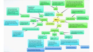
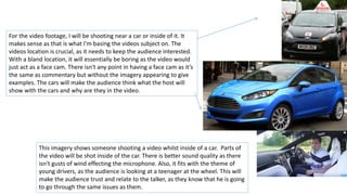
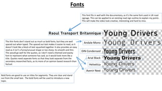
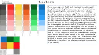
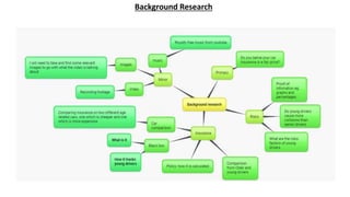
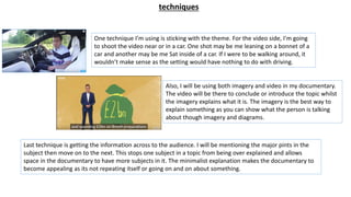
Idea Development
Factual Production Andreas Mina
Evidence of idea generation – mind maps - styles:
A range of ideas to take forward in to production. Should include images, colour schemes and font choices. Could include mock
ups and evidence of existing design work which is inspiring you.
The bar chart and ‘presentation’ image represents the way that I want to show
my information and proof. The presentation of the information needs to be
themed and creatively shown. The reason is because creative products are more
influential to look at. And more intriguing to the eye. Graphs are the but way to
show information, as it requires less explanation from the commentary seen as it
is representing information.
The Highway code signs are a good creative way to present the information. It fits
in with the theme of driving. The information will be placed on a template of
road signs. This will look interesting and recognisable as its something that the
viewers would see in the highway code. The familiar signage will trigger the
audience to watch more of the video to see what other references may show up.
This imagery shows someone shooting a video whilst inside of a car. Parts of
the video will be shot inside of the car. There is better sound quality as there
isn't gusts of wind effecting the microphone. Also, it fits with the theme of
young drivers, as the audience is looking at a teenager at the wheel. This will
make the audience trust and relate to the talker, as they know that he is going
to go through the same issues as them.
For the video footage, I will be shooting near a car or inside of it. It
makes sense as that is what I'm basing the videos subject on. The
videos location is crucial, as it needs to keep the audience interested.
With a bland location, it will essentially be boring as the video would
just act as a face cam. There isn't any point in having a face cam as it’s
the same as commentary but without the imagery appearing to give
examples. The cars will make the audience think what the host will
show with the cars and why are they in the video.
Andale Mono
DIN Condensed
Arial Black
Helvetica
Avenir Next
This font fits in well with the documentary, as it’s the same font used in UK road
signage. This can be applied to an existing road sign outline to explain my points .
This will make the video look creative, interesting and hard to miss.
Fonts
Bold fonts are good to use on titles for segments. They are clear and stand
out from the small text. The bold fonts will be used to introduce a new
topic.
The thin fonts don’t stand out as much as bold fonts, but they are well
spaced out when typed. The spaced out text makes it easier to read, as it
doesn’t look like a block of text squashed together. It also provides an easy
read as it isn’t a funny/unusual shape or too sharp, its smooth and thin.
This would go well for the quotes, as I don’t need a themed and wacky
font to represent what someone has said, as it would look more like a
title. Quotes need seperate fonts so that they look separate from the
secondary researched facts, as its more of an opinion based research than
factual.
Concept Boards:
A range of ideas to take
forward in to production.
Should include images, colour
schemes and font choices.
Could include mock ups and
evidence of existing design
work which is inspiring you.
Colour Scheme
These colours represent the UK roads in someway (except orange). I
thought these mix of bright colours would work, as it makes the video
look more appealing to the audience and makes it more attention
seeking. The blue represents motorway signage, but the bright blue is a
friendly colour which doesn’t scare off the audience. It works well with
my approach of drawing the audience in rather than distressing them.
For green and yellow, it is the signage of a primary route (yellow being
the text). Green also represents safety which fits in with the awareness
theme of the video. The darkish orange is a good background colour for
the blue and green. The reason is because It captivates the audiences
attention from its vibrant colour. In the highway code, the colour red is
used on signs to warn the driver. I will represent the colour in the same
way by warning the audience of dangerous driving. This is a creative
idea, as it fits with the theme of driving and shows awareness. The gray
colour will fit in with the theme of roads, as that is the colour they are
recognized as. It will be used in the imagery that I show of roads to give
examples of what I'm talking about. All of these colours together will
look familiar to the audience and will give them a better understanding
of the situation.
Background Research
techniques
One technique I’m using is sticking with the theme. For the video side, I'm going
to shoot the video near or in a car. One shot may be me leaning on a bonnet of a
car and another may be me Sat inside of a car. If I were to be walking around, it
wouldn’t make sense as the setting would have nothing to do with driving.
Also, I will be using both imagery and video in my documentary.
The video will be there to conclude or introduce the topic whilst
the imagery explains what it is. The imagery is the best way to
explain something as you can show what the person is talking
about though imagery and diagrams.
Last technique is getting the information across to the audience. I will be mentioning the major pints in the
subject then move on to the next. This stops one subject in a topic from being over explained and allows
space in the documentary to have more subjects in it. The minimalist explanation makes the documentary to
become appealing as its not repeating itself or going on and on about something.
Structure
The video is an awareness and explanation video. The purpose of the video is to show to the audience that young
drivers pay more insurance because they are classed as high risk and inexperienced. I’m trying to explain the
reasoning behind the high cost so that the audience can get a better understanding of the topic. I want to explain
this to them in a fascinating way, which is why I'm using imagery and diagrams to show an example of what I'm
talking about. The video will begin with footage introducing the topic. It will point out the what the video is
about and what the issue is. It will then move on to the commentary showing an explanation of the issue. It will
show the risks they face and the comparison of younger and experience drivers. It will also show the insurance
costs. It will go back to a video, having a quick conclusion to the first half. It will point out the primary research
coming up. The primary research will be read out and will show what point its proving. The end of the video will
be a conclusion to the whole topic and an opinion of the situation. I will be doing primary research to see what
other people have to say about their insurance and if they believe that they pay too much. The imagery will be
creative, as it will use the fonts, colours along with the road signs to explain the situation. There will be
background music so that the video doesn’t make you feel isolated.
Video/
point
Imagery
showing an
explanation
Conclusion to
the first point.
Move to the
next
Primary
research
Conclusion to the
whole topic and an
opinion
Reference
(october 2014). Young drivers. Available: http://www.brake.org.uk/slower-speeds-save-lives/15-facts-a-resources/facts/488-
young-drivers-the-hard-facts. Last accessed 21/9/2018.
Royalty free music. Available: https://www.youtube.com/results?search_query=royalty+free+music. Last accessed 22/09/2018.
Unknown. (22 Jun 2017). How is car insurance calculated?. Available: https://www.confused.com/car-insurance/guides/how-car-
insurance-is-calculated. Last accessed 22/09/2018.
Unknown. (unknown). Compare car insurance for young drivers.Available: https://www.money.co.uk/car-insurance/car-
insurance-for-young-drivers.htm. Last accessed 23/09/2018
Anita Shargall . (15/05/2018). Better understand telematics car insurance policies. Available:
https://www.moneysupermarket.com/car-insurance/how-does-black-box-insurance-work/. Last accessed 23/09/2018.
Unknown. (2014). Battle of the Ages: Older Drivers vs. Young Drivers.Available: https://www.edgarsnyder.com/blog/2014/12/17-
older-drivers-young-drivers.html. Last accessed 23/09/2018.

idea development Factual

  • 1.
  • 3.
    Evidence of ideageneration – mind maps - styles: A range of ideas to take forward in to production. Should include images, colour schemes and font choices. Could include mock ups and evidence of existing design work which is inspiring you.
  • 4.
    The bar chartand ‘presentation’ image represents the way that I want to show my information and proof. The presentation of the information needs to be themed and creatively shown. The reason is because creative products are more influential to look at. And more intriguing to the eye. Graphs are the but way to show information, as it requires less explanation from the commentary seen as it is representing information. The Highway code signs are a good creative way to present the information. It fits in with the theme of driving. The information will be placed on a template of road signs. This will look interesting and recognisable as its something that the viewers would see in the highway code. The familiar signage will trigger the audience to watch more of the video to see what other references may show up.
  • 5.
    This imagery showssomeone shooting a video whilst inside of a car. Parts of the video will be shot inside of the car. There is better sound quality as there isn't gusts of wind effecting the microphone. Also, it fits with the theme of young drivers, as the audience is looking at a teenager at the wheel. This will make the audience trust and relate to the talker, as they know that he is going to go through the same issues as them. For the video footage, I will be shooting near a car or inside of it. It makes sense as that is what I'm basing the videos subject on. The videos location is crucial, as it needs to keep the audience interested. With a bland location, it will essentially be boring as the video would just act as a face cam. There isn't any point in having a face cam as it’s the same as commentary but without the imagery appearing to give examples. The cars will make the audience think what the host will show with the cars and why are they in the video.
  • 6.
    Andale Mono DIN Condensed ArialBlack Helvetica Avenir Next This font fits in well with the documentary, as it’s the same font used in UK road signage. This can be applied to an existing road sign outline to explain my points . This will make the video look creative, interesting and hard to miss. Fonts Bold fonts are good to use on titles for segments. They are clear and stand out from the small text. The bold fonts will be used to introduce a new topic. The thin fonts don’t stand out as much as bold fonts, but they are well spaced out when typed. The spaced out text makes it easier to read, as it doesn’t look like a block of text squashed together. It also provides an easy read as it isn’t a funny/unusual shape or too sharp, its smooth and thin. This would go well for the quotes, as I don’t need a themed and wacky font to represent what someone has said, as it would look more like a title. Quotes need seperate fonts so that they look separate from the secondary researched facts, as its more of an opinion based research than factual.
  • 7.
    Concept Boards: A rangeof ideas to take forward in to production. Should include images, colour schemes and font choices. Could include mock ups and evidence of existing design work which is inspiring you. Colour Scheme These colours represent the UK roads in someway (except orange). I thought these mix of bright colours would work, as it makes the video look more appealing to the audience and makes it more attention seeking. The blue represents motorway signage, but the bright blue is a friendly colour which doesn’t scare off the audience. It works well with my approach of drawing the audience in rather than distressing them. For green and yellow, it is the signage of a primary route (yellow being the text). Green also represents safety which fits in with the awareness theme of the video. The darkish orange is a good background colour for the blue and green. The reason is because It captivates the audiences attention from its vibrant colour. In the highway code, the colour red is used on signs to warn the driver. I will represent the colour in the same way by warning the audience of dangerous driving. This is a creative idea, as it fits with the theme of driving and shows awareness. The gray colour will fit in with the theme of roads, as that is the colour they are recognized as. It will be used in the imagery that I show of roads to give examples of what I'm talking about. All of these colours together will look familiar to the audience and will give them a better understanding of the situation.
  • 8.
  • 9.
    techniques One technique I’musing is sticking with the theme. For the video side, I'm going to shoot the video near or in a car. One shot may be me leaning on a bonnet of a car and another may be me Sat inside of a car. If I were to be walking around, it wouldn’t make sense as the setting would have nothing to do with driving. Also, I will be using both imagery and video in my documentary. The video will be there to conclude or introduce the topic whilst the imagery explains what it is. The imagery is the best way to explain something as you can show what the person is talking about though imagery and diagrams. Last technique is getting the information across to the audience. I will be mentioning the major pints in the subject then move on to the next. This stops one subject in a topic from being over explained and allows space in the documentary to have more subjects in it. The minimalist explanation makes the documentary to become appealing as its not repeating itself or going on and on about something.
  • 10.
    Structure The video isan awareness and explanation video. The purpose of the video is to show to the audience that young drivers pay more insurance because they are classed as high risk and inexperienced. I’m trying to explain the reasoning behind the high cost so that the audience can get a better understanding of the topic. I want to explain this to them in a fascinating way, which is why I'm using imagery and diagrams to show an example of what I'm talking about. The video will begin with footage introducing the topic. It will point out the what the video is about and what the issue is. It will then move on to the commentary showing an explanation of the issue. It will show the risks they face and the comparison of younger and experience drivers. It will also show the insurance costs. It will go back to a video, having a quick conclusion to the first half. It will point out the primary research coming up. The primary research will be read out and will show what point its proving. The end of the video will be a conclusion to the whole topic and an opinion of the situation. I will be doing primary research to see what other people have to say about their insurance and if they believe that they pay too much. The imagery will be creative, as it will use the fonts, colours along with the road signs to explain the situation. There will be background music so that the video doesn’t make you feel isolated. Video/ point Imagery showing an explanation Conclusion to the first point. Move to the next Primary research Conclusion to the whole topic and an opinion
  • 11.
    Reference (october 2014). Youngdrivers. Available: http://www.brake.org.uk/slower-speeds-save-lives/15-facts-a-resources/facts/488- young-drivers-the-hard-facts. Last accessed 21/9/2018. Royalty free music. Available: https://www.youtube.com/results?search_query=royalty+free+music. Last accessed 22/09/2018. Unknown. (22 Jun 2017). How is car insurance calculated?. Available: https://www.confused.com/car-insurance/guides/how-car- insurance-is-calculated. Last accessed 22/09/2018. Unknown. (unknown). Compare car insurance for young drivers.Available: https://www.money.co.uk/car-insurance/car- insurance-for-young-drivers.htm. Last accessed 23/09/2018 Anita Shargall . (15/05/2018). Better understand telematics car insurance policies. Available: https://www.moneysupermarket.com/car-insurance/how-does-black-box-insurance-work/. Last accessed 23/09/2018. Unknown. (2014). Battle of the Ages: Older Drivers vs. Young Drivers.Available: https://www.edgarsnyder.com/blog/2014/12/17- older-drivers-young-drivers.html. Last accessed 23/09/2018.

Editor's Notes

  • #3  Evidence of idea generation – mind maps - topics: A range of ideas to take forward in to production. Should include images, colour schemes and font choices. Could include mock ups and evidence of existing design work which is inspiring you.
  • #7  Concept Boards: A range of ideas to take forward in to production. Should include images, colour schemes and font choices. Could include mock ups and evidence of existing design work which is inspiring you.
  • #8  Concept Boards: A range of ideas to take forward in to production. Should include images, colour schemes and font choices. Could include mock ups and evidence of existing design work which is inspiring you.
  • #9  Concept Boards: A range of ideas to take forward in to production. Should include images, colour schemes and font choices. Could include mock ups and evidence of existing design work which is inspiring you.
  • #11 A plan for your video. What is the purpose of the video, what is you intended direction, what are you trying to say?