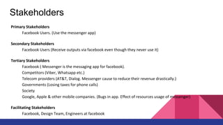
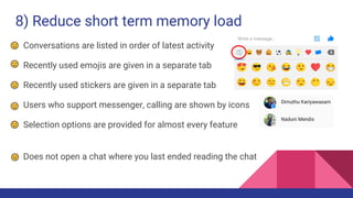
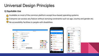
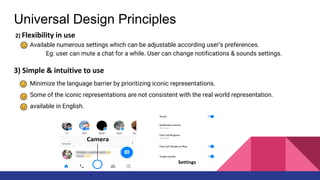
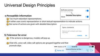
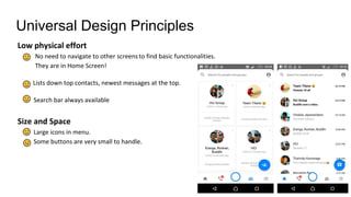
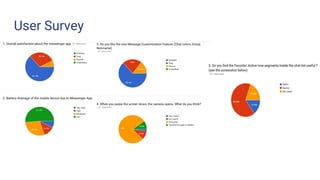
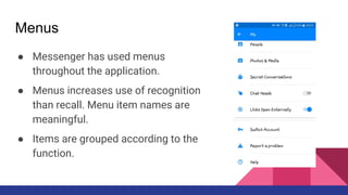
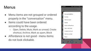
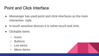
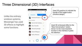
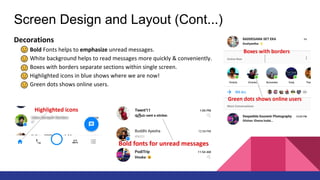
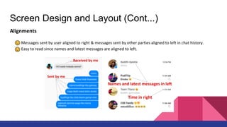
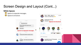
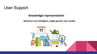
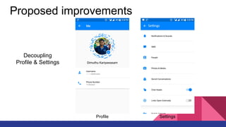
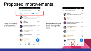
This presentation includes an evaluation of Facebook Messenger, in terms of Human Computer Interaction. This is under the module CS-4242 of the Department of Computer Science and Engineering.
Tech-Forward - Achieving Business Readiness For Copilot in Microsoft 365
Human Computer Interaction - Facebook Messenger
1. Facebook Messenger Evaluation
Group 15
CS - 4242 Human Computer Interactions
Computer Science and Engineering Department
University of Moratuwa
2. What is Messenger ?
Facebook Messenger is a free instant messaging service and software application
which provides text and voice communication, which is also integrated with
Facebook’s web based chat feature.
4. Stakeholders
Primary Stakeholders
Facebook Users. (Use the messenger app)
Secondary Stakeholders
Facebook Users (Receive outputs via facebook even though they never use it)
Tertiary Stakeholders
Facebook ( Messenger is the messaging app for facebook).
Competitors (Viber, Whatsapp etc.)
Telecom providers (AT&T, Dialog. Messenger cause to reduce their revenue drastically.)
Governments (Losing taxes for phone calls)
Society
Google, Apple & other mobile companies. (Bugs in app. Effect of resources usage of messenger)
Facilitating Stakeholders
Facebook, Design Team, Engineers at facebook
7. 1) Strive for Consistency
Facebook Web Messenger and Facebook Mobile Messenger - Consistent
Emoji Support Across any Platform (blank emojis)
Consistency between application and cross domain (sharing etc)
Green bulb to show online users (skype/ fb)
Inconsistency in messaging between applications (okay google/siri)
Unavailability of left right swiping (across multiple tabs)
Swiping down will cause the camera to be opened
(Normally for refreshing)
Inconsistency between Android and iOS
(no chat heads/ warning colours)
8. 2) Cater to universal usability
Multi Sensory - Eye, Touch, Ear
Auditory Icons, Earcons (emojis, messaging )
Support for Speech I/O (physically impaired/ dyslexia)
Handwriting recognition (speech impairment)
Localization support (Multi Coloured Emojis)
Screen Reading Support (Visually Impaired)
No gestures (speech/ visual impairment)
No separate multi language support (translation)
No support for disability aids/ memory aids
9. 3) Offer Informative Feedback
Message Notifications and Call Notifications
Sounds when sending messages, stickers, emojis
Changing chat colours, names, emojis will display an update on chat.
Unread messages in bold and read messages in light
Forwarding contents, will give a confirmation called “sent”
Pop up message before deleting or muting a conversation
Muted conversations are being displayed on the conversation
Provide last online time
No upload progress when sending images/ videos
10. 4) Design Dialogues to yield closure
Setting up the messenger account follows a sequence of actions
When creating a group, it goes as multiple steps
End of a call is notified by a “Call Ended” message
Provides completion of a message being sent by a tick in various states
Muting conversations will happen in multiple steps
11. 5) Prevent Errors
Confirmation Message before deleting conversations
Clicking on a chat with missed calls, will ask to “call” or “open chat”
Sending unnecessary stickers when the intention is to swipe.
Accidentally calling, when wanting to check information
Sending wrong Images, when wanting to swipe down the album
12. 6) Permit easy reversal of actions
Ability to delete wrong creation of groups
Ability to remove unintended users from
conversations
Incapability to cancel audio uploads
Incapability to cancel image uploads
Does not provide ability to clear call log or specific
call log
13. 7) Support internal locus of control
Let’s the user disable chat pop heads if not needed
User can customize chats as needed
Can decide on the size of the emoji to be sent
Can download only the set of stickers needed
Invite people to messenger if needed
Mute and Unmute conversations when needed
Incapability in assigning different notification tones
for chats and calls
Incapability to select image quality when uploading
Incapability to disable video at the beginning of a call
14. 8) Reduce short term memory load
Conversations are listed in order of latest activity
Recently used emojis are given in a separate tab
Recently used stickers are given in a separate tab
Users who support messenger, calling are shown by icons
Selection options are provided for almost every feature
Does not open a chat where you last ended reading the chat
16. Universal Design Principles
1) Equitable Use
Available on most of the common platform except linux based operating systems.
Everyone can access any feature without worrying constraints such as age, country and gender etc.
No accessibility facilities to people with disabilities.
17. Universal Design Principles
2) Flexibility in use
Available numerous settings which can be adjustable according user’s preferences.
Eg: user can mute a chat for a while. User can change notifications & sounds settings.
3) Simple & intuitive to use
Minimize the language barrier by prioritizing iconic representations.
Some of the iconic representations are not consistent with the real world representation.
available in English.
18. Universal Design Principles
4) Perceptible information
Too much redundant representations.
It either uses iconic representation or short textual representation to indicate actions.
But some of actions are given with detailed description.
5) Tolerance for error
If the actions is dangerous, modals will pop up.
Chat info, voice call, video call options are grouped together and that
promote slips
19. Universal Design Principles
Low physical effort
No need to navigate to other screensto find basic functionalities.
They are in Home Screen!
Lists down top contacts, newest messages at the top.
Search bar always available
Size and Space
Large icons in menu.
Some buttons are very small to handle.
26. Arrangement of Controls and Displays
● Pop up chat head is the size of a general finger touch
● Each message in a chat is of perceivable size.
● Each conversation in the list is of perceivable size
● The bottom tab buttons are placed with sufficient space
● Camera button in middle (frequency of use)
● The conversations options menu does not
have proper affordance
27. Health Issues
● No theme changing capability when using
device in the day and night
(high contrast for eyes)
● The application cogs up a lot of processing
power and battery, which causes the device
to heat significantly.
28. Use of Colour
● Have used blue as the main theme colour, whereas this could be blind to
some people (colour blind)
● Green to show online users - Consistent and attractive
● Use of red for warnings are also present.
30. Menus
● Messenger has used menus
throughout the application.
● Menus increases use of recognition
than recall. Menu item names are
meaningful.
● Items are grouped according to the
function.
31. Menus
● Menu items are not grouped or ordered
properly in the “conversation” menu.
● Items could have been ordered
according to the usage.
○ Open, Delete, Mute, Mark as unread, Create
shortcut, Archive, Mark as spam, Block
● Affordance is not good - menu items
do not look clickable.
32. Point and Click Interface
● Messenger has used point and click interfaces as the main
interaction style.
● In touch sensitive devices it is rather touch and click.
● Clickable items
○ Icons
○ Buttons
○ List items
○ Menu items
33. Three Dimensional (3D) Interfaces
Unlike the ordinary
windows systems,
Messenger has used
3D effects to highlight
some functions.
Used 3D graphics to indicate the
handle of the toggle button.
(Intuitive design)
Used 3D embossed effect to the
“New Conversation” button.
Since it is the most important
function in the interface it grabs
the attention.
37. ● Local Navigation Structure (Cont...)
○ Where are you going
The user knows that when he/she
clicks on the blue button, the
message will be sent.
Knows what will happen
38. ● Local Navigation Structure (Cont...)
○ What you have done
If the user has already sent a
message to a particular user, it is
explicitly indicated to the user.
41. Screen Design and Layout
Grouping of Items
Items are grouped in an effective manner most of the times.
42. Screen Design and Layout (Cont...)
Order of items
Frequently accessed items or latest accessed items come first. Otherwise the importance of actions or
alphabetical order have considered.
43. Screen Design and Layout (Cont...)
Decorations
Bold Fonts helps to emphasize unread messages.
White background helps to read messages more quickly & conveniently.
Boxes with borders separate sections within single screen.
Highlighted icons in blue shows where we are now!
Green dots shows online users.
44. Screen Design and Layout (Cont...)
Alignments
Messages sent by user aligned to right & messages sent by other parties aligned to left in chat history.
Easy to read since names and latest messages are aligned to left.
45. Screen Design and Layout (Cont...)
White Spaces
Spaces to separate messages.
Spaces to structure.
48. User Support
Online Documentation
Consists of questions that user may come across and detailed answers.
It is available on several languages also.
User support is separated from the app.
49. User Support
Has messenger been enriched with an excellent user support service?
Availability
High availability since help documentation is directly attached to facebook.
Accuracy & Completeness
It is not complete and accuracy is doubtful for the community answers.
Consistency`
Answers provided by facebook itself, are consistent. But the answers given by the community might be
inconsistent. But there is a feature to rate the consistency of the answers.
50. User Support
Has messenger been enriched with an excellent user support service?
Robustness
Even the messenger app crashes, user can access the help documentation via internet.
Flexibility
Not much flexible. User can’t choose the level of support that they want.
Unobtrusiveness
User should explicitly ask for the support. So no interferes!