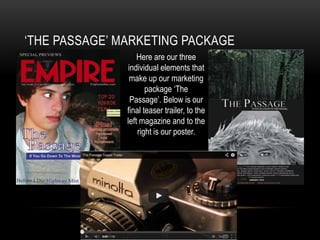
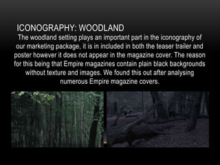
HOW EFFECTIVE IS THE COMBINATION OF YOUR
MAIN PRODUCT AND ANCILLARY TEXTS?
‘THE PASSAGE’ MARKETING PACKAGE
Here are our three
individual elements that
make up our marketing
package ‘The
Passage’. Below is our
final teaser trailer, to the
left magazine and to the
right is our poster.
ICONOGRAPHY: EYES
‘The Passage’ marketing package
features mainly close up shots of eyes, of
both the villain and hero. After viewing
and analysing the teaser trailers for ‘The
Woman in Black’ and ‘Insidious’ we
recognised that they contained close up
shots of eyes at heightened moments to
increase the pace of the moving
action, and also to convey themes of
desolation and loneliness. Our storyline
and trailer includes the male reading a
book alone in the middle of the
woods, and so we thought this would be
fitting.
ICONOGRAPHY: VILLAIN
Within our marketing package we have repeated the use of our villain in all three
products. The vagrant features on the front cover of the magazine and poster and
also appears during the majority of our teaser trailer. We collaboratively decided
that the character should feature in all three products as she forms the threat during
the storyline, disrupting the equilibrium and creating a problem for the male hero.
After extensively researching conventions of the horror genre, we came to the
decision to include an archetypal villain.
ICONOGRAPHY: WOODLAND

The woodland setting plays an important part in the iconography of
our marketing package, it is in included in both the teaser trailer and
poster however it does not appear in the magazine cover. The reason
for this being that Empire magazines contain plain black backgrounds
without texture and images. We found this out after analysing
numerous Empire magazine covers.
‘THE PASSAGE’ TITLE
The design of our title is fairly
minimalist. After creating a
moodboard of numerous different
titles from a range of horror films
such as Warm Bodies, Evil
Dead, Sinister, Scream, Mama and
The Purge we concluded that we
wanted to create a title that didn’t
detract away from the photography
on the products that it would be
featured with. We chose to produce a
white ghostly coloured title, with an
old styled typeface and enlarged ‘T’
and ‘P’ so that it stood out and
emphasised the ‘The’ and ‘Passage’.
DO THEY APPEAL TO THE SAME AUDIENCE?
In my opinion all three products do appeal to the same audience. The colours
that we have chosen to use are fairly unisex as they are not swayed towards
stereotypical colours such as light pink and pastels for girls, and blue for boys.
Contradictory to this, it could be suggested that the Empire magazine cover is
slightly swayed towards a male target audience as the focus is on the male
character. However this is balanced out by the inclusion of the female villain on
both the magazine cover and poster.

How effective is the combination of your main product and ancillary texts?

  • 1.
    HOW EFFECTIVE ISTHE COMBINATION OF YOUR MAIN PRODUCT AND ANCILLARY TEXTS?
  • 2.
    ‘THE PASSAGE’ MARKETINGPACKAGE Here are our three individual elements that make up our marketing package ‘The Passage’. Below is our final teaser trailer, to the left magazine and to the right is our poster.
  • 3.
    ICONOGRAPHY: EYES ‘The Passage’marketing package features mainly close up shots of eyes, of both the villain and hero. After viewing and analysing the teaser trailers for ‘The Woman in Black’ and ‘Insidious’ we recognised that they contained close up shots of eyes at heightened moments to increase the pace of the moving action, and also to convey themes of desolation and loneliness. Our storyline and trailer includes the male reading a book alone in the middle of the woods, and so we thought this would be fitting.
  • 4.
    ICONOGRAPHY: VILLAIN Within ourmarketing package we have repeated the use of our villain in all three products. The vagrant features on the front cover of the magazine and poster and also appears during the majority of our teaser trailer. We collaboratively decided that the character should feature in all three products as she forms the threat during the storyline, disrupting the equilibrium and creating a problem for the male hero. After extensively researching conventions of the horror genre, we came to the decision to include an archetypal villain.
  • 5.
    ICONOGRAPHY: WOODLAND The woodlandsetting plays an important part in the iconography of our marketing package, it is in included in both the teaser trailer and poster however it does not appear in the magazine cover. The reason for this being that Empire magazines contain plain black backgrounds without texture and images. We found this out after analysing numerous Empire magazine covers.
  • 6.
    ‘THE PASSAGE’ TITLE Thedesign of our title is fairly minimalist. After creating a moodboard of numerous different titles from a range of horror films such as Warm Bodies, Evil Dead, Sinister, Scream, Mama and The Purge we concluded that we wanted to create a title that didn’t detract away from the photography on the products that it would be featured with. We chose to produce a white ghostly coloured title, with an old styled typeface and enlarged ‘T’ and ‘P’ so that it stood out and emphasised the ‘The’ and ‘Passage’.
  • 7.
    DO THEY APPEALTO THE SAME AUDIENCE? In my opinion all three products do appeal to the same audience. The colours that we have chosen to use are fairly unisex as they are not swayed towards stereotypical colours such as light pink and pastels for girls, and blue for boys. Contradictory to this, it could be suggested that the Empire magazine cover is slightly swayed towards a male target audience as the focus is on the male character. However this is balanced out by the inclusion of the female villain on both the magazine cover and poster.