This document describes the characteristics of "Emergent Service Workers" as a social class. Key points:
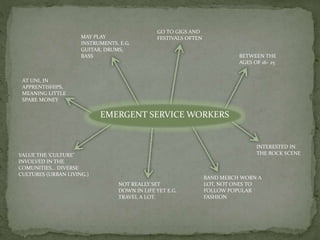
- Emergent Service Workers have low economic capital but high cultural and social capital. They are typically young adults living in urban areas.
- The traditional working class is shrinking, while groups like Emergent Service Workers and Affluent Workers are growing.
- Emergent Service Workers actively participate in cultural activities like going to concerts and festivals. They value diverse urban cultures. They are not yet settled in their careers and lives.