The document discusses plans for designing a digipak and website for an artist named Daniel Noir. For the digipak, panels on the front and back covers will feature urban cityscape images and photos of the artist. Interior panels will include song titles and credits. The website homepage design is inspired by Ben Howard's site and will feature tabs, understated fonts, and text aligned using the rule of thirds technique over a background image relating to the artist's music.
Digipak Planning & Creation Process Powerpoint0wgdurden
Here is a descriptive and visual powerpoint that shows my step by step mind process and creations of my CD Digipak for my year 13 A-Level Media project
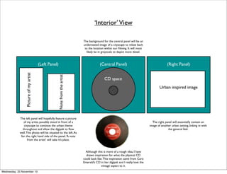
1. ‘Interior’ View
The background for the central panel will be an
understated image of a cityscape to relate back
to the location within our filming. It will most
likely be in greyscale to depict more detail.
(Central Panel)
Note from the artist
Picture of my artist
(Left Panel)
CD space
Urban inspired image
The left panel will hopefully feature a picture
of my artist, possibly stood in front of a
cityscape to continue the urban theme
throughout and allow the digipak to flow
well. This photo will be situated to the left. As
for the right hand side of the panel, ‘A note
from the artist’ will take it’s place.
The right panel will essentially contain an
image of another urban setting, linking in with
the general feel.
Although this is more of a rough idea, I have
drawn inspiration for what the physical CD
could look like. This inspiration came from Caro
Emerald’s CD in her digipak and I really love the
vintage aspect to it.
Wednesday, 20 November 13
(Right Panel)
2. ‘Exterior’ View
Alongside the continued image on this panel, I
was thinking of having a section with the
names of music writers, photographers etc..
anyone who would be involved in making a
digipak. I feel that this would break up the
image whilst adding more realism to my final
piece.
I will also feature Daniel Noir’s logo on the
front in a bold, black font, so that it grabs the
potential audience’s attention.
(Back Of Right Panel)
(Central Panel)
( Back Of Left Panel)
Song Titles with timings
Urban inspired image to be
carried on to this section
For this panel, I thought I would continue on
the image from the front of the right hand
side panel and essentially ‘wrap’ this image
around both sides. This is a technique that I
have seen featured on many digipaks. I think
that this will be a successful idea as it allows
the interior and exterior sections to
demonstrate a visible link between the two
and not seem unrelated or random in any
way.
Wednesday, 20 November 13
1.
2.
3.
4.
etc
One of the most common features that I
noted whilst researching digipaks is that they
usually have the song titles (and sometimes
timings) on a central panel. This is so that they
are easy to find and represent a similar layout
to a typical physical CD.
Portrait
Layered image.
This is essentially the very front cover of the
digipak, therefore it has to be the most
striking and effective out of all of the panels. I
am planning to have a straightforward close
up shot of my artist’s face. However, I am then
planning to layer this over a faint image of an
animal’s face which I will draw myself.
3. Digipak Advert
I hope that this
style of
photography will
compliment the
‘indie’ style of
genre.
My initial thoughts
will allow the
photograph to be
of the harbourside
in which we have
filmed on location.
As this adds an
urban edge but at
the same time in
keeping with the
indie and original
theme.
The top of the advert will feature a
large representation of Daniel Noir’s
logo to make a statement.
For the front cover and main
image of my digipak I am going
to use an app called ‘Tiny
planets’ in which it converts a
single photo into essentially into
a ‘world’ like this:
The name of the album will be clear and bold underneath the
image.
Wednesday, 20 November 13
My image will be
of somewhere in
which our music
video is set
because of
continuity.
I decided on this
technique as I feel
that if I did an
artist’s portrait
that it could be a
slightly
monotonous and
unadventurous
idea.
4. Website Homepage
I will have my
webpage
feature similar
tabs in the
way that
they’re laid
out with their
spacing,
alongside the
understated
font.
I love this text
that’s alligned
over one side
of the page as
it works with
the ‘rule of
thirds’
technique.
Wednesday, 20 November 13
I did my research into many different existing artist’s webpages but was
particularly inspired by one artist’s: Ben Howard’s. I was so inspired that I feel
that I will base a considerable amount of my webpage on the simplicity and
effectiveness of the layout.
Evidently, my
background
image will be
different and
will probably
revolve
around the
theme of
urban
cityscapes.
Overall I feel
that the
general style
completely
suits the genre
and feeling of
my artist
‘Daniel Noir’
and this is why
I have chosen
to be inspire
by such a
creative yet
professional
style.